

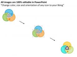
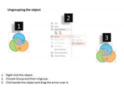
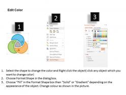
Three staged venn diagram business strategy flat powerpoint design






Try Before you Buy Download Free Sample Product
 Impress Your
 Audience
 100%
100% Editable
 Save Hours
 of Time


In order to tackle the art of formulation, evaluation and implementation, we present to you Three Staged Venn Diagram Business Strategy Flat PowerPoint Design which helps plan a good growth strategy, acquisition, product differentiation and price skimming techniques to strengthen the established network. The PowerPoint presentation helps to infuse new competitive technology for establishing a sound base, focus on the ongoing trends for the relatively easy way to approach the end customers and clients. This PPT design provides the best platform ever, by using the section-ally bifurcated ye colorfully integrated Venn diagram for easy compliance of the data and to easily manage the work leadership, differentiation and have a focused yet professional approach to win the cost game. The presentation slide show helps to recognize the essential strategies, bring into action the executable plan for all the basic long and short term business, sales and marketing activities. To infuse the latest trends, research and development findings, and evaluate and formulate plan for competitive advantage-PPT is a must.Extend a friendly hand with our Three Staged Venn Diagram Business Strategy Flat Powerpoint Design. They will appreciate your goodwill.
People who downloaded this PowerPoint presentation also viewed the following :
Three staged venn diagram business strategy flat powerpoint design with all 4 slides:
Generate animated discussions with our Three Staged Venn Diagram Business Strategy Flat Powerpoint Design. They will energize any boardroom.

FAQs for Three staged venn diagram business strategy
So there are three circles you gotta think about: What You're Good At, What the Market Actually Wants, and What Makes Money. The magic happens where all three overlap - that's your sweet spot. Most people I know get obsessed with just one area and totally miss the connections. Like, you might be amazing at something but if nobody wants to pay for it... yeah, that's not gonna work. The overlaps between two circles show you what's missing or worth exploring. Honestly, once you figure out where you are now, you can start moving toward that center where everything clicks.
Venn diagrams are actually perfect for this! Draw three circles - what customers want, what competitors offer, and what you can do. The magic happens where customer needs sit all alone without competitor overlap. I tried this a few months back and honestly? Found three gaps we'd been blind to. It's kind of embarrassing how obvious they seemed after mapping it out. Short sentences make gaps pop visually. Start with your biggest customer complaints and see what your main competitors aren't solving. You'll spot some pretty clear opportunities hiding in plain sight.
So basically, draw circles for your company and 2-3 main competitors. Each circle represents different strengths - tech, brand power, whatever matters in your space. Where circles overlap? That's where everyone's doing the same stuff (which happens way more than you'd think). The parts that don't overlap are your actual competitive advantages. I did this exercise last year and it was wild seeing how commoditized our "unique" features really were. Focus on those non-overlapping sections - that's where your real differentiation lives. Makes it super obvious where you should double down versus where you're just fighting in a crowded mess.
Honestly, Venn diagrams make everything look way cleaner than it actually is. Business stuff is messy and complex, but these diagrams trick you into thinking you've got it all figured out. Markets shift constantly too - good luck keeping those circles updated every time something changes. The worst part? Teams waste forever arguing about what goes where. Spoiler: most things probably belong in multiple spots anyway. They're decent for getting ideas flowing initially, but I wouldn't build your whole strategy around them. You'll just end up cramming complicated factors into oversimplified bubbles that don't really capture what's happening.
Honestly, Venn diagrams are clutch for this stuff. Just draw circles for your different stakeholder groups and see where they overlap - that's where the magic happens. I did this when our departments were basically at war over budget priorities (what a mess that was). Plot them by influence vs interest first, then use the overlapping parts to figure out who might actually work together. Short sentences work great here. The visual aspect makes it so obvious which groups share goals and which ones are gonna butt heads. Perfect for spotting coalition opportunities you might've missed otherwise.
Honestly, Venn diagrams are clutch for this. Map out your product features against competitors using overlapping circles - the overlaps show where everyone's fighting for the same customers. But here's the thing: those empty spaces between circles? That's where the magic happens. Those gaps are unmet customer needs nobody's targeting yet. I've used this approach tons of times and it works. You can plot features, benefits, whatever makes sense for your market. Just avoid the crowded overlapping areas unless you've got something genuinely different to offer there.
Honestly, Venn diagrams are clutch for this stuff. Map out different customer traits as circles - demographics, behaviors, whatever matters to your business. The magic happens where they overlap. Last quarter I found this whole segment of price-sensitive tech nerds we'd completely ignored before. Those intersection zones? That's where your best opportunities hide. You can either target underserved niches or craft messaging that hits multiple pain points. Start simple though - just pick 2-3 key traits and see what pops up in the overlaps. Works way better than you'd think.
Honestly, Venn diagrams are a game-changer for team decisions. Draw each stakeholder's priorities as separate circles, then look for where they overlap - that's your sweet spot. Way less painful than arguing in circles for hours (which we've all been there, right?). Each department can see their needs mapped out visually, plus you'll catch conflicts that usually get lost in all the talking. I used this trick last month and it saved us so much time. Just sketch three circles representing different viewpoints and boom - suddenly the best path forward becomes obvious. Your team will actually agree on something for once!
Try drawing your customer segments as overlapping circles - it's seriously helpful for finding those sweet spots. Each circle is a different customer group with their own needs and problems. Where they overlap? That's where the magic happens because you're seeing shared needs across multiple segments. I do this constantly when I'm stuck on what features to build next. Those intersection areas basically scream "build me first" since you'll hit several customer bases at once. Honestly beats trying to guess what people want. Start with your top 3 segments and map out their core needs.
Don't make your circles super vague or overlap everything just because it looks cool. Be specific about what each one means. Also, cramming tons of text in there? Total nightmare - nobody wants to read microscopic font. I'd stick to 3 circles tops, otherwise it turns into some crazy spider web thing. Your overlaps should actually make sense too, not just be random wishful thinking. Oh and here's what really helps: define each circle clearly before you start drawing. Short, punchy labels work way better than paragraphs of explanation.
Dude, Venn diagrams are a game changer for strategy stuff. They make complex ideas super obvious - like where your markets overlap or how different projects connect. Way better than drowning people in bullet points, you know? Both your boss and that new guy can look at the same circle thing and immediately get it. Everyone loves spotting that sweet spot where everything comes together. I actually used one last month and it saved me from explaining the same concept five different ways. Honestly, just swap out those text-heavy slides next time you're presenting.
Honestly, Venn diagrams are clutch for when you've got 2-3 things that overlap and you need to see where they intersect. Way better than those 2x2 matrices everyone's obsessed with. Perfect for finding sweet spots - like where your skills meet what the market actually wants. I use them all the time for competitive analysis or figuring out stakeholder stuff. The best part? Everyone instantly gets how to read them, which makes strategy meetings so much smoother. Oh, and they're amazing for capability mapping too. Next time you're wrestling with some messy overlap problem, just draw circles. Trust me on this one.
Honestly, Venn diagrams are perfect for this. Just map out what everyone's working on, then see where the circles overlap - that's where collaboration happens naturally. I tried this with my team last month and wow, it was eye-opening! The gaps between circles? That's your problem right there - people working in silos. Way easier to spot visually than trying to figure it out from endless email chains (which, let's be real, nobody reads anyway). Short sentences work. Longer ones help show the natural flow between ideas and make everything feel more connected. Definitely sketch one out before your next planning meeting.
Honestly, tech companies are obsessed with these things - always mapping what users want against what they can actually build and what'll make money. Healthcare uses them to spot gaps in patient care. Retail's constantly trying to find that perfect balance between what people want, what's in stock, and profit margins. Consulting firms? They practically worship Venn diagrams lol. Even banks, manufacturers, and nonprofits use them for figuring out where to spend resources. My advice? Pick your three biggest headaches and see where they overlap - that's usually where the magic happens.
Set up KPIs for each part of your Venn diagram - customer needs, your capabilities, and market opportunities. Track customer satisfaction, operational efficiency, and market share. The real gold is measuring how you're doing in that center overlap where all three meet. Build dashboards showing performance across the dimensions. Honestly, quarterly reviews are a game-changer for seeing if your strategy's actually working or if it's time to switch things up. Most people skip this part but it's what separates companies that thrive from ones that just survive.
-
Great quality slides in rapid time.
-
Qualitative and comprehensive slides.