


Modern with text and chart diagram flat powerpoint design




Try Before you Buy Download Free Sample Product
 Impress Your
 Audience
 100%
100% Editable
 Save Hours
 of Time


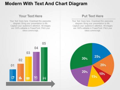
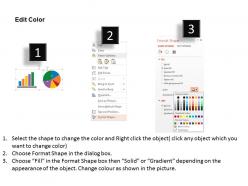
Give your presentations a new life with our modern with text and chat diagram flat PowerPoint design. Hosting a great collection of PPT slides, we have come with this PowerPoint layout which captures the attention of the audience in the first glance. With our PowerPoint diagram you can effectively represent data in the form of bars which can have different color schemes according to the scale or importance of data. This lets the audience understand the distinction quickly. This beautiful PowerPoint template contains pie chart as well which is the ultimate data presenter. With the help of our modern with text and chart Presentation slide a user is bound to impress the audience with his or her creativity in presentation skills. So download our Presentation template to achieve your business goals while explaining the overall concept with utmost clarity and precision. Also, browse through our complete website to look for PowerPoint designs that will help you gain an edge over your competitors. Give them a taste of diverse cultures. Develop a global view with our Modern With Text And Chart Diagram Flat Powerpoint Design.
People who downloaded this PowerPoint presentation also viewed the following :
Modern with text and chart diagram flat powerpoint design with all 4 slides:
Our Modern With Text And Chart Diagram Flat Powerpoint Design team are dedicated and conscientious. They do all the groundwork before hand.
FAQs for Modern with text and chart diagram
Honestly, just pick one main idea per slide and give it room to breathe with lots of white space. Visual hierarchy is huge - use high-contrast colors and decent fonts (yeah, Comic Sans is still banned lol). Keep your design consistent throughout instead of switching styles every slide. Animations should actually serve a purpose, not just look flashy. Oh, and make sure your visuals aren't just pretty decoration - they need to back up what you're saying. I always start with a basic template and stick to it. Trust me, your audience will thank you for not cramming everything onto one slide.
Pick colors that match the vibe you're going for. Blue's solid for business stuff since it screams trustworthy. Red gets people moving—great for "sign up now!" moments. Green feels stable and growing, orange is super friendly and energetic. I honestly used to just grab whatever looked nice, but thinking it through actually works way better. Your audience matters too though. Corporate types want different things than creative people do. Oh, and don't go crazy with like 8 colors—that's overwhelming. Start with one main color for your key message, then add a couple others that play nice with it.
Dude, typography makes or breaks your slides. I always go with clean sans-serif fonts - Montserrat's my go-to, or Source Sans Pro works great too. They're readable even from the back row. Skip anything fancy or decorative (RIP Comic Sans lol). Here's what works: pick ONE font family max two if you're feeling bold. Use different weights and sizes to create hierarchy - big for headers, smaller for body text. Oh, and make sure there's good contrast with your background or people will squint the whole time. Start simple and you'll be fine.
Honestly, whitespace is a game changer - it lets people actually focus instead of getting overwhelmed. You know how some slides look like someone just vomited text everywhere? That's what happens when you cram everything together. Your eyes literally don't know where to start looking. I used to do this constantly btw, thinking I was being "efficient" or whatever. But giving your content breathing room makes such a difference. It groups things naturally and guides attention where you want it. One main idea per slide works way better than trying to fit your entire presentation on three slides.
Try interactive videos that pause for polls - your audience actually pays attention when they can participate. Animated data visualizations work great too, especially ones that build while you're talking. I love adding subtle background sounds to emphasize points, but seriously don't overdo the transition effects (we've all sat through those painful presentations). Live web content is cool, or you could try AR apps like HP Reveal. Clickable hotspots on images are another solid option. Just make sure everything supports your main message instead of being random eye candy. Test one new thing per presentation so you don't overwhelm yourself.
Okay so templates are way more important than people think. They literally set the mood before you say anything - sleek minimal stuff screams "cutting-edge," while traditional layouts feel reliable and trustworthy. Colors and fonts guide where people look and honestly shape how they interpret everything you're saying. It's kinda crazy how much this visual stuff influences people. I always think of templates like movie genres - you wouldn't use horror music for a rom-com, right? Pick whatever matches your vibe and stick with it so the whole thing flows nicely.
Honestly, infographics are a game-changer for presentations - way better than those boring bullet point slides everyone's used to. Your audience will actually remember the info since visuals stick better than text walls. They look super professional too. But fair warning: good ones take forever to make. I learned this the hard way trying to cram too much into one graphic - total mess. Also they can look weird on different screens sometimes. You'll need some design chops or at least decent templates. Start small though! Just icons with text works great before you go crazy with full infographics.
Honestly, just keep it simple with your animations. Stick to basic transitions like "Fade" or "Push" - nothing flashy. I always use "On Click" timing so I can control when stuff appears instead of having everything pop up automatically. For revealing bullet points, "Appear" works fine, but don't go crazy with it. The worst presentations I've sat through looked like someone discovered animations for the first time and used every single one. Your audience should walk away remembering what you said, not wondering why your text flew in from seventeen different directions. Less is definitely more here.
One key message per slide - that's it. PowerPoint's chart tools are actually solid now, way better than copying stuff from Excel. Don't go crazy with colors either, maybe 2-3 max so people can actually read it. I used to be terrible at this honestly, would just dump everything into one messy chart. Your title should tell them what they're supposed to think, not just "Q3 Sales Data" or whatever. Like if sales went up 20%, say that! Three seconds - that's how long someone should need to get your point.
Okay so three main things to nail down: color contrast, fonts, and how you organize everything. There are websites that'll automatically check if your text/background combo works for people with vision issues - super handy. For fonts, go with something clean and readable (RIP Comic Sans dreams) and bump your body text to at least 24pt. Break up content with headings and bullet points since screen readers love that structure. Oh, and don't forget alt text for images! One thing that trips people up - never use just color alone to show something important. Run it through an accessibility checker when you're done and you should be golden.
Start with "Imagine if..." and watch your whole presentation change. Structure it like any good story - problem, journey, solution. Make your audience the hero dealing with challenges your idea fixes. Those boring data dumps? Frame them as "here's what we discovered" instead. Way more engaging that way. Progressive reveals work great for building tension, plus before/after comparisons really hit home. Oh, and customer journey maps are clutch for visual storytelling. I know it sounds cheesy, but treating your slides like chapters honestly makes everything flow better. Trust me on this one.
Honestly, feedback is like having a cheat code for your slides. People squinting? Your font's probably too small. Getting the "can you go back?" thing constantly? Yeah, been there - usually means too much stuff crammed on one slide. Watch for phones coming out during your talk - dead giveaway your design's boring them to death. I always ask what confused people afterward and look for patterns. If three different people mention the same issue, that's definitely something to fix. The body language thing is huge too. Don't ignore those visual cues while you're presenting.
Honestly, just go full minimalist right now. White space everywhere, maybe 2-3 colors tops, and make your fonts huge so people can actually read them. Dark mode is having a moment - looks way cleaner than those bright white slides that burn your retinas. Ditch the cheesy stock photos (seriously, we've all seen that same handshake image a million times). Custom illustrations work great, or just stick with text layouts. Oh, and keep animations super subtle. One main idea per slide. I know it sounds boring compared to the wild WordArt days, but trust me on this one.
Here's what works for me - stick one main idea per slide, otherwise people get lost trying to follow everything. White space is your friend! Keep bullet points super short, like 6-8 words max. I used to cram way too much text on slides thinking it looked more "professional" but honestly it just confuses everyone. Pick 2-3 colors and use boring fonts like Arial or Calibri (I know, exciting stuff). Make your biggest point literally the biggest thing on the slide. Quick test: can someone glance at it for 3 seconds and get the main point? If not, cut more stuff out.
Honestly, start with Canva's PowerPoint templates - total lifesaver if you're not a designer. Grab photos from Unsplash or Pexels so your slides don't look ancient. For icons, Flaticon's solid, though PowerPoint's built-in ones are way better than they used to be. Oh, and Coolors.co is clutch for picking colors that actually work together. I was skeptical but PowerPoint's Designer thing is pretty smart now - it suggests layouts based on what you write. Simple fonts are your friend. With a decent template you'll look way more put-together than expected.
-
Use of different colors is good. It's simple and attractive.
-
Excellent products for quick understanding.