


Vertical timeline with text boxes flat powerpoint design





Try Before you Buy Download Free Sample Product
 Impress Your
 Audience
 100%
100% Editable
 Save Hours
 of Time


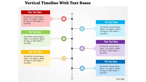
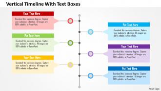
Project scheduling and time management impacts the overall finances of a project. So, to manage your time use our vertical timeline with text boxes flat PowerPoint design and attract your audience. Project scheduling ensures one task gets completed in a quality manner before the next task in the process begins. By assuring that quality measures meet expectations at every step of the way, you ensure that managers and team members address problems as they arise and don't wait until the end. This PowerPoint slide has been crafted with graphic of vertical timeline and text boxes. This PPT diagram visual slide contains the concept of growth and success can be used for business presentations. The PPT design also assists you in planning your events, meeting and conferences in an organized manner. Your timeline template also allows you to assign human resources to the work and evaluate their allocation to ensure you have the appropriate levels of utilization. So, just download the template and make it a part of your business presentation. Discover lucrative deals with our Vertical Timeline With Text Boxes Flat Powerpoint Design. They assure enhanced earnings.
People who downloaded this PowerPoint presentation also viewed the following :
Vertical timeline with text boxes flat powerpoint design with all 5 slides:
Create excellent citizens with our Vertical Timeline With Text Boxes Flat Powerpoint Design. They help ensure good grooming.
FAQs for Vertical timeline with text boxes
Dude, vertical timelines are seriously underrated! They work with how people naturally read - top to bottom - so it feels super smooth. Way more room for details too, unlike those cramped horizontal ones where you can barely read anything. The coolest part? Everything flows down logically, so cause-and-effect stuff makes total sense. Your audience can scan the whole thing quickly, get the overview, then focus when you dive deeper. I actually prefer them over any other layout now. Perfect for project timelines or showing processes!
Dude, vertical timelines are game-changers for presentations. You're basically turning boring data into a story people can follow. Start with your key milestones, then add details around each moment. The visual flow shows how you went from problem to solution - makes your recommendations seem logical instead of random. People remember stories way better than bullet points anyway. I actually learned this the hard way after watching too many eyes glaze over during my quarterly reviews. Map out cause-and-effect moments that build toward your main point. It's like giving stakeholders a roadmap they can actually use.
Make your timeline spine really stand out first - that's your anchor. Then connect your content boxes clearly to dates. Spacing is everything here; cramped timelines look terrible and nobody bothers reading them. I always use consistent fonts and colors for rhythm, but mix up box sizes based on what's most important. Also, test it on mobile since that's probably where most people will see it. The chronological flow should feel natural when you scan it. If someone gets confused about the sequence, the design needs work.
Okay so vertical timelines are definitely the way to go if you've got a lot of detail to work with. They give each section room to breathe, which is clutch for things like project docs or user journeys where you need to explain stuff properly. Horizontal ones just get messy fast - all that text wrapping looks terrible. Plus everyone scrolls up and down naturally anyway, so why fight it? Mobile users will thank you too since they won't have to do that annoying pinch-and-zoom thing. If you've got more than like 5 or 6 major points, vertical is a no-brainer.
Colors totally help people scan through your timeline faster - they create that visual hierarchy thing where related stuff gets grouped together. Use different colors for event categories, important items, or showing how things progress. But honestly? I've seen way too many people go overboard with rainbow madness that just hurts your eyes. Stick with maybe 3-4 colors that actually work together. Light backgrounds with dark text always win for readability. Throw in one accent color for major milestones so they pop. Oh, and definitely run it by someone else first - you'd be surprised how often your "perfectly clear" color scheme confuses everyone else.
Honestly, Canva's probably your best bet - they've got timeline templates so you won't start from scratch. TimelineJS is really clean if you want something web-based and interactive. Adobe Creative Suite gives you total control but might be overkill depending on what you're doing. PowerPoint actually works fine for quick internal stuff (I know, I know, but hear me out). Figma and Lucidchart are solid too if you're already familiar with them. Start with Canva though - you'll thank me later when you're not wrestling with formatting.
Keep your labels short - like 3-5 words tops. Nobody wants to squint at tiny text! Alternate them left and right of your timeline so they're not all crammed together. Icons help too since they cut down on how much text you actually need. Here's what I'd do: if you've got tons of dates, just group stuff under bigger time periods instead of labeling every little thing. Honestly, white space is way better than a cluttered disaster. I always step back from whatever I'm designing to see if I can actually read it from a normal distance. Sometimes fewer labels that you can actually see beats cramming everything in there.
Don't cram everything into each point - honestly, less is more here. Your time intervals should stay consistent or it looks sloppy. Font size matters too because squinting at tiny text is annoying as hell. Put the most important stuff first so people can scan easily. Always include actual dates (seems obvious but you'd be surprised). Skip the fancy graphics that look cool but confuse people. Write short, punchy descriptions that follow the same format. Oh, and start with your main milestones sketched out before you get all fancy with colors and design stuff.
Oh totally! Vertical timelines work great for both. I actually prefer them over horizontal ones tbh. So for project stuff, you'd drop in your deadlines and milestones going down the page. Historical events? Same deal - just swap out your quarterly reviews for like, wars and inventions and whatever. The trick is picking your time scale first. Are you tracking months or decades? Then keep those intervals consistent as you plot everything out. Structure stays the same either way - it's just what you're filling it with that changes. Start with deciding how much time you're covering, then add your events.
Vertical timelines are pretty flexible - just match them to your audience. Corporate stuff needs clean, minimal colors and standard fonts to look professional. Students do better with detailed text, icons, and color coding to follow complex info. Creative presentations though? That's where you can go nuts with custom graphics and bold colors. Honestly I think vertical layouts give you way more room to work with than horizontal ones anyway. Oh and adjust your detail level depending on whether people are reading it later or you're presenting live.
Oh man, typography can totally make or break your timeline! I'd focus on clear hierarchy first - bigger text for dates and headlines, smaller stuff for details. Otherwise people get completely lost trying to scan through everything. Font choices should guide your eye down naturally, you know? Give everything decent line spacing so it doesn't feel cramped. Actually, test it on mobile early because vertical timelines get super messy on phones - learned that one the hard way. Don't make my mistake of keeping all text the same size either!
Oh definitely use animations! They're perfect for revealing stuff bit by bit instead of overwhelming people. Fade-ins work great, or try those smooth slide transitions. Honestly, I'm obsessed with zoom effects on important dates - they just hit different. The trick is pacing it right so people don't scroll ahead and spoil everything for themselves. Flow your animations top to bottom since that matches how timelines naturally work. Keep the speeds consistent too, otherwise it gets janky. Oh and typewriter effects can be cool if you're feeling fancy!
Oh man, project management firms use these ALL the time - they're obsessed with showing milestones flowing down the page. Software teams do too for sprint planning and release roadmaps. Marketing agencies love them for campaign launches. Healthcare companies rely on vertical timelines for clinical trials (all those regulatory phases, ugh). I swear once you notice them, they're literally everywhere! Honestly? If you're presenting sequential steps, go vertical instead of cramming everything sideways. Way easier to follow.
Dude, stop just listing boring facts like "launched in Q2." Nobody cares about that dry stuff. Turn each milestone into an actual story - talk about the three failed prototypes, the late nights, how you finally figured it out. Show how people changed along the way too. I mean, timelines without drama are basically just fancy bullet points, right? Throw in some real emotions, setbacks that actually stung, maybe what the office smelled like during crunch time. Trust me, people will actually read the whole thing instead of bouncing after two seconds.
Honestly, just start with good spacing and alignment - that's half the battle right there. People automatically expect timelines to flow top-to-bottom, so don't fight that. Use little dots or icons to mark each event. Your text should be short but still tell the actual story. Colors are great but I've seen way too many rainbow disasters. Keep it simple. The whole point is someone can glance at it for like 10 seconds and understand what happened. Oh, and definitely test it on someone who doesn't know your stuff - if they squint or look confused, you need to cut more things out.
-
Editable templates with innovative design and color combination.
-
Really like the color and design of the presentation.