

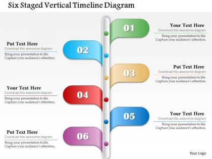
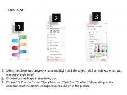
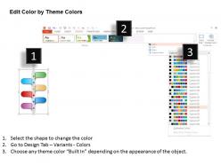
Six staged vertical timeline diagram powerpoint template




Try Before you Buy Download Free Sample Product
 Impress Your
 Audience
 100%
100% Editable
 Save Hours
 of Time


Give direct to beneficiaries with our Six Staged Vertical Timeline Diagram Powerpoint Template. No other consideration comes in between.
People who downloaded this PowerPoint presentation also viewed the following :
Six staged vertical timeline diagram powerpoint template with all 5 slides:
Call a halt to complacency with our Six Staged Vertical Timeline Diagram Powerpoint Template. Get all the efforts going again.
FAQs for Six staged vertical timeline
So you've got six stages stacked vertically with connecting lines between them. Each section has space for titles, descriptions, maybe some icons if you want. Works really well for step-by-step processes since we naturally read top to bottom anyway. You can tweak colors and fonts to match whatever look you're going for. Oh, and the text boxes are customizable too - honestly that's probably the most useful part. My advice? Figure out what content you're putting in each stage before you start messing with all the design stuff. Trust me, it'll save you from going in circles later trying to make everything fit right.
Dude, six-stage vertical timelines are actually genius for presentations. They turn everything into a proper story where each stage builds naturally on the last one. Perfect for walking people through project phases, events, or problem-to-solution stuff. The vertical layout just works better - people read top to bottom anyway, right? You can reveal stages one by one for drama or show everything upfront. Honestly beats those messy horizontal timelines every time. Works great for case studies and project updates. Trust me, your audience won't zone out like they usually do. Much better than bullet points or whatever.
Honestly, vertical timelines are way better for presentations. People read top to bottom naturally, so your audience won't be squinting at tiny text stretched across the screen. Mobile viewing is huge too - everyone's scrolling vertically on their phones anyway. If you've got detailed descriptions for each step, horizontal layouts get super cramped real quick. Vertical gives you actual room to breathe. I mean, think about it - when's the last time you enjoyed reading something that made you scroll sideways? Go vertical next time, trust me.
Use six stages when your process has clear phases that actually build on each other - like launching a product, hitting project deadlines, or tracking business growth. Each stage needs to show real progress, not just random stuff shoved into boxes (I've seen that disaster too many times). The key is natural progression. Your timeline should tell a story where stage 2 couldn't happen without stage 1. Works great for company evolution or campaign rollouts. Just don't force it if your content doesn't fit - honestly, sometimes fewer stages look way cleaner.
Oh man, this template works for pretty much everything! I've seen project managers use it all the time. Software teams love it for development cycles. Healthcare uses it for patient pathways - which honestly surprised me at first. Construction companies map out build phases with it. Marketing teams do campaign rollouts. Six stages just seems to hit that sweet spot where most processes naturally break down. Even startups use it for fundraising timelines, though that's probably overkill. Really, anywhere you're explaining "this happens, then this, then that" it'll work. Look at your current presentations - bet you'll find spots for it.
Honestly, colors can totally make or break your timeline. High contrast is your best friend - people need to scan those six stages without squinting. Blues and oranges work great for keeping attention (way better than those boring beige palettes everyone uses). Keep related stages in the same color family so it's not complete chaos. Oh, and definitely think about the poor souls sitting in the back row - they need to actually read this thing. Muted colors look sophisticated but might put your 3pm crowd to sleep. Just pick something that doesn't clash horribly with your brand and you'll be fine.
First thing - make sure the template actually works with your PowerPoint version. Most need 2016 or newer. Older versions like 2013? You might lose some animations or fancy formatting. Does your team use Google Slides or Keynote instead? That's where things get messy. Import a PowerPoint file and suddenly your colors are off, fonts look weird - it's such a pain. My advice? Grab a free preview first. Test it on whatever software you're actually using before you spend money on the full thing. Way better than finding out later it looks terrible.
Entrance effects are your friend here—try "Fly In" or "Fade In" for each stage. Set them up so they appear one by one instead of all at once. The Animation Pane lets you control the timing perfectly. Honestly, "Wipe" effects look amazing on timelines, way cleaner than most other options. Build each stage on the previous one so it flows naturally down your timeline. Oh, and throw in some emphasis animations on important dates if you want extra polish. Trust me, it'll beat boring static slides every time.
Start with chronological order, then figure out what's actually critical for each stage. Bullet points are your friend here - paragraphs just turn into word soup on slides. I can't tell you how many presentations I've sat through that looked like Excel vomit! Color-code different data types so people can follow along easier. Keep your formatting consistent across all six stages, and honestly? Group related stuff together instead of spreading it everywhere. Your audience needs to scan quickly and get the main progression without drowning in details. Run it by someone else first - you'll catch things you missed.
Think of visuals in timelines like a map vs getting directions over the phone. Your brain processes the flow way better when it can actually see how events connect. People spot patterns instantly instead of slogging through paragraphs. With a vertical timeline, the sequence becomes obvious - no mental gymnastics required. Color coding different stages works really well too. Honestly, I've seen presentations where timelines saved the whole thing from being boring as hell. Your audience retains more info because they're using both visual and logical processing. Icons help break things up if you've got space for them.
Ugh, biggest thing - don't cram everything onto one timeline. I've seen people try to fit like 20 bullet points and it's just chaos. Pick your main milestones and keep the formatting consistent throughout. Also please don't use size 8 font thinking you can squeeze more in. Nobody's reading that from across the room lol. Oh and chronological order matters! Sounds obvious but you'd be surprised how many people jump around randomly. The real key though? Tell people what happens next. Like, what's the actual takeaway here and where do we go from this timeline. That's what they'll remember walking out.
Don't dump all six stages on people at once - virtual audiences check out fast. Show maybe 2-3 stages per slide, or use animations to build them progressively. Your fonts need to be way bigger than normal since screen sharing makes everything look tiny. High contrast colors too. I've watched so many timelines turn into illegible messes on video calls, it's painful. Maybe create a stripped-down version with just the key dates and milestones? You could make it interactive - have people guess what comes next before revealing each stage. Oh, and definitely test it in presenter view first so you're not scrambling during the actual presentation.
Check the template's help docs first - they usually walk you through the basics pretty well. YouTube's honestly where I find the best tricks though, tons of people post really useful PowerPoint tutorials there. If you're still stuck, most template creators have email support that's actually helpful. Community forums are solid too for the more advanced stuff. Oh, and definitely save a backup before you start messing around with major changes - learned that one the hard way! Start simple with the included guides, then dive into the video tutorials when you want to get fancy with it.
Link each stage to your major milestones and throw in some deadlines. The vertical thing is perfect - shows the flow from start to finish like a roadmap everyone can follow. Color-code them too: green for done, yellow for working on it, red for "oh crap we're behind." Brief descriptions help so people know what actually needs finishing. Honestly, the visual impact hits different when everyone can instantly see where you stand. Update weekly during meetings and you're golden. Maybe I'm overthinking it, but regular updates make or break these things.
Okay so basically icons are like visual shortcuts - people see a rocket and instantly know you're talking about a launch without reading a wall of text. Your audience can scan way faster that way. Plus let's be honest, most people's attention spans are terrible these days, so anything that keeps them engaged helps. The visual stuff sticks in their memory better too. I'd say match each timeline point with an icon that actually relates to what you're saying, not just random decorative ones. A checkmark for milestones, that kind of thing. Makes the whole presentation flow smoother and people remember it afterwards.
-
Easily Editable.
-
Very unique, user-friendly presentation interface.