


Six staged sequential timeline with years powerpoint slides




Try Before you Buy Download Free Sample Product
 Impress Your
 Audience
 100%
100% Editable
 Save Hours
 of Time


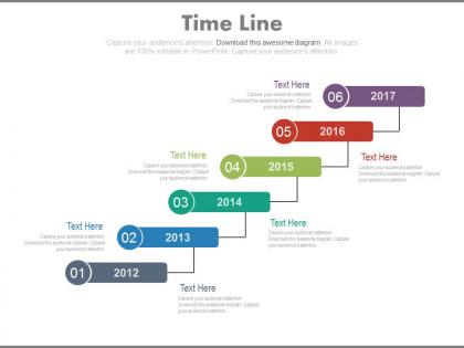
Presenting business timeline display PPT slides for keeping a track on your organization's growth over the time. This PPT slide is illustrated with a staircase display of 6 business years which are 2012, 2013,2014,2015, 2016 and 2017. Guiding through step patterns allow you to present complex data or statistics with ease in simpler and understandable manner, they allow you to easily portray your various business aspects. Timeline in the following PowerPoint template is divided into 6 sections which acknowledge you to edit the topics corresponding to them and use your own data for the best representation of your agenda, feel free to convey your thoughts, viewpoints and ideas. SlideTeam is here for you to make sure you have the best experience in business related Presentations. Just download this flat PPT design and display your organization's business pattern over time through our six staged sequential timeline with years PowerPoint slides. Get started now.Gain a greater dimension with our Six Staged Sequential Timeline With Years Powerpoint Slides. Your efforts will have a broader effect.
People who downloaded this PowerPoint presentation also viewed the following :
Six staged sequential timeline with years powerpoint slides with all 4 slides:
Our Six Staged Sequential Timeline With Years Powerpoint Slides will earn you credit. The audience will appreciate the advantage they create.
FAQs for Six staged sequential timeline with
First things first - figure out your actual start and end dates. Then pick the milestones that your audience will care about, not just everything that happened. I'd add specific dates and keep descriptions short but meaningful. Visual consistency is huge here - nobody wants to decode a messy timeline, trust me on that one. Show how events connect to each other logically. Oh, and definitely explain why certain moments mattered, otherwise people won't get the bigger picture. Test it out on someone before you present it because what makes sense to you might be confusing to others.
Dude, visuals are a game-changer for timelines. Nobody wants to stare at a wall of dates - instant eye glaze. Use progress bars or milestone dots to show the flow instead. Color coding is clutch: green for done, yellow for current stuff, red for what's coming up. People need to scan it quickly and get the gist, then dig deeper if they want. Oh, and don't go crazy with fancy graphics right away. Start basic and only add complexity if it actually helps clarify things. Trust me, simple usually wins.
Oh man, the worst thing you can do is cram like 15 events on there - nobody's reading that mess. Stick to maybe 5-7 max. Also don't randomly jump from "January 2020" to "5 years later" because it's confusing as hell. Make sure it flows left to right or top to bottom in an obvious way. Keep your formatting consistent too. Honestly, just leave some breathing room between stuff so it doesn't look like a word vomit explosion. Test it on someone first - they'll catch things you missed.
Think about who's actually going to look at this thing first. Executives? They want milestones and ROI stuff - basically proof things are moving forward. Students need more visual storytelling that breaks down complicated ideas. And yeah, kids obviously need way more colors than a boring boardroom presentation! What decisions does your timeline need to help people make? That's honestly the most important question. Project teams need detailed task breakdowns, while educational audiences respond better to progression-focused layouts. Match the complexity to what they're trying to accomplish. Start there and the design choices become way clearer.
Honestly, just go with Canva first - you can whip up something decent in like 10 minutes with their templates. Adobe Illustrator's incredible if you're design-savvy, but it's probably way too much for what you need. PowerPoint actually works better than you'd think, especially the SmartArt stuff. Lucidchart and Visme are pretty good too if you want something in between. I mean, I've seen people spend hours on fancy tools when Canva would've done the job perfectly. Start simple and upgrade later if you hate how it looks.
Honestly, your color choices will either save or destroy your timeline. I made this mistake once - went totally overboard with a rainbow mess that literally hurt people's eyes. Stick to maybe 3-4 colors tops. Use one for stuff that's done, another for what's coming up. Keep it consistent though! High contrast is your friend - dark text on light backgrounds actually works. Don't go crazy switching between totally different colors when you just need emphasis. Oh, and definitely test it on a projector first because what looks good on your laptop might be invisible on the big screen.
Oh man, so many cool ways to do this! Spiral timelines are amazing - they wind inward/outward and really show how everything connects. For cyclical stuff, go circular. I've been totally into subway map layouts recently (probably weird but whatever) - they're perfect when you have multiple things happening at once. Tree structures work great for cause-and-effect chains. Or flip it vertical with recent events stacked on top of older ones. Honestly, just pick whatever feels right for your story instead of cramming it into a boring straight line.
So basically you just plot events chronologically on a line - horizontal or vertical, whatever works. Include dates and short descriptions for each event. Honestly, I'm obsessed with these for teaching because students actually *see* how events connect instead of memorizing random facts. Google Sheets works great, or there's TimelineJS if you want something fancier. Hand-drawn ones are fine too. Keep descriptions brief but meaningful - that's the tricky part. I always start with the big events first, then layer in details depending on what grade level you're working with.
Honestly, you gotta turn your timeline into an actual story people want to follow. Pick a main character - maybe your company, a person, whatever - and show how they change over time. Like "scrappy startup becomes tech giant" is way more interesting than just listing random dates, you know? Nobody remembers boring chronologies anyway. Add some drama! What were the turning points? The conflicts? I always think the best timelines read like mini-stories with real stakes. That way people actually care about each milestone instead of just scrolling past another list of dates and facts.
Figure out who you're presenting to first. Executives just want the big milestones, but your project team needs all the nitty-gritty details. I do this layered thing where you can drill down if needed - keep your main timeline super clean with just key phases and major stuff, then have the detailed breakdowns ready as backup slides. Honestly, half the battle is making it look decent. Bold dates, clear icons, tons of whitespace so it doesn't turn into some crazy Gantt chart mess. Oh, and definitely test it on someone who wasn't involved - they'll tell you real quick if it makes sense or not.
Okay so chronological order is super important because people literally can't follow what you're saying otherwise. Your brain has to work overtime rearranging everything when stuff's out of sequence - it's honestly annoying. You want point A, then B, then C flowing naturally. Like, imagine giving someone directions but mentioning the left turn before telling them which street to look for first. Makes no sense, right? I learned this the hard way doing presentations in college. Keep things in order and boom - your timeline becomes this smooth roadmap instead of some confusing puzzle people have to solve.
Honestly, infographics are a game-changer for timelines. People's eyes just glaze over when they see endless dates and text - I know mine do. With icons and colors, you can actually show how events connect instead of just dumping everything chronologically. Your audience will process stuff way faster and remember it better too. Just don't go crazy with the design elements (I've seen some pretty awful ones). Stick to a consistent color scheme and simple icons that make sense. Oh, and keep it clean - sometimes less really is more with these things.
Definitely put your sources right next to each timeline entry - author, year, page number, the works. Don't just dump everything in a bibliography at the end because honestly, that's useless when people are trying to fact-check your stuff. I've been burned by timelines where half the "facts" turned out to be someone's wild guesses! Hyperlink whenever you can if it's digital. Tight on space? Fine, use footnotes but make them obvious. Your readers shouldn't have to play detective to figure out where you found something.
Honestly, animation is a game-changer for timelines. People just zone out with boring bullet points, but throw in some progressive reveals or zoom effects? Suddenly they're paying attention. I'd start with basic fade-ins—even that simple stuff works. Sliding elements are great for showing how events connect to each other. The whole point is making it feel like a story instead of just dumping data on people. Oh, and morphing graphics between time periods looks pretty slick too. You want it to feel like a journey, not a history textbook nobody wants to read.
Honestly, start with what story you're trying to tell first. Your audience doesn't want to squint at some massive 500-year timeline when they just need last quarter's numbers. Match your detail level to the time span - are we talking daily changes or decade-long shifts? I usually ignore half my data anyway because only certain years actually matter for the narrative. Short timelines work better than cramming everything in. Also think about attention spans - people zone out fast. Pick whatever timeframe supports your main point instead of showing off all your data.
-
Qualitative and comprehensive slides.
-
Content of slide is easy to understand and edit.