


Work experience editable presentation timeline




Try Before you Buy Download Free Sample Product
 Impress Your
 Audience
 100%
100% Editable
 Save Hours
 of Time


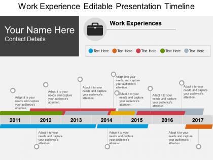
Pay your attention towards our work experience editable presentation timeline layout. Timeline is the best possible way to share company history and introduce it among new clients. In today’s business world “Time is Money” statement comes true as you have to present the information in quick time. Our PowerPoint template enables you to do so, makes it possible for you to present your business in the most desired manner among you audience that they understand your message. The seven year timeline shown from 2011 to 2017 provides an opportunity to the entrepreneurs and business presenters to make a statement about their business. You can share details about key projects that you have accomplished, business achievements and milestones in specific years, profit earned etc with this design. This PPT graphic design is adaptable and you have a complete access to make desired changes with it before presenting it. Download it now to present your business in the most unique way that provides you value when you share it with your audience. Identify factors holding back growth with our Work Experience Editable Presentation Timeline. Cut across barriers that have been created.
People who downloaded this PowerPoint presentation also viewed the following :
Work experience editable presentation timeline with all 5 slides:
Acquire eloquence with our Work Experience Editable Presentation Timeline. Fluent expression will be your forte.
FAQs for Work experience
So basically you want the big stuff - job titles, companies, dates, and what you actually did at each place. Throw in promotions or any times you switched fields completely. If you took breaks for school or travel or whatever, mention those too since they're part of your story. Certifications and major projects are good to include. Keep everything in order by date and focus on things that matter for what you want next. Honestly, skip random jobs unless they're relevant - like that barista stint probably doesn't need to be there unless you're going into hospitality or something.
Dude, colors are your best friend here - they'll help people scan through everything way faster. I like using different shades for each company and throwing in little icons for different job types. Bold those company names too, trust me on that one. You can also make the timeline bars thicker for senior roles vs thinner for contract stuff. Even basic things like consistent spacing make it look so much cleaner. Oh, and subtle background colors work great for grouping related experiences together. The whole point is someone should get your career story at a glance without reading every detail first.
Pick a date format and stick with it - either "Jan 2020 - Mar 2022" or spell it out fully. Don't mix both, looks sloppy. Use "Present" for current jobs instead of actual dates that'll be wrong in two weeks. Bullet points are your friend here, way better than giant blocks of text nobody wants to read. Oh, and don't try hiding employment gaps - just be upfront about them. People take breaks, it happens. One thing that drives me crazy? When dates are all over the place on the page. Keep everything aligned left so it actually looks professional.
Okay so instead of just listing what you did at work, show them actual numbers - like "boosted sales 30%" or "finished project 2 weeks ahead of schedule." Action verbs are your friend here. What really made you different from the other people doing your job? That's what hiring managers want to see. Break everything into bullet points so it's not just a wall of text - nobody has time for that honestly. Oh and here's the thing that really matters: match your wins to what they actually care about. If the job posting screams "we need a leader," don't waste space talking about your Excel skills.
Honestly? Canva's probably your best bet if you want something that looks polished without much effort. Adobe Creative Suite works too but might be overkill. PowerPoint is actually underrated for this stuff - their timeline templates are pretty decent. If you're not trying to get fancy, Google Docs or Excel can make clean timelines that'll do the job fine. I've even seen some nice ones done in Word, believe it or not. Just don't go crazy with colors and fonts - that's where people mess up. Pick whatever you're already comfortable using and keep the formatting consistent. Simple beats cluttered every time.
Oh man, this is such a good question! Different cultures view career moves totally differently. Japanese workers staying at one company for 20+ years? That's respected there, but here in Silicon Valley it'd look weird. Meanwhile, job hopping every two years shows ambition in some places but screams "unreliable" in others. You've also gotta think about their date formats, education systems, and whether family/military gaps are normal. Honestly, I learned this the hard way when I first started reviewing international resumes. Do some quick research on their background before judging their timeline through your own cultural assumptions.
Honestly, the worst thing you can do is leave random gaps without explaining them - employers get suspicious. Don't just copy-paste your job duties either. Like, nobody cares that you were "responsible for customer service." What did you actually accomplish? Focus on real results instead. Keep everything chronological so it's not confusing to follow. Oh, and if you've got employment gaps, just be upfront about them rather than trying to hide the dates (trust me, they'll notice). Skip the super old irrelevant jobs too. Makes you look way more focused when you stick to what matters for the role you want.
Think of each job like a mini-story - what problem did you walk into, how'd you fix it, what happened next? Way better than boring bullet points that hiring managers skip over anyway. Like instead of "managed filing system," try "took over a disaster of a filing mess and got it organized, cut processing time by 30%." Use action words and real numbers when you can. Oh, and connect the dots between jobs so they see you're actually going somewhere with your career, not just job-hopping randomly. Test it out with one role first - you'll be shocked how much better it sounds.
Dude, you gotta customize that timeline for each type of role. Tech jobs? Show off your coding projects and actual numbers. Creative stuff? Talk about teamwork and cool ideas you've brought to life. Honestly, I made this mistake for way too long - just blasting the same resume everywhere like some kind of spam bot. Don't do chronological order either. Put your most relevant experience first, even if it happened three years ago. Match their keywords too. Read a few job posts in your field and you'll start seeing the same phrases pop up. Use those. Cut the fluff that doesn't matter.
Honestly, color psychology matters way more than you'd think for timelines. Blue screams trustworthy and reliable - perfect if you're going corporate. Green works for creative/growth-focused stuff. Navy's solid for looking professional without being boring. I made this mistake once using bright red everywhere and looked way too aggressive lol. Stick to 2-3 colors max or it'll look like a kid's art project. Match whatever vibe your industry has, but don't sacrifice readability for aesthetics. Clean beats fancy every time.
Dude, trust me on this - infographics will save your resume from the trash pile. Progress bars are perfect for showing how you've moved up in your career. Throw in some icons for different jobs and color-code your big wins or promotions. I've seen people use charts to track salary bumps too, which is honestly pretty smart. Your career story needs to be scannable, you know? Hiring managers are drowning in boring bullet points all day. Grab a basic timeline template and just drop in your milestones with some visuals. Way better than another wall of text.
Yeah, definitely go reverse chronological - recruiters always want your latest job first anyway. It shows how you've grown professionally and makes your career path super easy to follow. Don't worry if there's a random gap or two, honestly everyone has those. Most people overthink this stuff way too much! Short sentences work fine, then you can explain your progression in more detail. I wouldn't get creative with the format unless there's something weird about your background that makes the standard way confusing. Just keep it straightforward and you'll be good.
Oh absolutely include that stuff! Volunteer work and internships are actually super valuable - they show you weren't just sitting around doing nothing. Hiring managers eat that up because it proves you take initiative and care about developing skills. I know someone who got hired mainly because her nonprofit work showed leadership abilities that her regular jobs didn't really showcase. Just format them like any other job - dates, where it was, what you did, any cool wins you had. Honestly sometimes that experience is more impressive than paid work anyway.
Honestly, just focus on your biggest wins first. Use spacing to make it breathable - nobody wants to read a wall of text (trust me, I made that mistake once and it was brutal). Bold your best stuff so it jumps out. Group similar things together and keep the same format for job titles, dates, whatever. Short bullets work great for the smaller details. Oh, and don't try to fit everything - you can always cut the less impressive stuff. The whole point is making their eyes go straight to what'll make them want to call you.
So digital timelines are awesome because you can add clickable stuff - job descriptions, portfolio links, even animations if you're feeling creative. Print versions need cleaner layouts though, with good fonts and clear sections. Both should have your basics: titles, companies, dates, achievements. Honestly, printed resumes are having a moment again since they're more memorable in interviews (who knew?). For digital, just make sure it works on phones. Print needs to be super readable - no fancy fonts that look cool but nobody can actually read. I'd start with digital first, then strip it down for printing.
-
Best Representation of topics, really appreciable.
-
Great designs, Easily Editable.