


Timeline continued presentation layouts





Try Before you Buy Download Free Sample Product
 Impress Your
 Audience
 100%
100% Editable
 Save Hours
 of Time


Pick any Timeline Continued Presentation Layouts from the pack. Be sure it will be the one to choose.
People who downloaded this PowerPoint presentation also viewed the following :
Content of this Powerpoint Presentation
Description:
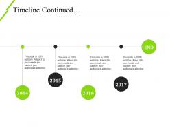
The image presented is a continuation slide of a timeline that appears to illustrate a sequence of events from 2014 to 2017. Each year is marked with a large green circle, with the exception of 2017, which is marked in black and a green circle labeled "END" indicating the culmination of the timeline. A horizontal line connects these circular nodes, suggesting a progression or flow from one year to the next.
The repeated emphasis on the slide's adaptability indicates a flexible presentation template typically used to showcase events, achievements, milestones, strategies, or growth over the indicated years. The fact that each point in time has the exact same placeholder text indicates that these should be replaced with content relevant to the user's context.
Use Cases:
Here are seven industries and their potential uses for such presentation slides:
1. Technology:
Use: Highlighting key product releases or version updates
Presenter: Product Manager
Audience: Internal Team or Stakeholders
2. Finance:
Use: Outlining annual fiscal achievements or growth statistics
Presenter: Financial Analyst or CFO
Audience: Investors or Board Members
3. Education:
Use: Showing institutional milestones or development plans
Presenter: Dean or Academic Director
Audience: Faculty or Educational Stakeholders
4. Healthcare:
Use: Timeline of medical research milestones or facility expansion
Presenter: Research Lead or Hospital Administrator
Audience: Medical Staff or Donors
5. Real Estate:
Use: Demonstrating market growth or significant property developments
Presenter: Real Estate Developer
Audience: Investors or Future Homeowners
6. Retail:
Use: Displaying new store openings or brand launch timelines
Presenter: Marketing Director
Audience: Franchisees or Marketing Team
7. Non-Profit:
Use: Illustrating progress of initiatives or impact over the years
Presenter: Program Coordinator
Audience: Donors or Non-Profit Members
Timeline continued presentation layouts with all 5 slides:
Docket it on our Timeline Continued Presentation Layouts. Explain all the key ingredients.

FAQs for Timeline
Okay so for timelines - pick your most important dates and milestones, don't dump everything in there. I learned this the hard way when I made one that looked like a history textbook exploded. Go chronological unless grouping by theme makes more sense for your specific content. Keep your colors and spacing consistent so people can actually follow along. Oh and here's something most people forget - add quick context for each point. Like don't just say "Project completed March 2023" but explain why that mattered. Makes a huge difference. Your audience needs to understand the "so what" not just the "when."
Dude, timeline presentations are game-changers. You know how people's eyes glaze over during regular presentations? This fixes that. Your audience can actually follow the story instead of getting lost in random bullet points. Show them how your product evolved or what led to current problems - suddenly everything clicks. The cause-and-effect stuff becomes obvious when it's visual. I started doing this for project updates and honestly, people ask way better questions now. They stay engaged too, which is half the battle. Try it next time you're presenting strategy or whatever - you'll see what I mean.
Horizontal timeline bars and Gantt charts are your best bet for presentations. PowerPoint works but honestly the templates look pretty dated - I'd check out Lucidchart or Canva instead. Way cleaner designs. If your timeline's complicated, try a combo approach. Start with a high-level roadmap view, then break down into detailed Gantt charts for each phase. Interactive ones are solid for virtual meetings too. Really though, just pick whatever makes your key milestones stand out and tells the story clearly. That's what matters most.
So it really depends on what field you're in. Tech companies are all about those product roadmaps with sprints and feature drops. Healthcare does treatment plans and clinical trial phases. Construction teams? They live and breathe Gantt charts - seriously, show them a timeline without bars and they get confused. Legal folks build case chronologies to map out what happened when. Marketing creates campaign schedules with launch dates. Oh, and finance uses them for budget cycles too. Just match your timeline style to whatever your audience expects to see.
Dude, color psychology is everything for timelines! You'll want warm colors like reds and oranges for urgent stuff and big milestones. Cool blues and greens work better for showing steady progress. I see people just slap random colors everywhere - like, why? Pick a color family for each phase and stick with it. Save your brightest, boldest colors for the deadlines or wins you really need people to notice. Oh, and don't make everything look like a rainbow exploded on your presentation. Trust me on this one.
Dude, interactive timelines are game-changers. Instead of your audience just sitting there zoning out, they're actually clicking around and exploring stuff. You can add hotspots they hover over for details, or let them jump between different time periods. People genuinely love clicking things - I swear it's like a weird human compulsion. The best part? They control how fast they move through your content. Way better than static slides where everyone's stuck at your pace. Try adding some expandable sections or clickable elements. Trust me, engagement goes through the roof when people can actually interact with your timeline instead of just staring at it.
Dude, don't cram everything onto one slide - people literally can't read tiny text from the back of the room. Pick one date format and stick with it! Mixing "March 2023" with "Q2 2023" just confuses everyone. Make your biggest wins pop with bold colors or bigger fonts instead of treating every milestone the same. I learned this the hard way during my first big presentation lol. Keep it to maybe 4-5 key points per slide, and definitely run it by someone first. Trust me on that last part.
Honestly, remote timelines are tricky because people can't see the details like they normally would. I'd make yours super interactive - use those annotation tools to highlight dates as you talk. Don't show everything at once though, break it up into chunks. Zoom in on specific sections when you're screen sharing because squinting at tiny text sucks. Get people involved by asking them to guess what happens next or drop their own experiences in chat. Oh, and definitely send a high-res version afterward - they'll want to reference it later when they're actually trying to remember stuff.
Honestly, group similar stuff together first and use colors or icons to separate different data types. Don't try cramming everything on one timeline - I've made that mistake and it looks awful. Multiple layers work way better, or let people click to see more detail. Your main timeline should just show the big milestones. Then add side charts for all the complicated metrics. Oh, and definitely test it on someone who doesn't know the data. If they look confused after 10 seconds, you need to simplify more.
Honestly, accessibility totally changes how you design timelines. Alt text for everything visual is a must. Color contrast matters way more than you'd think. Everything needs to work with keyboards and screen readers too - that super minimal visual-only style? It leaves people out. I'd add clear headings and make sure the tab order actually makes sense. Oh, and describe how timeline elements relate to each other spatially since screen readers can't see that. Testing with real users who use assistive tech will catch stuff you'd never notice.
Honestly, just start with whatever you already know - PowerPoint or Google Slides both have timeline templates that work fine. Canva's where I'd go if you want something that actually looks good though, their designs are way better. Timeline JS is free and interactive which is cool, but fair warning it's kind of annoying to learn. Oh and if your team uses Lucidchart already, that works too. I'd probably skip the fancy stuff unless you really need it - most people overthink this and waste time on tools when the content matters more anyway.
Honestly, the trick is making old stuff feel relevant to whatever people are dealing with right now. I'm always doing those "remember when X happened? It's basically like Y today" comparisons because suddenly everything clicks. Work backwards from what your audience actually cares about, then show how we got here through all these historical decisions. Cause-and-effect is huge - people need to see how past choices literally created their current world. Oh, and ditch those messy timeline designs for something clean. Nobody wants to squint at cluttered charts when you're trying to make connections between then and now.
So linear timelines are your go-to when you need that clear A-to-B-to-C flow. Perfect for project milestones or historical stuff where order actually matters. Your audience won't get lost. Nonlinear ones? Way more interesting visually - they're like webs showing how different events connect across time periods. Though honestly, I've seen people get totally confused by them if they're not done well. I'd say go linear if you're telling a straightforward story. But if you've got complex relationships to show and your audience can handle it, nonlinear's where it's at.
Yeah, this stuff actually matters way more than people think. Western audiences expect timelines to go left-to-right since that's how we read, but other cultures might process it totally differently - right-to-left or even top-to-bottom. Pacing is huge too. Some cultures want you to slow down and give context for everything, while others just want the main points fast. I've watched presentations crash because someone skipped the background info that half the room really needed. Oh, and different cultures view time itself differently - some are all about deadlines and linear thinking, others see it as more circular. Just... know who you're presenting to and adjust accordingly.
Honestly, just watch your audience - are they asking questions or looking like they'd rather be anywhere else? The glazed-over look is pretty much a dead giveaway. After your presentation, test if people actually remember the key dates or can explain how events connected. I always just ask straight up: "Did that timeline make sense?" Simple feedback beats overthinking it. Oh, and see if they bring up your timeline later in conversations - that's when you know it actually stuck. Quick participation checks work too, but nothing beats reading the room in real time.
-
Perfect template with attractive color combination.
-
Informative design.