


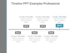
Timeline ppt examples professional






Try Before you Buy Download Free Sample Product
 Impress Your
 Audience
 100%
100% Editable
 Save Hours
 of Time


Our Timeline Ppt Examples Professional enable customer focused functioning. They allow you to act according to their demands.
People who downloaded this PowerPoint presentation also viewed the following :
Timeline ppt examples professional with all 5 slides:
Brief applicants for the job with our Timeline Ppt Examples Professional. Inform them of the criteria to be fulfilled.
FAQs for Timeline
Honestly, the visual hierarchy thing is huge - you need clear spacing between timeline points or it'll look messy. Make sure you can customize colors and fonts to match your brand. Icons are a game changer too, way better than boring text boxes. Here's what I learned the hard way: test it with your actual content first. Some templates look amazing with short bullet points but completely break when you add longer descriptions. Oh, and check that it handles different date ranges well - nothing worse than everything looking cramped together.
Dude, timeline slides are honestly game-changers for presentations. People can actually follow your story instead of getting lost in random facts. It's like - oh wait, you probably already know this but - showing how everything connects makes such a difference. Your audience literally sees the progression happen. Way less overwhelming too. I always go with simple horizontal timelines now for project updates. Makes keeping everyone aligned so much easier, and you'll definitely notice people paying more attention. Seriously wish I'd started using them sooner.
Honestly, project management and consulting firms get the biggest bang for their buck with timeline presentations - they're always juggling deadlines and milestones. Marketing teams are obsessed with them too, especially for product launches. Healthcare uses them for treatment schedules, manufacturing for production timelines. Pretty much any industry where timing matters, which is... most of them, actually. The visual aspect beats wall-of-text lists every time. Don't overthink it though - grab a basic template and tweak it for your field instead of starting from zero. Way faster and you'll still look professional.
Honestly, color choice can totally make or break your timeline. Too many clashing colors? People won't be able to follow anything. I'd stick with 2-3 colors tops - maybe one for backgrounds, one for text, and an accent color for the important stuff. Dark text on light backgrounds is usually your safest bet, though you can flip it if you're going for something more dramatic. Just keep it consistent throughout so people aren't getting confused trying to track everything. Oh, and definitely test how it looks on different screens first - learned that one the hard way!
Dude, biggest thing is don't cram a novel into each timeline point - keep descriptions super short. Stick with the same fonts and colors throughout or it'll look messy as hell. Skip the fancy animations too, they're honestly just annoying. Your timeline should flow logically (left-to-right or top-to-bottom). Double-check all your dates! Oh, and here's something I learned the hard way - test it on a projector first. Colors look totally different on the big screen and you might need bigger text than you think.
For timelines, try entrance effects that bring in each point as you talk about it. Fade-ins or fly-ins from the left work great. You don't want people reading ahead while you're still explaining the first part, you know? I'd skip the bouncy stuff though - super distracting. Keep your timing consistent, like 0.5-1 second between reveals. Oh and definitely test everything beforehand! I learned that the hard way when my animations completely broke during a presentation last month.
Timelines are perfect for anything chronological - project phases, product launches, company milestones, that kind of stuff. I use them constantly for feature rollouts because they show progression really well. Don't use them for static comparisons though. Like if you're just comparing different products without a time element, charts work way better. Start by listing your events in order first. Then pick a template that matches how much data you've got - some get pretty cluttered if you cram too much in. They're also solid for cause-and-effect stuff over time, which is honestly why I love them for showing how things evolved.
Swap out those generic milestones for your actual stuff - kickoff dates, deliverables, reviews, launch. Most templates are pretty flexible once you mess around with them. I'd replace the placeholder text with real deadlines and throw in your team's colors or whatever branding you use. Adjust the timeframe to match how long your project actually runs. Make sure the critical path jumps out - bold those dependencies and bottlenecks or use different colors. Oh, and definitely pad your final timeline with a week or two before showing stakeholders. Trust me on that one.
Honestly, visuals are a lifesaver for timeline slides. Nobody wants to read through a bunch of dates and text blocks - your audience will zone out immediately. Icons work great for marking different milestones or categories, and photos add that emotional hook that makes people actually care about each time period. The key is keeping everything consistent style-wise. I learned this the hard way after using random stock photos that looked terrible together. Short bursts of info work better than long explanations. Just don't overdo it with cheesy clip art that screams 2005, you know? Make sure each visual actually tells part of your story.
Honestly, the trick is making your timeline feel like a conversation, not a history lecture. Ask questions as you go and tie stuff to what's happening now. Tell little stories about the actual people instead of just rattling off dates - way more engaging. I bombed so hard once with this endless 30-slide timeline that half my audience was literally nodding off. Pretty embarrassing! Use clean visuals and don't jam everything onto one slide. Pause after big moments so people can actually process it. Oh, and try having them guess what comes next before you reveal it. Turns them into participants instead of just sitting there zoning out.
So horizontal ones go left-to-right, which feels pretty natural since that's how we read anyway. They're solid for showing lots of events. Vertical timelines stack everything top-to-bottom - honestly looks cleaner and way better on phones. Here's the thing though: horizontal gets messy fast if you've got detailed descriptions cramming everything together. Vertical gives you actual breathing room for text under each point. For PowerPoint, I'd probably do horizontal for quick overviews and vertical when you need more detail. Maybe sketch both first? That usually helps me figure out what works better with whatever content I'm dealing with.
Less text, more visuals - that's the key. I'd stick to 2-3 bullet points per timeline point, then let your icons and images carry the story. Consistent colors and fonts make a huge difference too. Always put text in the same spot (either above or below the timeline) - mixing it up looks sloppy. Make sure there's enough contrast so people can actually read your text. Oh, and here's something I learned the hard way: walk to the back of the room before you present. You'll be shocked how tiny some text looks from there.
Ditch the boring horizontal line! I love doing timelines as winding rivers with events as stops - way more visual. Vertical ones are cool too, like climbing a mountain through different eras. Oh, and newspaper headlines for each event? *Chef's kiss* - makes everything feel more real. You could try subway map style where different "lines" show parallel stuff happening. Animated clocks work if you're feeling fancy. But honestly, don't just pick something because it looks pretty - match it to whatever story you're telling. A medical timeline probably shouldn't look like a carnival ride, you know?
Hyperlinks are your best friend here - use them to jump between different timeline sections. Action buttons work really well too, they can reveal extra details when people click them. I'd start with basic hyperlinks between slides since that's pretty straightforward. Then maybe add some hover effects or animation triggers so viewers can control what they see next. Oh, and you can embed videos right into timeline points which looks pretty cool. The "Insert > Action" feature is where most of this stuff lives. Interactive charts that update when clicked are nice if you're feeling ambitious, but honestly the simple hyperlink approach works great for most people.
Oh there's a bunch of good options! I'd probably start with Canva - it's free and has really nice timeline templates you can customize easily. Lucidchart is solid if you want something that looks more professional. Google Slides works too, especially if you're already using their stuff. Actually, I've been using Aeon Timeline a lot lately and it's pretty amazing for complex projects since it's built specifically for timelines. For simpler things, even Google Drawings or Figma can do the job. Honestly depends what you're making it for, but Canva's probably your best bet to start.
-
Best way of representation of the topic.
-
Wonderful templates design to use in business meetings.