


 0 Comment
 Customer Reviews

The dashboard's open. Has been since Tuesday.
Not because the data's missing—it's all there. Every metric, every trend line, every anomaly from the last quarter. But somewhere between the spreadsheet and the boardroom, someone has to make sense of it. Has to turn numbers into a point of view. Has to show—not just tell—what's actually happening.
That's where things get uncomfortable.
Visual analysis sounds clean in theory. Pull the data, pick the right chart, done. But anyone who's had to present a business intelligence dashboard to a skeptical CFO knows the real problem isn't the data. It's the translation. Deciding which patterns matter. Choosing between a bar chart and a heat map. Figuring out if the story the numbers tell is actually the story the audience will see.
And then someone asks you to also make it look good.
The stakes compound quietly. A confusing chart doesn't just lose the room—it makes the underlying analysis look shaky too. One poorly chosen graph, and the conclusions you spent a week building feel uncertain. Visual data analysis isn't just about what you know. It's about how well you can show what you know.
That's why templates exist. Not because the analysis is too hard—it usually isn't. But because structuring the visual layer from scratch, every time, for every audience, is a separate skill entirely. One most analysts didn't sign up to develop.
SlideTeam's visual analysis templates handle exactly that gap—pre-designed frameworks that give your data a structure before you've had to fight with formatting. Content-ready slides built for the specific discomfort of turning complex information into something a room full of people can read in thirty seconds.
Here are the templates worth knowing about.
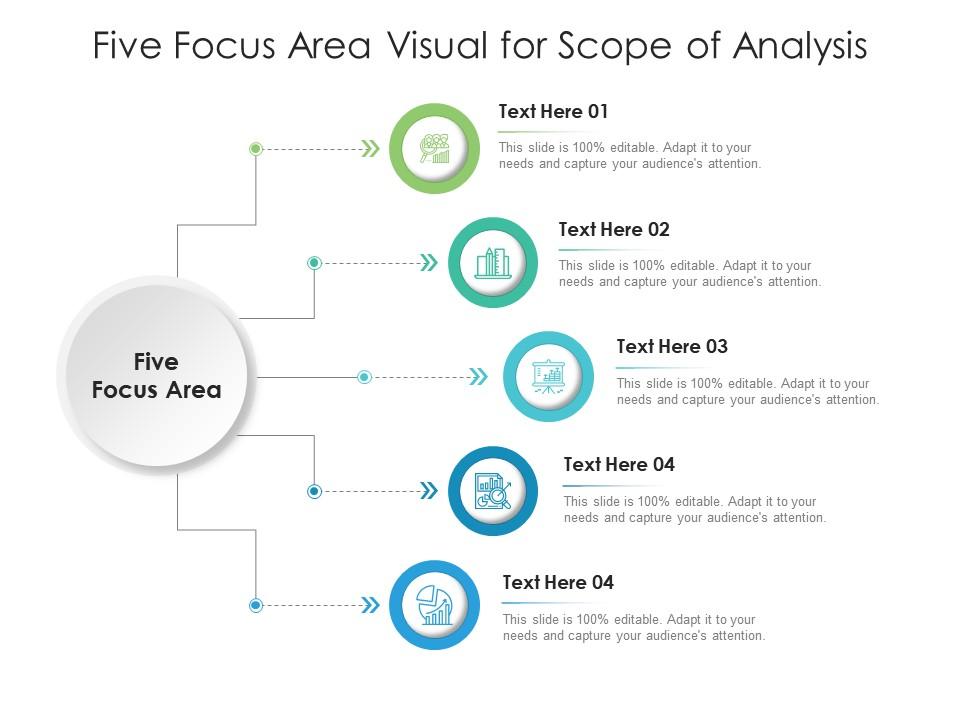
Template 1: Five Focus Area Visual for Scope of Analysis Infographic Template
Scoping an analysis gets messy fast when there are too many moving parts and no clear frame. This PPT template is built for analysts and consultants who need to present five distinct focus areas in a single, coherent visual. It works well for structured reviews where each area needs equal weight on the slide. The layout keeps the audience oriented without requiring a lengthy verbal explanation. The template is 100% editable and customizable.
Download this PowerPoint Template
Template 2: Visual Data Analysis PPT Presentation
Good visual data analysis needs a deck that doesn't fight the data for attention. This PPT is built for analysts and team leads who present findings across boardroom meetings and client reviews. It handles the structure so the data interpretation methods stay front and center. Whether the use case is an executive briefing or a cross-functional review, this slide does the heavy lifting. The template is 100% editable and customizable.
[product_image id=1411794]
Template 3: Market Gap Analysis PPT Slides Visual Aids
Spotting a market gap is one thing; making the case for it to a leadership team is another. This PPT template is designed for business and marketing professionals who need to walk stakeholders through a structured gap analysis. It works across strategy reviews and management presentations where the two-stage process—current state versus target state—needs to be visually clear. For context, it fits naturally into any business planning or exploratory data analysis workflow. The template is 100% editable and customizable.

Download this PowerPoint Template
Template 4: Comparison Chart Types for Visual Analysis
Choosing the wrong chart type is one of the quieter ways a presentation loses credibility. This PPT preset is built for analysts who need to compare chart and graph analysis options clearly for a non-technical audience. It lays out comparison chart types side by side so decision-makers can follow the logic without a statistics background. Useful in training sessions, tool-selection reviews, or any meeting where data visualization choices need to be justified. The template is 100% editable and customizable.
[product_image id=1658945]
Template 5: Visual Mining Dashboard Analysis PPT Example
Incident data is only useful when someone can see the pattern in it quickly. This PPT template is designed for operations and risk teams presenting mining or safety dashboard data to leadership. It covers three core views: incident cost ranges, incident-versus-cost comparisons, and total incident costs. The layout supports real-time data monitoring conversations without requiring the audience to do their own math. The template is 100% editable and customizable.

Download this PowerPoint Template
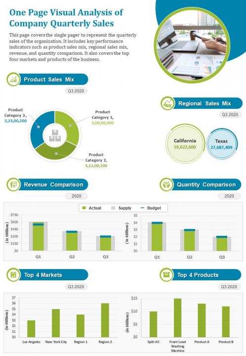
Template 6: One Page Visual Analysis of Company Quarterly Sales Presentation Report PPT PDF Document
Quarterly sales reviews are only as good as the clarity of the one page that carries the numbers. This PPT slide is built for sales and finance teams that need to present product-wise performance, regional breakdowns, and revenue comparisons in a single view. It covers top market highlights and high-yield product callouts without requiring multiple slides. Comparative analysis across revenue and volume fits cleanly into the layout. The template is 100% editable and customizable.
Download this PowerPoint Template
Template 7: One Page Visual Analysis of Projects Undertaken by Organization Report PPT PDF Document
Keeping stakeholders aligned on multiple active projects requires more than a status update—it needs a single, clear visual that tells the whole story at once. This one-pager drives instant clarity by mapping project scope, regional outcomes, and comparative performance metrics onto one structured slide. The layout empowers you to highlight your top four markets while showcasing revenue-driving initiatives with precision. Use these ready-made frameworks to present organisational project portfolios with the confidence that every data point lands. Explore more visual analysis PPT templates with samples and examples to find the right fit for your reporting needs. Transform your project reporting today. Download this dynamic one-pager now and deliver portfolio clarity with every presentation.

Download this PowerPoint Template
Template 8: Visual Metrics for Gap Analysis Model and Method
Gap analysis is most useful when the visual makes the problem undeniable before the meeting ends. This PPT template is designed for operations and process improvement teams who need to show action plan results, total problems identified, and solution comparisons in one dashboard view. It works well in manufacturing and value-stream reviews where loopholes need to be traced and tracked visually. So yeah, the layout does the diagnostic work before a single word is spoken. The template is 100% editable and customizable.

Download this PowerPoint Template
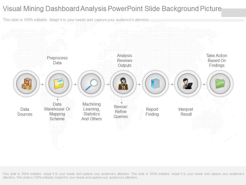
Template 9: Visual Mining Dashboard Analysis PowerPoint Slide Background Picture
Seven-stage data pipelines are genuinely hard to communicate without a strong visual anchor. This slide captures the full mining dashboard workflow—from data sourcing and warehousing through machine learning and statistics, all the way to interpreting and reporting results. The structured layout delivers instant visual clarity for technical teams presenting to non-technical leadership. Each stage connects logically, so audiences follow the process without needing a separate explainer. Transform your data pipeline presentations today. Download this dynamic template now and unlock analytical credibility at every stage.
Download this PowerPoint Template
Template 10: Competitor Analysis PPT Visual Aids Infographics
Competitor analysis only lands well when the audience can see the comparison without squinting at a table. This PPT preset is built for marketing and business development teams presenting sales development trends, performance indicators, and industry benchmarks side by side. The four-stage structure keeps the narrative tight across the slide. It suits quarterly reviews and pitch preparation where pattern recognition across competitors is the core task. The template is 100% editable and customizable.

Download this PowerPoint Template
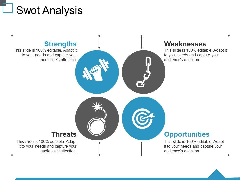
Template 11: SWOT Analysis PPT Visual Aids Layouts
SWOT analysis works best when the four quadrants are visually balanced and immediately readable. This layout delivers a clean, four-stage structure covering Strengths, Weaknesses, Opportunities, and Threats with professional visual consistency. The polished aesthetic builds instant credibility during strategic planning sessions and investor briefings. An extensive design framework empowers you to present complex organisational insights with precision and clarity. Transform your strategic analysis presentations today. Download this dynamic template now and unlock sharper decision-making for every audience.
Download this PowerPoint Template
Template 12: Statistical Analysis PPT Visual Aids Infographic Template
Statistical data visualization gets complicated the moment control bounds and cost thresholds enter the picture. This PPT slide is built for quality control and operations teams that need to present a six-stage statistical process clearly—covering control states, lower and upper bounds, and cost tier comparisons. It suits process review meetings and compliance reporting where the audience needs to see variance patterns at a glance. For context, it also works well in training sessions on statistical process control. The template is 100% editable and customizable.

Download this PowerPoint Template
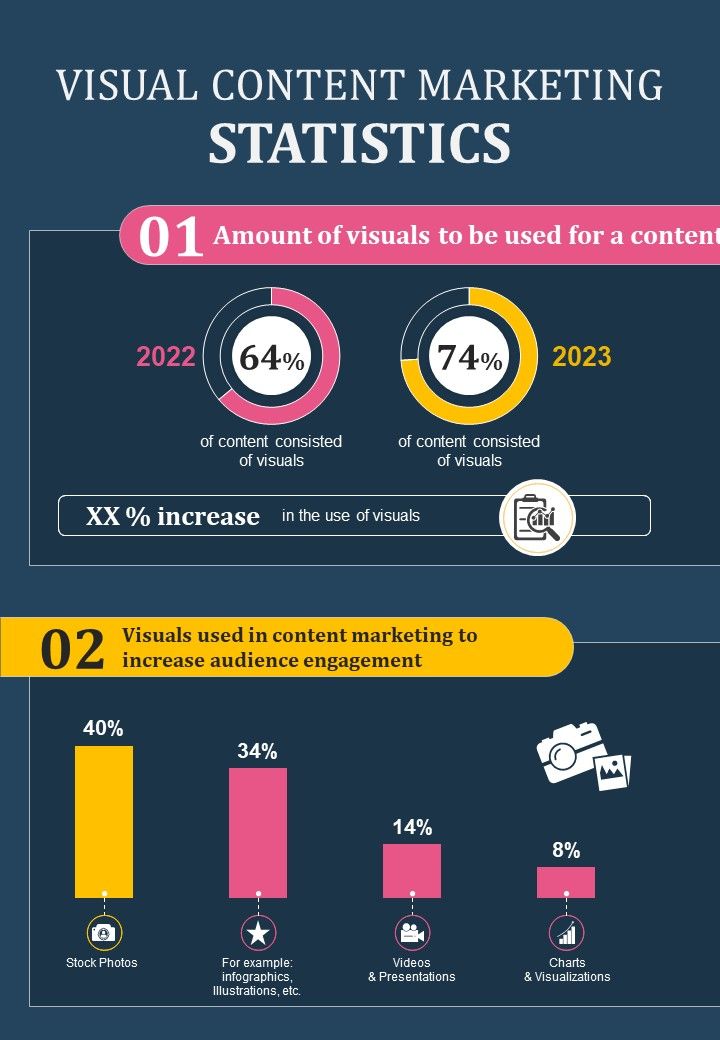
Template 13: Data Analysis of Visual Content Marketing
Visual content analysis requires a format that makes complex information land without a verbal guide. This infographic design template empowers communicators and marketing teams to present data, research findings, and process flows as clear, visually striking narratives. The diverse collection of layouts supports sales figure presentations, process explainers, and research showcases with equal effectiveness. Each design translates raw content into a visual story that captures attention and drives comprehension immediately. Transform your content marketing presentations today. Download this dynamic template now and unlock the power of infographic storytelling.
Download this PowerPoint Template
Template 14: Four Step Visual Problem Analysis Infographic PowerPoint Template
Breaking a problem into four visible steps is one of the fastest ways to make analysis feel structured rather than overwhelming. This infographic PowerPoint template delivers a four-step visual problem analysis framework built for analysts, consultants, and team leads who present diagnostic findings to mixed audiences. The design balance between simplicity and innovation ensures the framework reads clearly even in large rooms. Each step connects visually, so the audience follows the logic without needing a written brief. Transform your problem-solving presentations today. Download this dynamic template now and unlock a sharper way to present analytical thinking.
[product_image id=1506011]
Template 15: SWOT Analysis PPT PowerPoint Presentation Visual Aids Summary
A four-quadrant SWOT slide needs to hold attention through Strengths, Weaknesses, Opportunities, and Threats without losing the thread between them. This fully editable layout delivers a visually structured strategic analysis framework that builds immediate clarity for leadership teams and stakeholders. Strong design consistency across all four stages maximises the impact of your strategic narrative. The professional polish ensures your analysis lands with confidence, whether in a boardroom or a client pitch. Transform your strategic planning presentations today. Download this dynamic template now and unlock a compelling visual language for every SWOT discussion.

Download this PowerPoint Template
Elevate Every Insight with SlideTeam
SlideTeam's PowerPoint templates are the best in the industry for visual analysis presentations. These content-ready slides save hours of design work while delivering top-notch clarity for complex data interpretation. Use these PowerPoint slides to turn raw numbers into compelling visual narratives your audience can act on. Deploy these ready-made frameworks to present with confidence and drive smarter decisions every time.
FAQs on Visual Analysis
How does color contrast influence the viewer's ability to extract meaningful patterns from a data visualization?
High contrast between foreground and background helps viewers separate signal from noise quickly. Low contrast forces the brain to work harder, which delays pattern recognition. Use distinct hues for different data categories and reserve high-saturation colors for the most important values. A simple rule: if the chart still makes sense when printed in grayscale, the contrast is working.
What are the key differences between exploratory and explanatory visual analysis, and when should each approach be used?
Exploratory analysis is for the analyst—you're looking for patterns you don't yet know exist. Explanatory analysis is for the audience—you already know the finding and are building a case for it. Use exploratory when the data is new or the question is open. Use explanatory when you're presenting conclusions to decision-makers who need a clear, directed argument.
Which chart types are most effective for revealing outliers in large datasets, and why?
Box plots are the most reliable for showing outliers clearly—they display median, spread, and outliers in one view. Scatter plots work well when you need to show outliers in relation to two variables at once. Bar charts tend to hide outliers inside averages. For large datasets, a strip plot or dot plot gives individual data points direct visibility without aggregation.
How does pre-attentive processing affect the way audiences interpret visual information before conscious analysis begins?
Pre-attentive processing happens in under 250 milliseconds—before the viewer consciously reads anything. Color, size, shape, and position are the four attributes the brain picks up at this stage. This means your most important data point should differ from the rest in at least one of these attributes. If everything looks the same, nothing gets noticed first.
What role does white space play in directing attention during visual analysis of complex infographics?
White space reduces cognitive load by giving the eye a place to rest between elements. In a dense infographic, it separates sections and prevents the viewer from reading the wrong items together. Grouping related elements with shared white space signals belonging—a gestalt principle that works without labels. Remove white space, and viewers spend more time orienting than analyzing.
How can gestalt principles be applied to improve the clarity of presentation slides containing multiple data visuals?
Gestalt principles give designers a practical toolkit for visual clarity. Proximity groups related charts so viewers read them as a unit. Similarity uses consistent colors or shapes to signal that data belongs to the same category. Closure helps viewers complete incomplete shapes—useful for simplified icons. Apply these three and most multi-chart slides become significantly easier to read without adding any text.
What are the most common cognitive biases that distort visual analysis, and how can designers mitigate them?
The three most common biases are anchoring, pattern projection, and confirmation bias. Anchoring happens when the first number on a chart sets the reference for all others—watch your axis scales. Pattern projection causes viewers to see trends in random data, especially in small samples. Confirmation bias leads presenters to design charts that emphasize the data that supports their existing view. Label axes clearly, use consistent scales, and show the full dataset where possible.
How does the choice between static and interactive visualizations impact the depth of analysis a viewer can perform?
Static visualizations work best when the conclusion is clear and the audience needs a single, directed takeaway. Interactive dashboards let viewers filter, drill down, and explore the data themselves—useful when different stakeholders need different cuts of the same data. The trade-off is control: static keeps the narrative tight, interactive gives the viewer agency. Choose based on whether you want to guide the interpretation or enable it.