


Timeline ppt model file formats





Try Before you Buy Download Free Sample Product
 Impress Your
 Audience
 100%
100% Editable
 Save Hours
 of Time


Bestow honor on brave individuals with our Timeline Ppt Model File Formats. Extol heroic deeds.
People who downloaded this PowerPoint presentation also viewed the following :
Content of this Powerpoint Presentation
Description:
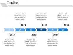
The image presents a simple and clean template for a timeline commonly used in presentations. Spanning from 2013 to 2018, the timeline features markers for each year, indicating points in time where events or milestones can be showcased. Above each year marker, there's ample space provided for text details, currently holding placeholder text stating, "This slide is 100% editable. Adapt it to your needs and capture your audience's attention." This message is repeated above the year markers for 2013, 2014, 2015, 2016, 2017, and 2018, highlighting the template's customizable nature for various presentation requirements.
Use Cases:
This versatile timeline slide can find application across various industries:
1. Technology:
Use: Roadmap for product development.
Presenter: Product Manager.
Audience: Investors and stakeholders.
2. Education:
Use: Overview of curriculum changes over years.
Presenter: Academic Coordinator.
Audience: Faculty and educational board members.
3. Healthcare:
Use: Milestones in medical research and development.
Presenter: Lead Researcher.
Audience: Grant providers and medical professionals.
4. Manufacturing:
Use: Stages of production enhancements.
Presenter: Operations Manager.
Audience: Company executives and process engineers.
5. Marketing:
Use: Launch of various marketing campaigns.
Presenter: Marketing Director.
Audience: Marketing team and external agency partners.
6. Construction:
Use: Progression of a major construction project.
Presenter: Project Manager.
Audience: Clients and investors.
7. Non-Profit:
Use: Historic events and achievements of the organization.
Presenter: Director of the Non-Profit.
Audience: Donors and supporters.
Timeline ppt model file formats with all 5 slides:
Our Timeline Ppt Model File Formats automatically attract brilliance. You will begin to bond with the best.
FAQs for Timeline ppt
Start with a clear horizontal or vertical axis and space your milestones evenly. Make text big enough so people in the back can actually read it - nobody's engaged when they're squinting. Use different colors or shapes to group related events together. Brief descriptions work better than walls of text, and only include dates that actually move your story forward. Icons or progress bars help break things up visually (saves you from boring your audience to death). Oh, and sketch it on paper first! You'll thank me later when you're not wrestling with formatting issues for hours.
Honestly, timeline templates are game-changers for presentations. Your audience gets a clear roadmap instead of jumping around randomly between points. People already think chronologically anyway - like when you're explaining what happened over the weekend, right? The visual flow makes cause-and-effect relationships super obvious. Way better than boring bullet points that nobody remembers five minutes later. Plus you can actually see how everything builds on itself step by step. Next time you're doing a project update or whatever, just swap out those regular slides for a timeline. Trust me on this one.
Keep it chronological and don't cram everything together like I always do - that's where most people mess up. Pick one visual style and stick with it. Use minimal text, just dates and short descriptions. Color coding can help but don't go crazy with it. White space actually makes things easier to read, not harder. Make sure it flows logically, whether that's left-to-right or top-to-bottom. Here's the test: step back and see if someone could scan it quickly and get the sequence. If they can't, you've probably got too much going on and need to cut stuff out.
Hey! So color schemes are honestly super important for timelines - they can totally make or break the whole thing. I'd stick to maybe 3-4 colors tops. Use the same colors for related stuff and then switch it up for the big moments you want to highlight. Trust me, I've sat through presentations where everything was like neon rainbow chaos and nobody could follow along lol. Also random tip - dark backgrounds look cool but they're usually harder to read. Before you finalize anything, just walk to the back of the room and see if you can actually read it from there.
Timelines are perfect when chronology actually matters - like project milestones, product launches, or company history stuff. Use them when the "when" is just as important as the "what." They're solid for showing how one thing led to another over time. But here's the thing - I've watched so many people jam timelines into presentations where they don't belong just because they look slick. Don't do that. If you're bouncing around dates or time isn't really the point, pick something else that'll actually help tell your story better.
So for interactive timeline stuff, I'd start with basic hyperlinks between slides - super easy to set up. Animation triggers are clutch though, like click-to-reveal events that pop up as you go. Keeps people actually paying attention instead of zoning out. You can also do hover effects and little pop-up boxes for extra details without making your timeline look messy. Oh, and clickable navigation buttons are solid for jumping between different time periods. Honestly just pick one method first and get comfortable with it before adding more fancy animations and stuff.
Yeah, totally! First thing - match your colors to your industry or brand. Tech companies love blues, healthcare goes green, that sort of thing. Then ditch those boring generic milestones for stuff that actually matters in your field - like regulatory approvals for pharma or product launches for startups. Icons are honestly my favorite part to mess with. Instead of basic dots, throw in gears for manufacturing or little chart symbols for consulting work. Oh, and don't forget to adjust the timeline length to fit how long your projects actually run. Just pick a template that's flexible enough to really customize properly.
Just use PowerPoint tbh - the SmartArt timeline templates are solid and you can tweak them however you want. Canva's prettier if you're going for that polished look without doing much work. Google Slides is fine too but kinda limited on timeline stuff. I swear people overthink this and dive into fancy timeline software when PowerPoint handles it perfectly fine. Pick templates based on how much info you're cramming in - some timelines are just major milestones, others need tons of detail. Start with PowerPoint's timeline SmartArt first. If it works, you're done.
Dude, make it interactive! Ask questions, pause for reactions when you hit the big moments. Visual stuff works great too - zoom in on specific dates with crazy details instead of just rattling off everything in order. I swear, breaking longer timelines into chunks makes such a difference. Let people guess what happens next before you reveal it. Think of it like a story with highs and lows, not some boring list. You want those "wait, what??" moments where everyone's actually leaning in. Oh, and definitely highlight the dramatic turning points - that's where you'll hook them.
Ugh, the worst thing you can do is cram a novel onto each timeline point. People just won't read it. Make those dates big enough to actually see - I've sat through way too many presentations where I'm squinting like crazy. Spacing is huge too. When everything's jumbled together it looks amateur. Colors? Keep it simple. Two, maybe three max. Those rainbow disasters are painful to look at. Oh, and definitely do the "back of the room" test before you present. Trust me on this one - what looks fine on your laptop screen might be tiny for everyone else.
Timelines are honestly a game-changer for mapping out project milestones. Just drop your key deliverables and deadlines on a visual line and boom - everything clicks. Stakeholders can instantly see what's next and how phases connect. Color-coding different teams or workstreams is clutch too. Build in buffer time between major milestones (trust me on this one). Mark any critical dependencies where one delay could mess up everything downstream. I always start with the must-haves first, then add nice-to-haves later so it doesn't look like a hot mess.
Dude, animated timelines are a game changer. Instead of throwing everything at people at once, you control the pace and reveal stuff step by step. Keeps them hooked instead of mentally checking out. The movement draws eyes to what matters at each point too. I've sat through so many boring static timeline slides where everyone just zones out completely - honestly the worst. Animation builds suspense where you need it. Start simple with fade-ins or slide transitions. Even basic movement beats a giant wall of text every single time.
Ugh, most timelines are so boring - just walls of text that nobody wants to read! Color coding works great for grouping related stuff together. Try making your icons different sizes based on importance, and throw in some progress bars or milestone markers. Charts are clutch when you've got actual numbers to show. Oh, and spacing matters more than people think - it should actually reflect your time intervals. Maybe add little data callouts at the big moments? Start simple with one trick and see how it goes. The whole point is making it easy to scan quickly.
Honestly, just go with something clean like Arial or Calibri - fancy fonts are the worst for timelines since people need to read them fast. Make your main dates/events around 18-24pt and bump the details down to 14-16pt. Bold the key stuff so it stands out. I always mess this up but try not to use more than two different font weights or it looks crazy chaotic. Oh and definitely do a readability test from across the room before you present - learned that one the hard way when half my audience was squinting at my slides last month.
Oh man, learned this one the hard way! Make your text way bigger for virtual stuff - people are squinting at laptops, not giant monitors. High contrast colors are your friend. I once did this Zoom presentation where literally nobody could read my timeline because I crammed everything onto one slide like an idiot. Now I split complex timelines across multiple slides or use animations to show pieces bit by bit. For hybrid meetings, definitely test on both big screens AND laptops first. Pro tip: drop a PDF in the chat so remote folks aren't completely lost trying to follow along.
-
Excellent work done on template design and graphics.
-
Visually stunning presentation, love the content.