

Timeline ppt visual aids infographics





Try Before you Buy Download Free Sample Product
 Impress Your
 Audience
 100%
100% Editable
 Save Hours
 of Time


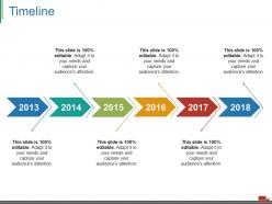
Reveal the significance of creating business timelines with our timeline PPT visual aids infographics PowerPoint slide. Display the concept of making time line diagram for business targets achievement with this exclusive timeline Presentation graphic. We have used graphic of a six staged arrow process to display timeline as this timeline PPT diagram contains the concept of past, present and future. To organize and complete your projects in a timely, quality and financially responsible manner, you need to schedule projects carefully. Effective project scheduling plays a crucial role in ensuring project success. To keep projects on track, set realistic time frames, assign resources appropriately and manage quality to decrease product errors. Our timeline PPT slideshow provides you a way which ensures that one task gets completed in a quality manner before the next task in the process begins. Download this PPT slide to give professional appearance to your presentations. Feel charitable with our Timeline Ppt Visual Aids Infographics. Gift them some of your brilliant ideas.
People who downloaded this PowerPoint presentation also viewed the following :
Timeline ppt visual aids infographics with all 5 slides:
Assimilate from different cultures with our Timeline Ppt Visual Aids Infographics. Set your thoughts free of any bias.
FAQs for Timeline ppt
Effective timeline infographics include clear chronological markers, concise milestone descriptions, consistent visual hierarchy, strategic color coding, and balanced spacing between events. These elements work together by enhancing readability, guiding viewer attention, and simplifying complex historical data, with many organizations finding that well-designed timelines significantly improve audience comprehension and engagement rates.
Timeline infographics enhance storytelling by creating visual narratives that guide audiences through sequential events, milestones, and cause-and-effect relationships with compelling clarity. These visual tools transform complex chronologies into engaging stories, helping presenters in sectors like project management and corporate communications deliver memorable narratives that resonate with stakeholders, ultimately improving audience retention and decision-making outcomes.
Timeline infographics work best for project milestones, product development cycles, company histories, process workflows, and historical events. These visual tools excel at showcasing evolution in sectors like technology launches, marketing campaigns, and organizational growth, with many businesses finding that chronological storytelling enhances audience engagement and information retention significantly.
Color schemes significantly impact timeline readability by creating visual hierarchy, establishing clear progression flows, and ensuring accessibility through proper contrast ratios. Strategic color choices help viewers distinguish between different phases, categories, or importance levels, while maintaining consistent visual flow from start to finish. Well-designed palettes enhance comprehension and reduce cognitive load, ultimately delivering more effective communication and better audience engagement across presentations.
Recommended tools include Canva, Adobe Illustrator, Visme, Timeline JS, and Lucidchart, each offering templates, drag-and-drop functionality, and customization options. These platforms streamline design processes by providing pre-built frameworks, collaborative features, and export capabilities, with many organizations finding that user-friendly interfaces enable faster content creation while maintaining professional quality standards.
Multiple events can be effectively represented through strategic layering, color coding, hierarchical positioning, and clear visual separation techniques. Organizations use categorized tracks for different event types, milestone markers, and consistent spacing to create comprehensive timelines that showcase project phases, historical developments, or business progressions while maintaining clarity and visual impact.
Common timeline infographic mistakes include overcrowding with excessive information, using inconsistent visual elements, poor chronological flow, inadequate white space, and unclear hierarchy of events. These design flaws confuse audiences and diminish message impact, with many organizations finding that streamlined timelines with consistent formatting, logical progression, and strategic content selection deliver significantly better engagement and comprehension rates.
Choose between vertical and horizontal timeline layouts based on your content length, presentation format, and audience needs. Vertical timelines work best for detailed, chronological processes in reports and documents, while horizontal layouts excel in presentations and dashboards, with many organizations finding that vertical formats enhance readability for complex project milestones and horizontal designs streamline audience comprehension during meetings.
Typography serves as the visual hierarchy backbone in timeline infographics, guiding readers through chronological information via strategic font sizes, weights, and styles that distinguish dates, headlines, and supporting details. Effective typography enhances readability and comprehension by creating clear information layers, with many organizations finding that consistent typographic choices across timeline elements significantly improve audience engagement and information retention.
You can incorporate multimedia elements into timeline infographics through embedded videos, interactive clickable hotspots, audio narration, animated transitions, and hyperlinked resources that expand on key events. These dynamic features enhance engagement by transforming static information into immersive experiences, with many organizations finding that multimedia timelines significantly improve audience retention and comprehension across digital platforms.
Timeline infographics in 2023 embrace interactive elements, vertical storytelling formats, animated progressions, immersive data visualizations, and mobile-first responsive designs. These approaches enhance user engagement by streamlining complex chronological information, delivering dynamic visual experiences, and enabling seamless cross-platform accessibility, with many organizations finding that interactive timelines significantly improve audience retention and comprehension rates.
Audience demographics significantly influence timeline infographic design through color preferences, complexity levels, visual hierarchy, and content presentation methods. For instance, corporate executives prefer streamlined designs with professional color schemes, while educational audiences benefit from more detailed visual elements and interactive features, ultimately ensuring maximum engagement and comprehension across different user groups.
Interactive timeline infographics can employ clickable elements, hover effects, animated transitions, embedded multimedia content, and progressive disclosure features. These strategies enhance user engagement by allowing viewers to explore specific periods in detail, access additional context through pop-ups, and navigate through complex historical or project data, ultimately delivering more immersive and memorable information experiences.
Timeline infographics enhance educational learning by visualizing chronological sequences, simplifying complex historical progressions, and helping students grasp cause-and-effect relationships across subjects like history, science, and literature. These visual tools streamline information retention through clear sequencing and milestone highlighting, with many educators finding that students demonstrate improved comprehension and engagement when abstract concepts are presented through structured, visual timelines.
Accuracy and sourcing in timeline infographics ensures credibility, prevents misinformation, and maintains professional standards across presentations and reports. Proper verification and citation enable organizations to build trust with stakeholders, support decision-making with reliable data, and avoid costly errors in strategic planning, ultimately delivering enhanced credibility and competitive advantage.
-
Very unique, user-friendly presentation interface.
-
Great designs, Easily Editable.