


Content ppt images





Try Before you Buy Download Free Sample Product
 Impress Your
 Audience
 100%
100% Editable
 Save Hours
 of Time


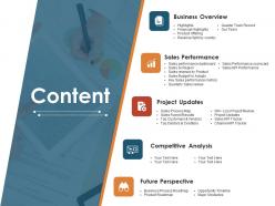
Take them through the full grind with our Content Ppt Images. They won't come away half baked.
People who downloaded this PowerPoint presentation also viewed the following :
Content ppt images with all 5 slides:
Empower folks to break free of their chains with our Content Ppt Images. Be able to eliminate crippling conditions.
FAQs for
Pick images that actually back up what you're talking about - don't just throw them in to fill space. High-quality photos beat those cringey stock images every time (you know the ones I mean). Make sure everything looks cohesive with similar colors and styles. Size matters too - people in the back need to see your visuals without squinting. Honestly, I've sat through way too many presentations where the images were basically useless decoration. Focus on stuff that genuinely helps your message instead of random fluff.
Okay so first thing - stalk your audience a bit (lol I know but it works). Check your analytics to see what images actually get engagement, not just likes but real comments and shares. I literally scroll through their profiles sometimes to see what they're posting about. Match your visuals to their actual world though. Like if they're busy professionals, skip the cheesy stock photos and use clean workspace shots instead. Test different styles because what you think looks good might flop completely. Oh and just ask them directly! Polls work great for this - people love giving opinions about what they want to see.
Honestly, colors in presentations are like mood controllers - they either draw people in or make them zone out. Warm colors (reds, oranges) pump up energy, while blues and greens feel chill and trustworthy. I once used this awful neon green that had everyone squinting like they were staring at the sun. Don't make my mistake! You've gotta match colors to your vibe too. Bright pastels for a financial report? That's just weird. Keep everything consistent across slides and make sure there's solid contrast so the people stuck in back can actually read your stuff.
Honestly, crop those stock photos instead of using the whole thing - focus on interesting details. Skip the cheesy handshake shots (we've all seen them a million times). What actually works? Apply filters that match your brand colors, or use photos as backgrounds with text over them. Try making collages from multiple images - it looks way more intentional. Even just adding consistent overlays helps tie everything together. The goal is small tweaks that don't scream "I grabbed this from Shutterstock." Oh, and using photos as subtle textures behind your content is a game-changer.
Honestly, just assume everything's copyrighted until proven otherwise. Google Images is basically a trap - no watermark doesn't mean it's free to use. I'd stick with sites like Unsplash or Pexels for free stuff, they're pretty reliable. Getty and Shutterstock work too if you've got budget for licensing. Creative Commons can be good but ugh, sometimes you still need to give attribution even for the "free" ones. Check the fine print. When I'm unsure, I just find something else or make my own - saves the headache later.
Honestly, aspect ratio is way more important than people think. Wide images like 16:9 are perfect for timelines or anything cinematic - they naturally guide your eye across the screen. Square works best for social stuff or when you want that balanced look. Tall images? Great for mobile screenshots or side-by-side comparisons. But here's what kills me - when people mix random ratios throughout their deck, it looks so sloppy. Pick a style and stick with it for each section. The shape should actually support what you're trying to show, not just be whatever random screenshot you grabbed.
For complex data, you can't go wrong with the classics - bar charts, line graphs, pie charts, scatter plots. They do most of the work for you. Heatmaps are solid for showing patterns too. One thing that drives me nuts? People cramming everything into one giant chart. It's just visual chaos. Stick to one key point per visual instead. Infographics work when you're telling a story, but don't let fancy design kill your actual data. Oh, and definitely start simple - test what clicks with your audience before getting all elaborate about it.
Honestly, the biggest game-changer is just picking one image size and sticking to it - like 16:9 or square, whatever works for your layout. Then apply the same filters or opacity to everything so it all looks cohesive, even if your original photos are totally different. Keep placement consistent too. If you put an image top-right on one slide, do that for the others. Oh, and here's what saves me tons of time - make a master template with image placeholders first. Then you just drop in your pics without messing with the formatting every single time. Way easier than starting from scratch each slide.
Oh man, so many good options! Unsplash and Pexels are clutch for free stuff - their photos actually look professional, not like weird stock images. Shutterstock's pricey but worth it if you've got the budget. Getty Images too. I'm obsessed with Unsplash honestly, like I'll go there just to look at pretty pictures when I should be working lol. Adobe Stock's decent, especially if you're already paying for their other apps. Need illustrations? Freepik's solid. Just don't forget to check the licensing stuff before you use anything - learned that the hard way once.
Dude, trust me on this - crappy images will tank your presentation fast. You need 300 DPI for anything printed, and at least 72-96 for screens (though go higher if your file size can handle it). I've watched people bomb because their photos looked like they were pulled from a 2005 flip phone. Super distracting. Your audience picks up on pixelated stuff right away, then they're not listening to what you're saying anymore. Oh, and definitely preview everything at full size first - sometimes images look decent when you're editing but turn into a blurry mess when projected.
First thing - figure out your vibe. Pick colors, fonts, and a photography style that actually feels like you. Then make templates for the stuff you post most. Canva's pretty solid for this, or Adobe if you're fancy. Here's what really works: find one signature thing that makes your content yours. Maybe it's a specific filter or how you place your logo - whatever. Just stick with it religiously. I swear consistency is everything, even the tiny details add up. Trust me, spend the time setting up those templates now and you'll be so glad later when you're not starting from scratch every single time.
Custom illustrations are clutch when stock photos look totally generic or your topic is super abstract. Break down complex processes step-by-step, or use visual metaphors that actually make sense with your content. For data and comparisons, infographics beat the hell out of bullet points every time. Plus they're great for sensitive topics where regular photos might be weird or inappropriate. I always think about whether the visual actually supports what I'm saying - too many people just throw random graphics in there to fill space, which honestly looks worse than having nothing at all.
Dude, animations totally help your images pop and guide where people look. I usually go with subtle fade-ins when users scroll, or maybe hover effects that zoom/brighten photos. Super tempting to go crazy with effects but honestly? Keep it simple. Gentle scaling or opacity changes work way better than flashy stuff - makes images feel like they actually belong instead of being randomly dumped there. Oh and timing matters big time. Under 300ms or it'll feel laggy as hell. Start with basic CSS transitions first, then get fancy later if you want.
Honestly, stick to about 60-40 text to image ratio, though it really depends on what you're presenting. Give everything room to breathe - cramped slides look awful. Put your key points next to images that actually support them, not ones that distract. Don't slap text over busy photos unless you add some kind of overlay or shadow behind it. I swear, half the presentations I see are just walls of text next to massive images. Here's my test: stand across the room and see if you can still read it easily. If you're squinting, you've overdone it.
Just ask people straight up after your presentations - surveys work, but honestly casual conversations give you better insights. "Which visuals actually made sense?" is way more useful than generic feedback. Watch faces during your talk too. People scrunch up when they're confused, and you'll notice when they suddenly get it. I keep a messy little note on my phone tracking what images bombed vs. what clicked for different crowds. Super basic but helps me spot patterns. Like, tech audiences hate stock photos but love screenshots. After a few presentations you'll start seeing what works for your specific topics.
-
Awesome use of colors and designs in product templates.
-
Innovative and Colorful designs.