


Presentation outline design ppt templates


Try Before you Buy Download Free Sample Product
 Impress Your
 Audience
Editable
of Time


Represent your topic of discussion with an apt background using this Presentation Outline Design PPT Template. Improvise your presentation with this professionally formatted PowerPoint template. Make the process of creating PPT easy and fast with this editable slide. It allows superior quality pictures, icons, and graphics to make the display impactful. With the presentation outline PPT design, give your audience a clear idea of the topic you are talking about. Help your audience to visualize the steps of the process in an easy to understand manner. Depict the steps of acquiring knowledge and synthesizing content to represent an outline. Present a simple version of detailed information with high-quality background images. Give a visually appealing look to your mundane presentation with this background information PPT template. Our designers at SlideTeam have exclusively designed this PPT template for your comfort. Incorporate it in your PowerPoint presentation to make it more effective.
People who downloaded this PowerPoint presentation also viewed the following :
Content of this Powerpoint Presentation
Description:
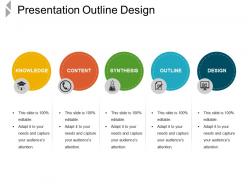
The image shows a PowerPoint slide titled "Presentation Outline Design", which is likely used as a template for planning and structuring a presentation. The slide is divided into five sections, each represented by a different colored circle and labeled with a key component of the presentation development process: Knowledge, Content, Synthesis, Outline, and Design.
1. Knowledge: The yellow circle, accompanied by an icon of a house with a graduation cap, possibly represents foundational knowledge or context setting for the presentation topic.
2. Content: The orange circle has a clock icon, suggesting this part focuses on the timely delivery or the core material that will be covered in the presentation.
3. Synthesis: The green circle with a test tube icon indicates the integration or combination of ideas to form the presentation's core message or conclusion.
4. Outline: The blue circle featuring a document icon signifies the stage of creating an outline, which serves as the skeleton or structure of the presentation.
5. Design: The darker blue circle with a presentation icon represents the final stage of adding visual elements to enhance the presentation's effectiveness.
Each section has bullet points emphasizing that the slide is "100% editable" and can be adapted to the presenter's needs to capture the audience's attention. The slide is designed to be a guide, helping to ensure that presentations are well-prepared and effectively communicate the intended message.
Use Cases:
This slide template is a universal tool, applicable across various industries, to organize and present information effectively.
1. Education
Use: Crafting lesson plans and educational materials.
Presenter: Educator.
Audience: Students, Faculty.
2. Marketing
Use: Developing campaign strategies and presentations.
Presenter: Marketing Manager.
Audience: Clients, Team Members.
3. Healthcare
Use: Outlining patient care protocols and healthcare findings.
Presenter: Medical Researcher.
Audience: Medical Staff, Stakeholders.
4. Technology
Use: Presenting software development processes or product demos.
Presenter: Software Developer.
Audience: Investors, Customers.
5. Finance
Use: Explaining financial strategies or economic forecasts.
Presenter: Financial Analyst.
Audience: Clients, Management.
6. Hospitality
Use: Designing customer service improvement plans.
Presenter: Hospitality Manager.
Audience: Staff, Executives.
7. Environmental Services
Use: Reporting on environmental impact assessments.
Presenter: Environmental Scientist.
Audience: Public, Government Officials.
Presentation outline design ppt templates with all 5 slides:
Assuage inflamed emotions with our Presentation Outline Design Ppt Templates. Bring down the degree of ire.

FAQs for Presentation outline
Okay so first thing - grab their attention right away, then give them a quick preview of what's coming. I usually do 3-4 main points max because people's brains can't handle more than that honestly. The secret sauce? Smooth transitions between sections - that's what makes you sound polished instead of scattered. Oh, and definitely map out your timing beforehand plus any visuals you'll need. Your closing should hit the main points again and tell people exactly what you want them to do next. Just keep the whole thing flexible since you might need to adjust for different crowds or if you're running short on time.
Honestly, outline templates are game-changers for presentations. You get a clear structure instead of just winging it - hook at the start, build up the tension, then nail your ending. Trust me, execs will actually stay awake during your quarterly review (learned that one the hard way). They stop you from going off on random tangents too. Plus you'll have natural spots to transition between your main points. Oh, and definitely try that problem-solution-outcome format next time you're pitching something. Works every time.
Academic templates are all about proving you know your stuff - tons of literature reviews, detailed methodology, citations everywhere. You'll be drowning in background research. Business ones? Totally different vibe. They're problem-solution focused and obsessed with ROI. Nobody wants to sit through endless theory slides in a boardroom meeting, honestly. Building arguments step-by-step works for academic presentations, but business folks want recommendations upfront with data backing it up. Just match whatever template fits your audience's vibe and how long they'll actually pay attention.
Planning visuals in your outline is actually a game-changer. You'll catch those boring text-heavy sections before you even touch the slides. I literally write "chart here" or draw little boxes right in my outline - sounds dumb but it works. Your audience needs breaks from processing words constantly, and mapping out where images or videos go creates way better pacing. Plus you can spot the deadly "bullet points, bullet points, more bullet points" pattern immediately. It's like having a roadmap that shows exactly where to add something visual. Trust me on this one.
Find templates with clear learning objectives right at the start. Built-in engagement spots every 5-10 minutes are crucial - trust me, kids check out so fast it's not even funny. Drag-and-drop content blocks make life way easier when you're scrambling to rearrange stuff. Assessment checkpoints throughout are key, plus timing guides help tons. You want space for videos, slides, interactive bits - the whole mix. Oh, and transition prompts between sections are surprisingly helpful. Test it out on something small first though. Don't go all-in on a major presentation until you've seen how the flow actually works.
Oh man, this is huge for presentations! Japanese audiences want tons of context and relationship stuff first - I learned this the hard way. Germans? Just hit them with facts immediately. Some cultures expect these long introductory stories before your actual point, which honestly felt weird at first but totally works for them. Hierarchy's another thing - certain places need formal acknowledgments and you can't be too direct. Research their communication style before you outline anything. Makes or breaks the whole thing, seriously.
You gotta figure out your audience before touching your outline - seriously, it changes everything. Their knowledge level decides if you need background info or can jump straight to the good stuff. Pain points matter too. What keeps them up at night? I totally crashed and burned once because I assumed they knew way more than they did... embarrassing but taught me everything. Short version: know who's in the room first. Are they beginners? Experts? Mixed bag? Write down 3-4 things about them before you plan anything else. Trust me on this one.
Oh man, presentation templates are such a game changer! AI tools can whip up different outline structures super fast - way better than starting from scratch every time. PowerPoint and Canva have tons of pre-made templates that auto-adjust layouts too. I'm obsessed with Miro for visual outlines since your whole team can jump in and edit them. Pro tip: save everything as custom templates you can duplicate later. Honestly wish someone had told me this years ago lol. Just pick one tool you already use and start building your template collection from there.
Ugh, the worst thing people do is treat templates like they're set in stone. You've got three solid points? Don't force two weak ones just because the template wants five. That's so unnecessary. Also please don't keep those generic placeholder sentences - they're painfully obvious. I cringe every time I see someone copy the template's formal tone when they're actually pretty casual speakers. Your presentation ends up sounding like everyone else's. Oh, and definitely tweak the flow so it matches how you'd naturally explain things. Templates should just give you a head start on organizing, not turn you into a robot.
So you'll want to match your template to what actually matters in your industry. Tech companies go heavy on data viz and product demos. Healthcare? They're obsessed with compliance stuff and patient results. Sales presentations are all about ROI and beating competitors - which is obviously way different from what some academic would present. Look at what drives decisions in your field first. Then build your template sections around those priorities. Honestly, the easiest way is just finding killer presentations from your industry and seeing what structure they use. You can totally reverse-engineer their approach.
Honestly, past presentation feedback is pure gold for tweaking your templates. Look at which parts always ran over time or felt rushed - adjust those sections accordingly. Did people keep asking about the same stuff? Build those answers right into your structure. I always notice when my transitions sound awkward too (seems small but makes a huge difference). Track what actually landed with audiences versus what bombed, then lean into the good stuff next time. Oh, and keeping a quick feedback note after each talk helps - I update my main template maybe once a month based on what I've learned.
For technical stuff, go with problem-solution or just walk through it chronologically - the issue, how you tackled it, what you found, why it matters. People need to follow your logic easily. But persuasive speeches? Totally different game. Use the classic intro-three points-conclusion thing, or better yet, problem-agitation-solution where you really make them feel the pain first. I swear, I've watched so many engineers try to be persuasive and just confuse everyone instead. Bottom line: figure out if you're teaching or convincing, then stick with that structure the whole way through.
Look, it really depends on how long you're presenting. Short 5-minute pitch? Just stick with intro-body-conclusion and call it a day. But once you hit 30-60 minutes, you need way more structure - multiple sections, transition points, maybe even built-in breaks because honestly, nobody's attention span is that good anymore. Time markers become super important for longer ones so you don't run over. Oh, and don't forget audience interaction stuff or you'll lose them halfway through. Here's what I'd do: figure out your time limit first, then find a template that actually fits instead of cramming everything into something too basic.
Honestly, templates are just starting points - you'll probably end up rearranging everything anyway. Map out your content first, then see what fits where. I usually have to merge sections or completely toss parts that don't work. Think about who's listening too. Technical crowd? Add more background info. Trying to persuade people? Focus hard on that problem-solution flow. The whole thing is really just scaffolding. Don't feel bad about customizing the hell out of it - that's literally the point. What matters is giving your audience exactly what they need to hear, not following some rigid structure.
Honestly, templates are a game-changer. Your brain doesn't have to work overtime figuring out what comes next - you can focus on actually delivering your message. I used to ramble like crazy before I started using them. The structure gives you these natural bridges between sections, and you won't forget your main points halfway through. Having that intro-body-conclusion framework means way fewer tangents too (though sometimes those are fun). Once you use the same template a few times, it becomes second nature. Your delivery gets so much smoother when the bones are already there.
-
Great product with highly impressive and engaging designs.
-
Really like the color and design of the presentation.