


Company Overview Powerpoint Presentation Slides


Try Before you Buy Download Free Sample Product
 Impress Your
 Audience
Editable
of Time


We are glad to present our customized company overview PowerPoint presentation slides designed by professionals. This company profiling presentation slides help you in demonstrating your company’s review to clients. Our corporate description PPT templates covers corporate profiling, executive summary, organizational structure, companies core value, members profile, team description, companies vision and mission, client description, investment strategy, corporate risk management. It also covers service offerings, competitive landscape, a project showcasing, operational highlights, future projects, companies market share, income statement, client reviews etc. if you are planning to make PowerPoint slides on corporate profiling, business company, company’s characteristics, a start-up company, company snapshot etc., then our corporate profiling presentation will be helpful. Our company summary PPT slides are fully editable so that the you can mold it accordingly. Download this company overview PowerPoint presentation and grab your audience attention. Entrust your thoughts to the care of our Company Overview Powerpoint Presentation Slides. They will prove worthy caretakers.
People who downloaded this PowerPoint presentation also viewed the following :
Content of this Powerpoint Presentation
Slide 1: This slide introduces Company Overview with your company name.
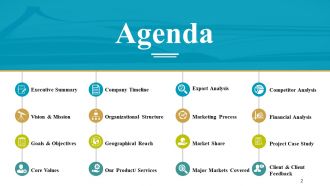
Slide 2: This is an Agenda slide with- Executive Summary, Vision & Mission, Goals & Objectives, Core Values, Company Timeline, Organizational Structure, Geographical Reach.
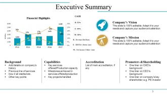
Slide 3: This slide presents Executive Summary in charts and graphs.
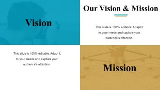
Slide 4: This is Our Vision & Mission slide with text boxes to state.
Slide 5: This is Our Goals & Objectives slide with creative imagery and text boxes. It includes- Business Plan, Programmers for Strategic Objectives, Systems & Solutions, Operation of Solution,
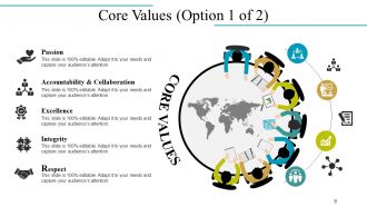
Slide 6: This slide showcases company Core Values which are- Passion, Accountability & Collaboration, Excellence, Integrity, Respect.
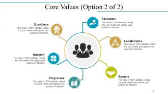
Slide 7: This slide also shows company Core Values in a circular image form.
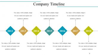
Slide 8: This is Company Timeline slide to state company growth, milestones etc.
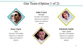
Slide 9: This slide presents Our Team with name and designation to fill.
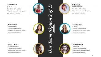
Slide 10: This slide also presents Our Team specifications, information etc.
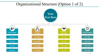
Slide 11: This slide showcases Organizational Structure in a flow chart form with text boxes.
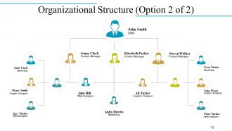
Slide 12: This slide also shows company Organizational Structure with name and designation.
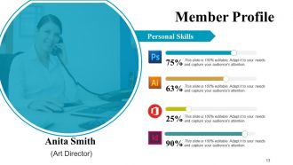
Slide 13: This slide presents Member Profile with name, designation, personal skills etc.
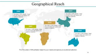
Slide 14: This is Geographical Reach slide on a world map image to show growth, presence etc.
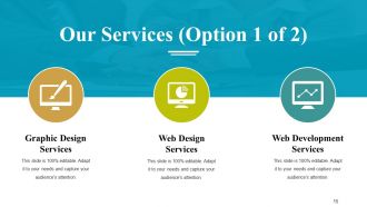
Slide 15: This slide showcases Our Services with their respective icons. These include- Graphic Design Services, Web Development Services, Web Design Services.
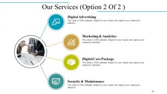
Slide 16: This slide also showcases Our Services which are- Marketing & Analytics, Digital Care Package, Digital Advertising, Security & Maintenance.
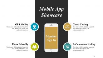
Slide 17: This is Mobile App Showcase slide with imagery. It shows- GPS Ability, Clean Coding, E-Commerce Ability, Users Friendly.
Slide 18: This is Design Section Work slide which involves- Sketching, Improve Design, Final Output, Brainstorm, Time & Schedule, Concept.
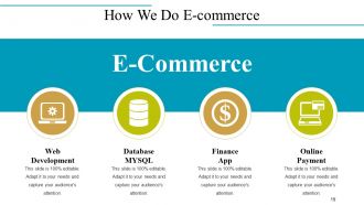
Slide 19: This slide shows How We Do E-commerce which involves- Web Development, Database MYSQL, Online Payment, Finance App.
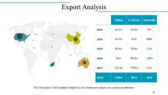
Slide 20: This slide displays Export Analysis on a world map image.
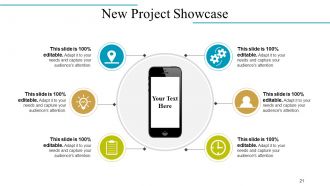
Slide 21: This is New Project Showcase slide with icons and imagery.
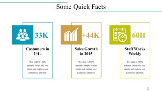
Slide 22: This is Some Quick Facts slide with Customers in 2014, Sales Growth in 2015 and Staff Works Weekly as examples. State your own facts here.
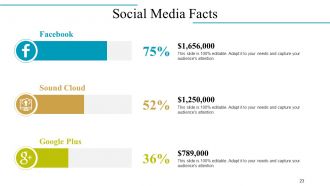
Slide 23: This slide showcases Social Media Facts with their respective icons.
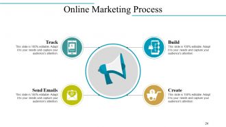
Slide 24: This slide states Online Marketing Process in terms of- Build, Create, Track, Send Emails.
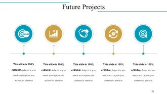
Slide 25: This slide showcases Future Projects in a timeline form.
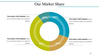
Slide 26: This is Our Market Share slide in a pie chart/ graph form.
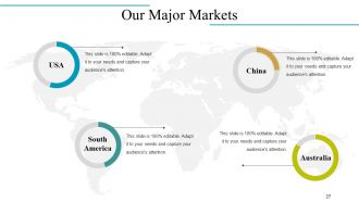
Slide 27: This slide shows Our Major Markets on a world map image.
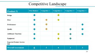
Slide 28: This is Competitive Landscape slide with respect to Product and Competitors.
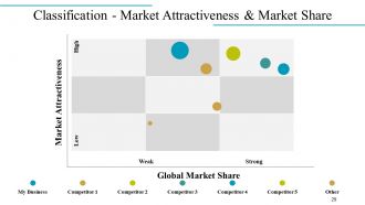
Slide 29: This is Classification - Market Attractiveness & Market Share slide in a matrix.
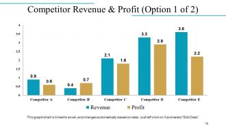
Slide 30: This slide showcases Competitor Revenue & Profit in a bar chart/ graph form.
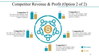
Slide 31: This slide also presents Competitor Revenue & Profit in a circular image form.
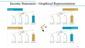
Slide 32: This is an Income Statement - Graphical Representation slide in a bar chart/ graph showing- Revenue, Operating Profit, Cogs, Net Profit.
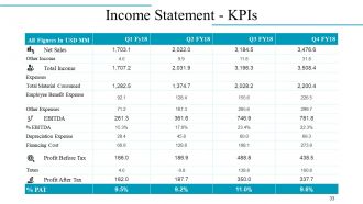
Slide 33: This slide presents Income Statement - KPIs in a tabular form.
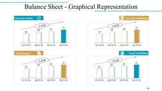
Slide 34: This slide presents Balance Sheet - Graphical Representation of- Current Assets, Total Assets, Current Liabilities, Total Liabilities.
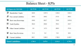
Slide 35: This slide shows the Balance Sheet - KPIs.
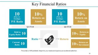
Slide 36: This slide states company Key Financial Ratios.
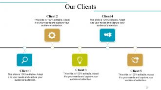
Slide 37: This is Our Clients slide in a timeline form. Add your client details here.
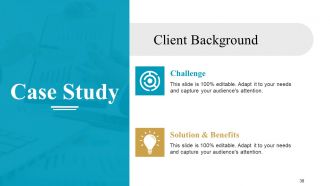
Slide 38: This slide presents a Case Study on Client Background.
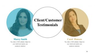
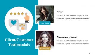
Slide 39: This slide presents Client/Customer Testimonials with name, image and text boxes.
Slide 40: This slide also presents Client/Customer Testimonials with name and designation.
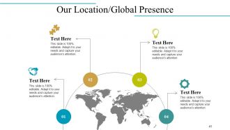
Slide 41: This is Our Location/Global Presence slide on a world map image.
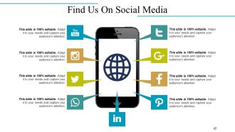
Slide 42: This is Find Us On Social Media slide with relevant imagery and icons.
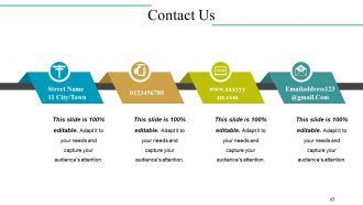
Slide 43: This is Contact Us slide with Address, Email address etc.
Slide 44: This is Icon Slide with various icons. Use as per need and requirement.
Slide 45: This is also an Icon Slide. Use/ add as per need.
Slide 46: This is Coffee Break slide with imagery. Alter/ change the image on the basis of your requirement.
Slide 47: This slide is titled Charts & Graphs to move forward. Change/ edit as per need.
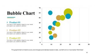
Slide 48: This is a Bubble Chart slide for product specifications to show.
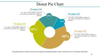
Slide 49: This is a Donut Pie Chart for product/ entity comparison etc.
Slide 50: This is a Stock Chart for product/ entity comparison etc. with High and Low parameters.
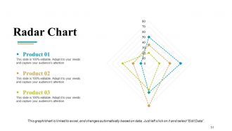
Slide 51: This slide presents a Radar Chart graph/chart. Compare Product 01, Product 02, Product 03 and use as per required.
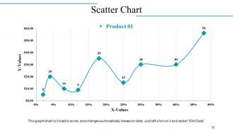
Slide 52: This is a Scatter Chart to present product/entity comparison, specifications etc.
Slide 53: This slide is titled Additional Slides to move forward. Change/ alter content as per need.
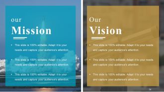
Slide 54: This is Our Mission Our Vision slide to state your mission, vision etc.
Slide 55: This is Our Team slide with name and designation to fill.
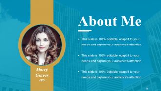
Slide 56: This is an About Me slide. State company/team specifications etc. here.
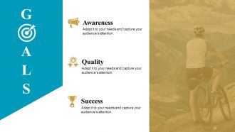
Slide 57: This is GOALS slide. State your goals, aspirations etc. here.
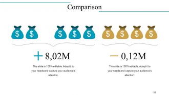
Slide 58: This is Comparison slide to compare two products/ entities etc.
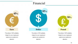
Slide 59: This is Financial scores slide. State your financial aspects etc. here.
Slide 60: This is a Quote slide to state quotes or anything you believe in.
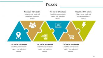
Slide 61: This is a creative Puzzle image slide to state information, specifications etc.
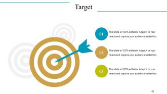
Slide 62: This is Target image slide to present product/ entity, information etc.
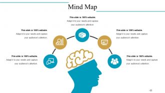
Slide 63: This is a Mind Map slide to show behavioural segmentation, information or anything relative.
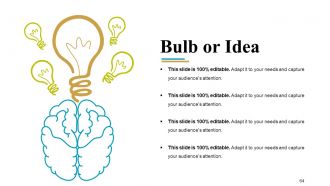
Slide 64: This is a Blub Or Idea image slide to present innovative/ creative aspects.
Slide 65: This is a Thank You slide for acknowledgement.
Company Overview Powerpoint Presentation Slides with all 65 slides:
Enhance collective competency with our Company Overview Powerpoint Presentation Slides. Facilitate efficient acts of collaboration.


FAQs for Company Overview
Honestly, we got tired of watching teams waste hours making slides look decent while their actual message got buried. You know that one deck where slide 3 looks totally different from slide 7? Yeah, that's the problem we're fixing. Our templates keep everything consistent with your brand, so your team can actually focus on the content instead of fighting with fonts and colors. The collaboration part is way smoother too - no more design disasters when multiple people jump in. Actually, try our startup pitch deck template first. It's super popular and gives you a good feel for what we're about.
So I dig into support tickets and user feedback first - that's where the real gold is. Your customer success team probably hears the same damn questions every single day, so definitely tap into that. Search data shows you what people are actually looking for vs what you think they need (spoiler: usually different). I also check which content gets tons of views and where users just... disappear. Honestly feels like detective work sometimes. Start with your top 10 support requests though - way more bang for your buck there.
Honestly, I always start with making sure everything's easy to read - good contrast, decent font sizes. Nobody's got time to squint at screens all day, right? Then consistency is key across all your templates so people aren't constantly figuring out where stuff is. Oh, and flexibility matters way more than you'd think. Your templates need to work for different content without completely falling apart. I'm kinda obsessive about user testing before we call anything "done." Best trick? Pretend you're seeing your templates for the first time. You'll spot the confusing bits immediately.
We collect feedback through support tickets, surveys, and that little widget in the editor. Survey responses are seriously amazing for understanding what users actually need. Monthly, we dig through all the complaints and requests, then figure out what to fix first based on how often it comes up and how big the impact would be. Like if everyone's struggling to customize a template, we'll make the structure simpler or throw in more flexible elements. Oh, and here's something crucial - always tell users when you've made changes based on their feedback. They love knowing their complaints actually led to something.
So we've got three things that make our templates different. The content blocks automatically change based on your industry, which is honestly pretty slick. Built-in compliance stuff handles all the legal headaches for different regions too. The drag-and-drop editor is way better than most - less clunky, you know? Plus real-time collaboration actually works well. Oh, and definitely try the demo with your real content instead of their boring sample stuff. You'll see how much faster it is than whatever you're using now.
Honestly, I'm obsessed with Presentation Zen - their blog is gold. Beautiful.ai sends out solid newsletters too. Behance and Dribbble are where I find the coolest ideas, even if they're not presentation-specific. Sometimes the best inspiration comes from random graphic design work, you know? LinkedIn's great for following actual presentation designers who post their latest stuff. Oh, and webinars when I remember to sign up. I just block out like 30 minutes each week to browse through everything. Pick 2-3 sources you'll actually read and stick with those.
Oh totally! This marketing agency slashed their proposal time by 60% and snagged three big clients right away. Pretty crazy. A startup guy used our pitch deck template to get $2M in funding - honestly didn't expect that one. Freelancers are finishing projects way faster now, and small businesses finally have their shit together. The thing is, people stop starting from scratch every damn time. They can focus on the actual work instead of reinventing everything. Check the case studies page if you want all the details.
Look, everyone goes with the obvious stuff first - Slack, Teams, Google Workspace, Notion. Project management tools are huge too: Asana, Trello, Monday.com. Sales teams love connecting to HubSpot and Salesforce. But honestly? Zapier and Make are where it gets interesting. They connect everything without needing to code, which is pretty sweet. I probably should've mentioned those first since they're total game-changers. Start by figuring out what you're already using in your workflow. Then see what makes sense to connect. Don't overthink it at first.
So we bake accessibility right into everything from day one - semantic HTML, good color contrast, keyboard navigation, alt text spots for images. Way easier than going back to fix it later (learned that the hard way). Your stuff automatically works with screen readers, has focus indicators, ARIA labels when needed. Oh and we test with real accessibility tools while building, follow WCAG 2.1 AA standards. Best part? You don't need to worry about the technical mess. Just use the templates and boom - accessible content without thinking about it.
Oh yeah there's tons of ways to customize! Themes, colors, fonts - basically everything can match your brand. The template library is huge and you can upload your own stuff too. Drag-and-drop editor makes it super easy. Honestly the color schemes are my weakness, I go down rabbit holes tweaking them forever lol. You can mess with slide transitions, custom backgrounds, even make master templates if you're doing multiple presentations. My advice? Start with a pre-made theme then tweak from there. Way faster than starting from scratch.
So we basically throw everything at the wall - different approaches for different people. Beginners get those hand-holding tutorials while experienced users can skip straight to the good stuff and API docs. The interface changes too, like simplified views for newbies versus full dashboards for pros. Took us ages to nail that balance, not gonna lie. During signup we ask about experience level and segment from there. Oh, and there's this skill assessment thing during setup that's actually pretty helpful - it customizes everything based on what you already know. Definitely worth doing that first.
Hey! So we grab content from verified industry sources and peer-reviewed stuff when we can. Recent data is key - like within 12-18 months because old stats will tank your presentation. Cross-referencing helps avoid bias too. Nobody wants to look stupid presenting skewed numbers, you know? There's a quick review process for accuracy and relevance. Honestly though, I'd still double-check any major stats before your presentation. Better safe than sorry, especially if it's a big one!
Yeah, don't stress about copyright stuff - we've got that covered already. The images come from legit stock sources or our designers made them. You can use everything commercially once you buy a template, which is nice because hunting down licensing used to be such a pain. Just can't resell the individual graphics separately, obviously. Oh, and if you need extra stuff beyond what's in there, hit us up and we'll point you to some good stock sites we like.
Good visuals are honestly game-changers for presentations. Your brain processes images like 60x faster than text, so charts and diagrams make complicated stuff click right away. I've sat through way too many slide decks that were just bullet point hell - pure torture. One concept per slide is clutch. Clean charts that show key trends work great, or simple images that back up what you're saying. Don't cram everything onto one slide though, that's amateur hour. The visuals should support your story, not BE the whole story. Try it next time - you'll actually see people paying attention instead of checking their phones.
So we do quarterly surveys asking users to rate how effective templates are and if they're easy to use. Plus there's usage data - download rates, completion rates, whether people customize stuff or just use it straight up. Honestly, the analytics dashboard is pretty telling. Templates that get ditched halfway through? Usually too complicated. Support tickets help too - if the same template keeps confusing people, that's obviously a problem. Oh, and check the monthly performance report to see which ones need fixing. That thing's actually useful for once.
-
Professional and unique presentations.
-
Best Representation of topics, really appreciable.
-
I love the content and data presented in the slides.