

Company Results Powerpoint Presentation Slides





Try Before you Buy Download Free Sample Product
 Impress Your
 Audience
 100%
100% Editable
 Save Hours
 of Time


Prepare visually appealing presentations within moments to display your organization’s performance with the help of Company Results PowerPoint Presentation Slides. This business result PPT template deck offers a series of modifiable slides to represent company appraisal with graphical excellence. Use or edit the performance metrics provided in our enterprise result PowerPoint presentation as required to document your firm’s operational outcomes. Professionals from manufacturing to marketing firms can design astounding presentations by reaping the design benefits of our company results PPT theme. Take advantage of this company result infographic PPT slides to showcase tedious surveys engagingly. Our operational results PPT slideshow will assist you to evaluate performance using parameters like customer recognition, enhanced sales, and competitive edge. Through this business performance PowerPoint template, you can create a personalized dashboard diagram, tabular format, or stacked column bar chart. Download the financial results ppt slide deck to illustrate your organization’s performance through gripping visuals.
People who downloaded this PowerPoint presentation also viewed the following :
Content of this Powerpoint Presentation
Slide 1: This slide introduces Company Results. State Your Company Name and begin.
Slide 2: This slide shows Company Results Template 1 with priorities, description, recommendation, and location.
Slide 3: This slide presents Company Results Template 2 with related imagery and text.
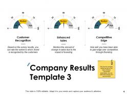
Slide 4: This slide displays Company Results Template 3 with the help of speedometer to monitor the company performance.
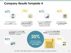
Slide 5: This slide represents Company Results Template 4 for survey/ tracking results.
Slide 6: This slide showcases Company Results Template 5 with related imagery and text boxes.
Slide 7: This slide shows Company Results Template 6 describing how it can be achieved.
Slide 8: This slide displays Company Results Icons.
Slide 9: This slide is titled as Additional Slides for moving forward.
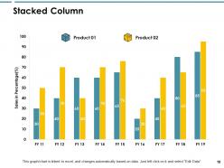
Slide 10: This slide shows Stacked Column chart with two products comparison.
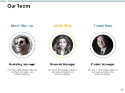
Slide 11: This is Our Team slide with names and designation.
Slide 12: This is About Us slide to show company specifications etc.
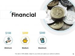
Slide 13: This is a Financial slide. Show your finance related stuff here.
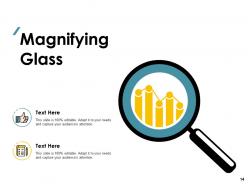
Slide 14: This slide shows Magnifying Glass to highlight information.
Slide 15: This is a Thank You slide with address, contact numbers and email address.
Company Results Powerpoint Presentation Slides with all 15 slides:
Use our Company Results Powerpoint Presentation Slides to effectively help you save your valuable time. They are readymade to fit into any presentation structure.







FAQs for Company Results
Look, it really comes down to your specific audience and industry, but some metrics are just universally crucial. Revenue growth, profit margins, cash flow - these are your bread and butter financials that you can't skip. Then you've got customer acquisition cost and lifetime value which show you're not just burning money for growth. Employee retention's huge too since it reflects what's happening internally. I've watched so many presentations go sideways because people throw in random vanity metrics that sound impressive but don't actually help with decisions. Keep it tight - maybe 5-7 KPIs tops that actually connect to what you're trying to achieve. Trust me, your executives would rather see focused insights than wade through a mountain of numbers.
Look, nobody wants to stare at endless spreadsheet rows - that's just torture. Good charts and graphs turn all that messy financial data into something people can actually understand. You can show trends, compare quarters, track goals, whatever. Color-coding helps too (green for good, red for... well, you know). Honestly, I'd start simple - pick maybe 2-3 key numbers that actually matter and build clean visuals around those first. Interactive dashboards are nice if you're feeling fancy, but even basic charts beat dumping raw data on people. Your stakeholders will thank you.
Honestly, storytelling with your company data is a game changer. People zone out when you just dump numbers on them. Instead, walk them through it like a story - what problem you had, how you tackled it, then boom, here's what happened. It's way more engaging than a spreadsheet, trust me. Connect your data points so they actually mean something together. I swear, once you start presenting results like this, you'll notice people actually paying attention instead of checking their phones. Structure matters more than you'd think.
Honestly, you gotta match what you show to what they actually care about. CEOs want the big picture stuff - revenue, growth, market metrics. Middle management needs data they can actually do something about. Board members? Don't overthink it, just show them KPIs and trends. I totally bombed this once by showing a CEO way too much granular conversion data - learned my lesson! Ask yourself: "what's this person gonna do with this info?" Can't answer? Cut it. Start with your biggest insights first. Then maybe add details if they seem interested, but honestly most people's attention spans are pretty shot these days.
Honestly, the worst thing you can do is dump a ton of numbers on people without explaining what they actually mean. Like, nobody cares about your 47% conversion rate if you don't tell them why that matters for the business. Clean slides are key - maybe 3-4 main points tops. Don't try to sugarcoat the bad stuff either, people aren't stupid and they'll call you out. Oh, and definitely practice explaining the complicated financial jargon beforehand. Trust me, someone's gonna ask a question that needs a simple answer, not some textbook definition. Short version: tell the story, not just the stats.
Show at least 3-5 quarters so trends don't look all over the place. Stick with basic line or bar charts - keep it simple. Those little directional arrows are gold, trust me. Executives love that visual stuff. Pick maybe 3-4 key metrics tops because nobody wants to stare at a wall of data. Call out what's actually causing the changes you're showing. Oh, and mark any spots where trends flip direction - those inflection points always spark good discussion. One more thing: prep a backup slide for weird outliers. Someone's gonna ask about that random Q2 spike, guaranteed.
Honestly, I'd just start with Canva Business - their templates are actually pretty decent and you can throw your company colors on there without much hassle. PowerPoint works too but gets boring fast. If you want something fancier, Adobe Creative Suite is solid but might be overkill unless you're doing this regularly. Figma's cool for custom stuff your whole team can mess with later. Oh, and Prezi does those swooshy presentations that look impressive, though I always get a little motion sick watching them lol. Really depends how much time you've got.
Dude, this is huge - culture totally changes how people see your company numbers. Like, growth that seems "meh" in the US? Europeans might be super impressed. But show aggressive expansion to stakeholders who love stability and they'll freak out. Risk tolerance is all over the place too. Some cultures want you to spell out every challenge, others just want the confident highlights. Honestly, I learned this the hard way when I assumed everyone wanted American-style optimism. Bottom line: research their business norms first. Same data, totally different story depending on who's listening.
Clean layouts are your best friend - tons of white space and max 2 fonts. Your color scheme should match your brand obviously. Charts need to be readable above all else (I've sat through way too many presentations where fancy graphs made zero sense). Use clear headers and bullet points so execs can scan fast. Don't cram everything onto slides - that's where most people mess up. Balance text with visuals and definitely test how it looks projected. Oh, and start with a simple grid system. Trust me on that one.
Honestly, just think of your data like you're telling a story. Where were you before? What went wrong or what opportunity popped up? Then show how you fixed it and what happened after. Like instead of just "revenue went up 15%" - tell them WHY. Was it a new product? Did you solve some annoying customer problem? Numbers are way more memorable when there's actual context behind them. Oh, and throw in real examples - customer stories, what your team did. People connect with that stuff way more than just raw stats sitting there by themselves.
Okay so first thing - keep your accounting standards consistent across all periods, that's like rule number one. Your data sources need to be legit and documented too. Honestly, triple-check those spreadsheet formulas because nothing's worse than sending out reports with calculation errors. If there are weird fluctuations or one-time stuff, just explain what's going on - don't make people guess. Always be honest about limitations in your data. Get a second pair of eyes on everything before it goes out. Bottom line: if your stakeholders can't follow your logic or understand what you're showing them, you've gotta make it clearer.
Honestly, audience feedback is everything when you're tweaking those company presentations. Watch people's faces during your financial section - if they're scrolling Instagram, you've lost them. The Q&A tells you exactly what you missed explaining clearly. I always grab a couple people afterward and ask what made sense versus what was confusing. Their questions show you which parts need work upfront. Body language doesn't lie either. Oh, and that story you think your data's telling? Half the time it's not as obvious as you assume. Use what they tell you to fix the narrative next round.
Dude, interactive stuff is a total game-changer for presenting company results. Add hover details to your charts, dropdown filters for departments or dates - whatever makes sense. Clickable tabs for different metrics work great too. I've watched so many people zone out during static slide decks, but when you let them actually click around and explore? They're suddenly paying attention. Oh, and try live polling mid-presentation - like "what should we dig into next?" It's kinda brilliant because you're basically handing them the remote control. People love that.
Look at your past revenue, margins, and seasonal patterns first - that's your foundation. Then layer in market research and pipeline stuff on top. Excel works fine for this, though some teams get fancy with other tools. Show conservative AND optimistic scenarios when you present - nobody likes getting blindsided. Call out your big assumptions upfront and what might screw things up. I'd start from your latest quarter's actual numbers and build forward. Makes people trust your approach more. Oh, and honestly? The 1-3 year timeframe is pretty standard for most companies doing this kind of planning.
Look, your brand is basically what makes people trust your numbers or not. Apple keeps their clean look even in boring SEC filings - well, sort of. Consistent visuals and tone across all your financial stuff builds credibility. People get overwhelmed by spreadsheets, so good branding helps them actually understand your story. Your investor decks should feel like they came from the same company as your earnings calls. Otherwise stakeholders won't know what to believe. It's like packaging - same info, but way more digestible when it looks professional and cohesive.
-
Wonderful templates design to use in business meetings.
-
Topic best represented with attractive design.