


Company profile powerpoint presentation slides
Presenting a company profile is a bit complicated task and to help you out we have created this content-ready company profile PowerPoint presentation. It can be presented by company’s middle/top management to third parties like banks, customers, investors. The corporate overview PPT template comprises of 59 slides including agenda, about us, founders of the company, overview, vision & mission, departments & teams, goals & objectives, core values, our team, organization structure, member profile, business services, solutions, workflow in organization, project timeline, future projects, market competition, business growth, revenue generation, performance, clients, case study, customer testimonials, location, global presence, key financials, financial snapshots, social media links, contact us and many more. This corporate summary presentation graphics are intended to present subjects such as business components, business information, corporate summary, organizations structure, corporate image, features and Introduction. Download our company profile PPT slides to keep the audience engaged till the end. Galvanize them into action with our Company Profile Powerpoint Presentation Slides. They will feel all charged up.
Presenting a company profile is a bit complicated task and to help you out we have created this content-ready company profi..


-

- Google Slides is a new FREE Presentation software from Google.
- All our content is 100% compatible with Google Slides.
- Just download our designs, and upload them to Google Slides and they will work automatically.
- Amaze your audience with SlideTeam and Google Slides.
-

Want Changes to This PPT Slide? Check out our Presentation Design Services
-

- WideScreen Aspect ratio is becoming a very popular format. When you download this product, the downloaded ZIP will contain this product in both standard and widescreen format.
-

- Some older products that we have may only be in standard format, but they can easily be converted to widescreen.
- To do this, please open the SlideTeam product in Powerpoint, and go to
- Design ( On the top bar) -> Page Setup -> and select "On-screen Show (16:9)” in the drop down for "Slides Sized for".
- The slide or theme will change to widescreen, and all graphics will adjust automatically. You can similarly convert our content to any other desired screen aspect ratio.
Compatible With Google Slides

Get This In WideScreen
You must be logged in to download this presentation.


Do you want to remove this product from your favourites?
PowerPoint presentation slides
PowerPoint presentation includes 59 slides. PPT templates are useful for management team and business owners. Templates content and designs are 100 % editable. PPT slides are accessible in both widescreen and standard format. All PowerPoint templates are compatible with Google Slides. We offer premium customer support. The main constituents of the deck are vision and mission, goals and objectives, organization structure, company overview, departments and teams.

People who downloaded this PowerPoint presentation also viewed the following :
Content of this Powerpoint Presentation
You have been asked to pitch your company to investors this weekend. Being a long term associate, you are familiar with your company’s achievements and have access to all needful resources and key data. All you need is an organized company profile template to strike the chord with stakeholders.
Here we present the perfect deck titled Company Profile PowerPoint Presentation that business professionals can use to showcase the all-about of their organization. Designed by experts, this presentation layout is your go-to resource to onboard potential investors and stakeholders. A guided approach as this PPT Presentation will help your audience grasp why your company is the ideal hotspot to invest in or even associate with.
This PPT Presentation features 59 selected slides that will help you share the best of your company, from vision to team structure; from achievements to future roadmaps. You can even showcase client testimonials and case studies to sprinkle a human touch to your company pitch.
The PPT Slides have been arranged in an organized way making the presentation neither overwhelming nor difficult to understand. Besides, this complete deck has a calculated percentage of graphs, charts and other visuals that will render your presentation engaging and appealing.
Template 1: Company Founders
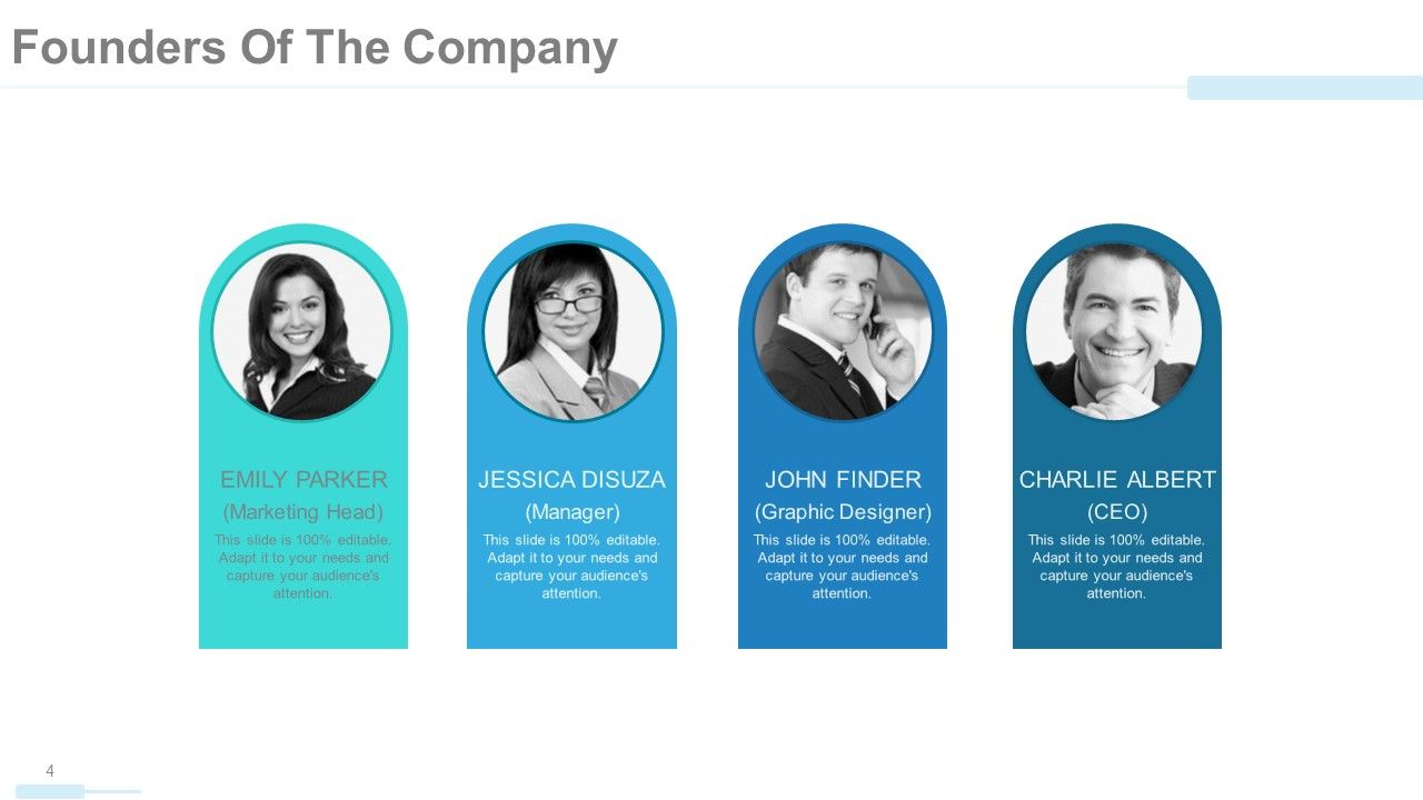
While pitching your company to potential investors and funders, introducing your leadership and pioneers is of top importance. Within the company profile presentation, we have included this section of founders’ information to introduce the forefathers of your company who laid its foundation. You can share top highlights of their career and the crucial position of responsibility they held (if the founders have been many)You can even identify each founder with their photo and if they are famous ones, they will automatically click and pique the attention of your audience.
Template 2: Company Overview
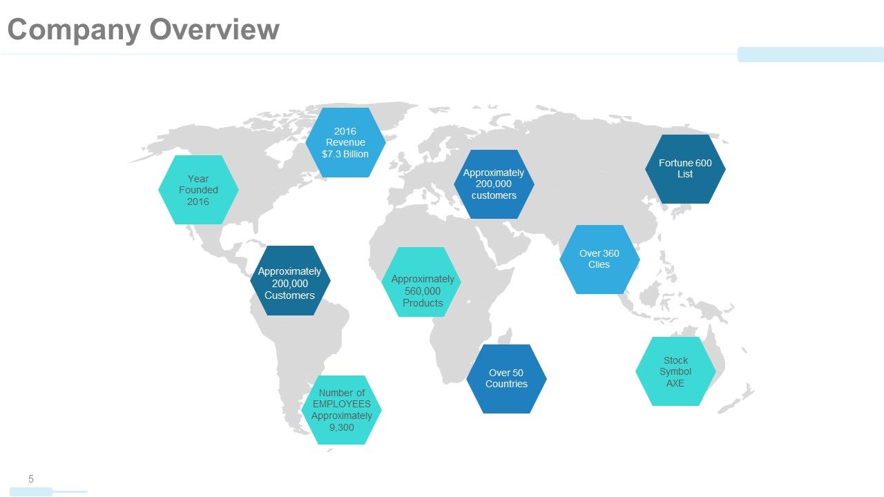
In pitching your company, you must talk about your spread worldwide. Mentioning having a national or international presence will excite your investors to invest because this association will also look good on them. With this world map diagram, you can also highlight specific features of your businesses worldwide, including the impressive daily sales or the increasing number of customers. You can even share other highlights of your company including growth trajectory and revenue accomplishments till date from all points of contact.
Template 3: Core Values
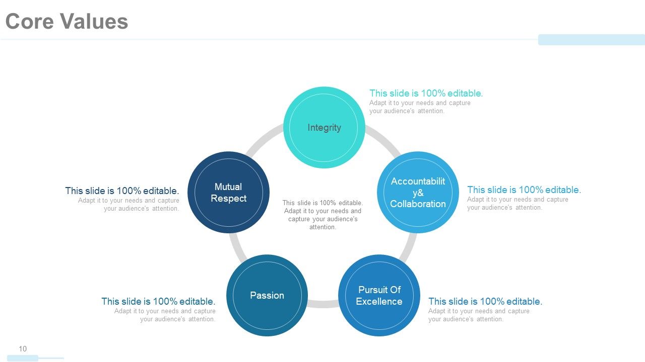
For the empathetic and visionary audiences who are keen to know about your core values, this slide will help you lay down the core values of your company. A diagrammatic approach as this can be used to point out the best traits of your founders and employees who implement these values daily. Talk about what each core value means to you and how these will benefit the investors in the long run. Of top mention are, excellence, passion, collaboration, respect, progressive and integrity. Edit or add onto this hexagon of core values by owning this complete deck now!
Template 4: Member Profile
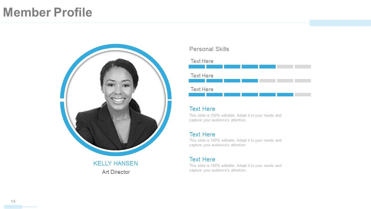
A company profile is also a great way to introduce your key members and praise their skills. Inform your investors about the skilled team players that represent your company’s strengths. Based on your company policies, you can even share ID photos of the employees alongside their list of strengths and skills that are valuable to the company. Mention their job profile just underneath their photo as this and all other templates in our gallery are 100% editable and customizable.
Template 5: Our Solutions
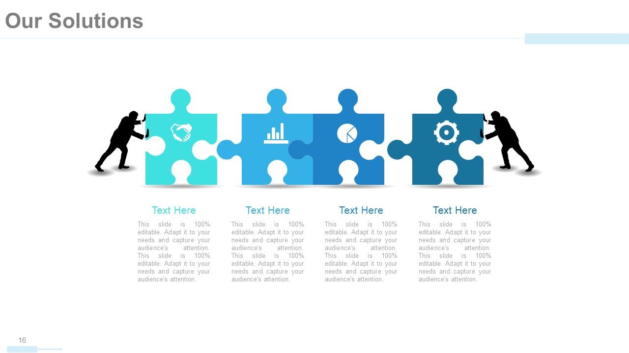
Investors are keen to know how your company services will resolve contemporary concerns and address their requirements. In this PPT Slide, you can talk about the solutions that would be best suited for them. A puzzle visual shown in this PPT Template signifies how your company will rise to the occasion in offering the necessary help as service in easing client worries.
Template 6: Future Projects
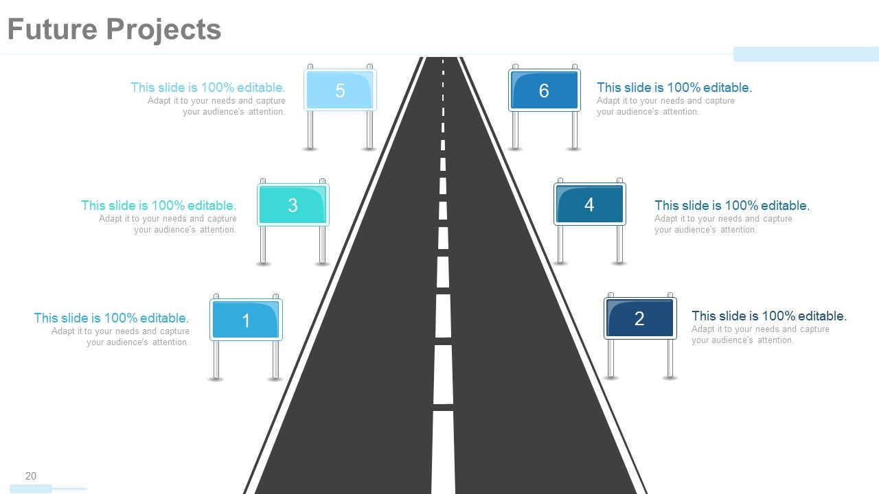
A visionary client and investor will be eying your future aspirations and roadmaps that indicate your broad outlook for the market and the goal to evolve. With this future project template, you can talk about your plans for the future, extensions that are imminent, markets that you wish to expand into, and technology that would be commonplace. Talk about your futuristic plans as you introduce your company during the session with this roadmap template.
Template 7: Our Market
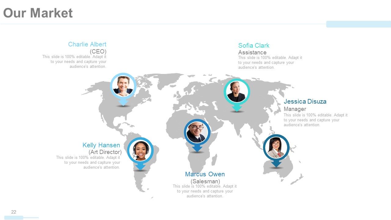
Your market is where your company exists and where it is budding. Use the world map as a template to pin top regions where your business is flourishing. You can highlight the key players leading company branches in these regions and also specify the genre of market servicing clients there.
Template 8: Us Vs. Competition
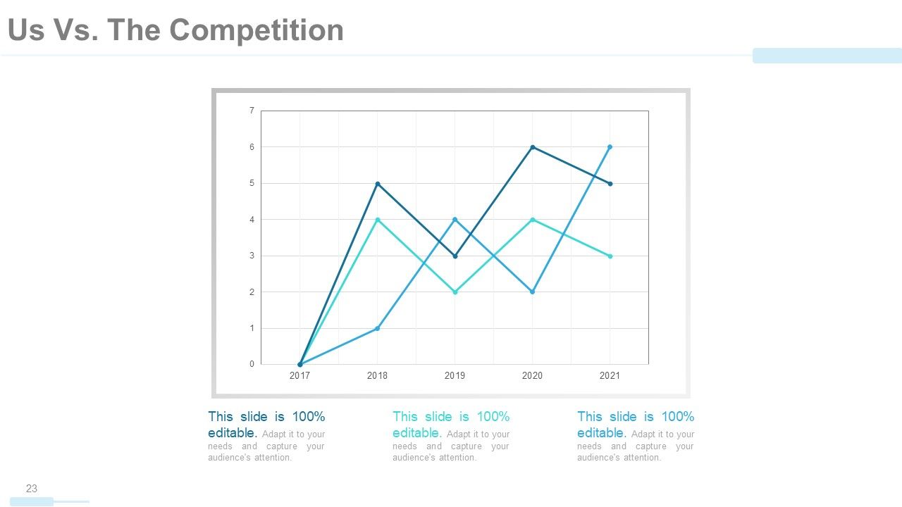
Too much theory might become mundane and sometimes contradictory in a company profile pitch, which is why intervention of graphs and statistics is a must! In particular, share a graphical snapshot of how your company is faring compared to the competitors over the years. Compare as many as three companies and track profitability over the years focusing on your rise and progress over the years. Impress the fact checkers with this aspect of your pitch
Template 9: Revenue Generation
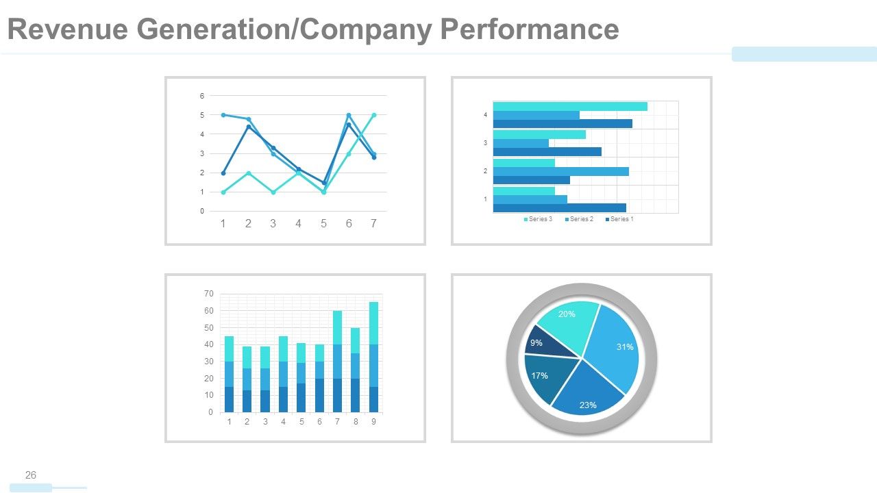
After stating the comparison with competitors, engage the data loving investors more by sharing statistics on revenue generation over the years. Compare your own products and services and share a snapshot of their increasing favorability and hereby business likeability in terms of revenue with this PPT Slide. A color-coded graphical data will be more visually appealing as well as clarifying even the complex data being presented. All of these graphs are Excel-linked therefore editable and therefore easy to project data imputed in variables.
Template 10: Case Study
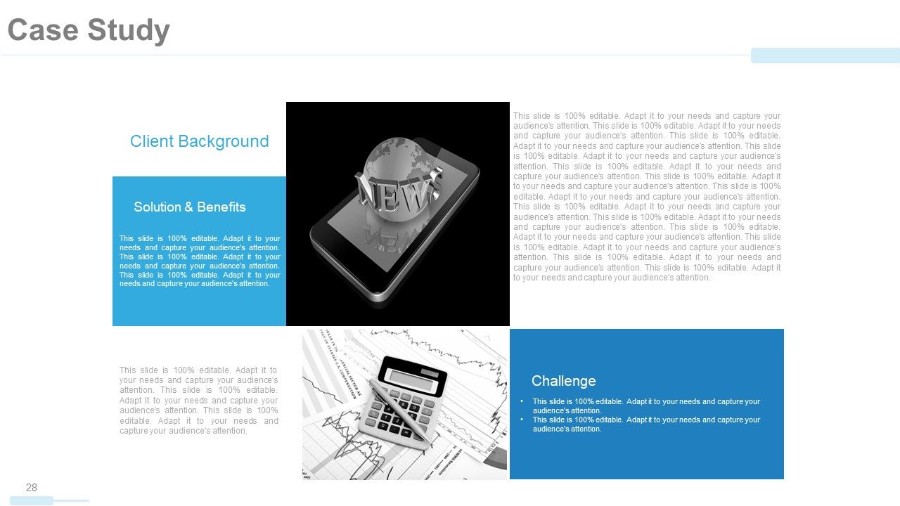
Lastly, a case study will do. It will make an investor emotionally and psychologically hinge to your business idea after you offer a practical example of real-life client experience that they could relate to. Introduce the then problem under consideration, and walk them through the path opted in finding solutions and creating a happy client. Share your strategies, tools and techniques, and skills used in cruising the challenge.
This Could Be Your Only Shot!
Your potential clients/stakeholders are going to admire your company once these details are shared as guided in this company profile presentation. Whether you want to forward this presentation over email or deliver it in a meeting room, the balanced visuals and text will have a gripping effect on your readers and listeners equally. If you want to receive immediate callbacks, you have to own this presentation template now. Have the experts back your pitch and impress your clients the easier way!
Company profile powerpoint presentation slides with all 59 slides:
Discover ingenious ways with our Company Profile Powerpoint Presentation Slides. Handle hurdles in a clever fashion.
FAQs
You can expect to find a statement of the company's overarching goals and aspirations, including its purpose and values.
The organizational structure is presented in a tree chart or graph form, with departments and teams listed along with their respective roles and responsibilities.
The Client/Customer Testimonial slides feature quotes or statements from satisfied clients or customers, along with their names and image.
The presentation features several slides with charts and graphs that display the company's revenue generation, financial performance, and growth over time.
The Work Flow In Organization slide typically features icons or graphics illustrating the steps involved in the company's workflow or business processes.
-
absolutely is perfect
-
convenient for design. I can save time
-
very good
-
Editable templates with innovative design and color combination.
-
Enough space for editing and adding your own content.
-
This is a great template. It generates many 8deas and resembles our dashboards.
