


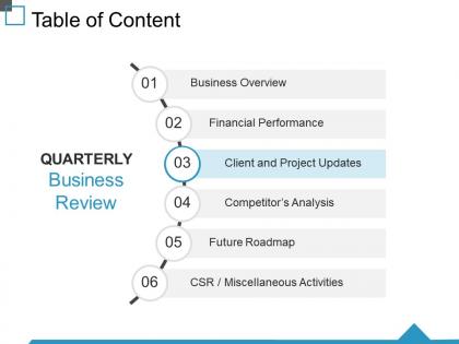
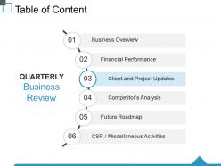
Table of content ppt visual aids infographic template




Try Before you Buy Download Free Sample Product
 Impress Your
 Audience
 100%
100% Editable
 Save Hours
 of Time


Argue against bigotry with our Table Of Content Ppt Visual Aids Infographic Template. Bring an end to chauvinistic intolerance.
People who downloaded this PowerPoint presentation also viewed the following :
Table of content ppt visual aids infographic template with all 5 slides:
Display commitment to every engagement. Our Table Of Content Ppt Visual Aids Infographic Template are dependable and consistent.


FAQs for Table of content ppt visual
Your headline's gotta grab attention first. After that, organize everything in clear sections that flow logically. Charts and icons help, but only if they actually add value - don't just throw them in randomly. White space is your friend here; cramming stuff together looks amateur and nobody wants to read a wall of text. Stick with consistent colors and readable fonts (please, no Comic Sans). Citations at the bottom build credibility. Oh, and don't forget your branding! Start simple with a grid layout, then get fancy once you've got the basics down.
Okay so color theory is actually super important for infographics - it's what makes people actually look at your data instead of scrolling past. Use complementary colors like blue/orange or red/green to make key info stand out. I swear, half the infographics I see are total disasters because someone used every color in existence. Keep it to 2-3 main colors tops. Lighter shades work great for backgrounds. Oh and think about who's seeing this - corporate stuff needs muted colors, but social media can be way more vibrant. Always check how it looks on phones too.
Ugh, don't cram everything onto one slide - drives me crazy when people do that. Also those tiny fonts? Nobody's squinting to read your masterpiece. Clashing colors are the worst too, learned that one the hard way lol. Stick to maybe 2-3 fonts max or it looks messy. Your data should actually tell the story you want, not just look fancy. Oh and test how it looks on different screen sizes first! I've seen so many presentations that looked great on laptops but terrible projected on walls. Design for whoever's actually viewing it.
Make your data the main event, not just pretty decoration. Bar charts work great for comparisons, line graphs for trends over time. Honestly, fancy effects usually just confuse people - keep it simple. Your color scheme should stay consistent throughout, and please make sure text is actually readable against whatever background you pick. Create a visual hierarchy so eyes naturally move from point to point. Oh, and sketch your layout first before opening any design software. Trust me, you'll thank yourself later when you're not redesigning everything three times.
For infographics, go with stuff that's already visual - survey results, comparisons, timelines, step-by-step guides. Lists are honestly perfect when you're stuck on format. People should scan it fast and get the main ideas without reading everything (attention spans are terrible these days). Skip dense paragraphs or concepts that need tons of explanation. Break things into 5-7 chunks that actually flow together. I'd start by outlining your points first, then figure out which ones work as visuals. Statistical data converts really well too.
Honestly, infographic templates are amazing for turning boring data into something people actually want to look at. Your audience will remember visual stories way better than a wall of numbers – it's just how our brains work. Plus they help you organize everything logically without making people's eyes glaze over (been there with bad presentations lol). Charts and icons guide viewers through your narrative naturally. Start by figuring out your main story first. Then find a template that matches that flow instead of forcing your data into whatever looks pretty.
Honestly, typography can make or break your infographic. Pick fonts that stay readable when they're tiny - sans-serif is usually your best bet since serif gets all blurry when scaled down. I learned this the hard way lol. Create a clear hierarchy with bold headers, medium subheads, then smaller body text. Don't go crazy with more than 2-3 font styles or it'll look like a ransom note. The whole point is guiding people through your data story without them getting lost. Stick with whatever fonts you choose throughout the whole thing - consistency is key for keeping things clean and professional.
Yeah, so industries totally customize their infographics based on who they're talking to. Healthcare goes super clean with clinical colors - patient education stuff needs to be crystal clear. Tech companies? They're all about that sleek look with fancy data viz. Teachers are actually amazing at this - they nail the storytelling format and break down complicated topics better than anyone. Finance keeps it conservative (makes sense) with tons of charts to show market trends. Honestly, just peek at what others in your field are doing and steal their visual style. Why reinvent the wheel, right?
Honestly, just go with Canva first - it's ridiculously easy and has a million templates already there. Most people I know started there anyway. Adobe Illustrator's obviously the pro choice if you want total control over everything, but man, that learning curve is brutal. Figma's solid too, especially when you're working with other people since it runs in your browser. I mean, you could probably knock out something decent in Canva in like 20 minutes. Then if you get hooked and want fancier stuff, upgrade later. Really depends on what you're comfortable with and how much you want to spend.
Three main things to nail: contrast, fonts, and backup options. Get a free WCAG contrast checker online - seriously, use it. Sans-serif fonts work best, nothing smaller than 12pt. Oh, and don't make color the only way people get info (learned this when my boss couldn't tell our red/green charts apart - awkward). Alt text on images is a must. Maybe throw in a screen-reader friendly PDF version too? I'd test it with actual accessibility tools first though. That's really the only way you'll know if it actually works for everyone instead of just looking pretty.
Interactive stuff is everywhere right now - clickable infographics, animated transitions when possible. Bold fonts are having a moment too. White space is your friend for that clean look everyone's obsessed with. Data storytelling is probably the biggest thing though. People don't want random charts dumped on them, they want actual narratives. Mobile-first design isn't even a trend anymore, it's just survival at this point. Oh, and make it feel less corporate-y if you can. Pick one of these to try first instead of changing everything at once - learned that the hard way lol.
Honestly, white space is your best friend here. Don't try to cram everything in - people hate squinting at tiny text. I usually go with this 40-30-30 split: 40% white space, 30% visuals, 30% actual text. Bold headers and color coding help guide people's eyes naturally. Break your info into chunks that are easy to scan. Here's a quick test I do - show someone your template for 10 seconds, then ask what they remember. If they can't tell you the main point, it's too cluttered. Icons help too, but don't go overboard with them.
Dude, layout literally makes or breaks the whole thing. People will bounce if they can't follow along easily. Your eye should flow naturally from one section to the next – like A to B to C without any guesswork. I always sketch the flow first before opening any design programs (saves so much headache later). Group similar stuff together and use plenty of whitespace. Don't cram everything in there. Short version: if someone gets confused halfway through, they're gone. Make it stupid simple to follow.
Honestly, infographic templates are a game changer for making your data actually interesting. Nobody wants to stare at spreadsheets or boring charts, but throw that same info into a colorful template? Suddenly people are sharing it. Perfect for survey results, explaining how your process works, or basically any stats that would otherwise put people to sleep. The best part is you don't need design skills - just swap in your colors and data. Takes like 10 minutes instead of hours. Works great for LinkedIn posts or even email newsletters. Way better than those text-heavy posts that get zero engagement (guilty of those myself).
Honestly, you gotta spread it around everywhere. Social media's your best bet - LinkedIn, Instagram, Twitter - but resize for each one since they're all picky about dimensions. Email newsletters crush it for infographics, trust me. Pinterest is weirdly good too, way better than people think. Throw it in blog posts, submit to those infographic directories. Oh, and definitely reach out to industry sites - sometimes they'll actually feature your stuff. One thing that's clutch: include embed codes so other people can easily slap it on their websites without hassle.
-
Excellent design and quick turnaround.
-
Attractive design and informative presentation.