


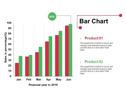
Bar chart ppt visual aids infographics




Try Before you Buy Download Free Sample Product
 Impress Your
 Audience
 100%
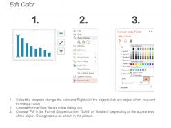
100% Editable
 Save Hours
 of Time


Create conditions conducive for functioning with our Bar Chart Ppt Visual Aids Infographics. Draw up guidelines to avoid injury.
People who downloaded this PowerPoint presentation also viewed the following :
Bar chart ppt visual aids infographics with all 5 slides:
Give folks a chance to experience humor with our Bar Chart Ppt Visual Aids Infographics. Encourage a jovial approach.
FAQs for Bar chart ppt
Bar chart infographics offer enhanced visual clarity, simplified data comparison, improved audience engagement, professional aesthetic appeal, and increased information retention rates. These visual tools streamline complex datasets by highlighting trends, patterns, and key metrics instantly, with many organizations finding that presentations using bar chart infographics deliver more persuasive outcomes and facilitate faster decision-making processes.
Bar chart infographics enhance data visualization by transforming complex datasets into clear, comparative formats that audiences can quickly interpret and understand. Through strategic color coding, visual hierarchy, and contextual annotations, organizations across sectors like healthcare, finance, and retail streamline performance reporting, accelerate decision-making processes, and ultimately deliver more engaging stakeholder communications that drive actionable insights.
Bar chart infographics excel at displaying categorical data comparisons, sales performance across regions, budget allocations, survey results, and demographic breakdowns. These visualizations streamline complex numerical relationships by enabling quick visual comparisons, highlighting performance gaps, and presenting survey findings in digestible formats, with many organizations finding that bar charts enhance stakeholder comprehension and accelerate data-driven decision-making processes.
Color choices in bar chart infographics significantly influence viewer interpretation by creating visual hierarchy, conveying emotional associations, and guiding attention to key data points. Strategic color application enhances data comprehension by distinguishing categories, highlighting critical trends, and establishing brand consistency, with many organizations finding that purposeful color schemes improve audience engagement and decision-making speed by up to 40%.
Common mistakes when creating bar chart infographics include inconsistent scaling, cluttered designs, misleading proportions, poor color choices, and inadequate labeling of axes and data points. These errors significantly impact data comprehension and audience trust, with many organizations finding that streamlined designs, consistent scales, and strategic color application enhance clarity, improve decision-making processes, and ultimately deliver more compelling presentations that drive business outcomes.
Choosing the right scale involves starting your y-axis at zero to avoid misleading proportions, selecting appropriate intervals that highlight meaningful differences, and ensuring your axis range accommodates all data points without excessive white space. Industries like financial services and healthcare find that consistent scaling across multiple charts enables accurate comparisons, while clear labeling and logical increments ultimately enhance data comprehension and decision-making credibility.
Bar chart infographics excel in storytelling by transforming raw data into compelling narratives through visual progression, comparative analysis, and strategic color coding that guides audience attention. These visualizations enable organizations to communicate performance trends, market comparisons, and growth trajectories effectively, with many businesses finding that well-designed bar charts enhance stakeholder engagement and decision-making processes significantly.
Professional bar chart infographic tools include Canva, Adobe Illustrator, Tableau, PowerPoint, and specialized platforms like Piktochart and Venngage. These solutions streamline design workflows by offering pre-built templates, drag-and-drop functionality, and advanced customization options, with many organizations finding that combining user-friendly interfaces with robust data visualization capabilities ultimately delivers faster creation times and more engaging presentations.
Horizontal bar charts enhance comparison of categorical data with long labels, while vertical formats excel at showing trends over time or sequential data. Horizontal layouts accommodate extensive text descriptions and enable easier left-to-right reading patterns, making them ideal for survey responses or performance rankings, whereas vertical charts streamline temporal analysis and deliver cleaner visual progression for time-based datasets.
Stacked bar charts excel when comparing parts within wholes across categories, showing composition changes over time, or displaying multiple data series where total values matter alongside individual components. They're particularly effective in business scenarios like budget breakdowns by department, sales performance by product line across quarters, or demographic distributions across regions, ultimately delivering both comparative and compositional insights that standard bar charts cannot provide simultaneously.
Ensuring clarity in bar chart infographics requires strategic design choices including consistent color schemes, clear axis labels, appropriate spacing between bars, and readable font sizes. These elements work together by eliminating visual clutter, establishing logical data hierarchies, and guiding viewer attention to key insights, with many organizations finding that simplified designs ultimately deliver faster comprehension and more effective data communication.
Annotations in bar chart infographics serve as contextual guides that highlight key insights, explain data sources, clarify methodologies, and draw attention to significant trends or outliers. These strategic additions transform raw data visualization into compelling narratives, enabling organizations across sectors like healthcare, finance, and retail to communicate complex findings more effectively, ultimately delivering enhanced audience comprehension and actionable intelligence.
Current trends shaping bar chart infographic design include interactive elements, animated data transitions, mobile-first responsive layouts, bold color gradients, and integrated storytelling narratives. These design approaches enhance audience engagement by simplifying complex data visualization, improving accessibility across devices, and creating memorable visual experiences, with many organizations finding that modern infographic styles significantly boost data comprehension and social media sharing rates.
Bar chart infographics support persuasive arguments by transforming complex data into clear visual comparisons, highlighting key trends, and making statistical evidence immediately accessible to audiences. Through strategic color coding, proportional scaling, and focused data selection, organizations can demonstrate market leadership, performance improvements, or competitive advantages, ultimately enabling faster decision-making and stronger stakeholder buy-in across presentations.
Creative animation techniques for bar chart infographics include progressive data reveals, cascading bar builds, color transitions, rotating perspectives, and interactive hover effects. These approaches enhance audience engagement by transforming static data into dynamic storytelling tools, with many presenters finding that animated reveals improve information retention, maintain viewer attention, and ultimately deliver more compelling business presentations.
-
Content of slide is easy to understand and edit.
-
Excellent design and quick turnaround.