

Bar graph powerpoint slide ideas




Try Before you Buy Download Free Sample Product
 Impress Your
 Audience
 100%
100% Editable
 Save Hours
 of Time


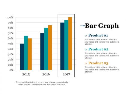
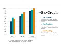
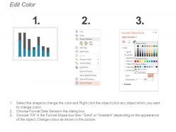
Showcase comparison with the help of Bar Graph PowerPoint Slide Ideas. You can determine different features by showing the correlation between two products using this comparison chart PPT template. Utilize this effective PPT slide to display a comparison between values from two categories. Track changes over time by using this bar chart graphic. Take advantage of this business chart template to show sales growth in business, financial comparison, etc. This vertical bar PPT template is useful for showing each data category in a frequency distribution. The bar graph summarizes a large data set in visual form. Use this bar chart to check the accuracy and reasonableness of calculation. This bar chart visual is appropriate for business, finance, and marketing. It is very easy to see a relation between different variables using a bar graph. Understand the data in an easy way by downloading this attention-grabbing bar diagram Powerpoint presentation.
People who downloaded this PowerPoint presentation also viewed the following :
Bar graph powerpoint slide ideas with all 5 slides:
Our Bar Graph Powerpoint Slide Ideas are empowering contributors. They enable achievement of dreams.
FAQs for Bar graph
Keep your bar graphs super simple - horizontal bars work way better when you've got long category names since vertical text is honestly annoying to read. I'd stick with maybe 3-5 colors tops and ditch all those gridlines that clutter things up. Sort your data logically (by value or alphabetically, whatever makes sense) and throw the actual numbers right on the bars if you can. Good contrast is key too. The whole point is people should get your message in like 3 seconds without squinting or getting confused.
Dude, color choice is everything for bar graphs! Use contrast to make your key data pop - like bold red for the important stuff, gray for the rest. Seriously, those rainbow charts are the worst and just confuse everyone. Stick with 2-3 colors tops. Oh, and don't forget colorblind people exist - test your colors! If it's for a client, work in their brand colors somehow. Here's something that works well: darker shades for bigger values creates this natural visual flow that just makes sense to people's brains.
Label your X and Y axes with bold fonts - make them big enough so people in the back can actually read them. You can put values right on the bars or use a legend if you've got multiple data sets. Honestly, nothing annoys me more than squinting at microscopic text during presentations lol. Go for "Q3 Revenue ($M)" instead of just "Revenue" or worse, "Rev." Oh and use PowerPoint's chart formatting tools rather than typing everything manually - saves you tons of time and keeps it all consistent.
Just think about what story you're telling. Vertical bars? Perfect for comparing categories like sales by region - way easier to read the labels. Long category names though? Go horizontal, trust me on this one. Grouped bars let you compare multiple things side by side, while stacked shows parts of a whole. I swear people make this harder than it needs to be! Quick test: are you comparing separate stuff, showing pieces of a total, or tracking time? That's literally all you need to figure out which format works best.
Just go with 2D, trust me. 3D looks cool but it's actually a pain - people can't tell if they're supposed to read the front or back of the bars, which is annoying as hell. The perspective messes with the values too, so your data ends up looking wrong. I learned this the hard way in a presentation once. 2D is way cleaner and people can actually understand what you're showing them. Only use 3D if you really need that flashy look and don't care about being super precise with the numbers.
Dude, animated bar charts are so much better than static ones! I usually make the bars grow from zero - it's like watching progress happen in real time. Sometimes I'll have them appear one by one, which builds this nice suspense as each data point shows up. The wipe effect is my go-to though, way cleaner looking than everything just popping in at once. Color changes work great too for highlighting the important stuff. Oh and definitely time it with what you're saying - nothing worse than your animation finishing before you're done talking about it. Start simple with basic grow effects, then get fancy later.
Don't cram everything into one chart - it just turns into visual chaos. Start your bars at zero or you're basically misleading people. Skip the 3D effects too, they look fancy but actually mess with how people read the data. Use colors that don't hurt people's eyes, and make sure your axes are labeled clearly. Bar width matters more than you'd think - too skinny or fat just looks weird. Honestly, if someone can't understand your chart in 5 seconds, you've probably overdone it. Simple beats flashy every time.
Oh totally, demographics make a huge difference! You've got to think about who's actually in the room. Older execs usually like those safe blue/gray colors and clean fonts - nothing too flashy. Younger crowds? They're fine with bold colors and trendy designs. Education level matters too - don't throw 15 data points at people who aren't data nerds. Keep it simple for non-technical folks. And honestly, color meanings vary so much by culture, especially if you're presenting internationally. I learned that one the hard way once. Just picture your actual audience first, then work backwards from there.
Go with something clean and minimal - you don't want your design fighting with your data. Side-by-side layouts work really well for comparisons. High contrast colors are key so people can actually see the differences quickly. Honestly? Basic PowerPoint templates are usually perfect for this stuff since they're built for readability. Just make sure there's enough white space around your bars. Oh, and use colors that are actually distinct from each other - I've seen too many graphs where everything looks the same shade of blue. Start with your company template and tweak it.
Three things to nail: color, text, and backup formats. High contrast is your friend, but don't make color do all the work—throw in some patterns or labels too. Font size matters more than you think. Go for 18pt minimum because squinting at tiny axis labels is the worst. Alt text for your visuals is clutch, plus maybe have the raw numbers ready as a handout. Oh, and talk through the main trends out loud when you're presenting. That way everyone stays in the loop no matter what their vision situation is.
Okay so the biggest thing is telling a story with your data, not just dumping numbers on people. Put your main point right in the title - like "Sales jumped 40% after product launch" instead of boring "Q3 Sales Data." I'm always tempted to cram every single data point in there but honestly? Less is more. Sort your bars logically (highest to lowest works great) and use color to highlight what actually matters. Keep the rest neutral. Add little notes explaining weird spikes or dips. Your audience should get the point in like 5 seconds max.
Dude, flip those bar graphs vertical for mobile - horizontal ones look terrible on phones. Make the bars thick enough that people can actually tap them without missing. I learned this the hard way after watching someone struggle with my tiny bars for like 30 seconds straight. Keep your text big and put labels outside the bars so they're readable. Only show 3-4 data points max or it gets messy. High contrast colors are your friend since people check phones everywhere. Complex stuff? Just split it across multiple slides instead of cramming everything together.
Dude, consistency is everything with bar graph slides. Same colors, fonts, axis scales - the whole nine yards. Otherwise your presentation looks super messy and people get distracted trying to figure out why slide 3 suddenly has different formatting. I made this mistake once and could literally see people in the meeting getting confused instead of focusing on my data. Short sentences work well. Longer ones help mix up the rhythm so it doesn't feel robotic. Create one template slide first, then just copy that format for all your graphs. Makes comparing data way easier and your story actually flows together. Trust me on this one.
Timeline bar graphs work great for this - put time on the x-axis and your values on the y-axis. Keep all your bars the same width and evenly spaced, otherwise it looks messy (learned this the hard way). Stick to one color if you're tracking one thing, or maybe 2-3 colors max if you're comparing stuff. Don't cram too many time periods together or it gets unreadable. I usually add the exact numbers on top of each bar since people love seeing precise values. Oh, and if the trend isn't super obvious, throw in a trend line to make your point clearer.
Dude, Think-Cell is a game changer for PowerPoint charts. Makes everything look super professional without the usual formatting nightmare. PowerBI works great too if you're dealing with tons of data. I wasted way too much time with PowerPoint's basic chart tools before finding these add-ins. XLCubed and ChartExpo are solid alternatives - especially for fancy visualizations. Honestly? Just try Think-Cell's free trial first. Once you see how smooth it is, you won't want to go back to fighting with regular PowerPoint charts. Trust me on this one.
-
It saves your time and decrease your efforts in half.
-
Innovative and Colorful designs.