


Horizontal bar graph with percentages






Try Before you Buy Download Free Sample Product
 Impress Your
 Audience
 100%
100% Editable
 Save Hours
 of Time


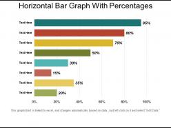
Introducing this Horizontal Bar Graph With Percentages PowerPoint presentation to showcase the comparison between various products. Using this statistical chart PPT layout, you can discuss the significance of illustrating data in the form of the bar chart to your employees. Tracking of marketing and sales figures can be represented using this bar graph PPT slide. The proportional value of a business variable can be represented in the length of the rectangle with the aid of our statistical interpretation PPT theme. Each product’s sale over a period of time can be easily tracked using this data evaluation tool PowerPoint theme. The discrete categories comparison can be showcased using this horizontal column chart PPT template. Additionally, the different products of your company can be highlighted with the help of this data analysis PowerPoint layout. Hence download this analytical data PowerPoint layout to show interrelation among variables over time.
People who downloaded this PowerPoint presentation also viewed the following :
Horizontal bar graph with percentages with all 5 slides:
Stand at ease with our Horizontal Bar Graph With Percentages. Deliver your ideas in a relaxed atmosphere.
FAQs for Horizontal bar
Honestly, readability is huge here. You get way more room for those long category names instead of cramming "Q3 Marketing Campaign Performance" into some weird sideways text that nobody wants to squint at. Horizontal bars just make sense too - we read left to right anyway, so comparisons feel more natural. Mobile's another thing - phones are tall, not wide, so horizontal works way better there. I always go horizontal when I've got wordy labels or I'm presenting on mobile. People can actually read the damn thing without tilting their heads.
Horizontal bar charts are honestly the way to go for comparing stuff. Your eyes just naturally scan left to right, so comparing bar lengths feels effortless. Long category names? No problem - they sit nicely on the left instead of getting all squished and rotated underneath like those awkward vertical charts (seriously, who likes craning their neck to read sideways text?). Since all the bars start from the same baseline, you can instantly spot what's bigger or smaller. They're also way better on phones - takes advantage of that vertical screen space. Once you hit 5 or more categories, horizontal bars make everything so much cleaner.
Horizontal bar charts are perfect for comparing different categories, especially when your labels are super long or you've got tons of categories. Pie charts? They're fine for parts-of-a-whole stuff, but honestly they get messy fast with more than 4-5 slices. Bar graphs let you actually read the values properly instead of squinting at tiny pie wedges. Also - and this might just be me - but trying to fit long category names around a circle always looks cramped. If you're showing rankings or changes over time, bars win every time. Quick test: ask yourself if you're showing pieces of one thing or comparing totally separate stuff.
Horizontal bars are honestly the way to go for this stuff. Put your category names on the left (y-axis) and values either inside the bars or right at the end - whatever looks cleaner. Don't be lazy with axis titles though - "Category" tells us nothing! Long names? Perfect, you've got way more space than vertical charts. I'd keep fonts consistent and skip rotating text since it's harder to read. Oh, and always include units in your labels. Maybe add a subtitle too so people actually know what they're looking at without having to guess.
Honestly, colors can totally make or break your bar graph. Go for contrasting ones so people can actually tell your categories apart - and don't forget about colorblind folks! I'd stick with whatever matches your presentation theme. Rainbow charts are... well, they're pretty awful unless you're presenting to five-year-olds. Highlight your important data with brighter colors, then tone down the less crucial stuff. Oh, and definitely test how it looks on your actual projector first - I learned that one the hard way when my "perfect" blue turned into muddy gray on screen.
Honestly, Excel's probably your best bet - it's way better than it used to be and handles the formatting pretty well. Tableau makes gorgeous charts but there's definitely a learning curve there. PowerPoint works fine too if you want everything in one spot for presentations. Oh and Google Sheets is clutch for team stuff since everyone can edit at once. I'd just go with whatever your team's already comfortable with tbh. You can always export it later and make it prettier if you need to.
Keep it under 15 categories max, trust me on this one. More than that and your chart looks like a hot mess. Group the tiny ones into "Other" or split into separate charts. Give those bars some breathing room by making the chart taller - cramped bars are painful to look at. Rotate your labels if they're getting cut off, or just use shorter names. I usually sort mine from highest to lowest so the pattern jumps out. Oh, and if someone has to lean in and squint? You've definitely overdone it.
Don't start your bars from anything but zero - it makes tiny differences look huge. Also, cramped bars are the worst. Order them in some logical way too, like biggest to smallest or alphabetical. Honestly, I see people mess up colors all the time - bright neon everything just distracts from what you're trying to show. Make your labels big enough to actually read! Skip the 3D effects completely. They look dated and make it impossible to compare values. Oh, and double-check that people can see where zero is on your chart.
Yeah, horizontal bar charts can totally work for time series! Put your time periods down the y-axis and let the bars stretch out horizontally. It's honestly way better when you've got long labels - no more squinting at sideways text. Plus our eyes read left to right anyway, so comparing values feels natural. You can do static snapshots or even animate the bars growing over time (though that might be overkill depending on your audience). Just keep your colors consistent and make sure the time labels are clear on the left side so people don't get lost.
Dude, horizontal bar charts are a game changer for presentations. Your audience can compare stuff instantly - like who's crushing it and who's not. Category labels aren't all squished up vertically either, which honestly looks terrible. They're perfect for ranking things like regional sales or survey results since we naturally read left to right anyway. Long category names? No problem - they actually fit without getting cut off. I started using them last year and people definitely pay more attention. Trust me, flip your next chart horizontal and watch how much easier it is for everyone to follow.
Horizontal bar graphs work great when your category names are super long - way better than squinting at sideways text. I usually drop them right after building up some tension in my presentation. Here's what works: animate each bar to appear separately so people don't scan ahead and miss your point. Color the most important bar in your brand color, leave the rest neutral. Honestly, I think of it more like storytelling than just showing data. Walk through each bar individually and explain what it actually means for them. Makes a huge difference.
Honestly, color is gonna be your biggest win here. Pick a bright or bold color for the bars you want people to notice, then keep everything else neutral. I'd also throw data labels right on those important bars - just don't label every single one because that looks awful. You could get creative with arrows pointing to key values or maybe some callout boxes if you're feeling fancy. Oh, and different bar patterns work too, though I don't see those used much anymore. Just don't go overboard - maybe highlight 2-3 things max or you'll confuse everyone.
Yeah, reading direction totally changes how people scan bar charts. Right-to-left cultures (Arabic, Hebrew) process the data flow differently than we do. Colors are tricky too - red means danger here but luck in China, which is kinda wild when you think about it. The whole "progress moves left-to-right" thing? Not universal at all. I'd definitely test your charts with people from different regions first. Clear labels help, and maybe stick with neutral colors unless you're sure about cultural meanings. You don't want someone misreading your data because of assumptions!
First thing - check your min and max values to figure out where your scale should actually start and end. You don't always have to begin at zero if it makes everything look flat (though yeah, some people get touchy about that). Pick increments that make sense so you can actually compare the bars without doing math in your head. Short bars are honestly fine if the differences matter. Also leave some wiggle room in case you get new data later that's higher or lower. The whole point is helping people spot differences quickly without making them work for it.
Dude, interactive horizontal bar charts are honestly a game-changer for presentations. Your audience can mess around with the data while you're talking - filtering stuff, highlighting bars, whatever. Way better than boring static charts that just sit there. People actually remember more when they can watch the data change as you explain things. Plus horizontal works great when you have those annoyingly long category names that look terrible stacked vertically (learned that one the hard way). Build in maybe 2-3 spots where you pause and let people actually process what they're seeing. Trust me, it's worth it.
-
Appreciate the research and its presentable format.
-
Unique and attractive product design.