

Data visualization





Try Before you Buy Download Free Sample Product
 Impress Your
 Audience
 100%
100% Editable
 Save Hours
 of Time


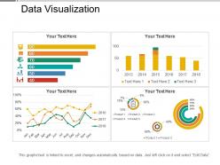
Use this Data Visualization PowerPoint presentation to communicate the company data to your employees. The quantitative data can be conveyed by using dots, lines, or bars, using this data visualization PPT layout. By using this visualization tools PowerPoint theme, the trends, outliers, and patterns in data can be identified with the help of a bar chart, histogram, scatterplot, Gantt chart, line chart, heat map, matrix, pie chart, etc. Professionals in fields of government, finance, marketing, history, consumer goods, service industries, education, sports and researchers can employ this statistical graphics PPT theme. The data analysis of the company can be effectively depicted using this descriptive statistical PowerPoint template. The advantages of data visualization can be discussed with your employees using this graphical PPT theme. You can explain the complex data in easy to understand manner using this statistical PowerPoint template. Hence download this data interpretation PPT layout to make large data sets coherent to different variables.
People who downloaded this PowerPoint presentation also viewed the following :
Data visualization with all 5 slides:
Experience creativity at it's best with our Data Visualization. You will find them an aesthetic delight.


FAQs for Data visualization
honestly, just focus on making it stupid simple. your audience should get the point in like 3 seconds max. bar charts work great for comparing stuff, line charts for trends over time - pretty straightforward. colors are tricky though - highlight what actually matters instead of just making it look nice (i always end up going overboard with pretty colors lol). keep text short but useful, and your title should basically tell people what they're supposed to think. oh and definitely test it on someone first! if they can't explain it back to you, it's too complicated.
Dude, visuals are a game-changer for presentations! Charts and infographics help people actually *get* your points instead of zoning out. Nobody wants to stare at endless bullet points - that's just cruel. Your brain processes images way faster than text anyway. I always throw in a visual every few minutes to keep things moving. Interactive stuff works great too since people can actually participate instead of just sitting there. Oh, and they give natural breaks in your talking so you're not just rambling nonstop. Seriously, try it once and you'll see how much more engaged everyone gets.
Don't cram everything onto one slide - it's overwhelming. Also, make your fonts big enough so people in the back can actually see them. Those terrible stock photos are the worst (you know, the awkward handshake ones). Pick simple colors and stick with them. Never just read your slides out loud - honestly, it's so annoying and people read faster than you talk anyway. Oh, and test everything beforehand on the actual screen you'll use. Technology always fails at the worst moment, so have a backup ready just in case.
Honestly, colors can totally make or break your charts. People won't be able to read your data if you mess this up. For continuous stuff, use sequential colors - like light blue to dark blue. Diverging palettes work when there's a natural middle point. I learned this the hard way, but never use more than 3-5 colors for categories or it gets chaotic. Also think about colorblind folks who can't tell red from green apart. Here's what saved me tons of headaches: always check your chart in grayscale first. If it still makes sense without color, you're golden.
Okay so storytelling is literally what makes data presentations worth watching instead of putting people to sleep. Think coffee chat with a friend - you've got this interesting thing that happened, right? Same deal here. Set up the problem first, walk them through what you found in the data, then hit them with your big insight. Your charts should back up that story flow, not just be random numbers thrown on slides. Honestly, most people do this backwards - they make all these visuals first then try to squeeze meaning out of them later. Start with your main point instead, then build everything around that. Way more effective that way.
Honestly, infographics are amazing because they turn overwhelming data into something you can actually understand at a glance. Most of us are visual learners anyway - I know I'd rather look at a colorful chart than read through some boring spreadsheet. They work by using icons, simple charts, and colors that guide your eye through the info naturally. The trick is keeping everything consistent and not cramming too much in. Figure out your main point first, then build the visuals around that. Oh, and use simple language! No one wants to decode fancy jargon when they're just trying to get the gist of something quickly.
Honestly, just start with Canva - it's ridiculously easy and has templates for everything. Adobe Creative Suite is obviously the pro choice but ugh, the learning curve is brutal. Tableau and Power BI are your best friends for turning boring spreadsheets into actually cool charts. Oh, and Figma's clutch if you're working with other people on designs. I'd say mess around with Canva first since it's free anyway, then figure out what else you need from there. You'll probably know pretty quickly if you need something more powerful.
Okay so first rule: stick to max 6 bullet points per slide, 6 words each. Let your visuals do the talking while you fill in the gaps. Nobody wants to squint at paragraphs while you're presenting anyway - that's just awkward for everyone. Save text for headlines, key points, or numbers that need to be exact. Charts and images should carry the story. Here's my test: if someone gets your whole message just from reading the slides silently, you've crammed too much text in there. Your slides should back you up, not do your job for you.
Interactive dashboards are everywhere now, plus people are really into data storytelling - like actually making your data flow with a narrative. Real-time collaborative stuff too. Most folks are ditching static PowerPoint for tools like Tableau, Figma, or Miro during live presentations. Animation and micro-interactions are having a moment - those little transitions that guide people's eyes through your data points. The bar keeps getting higher each year, which is honestly exhausting sometimes. But the main thing? Your data needs to tell a story, not just dump charts on people. Start small though - just try one interactive element next time, even clickable sections.
Dude, interactive visualizations are game-changers because people can actually *do* stuff with your data instead of just staring at boring slides. Let them click around, filter things, hover for details - suddenly they're invested. When someone discovers something themselves by drilling down into a chart, they'll remember it way better than if you just told them. It's like the difference between being handed directions vs. exploring a new city yourself (okay maybe that's dramatic but you get it). Start small though - even simple hover tooltips make people feel more engaged. Trust me, it works.
Three things I'd track: accuracy, efficiency, and engagement. Can people actually understand what your data's saying? How fast do they get insights? And honestly, do they even want to dig into it or just glance and move on? I used to obsess over making charts super polished but realized those three beat pretty visuals every time. Oh and think about who's looking at this stuff - your CEO wants different things than the analyst sitting next to you. Just grab a couple coworkers and have them walk through what they're seeing. You'll learn more in 10 minutes than hours of tweaking colors.
Pick one message per chart - seriously, don't try cramming everything in. Make text big enough so people in back can actually see it. Your colors need to mean something (rainbow pie charts are the worst). Bars work for comparing stuff, lines show trends, pie charts only for parts of a whole. Label your axes and include units - sounds obvious but you'd be surprised. Here's what helped me: figure out your main point first, then build the visual around it. If you can't explain what the chart shows in one sentence, start over.
Yeah, visuals get tricky when you're dealing with different cultures. Colors are huge - red screams danger here but it's lucky in China. Then there's reading patterns too. Some folks scan right-to-left, which totally changes how they follow your data. Individual vs group metrics? That hits different depending on whether people are more collectivist or individualist. Honestly, chart types can even be cultural - what looks normal to us might confuse someone else. Best thing you can do is research your audience first and maybe test with a few people from different backgrounds if you can swing it.
So basically you want your charts to work for everyone, right? Think color contrast and alt text for screen readers. Don't just rely on color coding either - colorblind people will hate you for that lol. Font sizes matter too, and honestly I always throw in a data table backup just in case. Two quick wins: check if your stuff looks okay in grayscale, and write actual descriptive titles instead of just "Chart 1." Once you start doing it, it becomes second nature. Way easier than people make it sound.
Dude, keep your animations super simple - fade or slide, that's it. Don't get fancy with spinning text or crazy effects (trust me, I've seen people literally get motion sick from presentations). Pick one style and stick with it throughout. The timing matters more than you'd think. Too slow and people zone out waiting. Too fast feels jarky. Test everything beforehand! Seriously, tech always fails when you need it most. Have a backup version without animations ready to go. Your transitions should basically be invisible - just smoothly moving people's attention where you want it.
-
Top Quality presentations that are easily editable.
-
Presentation Design is very nice, good work with the content as well.