


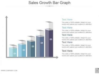
Sales growth bar graph powerpoint templates




Try Before you Buy Download Free Sample Product
 Impress Your
 Audience
 100%
100% Editable
 Save Hours
 of Time


Establish your credentials with our Sales Growth Bar Graph Powerpoint Templates. They will certify your capability.
People who downloaded this PowerPoint presentation also viewed the following :
Sales growth bar graph powerpoint templates with all 5 slides:
Ensure good humor is infectious with our Sales Growth Bar Graph Powerpoint Templates. It will create a jolly epidemic.
FAQs for Sales growth bar
Start with your current numbers - revenue trends, conversion rates, all that baseline stuff. Growth targets come next with realistic timelines, then dive into your actual strategies (new markets, product launches, whatever fits). Budget breakdown is crucial because they'll definitely ask about resources needed. Oh, and make sure you've got clear metrics for tracking progress - execs get weird about measurable outcomes. Charts and graphs are your friend here, honestly leadership eats that visual stuff up. Each slide should build on the last one so your whole argument flows logically. Sounds boring but it works.
Dude, people's eyes literally glaze over when you show them raw spreadsheet data - it's brutal to watch. But charts and graphs? They actually tell a story people can follow. You're basically creating a journey from where you started to where you're going, with all the turning points in between. Colors help too - use them to highlight your wins vs. the rough patches. Icons make those abstract numbers feel real somehow. Oh and stick with a consistent color scheme throughout, trust me on this. Progressive reveal keeps them hooked instead of overwhelming them with everything at once.
Track your revenue growth for sure, but dig deeper - split it between new customers vs existing ones. Conversion rates at each funnel stage matter too, plus average deal size. Sales cycle length is honestly where I see most people mess up because it shows if you're actually getting faster at closing or just landing whale clients. Activity stuff like calls, demos, qualified leads - yeah, track those. The trick is pairing what happened (outcomes) with what caused it (activities). That way you can actually figure out what's working instead of just guessing.
You gotta swap out the metrics and lingo for each industry's vibe. B2B tech cares about MRR growth and acquisition costs. Retail? All about seasonal patterns and inventory turnover. Healthcare is ridiculously strict about compliance stuff - like, every document needs approval from three people. Manufacturing deals with way longer sales cycles, so build those relationship frameworks in. Keep your basic template structure but switch up the KPIs and timelines. Oh, and actually use the words each industry uses - don't sound like an outsider. I'd dig into maybe 4-5 case studies from each sector first to get the language down.
Honestly, customer segmentation is what separates the pros from people just winging it with random data. Break your customers into groups - demographics, spending habits, whatever makes sense for your business. Each segment needs its own numbers and game plan though. This way when you're pitching growth strategies, you can actually explain WHY you're going after certain groups first. Way better than that "let's target everyone!" approach that makes executives roll their eyes. Plus it gives your whole presentation more weight since you're showing real market knowledge instead of just hoping something sticks.
So here's the thing - a sales growth template gets your marketing and sales teams actually talking to each other instead of doing their own random stuff. You'll map out the same metrics, figure out what counts as a real lead (finally!), and nail down who does what when. No more of that "well marketing thinks this but sales thinks that" nonsense. It forces everyone to write down their processes and work toward the same goals instead of just hitting their individual numbers. Oh, and definitely use it in your next quarterly meeting - that's when you can actually get people to agree on definitions without it turning into a whole thing.
Honestly, less is more with colors - stick to 2-3 max or your slides look like a mess. I always use green for good numbers, red for bad ones, plus maybe blue or gray for background stuff. Just make sure people in the back can actually see it! Oh and skip the red-green thing since some people are colorblind. Here's what I do: print everything in black and white first. If you can still tell what's happening, you're good to go. Sounds boring but it works.
Put your case studies right after you pitch a solution - that's when people are like "okay but does this actually work?" Keep them crazy short, maybe 2-3 sentences because honestly nobody wants to read a whole story. Numbers are your best friend here, and pick examples that actually match what your prospect is dealing with. I've got maybe 5 or 6 solid case studies that I can just swap in and out depending on the situation. Oh and don't make them sound too polished - relevant beats impressive every time.
Honestly, the biggest screwup is overcomplicating your template right off the bat. You'll build this monster spreadsheet and then never touch it again. Focus on maybe 3-5 things that actually matter - lead conversion, deal size, sales cycle time. That's it. I've seen people try tracking like 20 different metrics and it's just... why? Don't make it super rigid either. Your business changes, so should your template. And here's the thing - the prettiest dashboard is useless if nobody updates it. Start simple, run it for a month, then tweak what's not working.
Dude, throw in some polls and clickable stuff during your presentation! Let people vote on which growth strategy sounds best or click through different scenarios. Nobody wants to sit there while you drone on about numbers - trust me, I've watched way too many people's eyes glaze over during those things. Live surveys work great too, especially when people can share what problems they're actually dealing with. Short discussion breaks tied to your data keep everyone engaged. The whole point is making them feel involved instead of just sitting there listening to you talk at them.
Honestly, your CTA is what separates presentations that actually move the needle from ones that just get polite applause. Without it, people walk away thinking "nice charts, but what am I supposed to do now?" - which is basically presentation death. You need to be super specific about the next step. Don't just say "let's move forward" - tell them to schedule the follow-up by Friday, approve the Q3 budget, whatever. I've seen too many great presentations fall flat because they ended with some wishy-washy "thanks for listening" instead of a real ask. Give them one clear action before they pack up their laptops.
So for historical data, line charts work great for showing revenue trends - way better than just tables everywhere. Put your raw numbers on one side, then add the actual analysis right next to it. Color code the good/bad growth so it pops visually. Honestly, I've seen too many reports that just dump Excel sheets and call it a day - nobody wants to dig through that mess. Add quick notes explaining any weird spikes or drops. The whole point is making it super scannable. People should spot the important stuff in like 30 seconds max.
Dude, you HAVE to include competitive analysis. Stakeholders want proof you're not just guessing about market conditions. Show them what competitors are doing with pricing and positioning - makes your whole strategy look way more legit. When you ask for budget later, having that competitor data backing you up is clutch. Plus it proves you actually researched instead of winging it. I'd say grab 2-3 main competitors with real numbers. Honestly, skipping this step is how strategies fall apart when reality hits.
Put testimonials right after you pitch your solution, but before you hit them with pricing. Skip the generic "amazing service!" garbage - nobody cares. Get specific quotes about actual results instead. Names, companies, job titles make it legit. Honestly, video testimonials crush it if you can get them, but even headshots with company logos work great. Make sure they're easy to scan through quickly. Here's what really works though - match your testimonials to whoever you're pitching. Swap in 2-3 that fit their industry or situation perfectly.
Make it modular so different teams can swap out sections - like SaaS metrics vs retail benchmarks. Set up dropdowns and variables for time periods, KPIs, that stuff. Nobody uses those rigid "universal" templates, trust me. Add conditional formatting that shows relevant parts based on team size or whatever. Smart defaults are clutch here - people want customization but don't want to rebuild everything from zero. Oh, and make sure your formulas don't break when they start tweaking things.
-
Colors used are bright and distinctive.
-
Easy to edit slides with easy to understand instructions.