


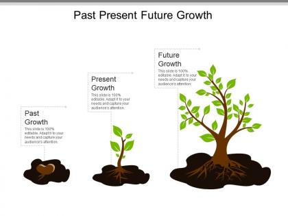
Past present future growth powerpoint templates




Try Before you Buy Download Free Sample Product
 Impress Your
 Audience
 100%
100% Editable
 Save Hours
 of Time


Create conditions that accelerate growth with our Past Present Future Growth Powerpoint Templates. It is designed to facilitate.
People who downloaded this PowerPoint presentation also viewed the following :
Past present future growth powerpoint templates with all 5 slides:
Our Past Present Future Growth Powerpoint Templates allow individuals to indulge their fancies. It caters for idiosyncracies.
FAQs for Past present future
Build it with flexible pieces that work everywhere. Start with goal frameworks you can customize, plus KPI sections that adapt to whatever metrics matter. Modular strategy bits you can swap around are clutch. Don't forget stakeholder mapping - every industry's got different key players. Risk assessment and timeline stuff too, though honestly timelines always mess people up since B2B moves so differently than consumer. Regular review checkpoints are huge. The whole point is making something structured but not rigid - like, a SaaS startup and manufacturing company should both be able to use it without weird workarounds.
Honestly, visual design is a game-changer for making your growth template actually readable. Color-code your key metrics so they pop. Mix up font sizes to create a hierarchy - your eyes know where to look first. Charts and progress bars beat boring raw numbers every day of the week. Nobody's got time to decode a wall of spreadsheet hell, you know? White space helps too - gives your brain room to breathe. The whole point is making complex stuff feel simple so your team can spot trends fast instead of drowning in data chaos.
Okay so basically start with real customer stories instead of boring numbers. Nobody cares about metrics upfront - they want to see actual people succeeding. Structure it like: problem they faced, how you helped, what changed for them. Make it feel like a mini journey, you know? Use specific details and actual customer names if you can. The whole point is making readers think "oh shit, that could be me." I always tell people to focus on the transformation part - that's where the magic happens. Keep it concrete though, not vague "increased efficiency by 40%" nonsense. Show them exactly what life looks like after working with you.
Honestly, stick to the big three that actually matter: user growth, revenue percentages, and how well you're keeping people around. Conversion rates and customer lifetime value are clutch too - shows you're not just burning cash on acquiring users who bounce immediately. Maybe toss in some engagement stuff or pipeline health depending on what kind of business you're running. But seriously, don't go overboard with like 15 different charts. Five to seven solid metrics tops. People's eyes glaze over otherwise. Pick whatever best shows you're actually moving the needle and connects to what you're trying to build.
Honestly, your audience totally determines how you should set up your growth template. B2B folks want all the proof - case studies, ROI breakdowns, the whole nine yards. Their buying process drags on forever, so you need multiple touchpoints and educational stuff baked in. Consumer audiences are way different though. They decide faster and respond better to social proof and those "limited time" pushes. Enterprise clients? They're probably the pickiest - they want stakeholder materials and detailed calculations before they'll even consider it. The real trick is actually studying how YOUR specific audience makes decisions instead of just copying some template that worked for a completely different market.
Honestly, color psychology is such a game-changer for growth stuff. Green makes people think "trust" and "growth" - perfect for those signup forms you're testing. Orange creates this sense of urgency that's killer for CTAs. Red can boost conversions but don't go crazy with it or you'll just stress everyone out (learned that the hard way). Blue feels super safe and reliable, which is probably why every SaaS company ever uses it. You basically want to match whatever color you pick to the exact action you need people to take. Each part of your funnel should feel intentional, you know?
So it really depends on what stage your company's at. Startups should go all-in on experimenting fast, grabbing users, and nailing product-market fit - we're talking weekly sprints and pretty aggressive targets. Bigger companies? They're better off optimizing what already works and focusing on keeping customers around. Honestly, the startup thing is just throwing stuff at the wall and seeing what sticks. More established businesses can actually plan ahead without everything changing next week. Figure out if you're still discovering what works or if you're trying to make existing stuff better, then match your templates to how much risk you can handle.
One metric per chart - seriously, cramped dashboards are the worst. Your team needs to instantly get what they're seeing, so stick with the same colors across everything. I've watched so many gorgeous visuals just sit there unused because they're impossible to decode! Always throw in comparison data like last quarter or industry benchmarks. Interactive stuff is cool if people will actually click around, but honestly? Static works fine too. Put your biggest growth number right at the top where it smacks people in the face first thing. Oh, and definitely test layouts with your actual team - they'll tell you what actually gets them moving.
Look, shared growth templates are basically like giving everyone the same roadmap. Everyone tracks stuff the same way and knows what success actually looks like. You can see what your teammates are doing, share wins and problems as they happen. Way better than everyone doing their own thing in separate bubbles, you know? The real benefit is spotting patterns when everyone uses the same format - though good luck getting people to actually use them consistently! I'd start simple: pick one template and do weekly check-ins where people share updates using it.
Honestly, the worst thing you can do is make them super rigid. People try cramming every situation into the exact same format and it just doesn't work like that. Also - and I learned this the hard way - if your template has like 15 steps, nobody's gonna bother using it. Way too complicated. Another trap is basing everything on one win. Just because something worked once doesn't mean it'll work every time, you know? Test your template on a few different scenarios first. I've watched entire teams spin their wheels for weeks because they skipped that part. Keep it flexible, not too fancy, and definitely try it on something small before you go all-in.
Don't just make templates that show data - build in sections that force action. Like "What does this mean?" and "Who's doing what by when?" I've watched so many gorgeous reports get completely ignored because nobody knew what to do next. Your template should make people uncomfortable if they can't answer the "so what are we actually changing?" part. Short sentences work. But also mix in some longer ones that actually flow naturally when you read them out loud. If someone can breeze through your template without thinking, you've missed the point entirely.
I'd go with **Notion** or **Airtable** for growth templates - both let you build custom frameworks that teams actually want to use. Notion's my personal favorite since you can make those clean visual templates with databases and charts built right in. **Google Sheets** with some custom formulas works great too if you're more of a spreadsheet person. Oh, and **Miro** or **FigJam** are perfect when you want something visual for mapping strategies with your team. But honestly? The biggest thing is keeping your template dead simple - if it's too complicated, people just won't use it consistently.
Honestly, just bake the feedback stuff right into your templates from the start. Add checkpoint reviews and simple forms for people to fill out after big milestones. I always include a "what's broken" section - you'd be amazed how candid people get when you just ask straight up. Track specific metrics at each stage, then do monthly reviews comparing what actually happened vs. your original plan. The trick is making it automatic instead of scrambling to collect feedback later. Oh, and don't overthink the forms - keep them dead simple or nobody will bother filling them out.
Oh man, this stuff is trickier than people think! Colors are huge - red screams "danger" here but it's lucky in China. White means purity to us but mourning in parts of Asia. Germans want you to be super direct, while Japanese customers prefer hints and subtlety. Don't forget reading direction either (Arabic goes right-to-left). Religious holidays can totally throw off your timing too. I learned this the hard way on a project once - we almost launched during Ramadan! My advice? Research your markets like crazy and test everything with actual locals first. You'll save yourself major headaches.
Build your growth templates like building blocks you can mix and match - way better than rigid frameworks that break when things change. Learned this when ChatGPT hit and our whole content strategy went sideways lol. Create "trend spots" where you drop in new channels or tactics as they pop up. Do quarterly check-ins to see what's dead weight. Join communities where people actually share what works (not just theory). Follow good industry newsletters too. The whole point is your templates should grow with you, not trap you in last year's playbook.
-
Visually stunning presentation, love the content.
-
Design layout is very impressive.