


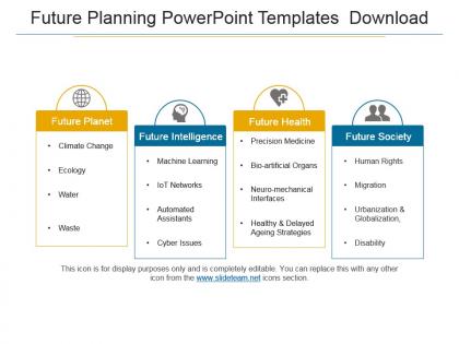
Future planning powerpoint templates download




Try Before you Buy Download Free Sample Product
 Impress Your
 Audience
 100%
100% Editable
 Save Hours
 of Time


Begin brilliantly with our Future Planning Powerpoint Templates Download. They make for an excellent gambit.
People who downloaded this PowerPoint presentation also viewed the following :
Future planning powerpoint templates download with all 5 slides:
Endure any hardship with our Future Planning Powerpoint Templates Download. They will handle your thoughts with great care.

FAQs for Future planning
Honestly, start with timeline slides - those milestone markers are lifesavers. SWOT analysis templates help with the strategic stuff, plus goal-setting sections where you can actually measure results. Budget and team assignment slides are pretty crucial too. I'd throw in risk assessment pages because something always goes sideways (learned that the hard way). Progress tracking keeps you honest about where things stand. If you're working with different departments, stakeholder mapping slides save so much confusion later. Keep everything visual since you'll be tweaking constantly. Just pick one template and build from there - way easier than starting from scratch.
Dude, visuals are a game-changer for planning presentations. People need to *see* the roadmap, not just hear you talk about it. Timeline graphics and milestone charts make everything click - way better than boring bullet points about Q3 goals. Plus they help with those messy interdependencies that are impossible to explain otherwise. I always throw in resource allocation charts and progress dashboards too. Makes the whole thing feel more real, you know? Your audience will actually stay awake and maybe even get excited about the plan. Trust me on this one.
Timeline charts and roadmaps are perfect for future planning stuff - they make everything way clearer. Gantt charts work well if you've got detailed project phases to map out. I really like those scenario comparison charts that show different outcomes side by side. Super helpful for getting buy-in from stakeholders. Growth projections are solid for financial planning presentations too. Oh, and anything showing progression over time is your friend here. One thing though - stick with clean, simple templates. You don't want flashy graphics competing with your actual data. That's honestly my biggest pet peeve with most chart designs.
Oh totally! Your industry matters way more than you'd think for templates. Tech companies love those clean, data-heavy layouts with tons of charts. Creative agencies? They go wild with visual storytelling stuff. Finance and healthcare play it super safe - boring colors, structured everything because compliance is a nightmare. Manufacturing needs all those timeline and resource sections (honestly makes my head spin). It's wild how you can guess someone's industry just from their slide style! Just match whatever vibe your field expects and you'll look way more legit to stakeholders.
So I always work backwards from the finish line - helps catch those "wait, that's impossible" moments early. Make it visual with colors or whatever so people can scan quickly. Don't dump every tiny detail in there, honestly it just becomes a hot mess. Focus on the big stuff your audience cares about. Buffer time is non-negotiable because literally everything takes longer than you think it will. Keep your date formatting consistent and text short. The whole thing should tell a story right away - I usually test mine on my coworker who wasn't involved. If she's confused, back to the drawing board.
Templates are total lifesavers for strategic planning - you're not reinventing the wheel every single time. They come with sections already mapped out for trend analysis, scenario planning, risk stuff. Honestly? It's such a time saver. Your team can actually focus on the real thinking instead of stressing about slide layouts or forgetting key pieces. Everyone stays on the same format too, which makes comparing insights between departments way less of a headache. I'd grab a basic foresight template first, then tweak it to fit however your company does planning cycles.
Dude, storytelling makes ALL the difference in planning presentations. People zone out with spreadsheets and data dumps - but give them a story? Now you've got their attention. Paint the picture: here's where we are now, here's our amazing future, and here's the path to get there. Makes everything feel real instead of just theoretical nonsense. Your audience needs to actually see themselves in that future success story. Trust me, I've sat through way too many boring strategy meetings. The ones that stick? They always have that clear narrative arc that gets people genuinely excited about what's coming next.
Honestly, it's all about knowing your audience. Executives want data-heavy stuff - ROI numbers, strategic timelines, that whole nine yards. Younger teams? Go modern and interactive because they actually engage with that stuff. Don't use jargon with general audiences, but specialists expect industry terms. Oh, and color schemes matter more than you'd think - especially with global teams since cultural preferences are real. Short version: match your content depth to what clicks with each group. Some want surface level, others want to dive deep into the weeds.
SWOT analysis makes your presentations way more credible because you're showing you've actually done your homework. Instead of just wishful thinking, you're being real about your strengths and weaknesses while spotting actual opportunities. The threat part is huge too - shows you know what could mess things up. Honestly, stakeholders eat this stuff up because it proves you're not being overly optimistic about everything. It's kinda like showing your work in math class but for business strategy. Drop a clean SWOT slide early in your deck before jumping into the fun planning stuff.
Dude, interactive stuff is a game-changer for planning presentations. Like, instead of just talking at people, you can add clickable timelines where they explore different phases themselves. Polls work great too - get real-time input on what they think matters most. Even basic hover effects that show extra milestone details make a huge difference. People literally sit up straighter when they can click around! I mean, who doesn't love discovering things on their own? Start with just one interactive timeline next time. You'll be shocked how much better the questions get afterward.
Generic templates are such a pain for strategic planning stuff. They're made for regular business presentations, so you end up wrestling with layouts that don't work for roadmaps or timeline visuals. Most don't have the right setup for scenario planning either - I learned this the hard way last quarter. Your audience gets lost because the flow doesn't match how people actually think about future planning. Short sentences and weird visual hierarchy everywhere. Find templates built specifically for strategic work instead, trust me on this one.
Templates are a game changer - everyone works within the same structure instead of doing their own random thing. You can split sections by expertise too. Like Sarah does market stuff, Mike handles resources. Makes merging everything so much easier since you're not dealing with completely different formats. Honestly, beats those messy brainstorming meetings where nothing gets decided. Plus you'll actually spot the gaps in your plan when everything's organized the same way. Just match people's strengths to the right sections and you're golden.
Look for templates with solid timeline visuals and goal-setting sections already built in. SWOT analysis slides are clutch too. Honestly, most templates are way too messy - you'll spend forever just trying to make sense of them. The good ones have editable budget charts and spots for risk planning. Short-term vs long-term goals? Make sure it handles both. Oh, and consistent formatting is huge because nobody wants to mess with fonts all day. Find something that works for quarterly stuff but also scales up if you're doing those crazy five-year plans.
Honestly, start with modular pieces instead of rebuilding everything from scratch each time. Mix and match components when priorities change - trust me, I've watched teams burn hours redoing entire decks every quarter. Build assumption trackers, risk matrices, scenario planning stuff that works no matter what gets thrown at you. Short sentences work. Longer ones with natural flow help break things up and keep it readable. Also - and this might sound obvious but people forget - set up quarterly reviews with your team to catch outdated sections before they become a headache. Keep templates as living documents, not something you create once and never touch again.
Don't cram everything onto one slide - those templates are already visually busy. Also, watch your color choices so text stays readable. I've seen so many people go overboard with flashy animations thinking it looks "futuristic" but honestly? Super distracting. Stick to 2-3 fonts max and keep them consistent. Oh, and make sure your timeline actually makes sense for what you're planning - I can't tell you how many times I've seen wonky scales that don't match the project scope. Focus on getting your content structure right first, then make it look good.
-
Great product with highly impressive and engaging designs.
-
Unique research projects to present in meeting.