


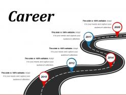
Career powerpoint slide templates download





Try Before you Buy Download Free Sample Product
 Impress Your
 Audience
 100%
100% Editable
 Save Hours
 of Time


We've compiled a team of expert designers to develop a collection of Career Powerpoint Slide Templates Download. With thousands of designs to choose from we should have the perfect solution to your presentation needs.
People who downloaded this PowerPoint presentation also viewed the following :
Career powerpoint slide templates download with all 5 slides:
Employ a bit of humour to administer the dose with our Career Powerpoint Slide Templates Download. Indulge in a few jokes.
FAQs for Career powerpoint
Go with clean layouts and stick to professional colors - blues, grays, nothing too flashy. White space is your friend here. I've literally watched people bomb presentations because their template had these ridiculous spinning animations that made everyone dizzy lol. Your template needs clear sections for accomplishments and contact info. Don't get fancy with fonts either - consistency matters more than creativity. The whole point is showcasing your work, not proving you're some design genius. Pick something polished but flexible so you can tweak slides for different audiences without starting from scratch.
Honestly, a good template makes you look way more put-together than you probably are. People are so used to seeing garbage PowerPoints that anything clean automatically stands out. Plus it keeps you organized during presentations - like, you won't forget to mention that big project because the layout reminds you. Visual consistency is clutch too since recruiters can focus on what you're saying instead of getting distracted by wonky fonts. I'd grab one that matches your field's vibe and throw in some personal touches. Trust me, it's worth the five minutes.
Go with clean fonts - Calibri or Arial work great. Stick to conservative colors like navy or dark gray instead of anything bright and distracting. Keep your spacing consistent throughout and make sure you have spots for bullet points since everyone loves those in career stuff. Honestly, I'd avoid flashy templates completely because they just pull attention from what you're actually saying. You'll need different slide layouts: title slides, content ones with image spots, maybe some comparison charts. The whole thing should look polished without being stuffy - you want them focused on your skills, not wondering why you chose comic sans or something weird.
Oh totally, colors make a huge difference! I learned this the hard way when I wore bright orange to a board meeting once - felt like I was hosting a kids' party lol. Blues and grays are your safest bet for looking professional and trustworthy. Burgundy or forest green work too if you want something warmer but still confident. Don't go crazy with too many colors though - 2 or 3 max or you'll look all over the place. Start with your company's brand colors if they have them, then maybe add one neutral. Works every time.
Oh definitely anyone in consulting, sales, or marketing - they're presenting to clients constantly so good templates are a game-changer. Training and education folks too. I've literally seen deals probably tank because of ugly default PowerPoint slides, it's painful! Product managers and analysts also benefit huge since they're always pitching ideas internally. Even team leads need this stuff. The time you'll save is insane. Just pick something that actually fits your industry's style and doesn't look like everyone else's boring presentations. Oh, and make sure it matches your personal brand too.
Dude, don't cram a novel onto each slide - makes it impossible to read. Those cookie-cutter templates? Skip them, they look lazy honestly. Go with clean colors that won't hurt people's eyes. Animations are usually overkill unless you're presenting to kindergarteners lol. Make your font big enough so the person in the back row isn't squinting. Typos will make you look sloppy, so double-check everything. Oh and give your content some breathing room - white space is your friend. Focus on good visuals instead of walls of text.
Swap out the colors for your brand palette first - that makes the biggest difference. Upload your own fonts too, they're way better than the generic ones. Replace any placeholder logos with your headshot or logo. Most templates let you change colors super quickly, which is honestly the fun part once you figure it out. Keep everything consistent across slides though. Oh, and definitely update those boring stock icons with ones that actually match your field. The whole point is making it feel like YOU while still looking professional, you know?
Dude, typography can totally make or break your presentation. Poor font choices? You'll look amateur even if your content's solid. I've watched people bomb just because their slides looked messy. Clean fonts like Calibri work great - nothing fancy needed. Keep your sizing consistent and make headers pop so people can actually follow along. Honestly, most hiring managers are skimming fast, so readable text guides their eyes where you want. It's one of those small things that screams "I pay attention to details" without saying it.
Oh definitely! Your brain just processes visuals way faster than text - it's kinda wild how that works. So instead of droning on about achievements with bullet points, infographics turn your career story into something people actually want to look at. Timelines, skill charts, project outcomes... they become talking points instead of snooze-fest slides. I started doing this last year and honestly? The difference is night and day. People ask questions, they remember what you showed them. You don't need anything fancy either - basic icons and simple charts work great. Makes presentations feel way more interactive.
Oh totally! Finance and consulting folks want super clean layouts - tons of charts, boring colors, all business. But if you're in marketing or design? Go wild with the visuals and personality. Healthcare sticks to blues and whites (trust me, they're obsessed with looking "trustworthy"). Tech companies are all about that minimalist thing with clean fonts. Honestly, just creep on LinkedIn and see what presentations people in your field are actually posting - way better than guessing what works.
Dude, seriously - clean visuals only. High-quality icons, simple charts, photos that actually connect to your story. I swear half the presentations I see have these random stock photos that mean absolutely nothing. Your visuals should back up what you're saying, not pull attention away. Pick a color scheme that looks polished without being snooze-worthy. White space is clutch - don't jam everything together like you're running out of room. And for the love of all that's holy, no 2003 clipart! One strong visual per slide. Build from there.
Think of animations like telling your career story in person - you wouldn't dump everything at once, right? Start simple with fade-ins for bullet points or smooth slides between jobs. Progressive reveals work great for timelines too. The trick is keeping motion super subtle because nobody wants to get dizzy scrolling through someone's resume (learned that the hard way). Transitions can actually show how your roles connect naturally. It's basically creating visual flow that matches how you'd explain your path out loud. Don't go overboard though - less is definitely more here.
Dude, templates are honestly a game changer when you're swamped. You skip all that formatting nightmare stuff and get something that actually looks decent. The colors match, everything's aligned properly - you know how I am with making things look even lol. Sure, you can't go totally wild with creativity, but for work stuff like portfolio reviews? That clean structure is perfect. I always grab a template first, then mess around with the fonts or colors to make it feel less generic. Way better than starting from scratch and spending three hours on slide layouts.
Look, making your PowerPoint accessible isn't just nice - it's smart career strategy. Use high contrast colors and readable fonts so screen readers work properly. Alt text for images is clutch too. Don't rely on color alone to make your point (learned this the hard way once). Captions for any videos you include. I know it sounds like extra work, but honestly? You'll reach way more people and employers notice when you think inclusively. Plus it's just good practice we should all be doing anyway. Makes your presentations better for everyone, not just people with disabilities.
For career presentations, I'd definitely check out Canva first - their templates are way better than the basic PowerPoint ones everyone uses. Slidesgo is another solid choice, though I always get distracted browsing their designs for like an hour lol. Microsoft does have some decent options in their template gallery if you're already working in PowerPoint. Google Slides works too if that's your thing. Just don't go with anything too generic or obviously templated. You want something clean that actually reflects your style, not something that looks like 50 other people used it.
-
Out of the box and creative design.
-
Use of different colors is good. It's simple and attractive.