


Executive summary powerpoint slide download


Try Before you Buy Download Free Sample Product
 Impress Your
 Audience
Editable
of Time


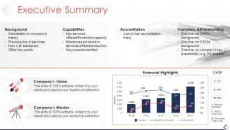
Give a precise summary of your business to your audience with Executive Summary PowerPoint Slide Download slideshow. You can add details of company history, previous lines of services, etc. Mention the key clients, market leaders, key USP, and major accreditations for your company. Address the areas and issues that need to be focused through a summary. Showcase the key services, milestones achieved, and capabilities by using this effective PowerPoint graphic. Impress your audience including investors, lenders, your employees, customers, and suppliers using this PowerPoint slide design. Also, mention key projects handled, list of accreditation, prompting, and sharing details. Vision and Mission of the company can be showcased by using this company profile PowerPoint visual. Seek capital investment by attracting investors with the help of this company summary PPT template. You can communicate effortlessly with your audience using a brief executive summary of your business plan. The structure and content of the PowerPoint presentation are kept clear and understandable for the target audience. Thus, download our business PowerPoint presentation immediately.
People who downloaded this PowerPoint presentation also viewed the following :
Executive summary powerpoint slide download with all 5 slides:
Empower the infirm with our Executive Summary Powerpoint Slide Download. Enable them to conquer disability.
FAQs for Executive summary
Okay so for your exec summary slide, you basically need four things: what problem you're solving, how you'll fix it, what good stuff will happen, and what you need from them (money, people, whatever). Honestly, execs are swamped so make it dead simple - one bullet per point with real numbers if you've got them. Skip the corporate BS. Someone should be able to read just that slide and get your whole pitch. Oh and put your ask right at the bottom so they can't miss it. You don't want them guessing what you actually want from them.
Dude, charts and graphs are a game changer for exec summaries. Way better than drowning people in text blocks. Icons work great too - they highlight your main points without making slides look messy. Honestly, I cringe when I see someone jam entire paragraphs on there. A simple before/after shot or progress bar showing how you hit goals? That's gold. Even just using the same colors to group stuff helps execs scan faster. Oh and stick to one really strong visual instead of throwing three okay ones at them. Less is definitely more here.
Honestly, less is more with exec summary slides. Stick to 3-5 bullet points max and give them room to breathe with white space. Big fonts too - like 24pt minimum. I always put the most important thing at the top since that's where eyes go first. Dense paragraphs are the worst - execs want to scan, not read War and Peace. Bold your headers so people know where to look. Here's a trick: stand back from your screen about 6 feet. Can't read it easily? Then it's too cluttered. Trust me, they'll appreciate you not cramming everything onto one slide.
Dude, you've gotta totally switch up your approach depending on who you're talking to. C-suite wants the money stuff and big picture impact right away – like, what's the bottom line? Technical people actually want to hear about how you did it and all the nitty-gritty details. Board members? They're all about risk and staying ahead of competitors. I swear, I've watched so many people crash and burn using identical slides for their CEO and dev team. Super painful to watch. Figure out what decision they need to make first, then build everything around what keeps them up at night.
Honestly, the biggest thing is not cramming everything onto one slide. I've watched so many people lose executives in the first minute doing this. Stick to 3-4 key points max. Skip the jargon too - nothing kills momentum like confusing your audience with acronyms they don't know. Put your main ask upfront, not buried at the end where they might miss it. Data dumps are fine but save them for backup slides. You want something they can actually scan and talk through, not a wall of text that makes their eyes glaze over.
Lead with your biggest insight - what decision are we actually making here? Then back it up with 3-4 bullet points max using your strongest data. I pretend I'm in an elevator with someone who matters. What would I say in 30 seconds? Everything else gets cut, even the stuff that feels important (trust me on this). Your slide needs to answer three things: what happened, why we care, and what's next. Here's my test - cover everything except your headline. Does that one line tell the whole story? If not, you're not there yet.
Okay so here's the thing about exec summary slides - you gotta turn your data into an actual story people will remember. Nobody wants to sit through a boring list of facts and numbers. Build it like a story arc: problem, discovery, solution. Think movie trailer but for business stuff (which honestly sounds terrible when I put it that way lol). Start with something that grabs them right away. Then connect your findings to real business impact - that's what executives actually care about. Your recommendation should feel like the natural conclusion, not some random jump. Flow matters way more than people think.
Honestly, pick just one chart that screams your main point - bar chart for revenue growth, pie chart for market share, whatever. Don't make execs work for it since they're literally scanning slides for like 2.5 seconds max. Your chart title should say the conclusion, not something boring like "Q3 Results." I always match company colors because it looks more professional. Oh, and put the "so what" right there on the slide - spell out why this matters. The whole point is making your data bulletproof so nobody can twist it into something else later.
Definitely go with 24-32pt for your main text and bump headers up to at least 36pt. Arial, Calibri, or Helvetica are your friends here - they're super clean and readable. I cannot tell you how many times I've sat through presentations where someone crammed everything into tiny 18pt font. It's torture. Execs hate squinting at slides, so bigger is always better. Use bullet points but don't go crazy with them. Oh, and here's what I always do - step back like 6 feet from your screen to test if you can still read everything clearly. Trust me on this one.
Honestly, just stick to your brand colors for headers and charts - keeps it cohesive without screaming "look at my logo!" Typography matters too, so use your company fonts if you've got them. I've seen decks where people slap their logo on every corner and it's... yikes. Super tacky. Clean template first, then build from there. The goal is making it feel naturally like your company through smart design choices. Oh, and don't forget callouts - those are perfect spots for brand colors. Way better than cramming branding elements everywhere just because you can.
Your exec summary needs a clear call-to-action or you're basically just throwing info at people and hoping something sticks. End with something specific like "approve this budget" or "let's schedule the follow-up by Friday." I've watched so many solid presentations die because people walked out thinking "cool story, but what now?" Short sentences work. Longer ones that actually flow and connect ideas work too. Without that CTA, you've got an expensive slideshow that'll get forgotten by lunch. Tie your ask to a deadline - creates urgency and keeps people accountable.
Look, animations can totally make or break your exec summary. I'd stick with super basic stuff - maybe fade-ins for bullet points so you control the pacing. Simple slides between sections work too. But avoid anything flashy! Those spinning text effects are honestly the worst and scream unprofessional. I watched a presentation last week where the guy used like 12 different transition styles and nobody could focus on what he was actually saying. Your summary needs to feel serious and polished. Keep transitions consistent throughout. Less is definitely more here - you want people thinking about your content, not getting dizzy from all the movement.
Start with your biggest win or craziest finding right off the bat - you need that hook before people zone out. Ditch the bullet point slides for actual visuals that tell a story. Keep it punchy but make sure each point hits. I always throw in a quick pause after dropping something important so it actually lands. Mix up how fast you're talking and maybe ask them something rhetorical to snap them back in. Oh, and definitely practice those transitions between sections - that's where you'll either keep the momentum or completely lose them. Trust me on this one.
Oh totally, you need to track this stuff! After each presentation I write down what got people asking questions vs where they looked totally lost. Took me way too long to start doing this honestly - kept making the same dumb mistakes over and over. Also watch your timing. If you're always racing through certain slides, you've crammed too much in there. The follow-up convos are gold too - people will circle back to whatever actually stuck with them. Just keep a basic log so you can spot the patterns and tweak your stories accordingly.
Honestly just stick with PowerPoint - execs are used to it and it won't break when IT gets involved. Canva's got some nice business templates if you want something prettier, or there's Figma if you're into that whole design thing. Google Slides is fine too, especially for remote stuff. But here's the thing - the tool doesn't really matter. What matters is keeping it simple. Grab a clean template, pick one font and stick with it. Oh and seriously, cut your text in half. Then cut it again. Bullet points are your friend here. Less words = more people actually paying attention to what you're saying.
-
Best Representation of topics, really appreciable.
-
Easy to edit slides with easy to understand instructions.