“That’s a percentage shot,” we hear this in sports commentary on baseball, American football, lawn tennis, and other popular sports as well. Translated into English, it means the shot was played after considering the chances of success. Businesses need this skill of acing their ‘percentage shots’ every time. For them, this means getting the growth in percentage in their sales numbers right and comparing it to the percentage of expense increase. If expense percentage increase exceeds the growth in sales percentage, alarm bells must ring.
Therefore, percentage charts and PPTs are essential for understanding and comparing if the business is pulling in one direction. Such percentage chart PPTs also help understand that growth in one direction needs support from all other directions to be sustainable. A percentage chart helps stakeholders, business analysts, and investors understand how percentages and growth correlate and create healthy businesses.
Designing and implementing initiatives that resonate with teams and cater to varying goals is a challenge many businesses face. The solution is incentive chart templates.
At SlideTeam, we have curated top-class templates on PPT percentage chart templates to help businesses compare internal numbers and interdepartmental performance. In these areas, usually, there is no tool available to give a scientifically rigorous explanation of growth and problems in business. SlideTeam does this with ease through the slides.
Controlling expenditure and spend is an important key. Find best-in-class expenditure templates here.
Each slide is 100% editable and customizable, providing both structure, a starting point, and the capability to tailor each presentation to a unique audience profile.
Let’s explore.
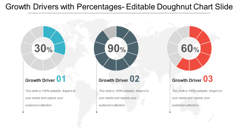
Template 1: Growth Drivers with Percentages PPT Presentation
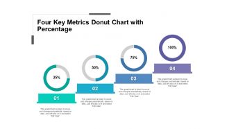
This PowerPoint Template, a Donut Chart, showcases your data and well-researched information. Donut charts express a ratio, which is always some part of a whole, with the pieces together making up 100%. You can use this doughnut graph PPT Slide to make it aesthetic. For instance, the three variables shown in the diagram are representative of the growth each provides to the business from a total of 100 (as we are talking about percentage charts). Hence, growth driver 1 (a factor that depends on your line of work drives 30% of the business at any given time, and so on. Similar is the case with other drivers. These slides give you profitable business results and identify potential market growth drivers for advancement and development. Use these growth driver percentage charts to lead your business toward growth.
Download this PPT Template Now!
Template 2: Revenue and Expenses Progress Charts Percentage Circle
This slide gives you a visual representation of a progress chart using the metrics of revenue and expenses and whether your business consistently wins expenses over revenue. It includes details on whether progress is on course as planned for achieving the best results in the metrics showcased. In the sample template below, for instance, it is depicted that 96% of revenue is achieved, and so on for the other three metrics of expenses and margin. This PPT Template can present a comprehensive framework of any business process that is important to you. For example, it could lead, marketing-qualified leads, sales-qualified leads, and customers. The chart will depict the progress in conversions at each stage.
Download this PPT Template Now!
Template 3: Four Percentage Charts for Comparison PPT Infographic
Recognize the significance of comparisons in business, especially within your departments. Use this PPT Template to showcase inter-departmental comparisons in sales performance, customer retention, cash inflow and outflow, and profit margins. Again, this is also a progress tracker, with the idea of giving a clear direction to meetings with these figures. For instance, the toothbrush division of a company might be doing well on cash flow, but its plastic chair business might be working for it to increase profit margins. Comparisons like this bring out good ideas that the management would like to try.
Download this PPT Template Now!
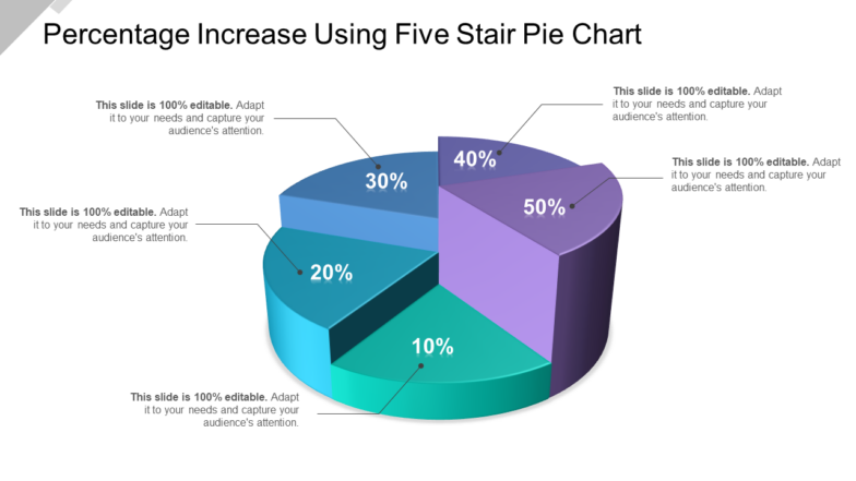
Template 4: Percentage Increase Using Five-Stair Pie Chart
Employ this PPT Template to be aware of how to understand and deal with growth increases across areas of concern in your business. With the five-stair pie chart depiction, please note that each stair or step represents the percentage growth of each segment. For instance, this slide could be for a technology company. Here, for the period under review, robotics could have grown by 20%, content by 50%, AI by 80%, machine learning by 22%, and so on. Use this slide to depict these percentages. The slides aim to create a mechanism to discern the high-performing areas from low-performing ones. The recommended use is on net operating income and growth.
Download this PPT Template Now!
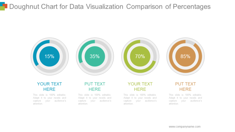
Template 5: Doughnut Chart for Data Visualization Comparison of Percentages
This PPT Template allows you to compare progress on work across their metrics. With the donut chart proving to be a huge asset, the contribution to the company of each department and their speeds (efficiency) can also be assessed. Whether marketing, financial projections, or results, this chart for data visualization helps provide the proper perspective to stakeholders. Apart from this, other details on sales and customer services can also be showcased.
Download this PPT Template Now!
PERCENTAGE MATTERS!
For comparison, you need a common base, and Per 100 or percentage gives you that base. All our percentage chart templates above aim to ensure businesses can quickly know their internal divisions and numbers. Ultimately, these numbers are meant to make enterprises understand the role of percentage comparison for continuous improvement.
PS For companies to function well and inculcate excellence into their working, it is important to prioritize tasks and track the same. Get prioritizing chart templates here.



 Customer Reviews

