

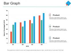
Bar graph ppt powerpoint presentation pictures visual aids





Try Before you Buy Download Free Sample Product
 Impress Your
 Audience
 100%
100% Editable
 Save Hours
 of Time


Our Bar Graph Ppt Powerpoint Presentation Pictures Visual Aids help find their favor. You will extract the best deal.
People who downloaded this PowerPoint presentation also viewed the following :
Bar graph ppt powerpoint presentation pictures visual aids with all 5 slides:
Get a gut feeling with our Bar Graph Ppt Powerpoint Presentation Pictures Visual Aids. You will come up with a brilliant idea.

FAQs for Bar graph ppt powerpoint presentation
Bar graphs offer superior clarity for comparing quantities, immediate visual impact for audiences, versatility across industries like sales performance and market research, and simplified data interpretation without complex analysis required. These advantages enable presenters to communicate key insights more effectively, facilitate faster decision-making processes, and enhance audience engagement, ultimately delivering stronger presentation outcomes and clearer business communications.
Strategic color schemes enhance bar graph effectiveness by improving data comprehension, creating visual hierarchy, and enabling instant pattern recognition across categories. Through contrasting hues for different data sets, complementary palettes for related variables, and strategic accent colors for key insights, organizations can streamline information processing, reduce interpretation time, and ultimately deliver clearer business presentations that drive faster decision-making.
Best practices for labeling bar graph axes include using clear, descriptive titles, consistent units of measurement, appropriate scale intervals, and readable font sizes. These labeling strategies enhance data comprehension by eliminating ambiguity, reducing interpretation errors, and ensuring accessibility across diverse audiences, with many organizations finding that properly labeled axes significantly improve stakeholder decision-making and presentation effectiveness.
Bar graphs enable effective comparison of diverse data sets by standardizing different metrics on consistent scales, using grouped or segmented formats, and applying color coding for clarity. Through normalized scales and strategic categorization, organizations in sectors like retail, healthcare, and finance can visualize performance metrics, budget allocations, and trend comparisons simultaneously, ultimately delivering comprehensive insights that enhance data-driven decision making.
Avoid 3D effects, truncated y-axes, inconsistent scaling, excessive colors, and cluttered legends in bar graphs, as these elements distort data perception and create visual confusion. These design flaws can mislead stakeholders in financial presentations, market analysis, and performance reports, with many organizations finding that clean, proportional designs enhance data comprehension and support accurate decision-making.
The choice between vertical and horizontal bar graphs significantly impacts readability, with vertical bars excelling for time-series data and category comparisons, while horizontal bars enhance readability for lengthy category names and large datasets. This strategic selection streamlines audience comprehension by optimizing visual flow and text clarity, ultimately delivering more effective presentations and better stakeholder engagement across diverse business contexts.
Data scaling significantly impacts bar graph accuracy by determining axis ranges, interval spacing, baseline positioning, and proportional relationships between data points. Poor scaling can distort visual comparisons and mislead audiences about actual differences in values. Through proper scaling techniques, organizations in sectors like financial services and retail can present quarterly performance data, sales metrics, and operational benchmarks accurately, ultimately ensuring stakeholders make informed decisions based on truthful visual representations.
Animation and transitions enhance bar graph engagement by creating visual storytelling, directing audience attention to key data points, and revealing information progressively rather than overwhelming viewers with static displays. These dynamic elements help presenters control narrative flow, emphasize comparative trends, and maintain audience focus during complex data presentations, ultimately delivering more memorable and persuasive business communications.
Common mistakes include using inconsistent scales, overcrowding with excessive data points, choosing poor color contrasts, omitting clear axis labels, and starting Y-axes at non-zero values that distort comparisons. These design flaws undermine data credibility and audience comprehension, with many presenters finding that simplified layouts, consistent formatting, and strategic color choices significantly enhance message clarity and professional impact.
Bar graphs integrate effectively with pie charts, line graphs, scatter plots, and infographics to create comprehensive analytical dashboards. Through strategic combination, organizations enhance data storytelling by showing trends, comparisons, and correlations simultaneously, while delivering deeper insights and clearer decision-making frameworks, with many businesses finding that multi-visual approaches significantly improve stakeholder understanding.
Cultural differences influence bar graph interpretation through varying reading patterns, color associations, numerical formats, and contextual frameworks. While Western audiences typically read left-to-right expecting ascending data progression, audiences from different cultural backgrounds may interpret visual hierarchies, symbolic meanings, and data relationships differently, with many global organizations finding that culturally-adapted visualizations significantly enhance comprehension and decision-making accuracy.
**INPUT**: What tools or software are most effective for creating professional bar graphs for presentations? **OUTPUT**: Professional bar graph creation tools include Microsoft Excel, PowerPoint, Tableau, Google Charts, and specialized presentation software like Prezi or Canva Pro. These platforms streamline data visualization by offering customizable templates, automated formatting, and seamless integration capabilities, with many organizations finding that combining Excel's analytical power with PowerPoint's presentation features delivers compelling visual narratives that enhance audience engagement and decision-making processes. **Word count: 60 words**
Bar graphs enhance storytelling by transforming raw data into compelling visual narratives through strategic design choices, color coding, progressive reveals, and contextual framing that guides audience interpretation. By emphasizing key comparisons, highlighting growth trajectories, and using annotations to provide context, presenters create emotional connections with data, ultimately delivering more persuasive presentations that drive decision-making.
Bar graphs face limitations with continuous data, complex relationships, temporal trends, and proportional analysis, while struggling with overlapping categories or detailed breakdowns. Alternative charts like line graphs for trends, pie charts for proportions, scatter plots for correlations, or heat maps for multidimensional data often deliver clearer insights, with many organizations finding that strategic chart selection enhances audience comprehension and decision-making effectiveness.
Audience analysis significantly influences bar graph design through color choices, complexity levels, data granularity, and contextual framing tailored to viewer expertise and needs. For instance, financial executives require detailed comparative data with industry benchmarks, while general audiences benefit from simplified visualizations with clear legends and explanatory text, ultimately ensuring maximum comprehension and strategic decision-making across diverse organizational stakeholders.
No Reviews