


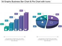
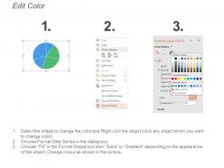
3d graphs business bar chart and pie chart with icons





Try Before you Buy Download Free Sample Product
 Impress Your
 Audience
 100%
100% Editable
 Save Hours
 of Time


Our 3d Graphs Business Bar Chart And Pie Chart With Icons bring about change effectively. They ensure it is acceptable to all.
People who downloaded this PowerPoint presentation also viewed the following :
3d graphs business bar chart and pie chart with icons with all 6 slides:
Our 3d Graphs Business Bar Chart And Pie Chart With Icons generate handsome dividends. You will be gifted with greater assets.
FAQs for 3d graphs business bar chart and pie
Honestly, the main thing is you'll catch patterns that are totally hidden in regular 2D charts - especially with messy, complex data. Spatial stuff just clicks better in your brain, you know? Plus you can spot clusters and weird outliers way easier. Oh, and stakeholders eat this stuff up during presentations (the flashier the better lol). You can also cram more variables into one view instead of flipping between a million different charts. But real talk - if your data works fine in 2D, don't overcomplicate it. Save 3D for geographic stuff, network data, or anything that's naturally spatial to begin with.
Dude, 3D visualizations are actually game-changers for messy data. Your brain can process way more when you see sales across regions, time, and products all at once instead of flipping through boring spreadsheets. I swear teams catch trends like 3x faster this way. The coolest part? You'll spot outliers and patterns that would totally hide in flat charts. Honestly, even executives stay awake during these presentations – which is saying something lol. Just grab your gnarliest dataset first and plot it in 3D space. You'll definitely find something new you missed before.
Plotly's probably your best bet starting out - works with Python and R, plays nice with notebooks, and won't make you want to pull your hair out learning it. For web stuff, Three.js and D3.js are solid choices too. Desktop-wise, ParaView's pretty standard, though honestly Blender (yes, the 3D animation thing) is surprisingly good for data viz if you don't mind the quirky interface. Matplotlib has some 3D extensions that work fine. Tableau and Power BI handle basic 3D stuff without much fuss. R's got rgl and plotly packages that are decent. Really depends what you're building though - web dashboard or just exploring data?
Honestly, less is more here. Pick 3-4 colors max and make sure there's clear visual hierarchy - nobody wants their eyes assaulted by rainbow chaos. Don't cram everything into one view either. Break it up or add filters so people can actually process what they're seeing. Keep your camera angles sane (motion sickness isn't fun), make labels readable, and always include basic navigation controls. Oh, and throw in a simple 2D reference view alongside the 3D one. Trust me on this - test it with real people first because what makes perfect sense to you might be totally confusing to everyone else.
Focus on rotation, zoom, and pan first - those are your core 3D navigation tools. I'd add hover tooltips and click interactions for exploring details, but honestly, skip the flashy animations. They just make people nauseous. Level-of-detail rendering keeps things smooth, and you'll want both mouse and touch support. Always include a reset button though - trust me, users get lost in 3D space constantly. Oh, and test with real people early on. What seems obvious to you might be completely confusing to everyone else. Performance matters more than you think it does.
So 3D visualization works great for tons of scientific stuff. Molecular biology uses it for rotating protein structures, geologists map terrain and underground layers, medical folks reconstruct organs from MRI scans. Climate scientists build these atmospheric models that honestly look pretty sick. Astronomers map where galaxies sit in space, particle physicists track collision data. The whole point is catching patterns you'd never see in flat charts. Oh, and astronomers get kind of obsessed with their galaxy maps - can't blame them though. Just look for datasets with spatial relationships first, that's usually your safest bet for going 3D.
Dude, 3D visualizations are a game-changer for medical stuff. Instead of squinting at flat X-rays, doctors can actually rotate and explore patient scans in 3D space. Surgeons practice on virtual models before the real deal. Radiologists catch tumors way easier when they can see volumetric data properly. Plus patients finally understand what's going on inside them - which honestly makes those awkward diagnosis conversations less terrible. Your brain just processes spatial info faster than boring 2D charts. I'd say pick one dataset and test it out in 3D first. You'll probably be surprised how much clearer everything becomes.
Dude, color theory makes or breaks 3D visualizations. Use contrasting colors to separate your data categories - sequential schemes work perfectly for showing progression or size. I swear, bad color choices make charts look like rainbow disasters. Warm colors naturally jump forward while cool ones stay back, so you can highlight what's actually important. Oh, and lighting totally changes how colors appear, so test that stuff early. Keep your palette simple though - like 3-4 colors max. Trust me, viewers will thank you for not assaulting their eyeballs.
Dude, 3D visualizations are actually game-changers for presentations. Regular bar charts? People's eyes glaze over instantly. But with 3D, you can literally walk people through your data - rotate it, zoom into clusters, show relationships that would need like five different slides otherwise. Multi-dimensional stuff suddenly makes sense. I learned this the hard way after bombing a quarterly review with flat charts lol. The trick is keeping animations smooth and purposeful. Don't go crazy with the spinning effects though. Practice those transitions beforehand or you'll look like you're fumbling around up there.
Honestly? Pretty visuals are performance killers. Your frame rates go to hell when you add fancy lighting and smooth animations - users hate waiting around. But here's the weird part: sometimes the coolest-looking approach actually makes your data harder to read. Like dramatic camera angles that hide key patterns, or flashy effects that just distract people from what matters. You've gotta hit that sweet spot where it looks good enough to grab attention but doesn't sacrifice functionality. Nobody wants eye candy they can't actually use.
So basically, instead of squinting at flat charts all day, AR and VR let you actually walk through your data. It's pretty cool - you can grab 3D models and spin them around, or have charts floating in your living room with AR. The spatial thing really helps your brain connect the dots better. I got totally lost in a VR dataset last week for like an hour. Try a simple VR tool first if you're dealing with complex stuff. You'll know pretty quick if it's worth the hassle or just fancy tech for tech's sake.
Don't let 3D effects mess with your data's story - they can totally warp how people read proportions and relationships. Sure, spinning charts look slick, but are they actually helping anyone understand the info better? Probably not. Plus some folks have trouble with depth perception stuff. Here's what I always do: show it to a couple people first and see what they think the data's saying. If they're reading it wrong, you know you need to dial back the fancy effects. Trust me, clear beats flashy every time when you're trying to communicate real information.
For real-time 3D data viz, animated transitions are your best bet. Particle systems work awesome for streaming data - way better than those ridiculous spinning cubes everyone seems obsessed with. Heat maps with smooth color gradients are solid too. Surface plots that morph as new data comes in look pretty slick. Keep your frame rate above 30fps or it'll look janky. Three.js handles this stuff well if you're doing web-based, but Unity's got more muscle if you need it. Oh, and buffer your data - trust me on this one, it prevents all that stuttering nonsense when updates hit.
So basically you're dealing with three big things: processing power, screen size, and how people actually interact with it. Mobile GPUs are pretty weak compared to desktop, so cut your polygon counts and ditch the fancy lighting effects. Shadows and reflections? Skip 'em. Your UI needs to be way bigger too - what looks fine on a monitor becomes this tiny unreadable mess on phones. Touch controls are totally different from mouse clicks, so make sure pinch-to-zoom and rotation actually feel smooth. Oh, and show less stuff at once or it gets overwhelming fast. I'd honestly just design for mobile first then add the bells and whistles for desktop later.
Honestly, user feedback is everything for 3D visualizations. Your users will straight up tell you when navigation sucks or when they can't figure out the viewing angles. They'll also call out data points that get buried in visual clutter - which happens more than you'd think. Plus they reveal what features actually matter vs what you assumed was cool. Performance issues? They'll spot lag and rendering problems on different devices way faster than you will. Oh, and definitely do feedback sessions throughout your design process, not just dumping it on them at the end.
-
Excellent work done on template design and graphics.
-
It saves your time and decrease your efforts in half.