

Bar graph timeline with percentage and years powerpoint slides





Try Before you Buy Download Free Sample Product
 Impress Your
 Audience
 100%
100% Editable
 Save Hours
 of Time


Impress your management with data based on actual performance of your business unit using this PowerPoint slide which has a bar graph to depict the timeline with percentage and respective years. All those figures related to sales volume, market research data outputs, customer base growth, number of units sold, market capitalization, revenue growth etc. need not be banal digits with our PowerPoint presentation design in which you can give them a life of their own through visually arresting bar graphs which help in easy comprehension of yearly progress and enable decision making to be data oriented even as it is tempered according to subjective inputs from all the stakeholders in the planning process. Give your business strategy a consequential push through discussions based on financial accounting, auditing, impact assessment of various initiatives, sales growth figures and actionable data received from various departments and key stakeholders which can be represented through this PPT slide design. Create a feeling of balance with our Bar Graph Timeline With Percentage And Years Powerpoint Slides. They encourage a level headed approach.
People who downloaded this PowerPoint presentation also viewed the following :
Content of this Powerpoint Presentation
Description:
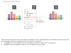
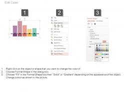
The image displays a bar graph timeline titled "Bar Graph Timeline With Percentage And Years," designed to visually represent data changes over a five-year period, from 2015 to 2019. Each bar on the graph represents a percentage value for a specific year, allowing for a clear comparison of values across the timeline. The data points show a trend or change over time and can be used to track various performance metrics or growth indicators.
The text in the image emphasizes the slide's adaptability and user-friendliness for presentations, encouraging the presenter to "Capture your audience's attention." It also mentions that the diagram is downloadable and fully editable in PowerPoint, making it a versatile tool for creating impactful presentations.
Use Cases:
Here are seven industries where this bar graph timeline can be effectively applied:
1. Marketing:
Use: Show year-over-year changes in market share, campaign effectiveness, or customer acquisition rates.
Presenter: Marketing Analyst or Strategist
Audience: Marketing team, stakeholders, and executives
2. Finance:
Use: Illustrate annual growth rates, investment returns, or financial performance metrics.
Presenter: Financial Advisor or Analyst
Audience: Investors, management, and financial teams
3. Healthcare:
Use: Display patient satisfaction statistics, improvements in health outcomes, or changes in healthcare service utilization.
Presenter: Healthcare Administrator or Quality Improvement Specialist
Audience: Healthcare staff, policy makers, and administrators
4. Education:
Use: Exhibit changes in graduation rates, student test scores, enrollment trends, or educational program effectiveness.
Presenter: Education Researcher or Administrator
Audience: School board members, educators, and educational stakeholders
5. Manufacturing:
Use: Demonstrate production efficiency, quality control percentages, or manufacturing process improvements.
Presenter: Operations Manager or Quality Assurance Specialist
Audience: Production team, quality assurance staff, and management
6. Real Estate:
Use: Present trends in property values, rental occupancy rates, or real estate market fluctuations.
Presenter: Real Estate Analyst or Agent
Audience: Investors, real estate agents, and property owners
7. Retail:
Use: Visualize customer retention rates, sales growth, or the expansion of loyalty programs over time.
Presenter: Retail Manager or Sales Analyst
Audience: Retail employees, corporate management, and marketing teams
Bar graph timeline with percentage and years powerpoint slides with all 4 slides:
Give them a defining experience with our Bar Graph Timeline With Percentage And Years Powerpoint Slides. Allow them a glimpse of your essential brand.


FAQs for Bar graph timeline with percentage and
Honestly, bar graph timelines are a game changer for project presentations. People can actually see what's happening when without having to decode some tiny Gantt chart. Multiple workstreams? No problem - the visual overlap is super clear. I way prefer them over bullet points (so boring). Colors help too if you want to show different teams or priorities. Your stakeholders will actually pay attention instead of zoning out. Duration becomes obvious at a glance. Try it next time instead of your usual format - I bet you'll get way better engagement from your audience.
Dude, bar graph timelines are perfect for this stuff. You get quantities AND time in one chart instead of juggling multiple visuals or staring at boring spreadsheets. Trends jump out at you immediately, plus it's super easy to compare different periods and catch weird outliers. They work great for categorical data over time - like sales by region or tracking project deadlines. Honestly, I love that stakeholders don't need a PhD to understand them (unlike some of those overly complex charts people obsess over). Next time you're presenting quarterly numbers, definitely try one. Your audience won't be confused for once.
You'll want bar graphs for stuff like quarterly sales, yearly population data, or budget breakdowns - basically when you're comparing specific numbers across different time periods. Line graphs are way better for continuous trends though. I use these constantly for tracking project milestones and resource stuff at work. What matters is having measurable data you can actually compare between periods. Honestly, they're clutch when you need to show dramatic changes. Perfect for presentations too since stakeholders love clear comparisons they don't have to think too hard about.
For showing data over time, bar graph timelines win hands down. Traditional timelines work fine if you just need the sequence of events, but they're awful when you've got actual numbers to display. With bar graphs, you instantly see which periods were higher or lower - no need to decode tiny text labels. It's way more intuitive. Traditional ones get messy real quick when there's data involved. Think of it this way: if someone needs to know "how much" happened during each period (not just when), definitely go with bars. Way clearer for that kind of thing.
Make sure your time intervals stay consistent and size those bars to match your actual data. Use a clean font that's easy to read, and pick colors that make sense - either one color throughout or group them logically if you're showing different categories. White space is your friend here, don't cram everything together. I swear, half the timelines I see are just visual chaos because people try to get too creative with it. Flow should go left to right chronologically (obviously), and you need a title that actually tells people what they're looking at. Show it to someone first - if they squint or look confused, you've got more work to do.
Colors make a huge difference for bar graph timelines. Similar colors will just confuse people - they won't see the differences between your data points. Go for high contrast so trends pop out. Oh, and definitely use colorblind-friendly palettes! Red-green combos are terrible for way more people than you'd think. For showing time progression, sequential colors work best. Comparing different groups? Stick with categorical colors instead. Honestly, just run your color choices by a couple coworkers first. Trust me on this one - especially if your data's complicated.
Start with a fade-in for your baseline data, then animate bars growing up as each time period comes in. Smooth transitions are way better than everything just popping up at once - that's honestly just overwhelming to watch. Keep each transition under 2-3 seconds so people don't get bored. You can add some highlighting when bars hit important milestones or whatever data points you want to emphasize. The whole thing is about pacing really. Give viewers time to actually see what's changing before you move to the next bit. Trust me, controlling that flow makes such a difference.
Honestly, the worst thing you can do is mess up your time intervals - like having uneven spacing between dates. Makes everything look sloppy. Also don't squish too many bars together or people can't read anything. I see people skip the zero baseline all the time to make changes look more dramatic, but it just makes you look sketchy tbh. Colors should be simple, labels need to be obvious, and for the love of god put units on your axes! I've stared at so many charts wondering if it's days or months. Quick tip though - sketch it out first to catch spacing problems early.
Hover effects are a game changer - people love seeing extra details pop up when they mouse over bars. Clickable drill-downs work really well too if you want them exploring specific time periods. Honestly, those racing bar chart animations are kind of addictive to watch, maybe try something like that? Animation in general makes everything feel smoother. Oh, and toggles are clutch for filtering different categories. Short version: give people control instead of just staring at static bars. Makes such a difference.
Honestly, just use **Excel** or **Google Sheets** first - they're way more capable than people think for timeline stuff. **Tableau** and **Power BI** are amazing if you need fancy interactive features, but they're overkill for most projects. For web stuff, **Google Charts** is pretty decent. You could also try **D3.js** if you're into coding and want total creative control (though fair warning, it's a bit of a learning curve). Oh, and those project management tools like **Monday.com** or **Asana**? They're basically bar timelines already, so that might work too. Start with whatever you already have access to - it'll probably cover most of what you need anyway.
Honestly, bar graph timelines work for pretty much any industry - you just gotta switch up what you're measuring. Healthcare folks might track patient recovery rates monthly or vaccine distribution quarterly. Finance teams are obsessed with showing revenue trends and budget cycles over their fiscal years. The trick is figuring out what timeline your audience actually cares about first. Then pick data points that help them make real decisions. Don't get stuck using generic labels when you could use industry-specific metrics that'll actually resonate with whoever's looking at your chart.
Annotations are honestly a game-changer for bar graphs. Without them, people just stare at your data wondering what the hell happened in March or why there's that weird spike. Use callout boxes or arrows to mark the important stuff - like when your competitor launched that product or when the new policy kicked in. Short labels work great too. I mean, raw numbers tell you what happened, but annotations explain why it matters. Otherwise you're basically making people solve a puzzle instead of just showing them the story. Trust me, your audience will actually get what you're trying to say.
Set up your x-axis chronologically with consistent time gaps - could be monthly, yearly, whatever fits your data best. Bar heights show the magnitude of what you're tracking. Honestly, I think these work way better than line graphs for showing discrete time periods. The real magic happens when you label major historical events right on the chart - that's how people connect your data spikes to actual stuff that happened. Oh, and start with your most dramatic period first to hook people, then let the full story unfold from there.
Dude, there's so many better options than boring bar charts! River charts are pretty cool - the width changes to show volume over time. Or do a stepped timeline with little icons for milestones. Sankey diagrams work if your data flows between categories (though they're kinda overused lately tbh). Sometimes a simple dot plot looks way cleaner than bars anyway. For storytelling stuff, try scrolling narrative timelines or those animated progression things. Just match your visual to your story - curves for continuous change, steps for discrete events. You want people thinking "oh yeah, that makes total sense!"
Seriously, get other people to look at your timeline before you're done with it. They'll spot stuff you totally missed - like when your dates are all over the place or you picked colors that look identical (guilty of this SO many times). Fresh eyes are clutch for catching unclear labels too. Plus they'll tell you if your main points aren't jumping out right away. I always do a quick "hey does this make sense?" check with someone. Trust me, it's way better than presenting something confusing and watching everyone's blank faces.
-
Excellent design and quick turnaround.
-
Great product with effective design. Helped a lot in our corporate presentations. Easy to edit and stunning visuals.