

Trends timeline presentation slides





Try Before you Buy Download Free Sample Product
 Impress Your
 Audience
 100%
100% Editable
 Save Hours
 of Time


Download Trends Timeline PowerPoint template design to deliver presentation on business development, career achievements etc. The PPT slide explains the concept of growth that you can show to your stakeholders, team members etc. Whether you are a startup or an established business firm, you have to present your achievements in the most desired manner to gain the interest of the investors and your target audience. Using this presentation shape, let your potential clients know what has your organization achieved so far and what you are expecting to achieve in the coming years. Moreover, the PowerPoint diagram can also be used to show the details related to future objectives as what strategies you are planning to implement to meet the numbers set by the management team. The PPT layout is easily editable and you can edit and present it according to your need. So, download and get access to this impressive Presentation template that will help you to deliver the message in an effectual way. To see more timeline designs, you may browse through our website. Address jarring aspects with our Trends Timeline Presentation Slides. Increase the acceptability of your ideas.
People who downloaded this PowerPoint presentation also viewed the following :
Content of this Powerpoint Presentation
Did you ever feel like business trends are a blur whizzing past your window? Imagine a roadmap, not a blur! This isn't your monotonous history timeline from school. This is your business's personal time machine, helping you visualize the hottest trends on the horizon.
Keeping updated with current business trends helps the organization plan for the future and implement innovations to increase profit and customer satisfaction. These trends also help the business identify new demand or use the most promising future strategies to meet its goals.
Aitsu is looking for a timeline for your business. Click here to unlock the roadmap of the business timeline.
If you want to stay ahead of the curve, you need to identify opportunities. Therefore, SlideTeam has introduced a set of templates that show your business's dynamic timeline. These slides help you find the waves of innovation. They are 100% editable and customizable, and you can change the information as per your requirements. Therefore, chart your future, one trend at a time!
Click here to get access to the project management timeline.
Template 1- Trends Timeline Template
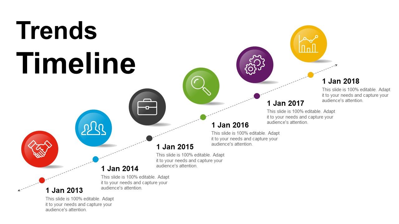
Check out this trend timeline PPT template design to make a presentation on business development, career achievements, etc. This template showcases the concept of growth, which you can show to your stakeholders, team members, etc. If you are a startup or an established business firm, you need to present your achievements in a manner that attracts investors and your targeted audiences. This template provides clients with an idea of the organization's achievements and plans. However, this PPT Slide can also be used to present details about objectives and strategies you're planning to implement. Therefore, unlock the opportunity and download this template to deliver the message.
TIME IS IMPORTANT, MAP IT WELL
This timeline depicts the course of your business from its beginning to the present. Since the business world changes frequently, the trend timeline shows its evolving nature. This template offers an opportunity to explore the evolving changes in business trends. By understanding these shifts, businesses can make informed decisions and make sure they are able to control and manage the future landscape.
Trends timeline presentation slides with all 5 slides:
Our Trends Timeline Presentation Slides enable effective introspection. It allows you to honestly assess your ideas.
FAQs for Trends
Overhead projectors kicked things off in the 60s, but PowerPoint in '87 was the real game-changer. Man, the 2000s were rough though – everyone went crazy with bullet points. Like, SO many bullet points. Around 2010, Prezi and Canva finally saved us by pushing actual visual storytelling instead of text walls. Now? Everything's interactive and collaborative, plus AI helps with design. Here's what actually matters: ditch the text dumps. Your slides should tell the story visually because people zone out fast. Short attention spans are real, so make every slide count.
Dude, presentations have changed SO much lately. Everyone's doing interactive polls and real-time Q&As now instead of boring slide decks. The whole pandemic thing made us all virtual presentation experts whether we wanted to or not lol. People expect you to share screens smoothly, use multimedia stuff, and honestly? Your slides better look good on phones too since that's how half your audience will see them. AI tools are starting to help with design work, which is pretty cool. Oh, and cloud collaboration is everywhere now. If you're still presenting like it's 2014, you're gonna look ancient.
Dude, storytelling literally makes or breaks presentations these days. Nobody wants another boring slide dump, you know? What you need is a proper narrative that takes people on a journey - emotionally AND logically. I always think of it like Netflix eating PowerPoint's lunch, if that makes sense. Your slides are just backup dancers. The real magic happens when you outline your story first, then build visuals that support each part. Smooth transitions between points are key. Oh, and always build toward something - like a conclusion that actually matters. Trust me, this approach works way better than just throwing facts at people.
Okay so basically everyone's doing minimalist slides now - like one big message with tons of white space. Dark mode is huge too, which honestly looks way cooler than regular presentations. Custom illustrations are replacing stock photos everywhere. Typography is where people are getting creative though. Two fonts max, but they're playing with size contrast to make things pop. Animation's back but subtle - none of that crazy spinning stuff from way back. Data visualizations need to actually tell a story now instead of just sitting there. Oh and here's my random take: most people still cram too much on each slide. Start by cutting half your content per slide and you'll be ahead of like 90% of presentations out there.
Dude, presenting remotely is a whole different beast. Your slides need bigger fonts since everyone's squinting at laptops now. I still feel awkward talking to a grid of muted faces - you can't tell if people are bored or just checking email. You've gotta amp up your voice way more and pause constantly for questions. Tech will definitely mess with you at some point, so have backup internet ready. The cool part though? Screen sharing is actually smoother than fumbling with projectors, and you can throw in videos without worrying about compatibility. Oh, and everything gets recorded automatically which is clutch.
Dude, this stuff actually matters way more than people think! Your font choices can totally kill engagement if people are squinting at some weird typeface. Comic Sans at work presentations? Just don't. Colors guide where people look and how they feel - warm ones get people pumped, cooler tones seem more trustworthy. But honestly, clashing colors will lose your audience super fast. Stick with maybe 2-3 colors tops. One main font is usually enough, though you can throw in an accent font for headers if you want. Poor contrast is probably the biggest mistake I see people make.
So everyone's going mobile-first now for presentations. Vertical layouts, huge fonts, tiny chunks of info that actually work on your phone. Interactive stuff is big too - like clickable buttons and polls instead of boring slide decks. Some companies are straight-up abandoning PowerPoint (honestly, about time). The content needs to be modular so it automatically fits different screens. People want to view presentations on their own time now instead of sitting through another meeting. Oh, and test on mobile first then work backwards - way easier than trying to shrink desktop stuff down later.
Honestly, you gotta check out Gamma - it'll build your whole presentation from just typing what you want. Saves so much time on formatting. Beautiful.AI is similar with the AI generation thing. Canva's templates are actually insane now, way better than they used to be. Oh and Figma's everywhere for design collabs if you're working with a team. There's also these interactive ones like Prezi and Genially where people can click around instead of just watching slide after slide. Way more engaging than PowerPoint, though some people still find it gimmicky. I'd start with Gamma though - seriously a game changer.
Honestly, interactive data viz is everywhere now. Real-time dashboards, animated charts, stuff where people can actually click around and explore - it's pretty cool. Static pie charts are finally dying (seriously, about time). Tools like Tableau and Power BI make it super easy to add motion and engagement. Oh, and everything needs to work on mobile since that's where people are looking at this stuff. You should try adding some interactive bits to your next presentation. Even basic hover effects make data way more interesting to look at. Makes a huge difference in keeping people engaged instead of zoning out.
Oh man, your audience won't just sit there anymore like they used to. They want polls, Q&As, breakout rooms - the whole interactive thing. People also expect content that's actually tailored to them, not some generic slideshow nightmare. Honestly, those old-school presentations where someone just talks at you? Dead. You need live voting, chat features, maybe some small group stuff mixed in. Without those touchpoints your retention tanks - I've seen it happen. Try to squeeze 3-4 interactive bits into every 30 minutes. And definitely have a backup ready because tech will absolutely mess with you at the worst moment.
D&I has totally changed how I approach presentations now. You've gotta think about accessibility upfront - high contrast colors, diverse imagery that actually looks like your audience, ditching the outdated stock photos (you know the ones). Presenters are sharing pronouns more, using plain language instead of corporate speak. Also designing for different learning styles with visuals, audio, text elements. Honestly, it's way overdue. Quick tip - audit your current templates and ask if someone from any background could easily connect with your content. Makes a huge difference.
Don't just slap visuals in there because they look cool - make sure they actually back up what you're saying. Test everything on the real equipment first, trust me on this one. Keep file sizes reasonable or you'll watch your laptop freeze mid-presentation (awkward). High-res is key so people in the back can actually see stuff. Audio clips? Short and punchy works best. Nobody wants to hear your entire 3-minute soundtrack. Always have a backup plan ready. Oh, and practice your timing with all the multimedia included - you don't want to suddenly realize you're going 10 minutes over.
Honestly, just jump on whatever formats people are already vibing with - TikTok transitions, Instagram polls, that kind of stuff. Timing's everything though. Don't be that person using a three-month-old meme thinking it's fresh. Grab trending audio for background music or copy those popular visual templates everyone's using. I've seen so many cringey attempts where brands try way too hard with viral references. Just... don't do that. Quick tip: double-check if your trend is still actually trending right before you present, because the internet moves ridiculously fast.
Honestly, minimalism works so well because people's attention spans are shot these days. When you cut out all the random clutter, your main points actually pop. Clean slides just look way more professional too - like you know what you're doing instead of throwing everything at the wall. I've noticed this really exploded when everyone went remote and had to stare at screens all day. Stick to 2-3 colors max. Embrace white space. One main idea per slide and you're golden.
So basically everyone's going digital now because of the whole environmental thing. Interactive PDFs are huge, plus QR codes instead of those massive handout stacks nobody reads anyway. When people DO print stuff, they're using recycled paper and keeping designs super clean. Honestly, audiences seem way happier with less clutter too. Virtual presentations are everywhere now. I'd just default to sharing everything digitally first, then maybe print like one or two key pages if you absolutely have to. Way easier and your presentation won't look like a small novel.
-
Editable templates with innovative design and color combination.
-
Great quality product.