

Trend analysis powerpoint slide





Try Before you Buy Download Free Sample Product
 Impress Your
 Audience
 100%
100% Editable
 Save Hours
 of Time


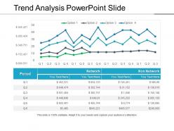
Look at our Trend Analysis PPT slideshow and analyze the trends and improvements in your business. By displaying your important business information and concepts in a creative way, you can attract the attention of your customers, stakeholders, suppliers, competitors, etc. So, use our amazingly designed trend analysis PowerPoint template in your business presentations and get noticed. Our trend analysis PPT diagram slide demonstrates the concept of trend analysis with the help of editable charts and visuals. Trend analysis is the process of comparing business data over time to identify any consistent results or trends. You can then develop a strategy to respond to these trends in line with your business goals. The PPT slide is completely amendable so that you can add your own company’s data and information. Whatever you want to achieve with the presentation slide can be easily achieved with this design. Hail a fresh dawn with our Trend Analysis Powerpoint Slide. Begin your endeavour in a bright environment.
People who downloaded this PowerPoint presentation also viewed the following :
Trend analysis powerpoint slide with all 5 slides:
Control the dialogue with our Trend Analysis Powerpoint Slide. They allow you to handle any conversation.
FAQs for Trend
Look at revenue patterns and market share changes first - that's your baseline. Customer acquisition costs matter too. But honestly, the soft stuff is where you'll catch trends early. Consumer sentiment shifts, what competitors are doing, new tech popping up. I got burned once ignoring regulatory whispers that turned into major changes. Seasonal patterns will mess with your head if you're not careful - they hide real trends or make fake ones look legit. Mix the hard numbers with industry gossip and expert takes. Just review this stuff regularly so you're ahead of the curve.
Honestly, historical data is like your safety net for figuring out what's actually a pattern versus just random stuff happening. More quality data means you can spot seasonal trends and long-term shifts that'll help with forecasting. It's kinda like connecting dots—more points make a clearer picture. You can also backtest your models to see how they would've done before, which builds confidence. Oh, and definitely try to get at least 2-3 years of solid data if you can swing it. That usually captures most of the recurring patterns you'd want to know about.
Honestly, consumer behavior is what makes or breaks trends in every industry. People change how they shop or what they care about, and boom - entire sectors have to pivot. Take millennials obsessing over experiences instead of buying stuff. That totally flipped travel and hospitality on its head. What's wild is how these shifts jump between industries. Sustainability worries in fashion suddenly show up in beauty, cars, even banking. I'd focus on understanding WHY people make certain choices, not just tracking what they buy. That's how you tell which trends will actually stick around versus the ones that'll fizzle out in six months.
Dude, the amount of data we can work with now is insane compared to just a few years back. Real-time social feeds, IoT sensors, massive datasets - stuff that would've taken forever to crunch manually. Machine learning spots patterns I'd totally miss, and AI actually predicts trends before they blow up. Wild, right? The tricky part is not getting overwhelmed by all the automated insights. You still need your gut instincts to filter through the noise and figure out what actually matters.
For showing trends, line charts are honestly your best friend - everyone knows how to read them and they just work. Heat maps are solid too if you're juggling multiple variables or want that intensity effect. I'm probably guilty of overusing line charts but whatever, they get the job done! Slope graphs are cool for comparing two specific time points. Oh, and small multiples let you break out trends by different categories which can be super helpful. Start basic with a line chart, then throw in some annotations to explain what's actually happening in your data.
Track your industry data monthly - sales, social media buzz, search trends, whatever matters for your space. Honestly, most companies just react after stuff happens instead of watching for patterns. Look for shifts in what people want before it becomes obvious to everyone else. Like if eco-friendly demand is climbing, switch up your products early. I'd set up some kind of dashboard to monitor this stuff regularly. Acting on trends beats playing catch-up every time. Though I'll admit, it's easier said than done when you're swamped with daily fires.
Okay so first things first - make sure people actually agreed to this, not just some buried checkbox nonsense. Anonymize everything personal obviously. Be honest about what you're pulling from the data too. Here's what I always think about: could this hurt certain groups or communities? Because that happens more than you'd think with this stuff. Don't keep the data forever either - that's just asking for trouble down the line. Honestly, the whole thing comes down to whether you'd be cool with someone doing the exact same analysis on your personal info.
Dude, seasonal trends make you think in cycles instead of just straight-line growth. Like, retail knows December's gonna be insane, landscaping companies brace for winter slowdowns - that kind of thing. You've gotta build flexibility into staffing and cash flow plans. Honestly, most businesses mess this up because they don't look at their patterns. Pull your last three years of quarterly data first - that'll show you everything. Smart move is using that historical stuff to catch opportunities competitors miss. Also helps you avoid being stuck with tons of inventory when demand drops. It's basically business weather forecasting, which sounds nerdy but actually works.
Google Trends is your starting point, then grab something like Brandwatch for social listening. Excel works for basic stuff but honestly, Tableau will save you so much headache if you're working with bigger datasets. I'm kind of obsessed with SEMrush for tracking keyword trends - probably use it way too much. Python or R are amazing for deeper analysis, though fair warning, there's definitely a learning curve there. Don't try to find one magic tool that does everything. Mix and match 2-3 different ones instead.
Numbers tell you what happened, but talking to actual users tells you why. Like when your engagement drops - data just shows the decline, but interviews reveal people can't figure out your interface. I've watched so many teams completely misread their metrics because they skipped this step. User conversations also catch trends way before they hit your dashboard. Next time you're analyzing data, throw in some quick user chats too. You'll probably find stuff that completely changes how you interpret those numbers. It's honestly game-changing.
Macro factors are basically the tide that moves whole industries up or down. Interest rates, inflation, GDP growth - they all mess with how much people spend and how businesses invest. High interest rates? Construction and car sales get crushed because loans become crazy expensive. But defensive stuff like utilities usually hold up better during rough times - people still need electricity, right? When you're looking at industry trends, check the leading economic indicators first. Honestly, half the time what looks like a major shift is just the economy being weird. You gotta separate the real changes from the background noise.
Honestly, cross-industry analysis is where the magic happens. Netflix figured this out - they didn't copy Blockbuster, they borrowed subscription models from gyms and magazines instead. Wild, right? You want to find industries that solve similar human problems but in totally different ways. Pick maybe 2-3 sectors that seem random but serve the same core needs as yours. Then just map what works for them against your current headaches. The best breakthroughs usually come from places you'd never think to look. It's all about spotting those underlying patterns in how people actually behave.
So for long-term stuff, stick with moving averages (200-day is solid), linear regression, and seasonal patterns - they cut through all the market noise. Short-term? That's where RSI, MACD, and Bollinger Bands shine since they pick up on recent moves fast. I've watched too many traders mess this up by mixing timeframes wrong. Your chart period should match your tools, period. Oh and here's what works - always check the big picture first to see which way things are heading, then use the short-term indicators to nail your timing.
Stop treating trend analysis like homework you do once a quarter. Set up real-time feeds and social listening tools so you're always plugged in. Weekly pulse checks with customers work way better than quarterly deep dives - trust me on this one. Your analysis needs to match how fast your market actually moves. Most companies are way too slow here. Build feedback loops so you can tell if the trends you're watching are real or just noise. Pick 3-5 key indicators and check them weekly. It's more work upfront but you won't get blindsided.
So once you spot a trend, you've got two moves - jump on it or go the opposite direction. Jumping on means moving fast with your budget and maybe retraining your team for new skills. Going against the grain? Look for what everyone's ignoring - honestly, that's where some of the best opportunities hide. I'd probably run small tests in the trendy stuff while keeping your main thing solid. Just don't sit on it forever. Trends die quick, so check in every few months and pivot if you need to.
-
Professional and unique presentations.
-
Great designs, really helpful.