


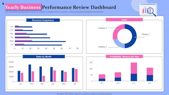
Yearly Business Performance Review Dashboard




Try Before you Buy Download Free Sample Product
 Impress Your
 Audience
 100%
100% Editable
 Save Hours
 of Time


This slide contains annual business review of a company. It includes revenue comparison, sales assessment and profitability representation.
People who downloaded this PowerPoint presentation also viewed the following :
Yearly Business Performance Review Dashboard with all 7 slides:
Use our Yearly Business Performance Review Dashboard to effectively help you save your valuable time. They are readymade to fit into any presentation structure.





FAQs for Yearly Business
Okay so revenue growth, profit margins, and cash flow are your must-haves - that's like checking your pulse. Then throw in customer acquisition cost, lifetime value, conversion rates. Maybe employee productivity and customer satisfaction too. But seriously, don't go crazy here. I've worked places where they had these massive dashboards with like 40 different metrics and honestly? Nobody checked half of them. Stick to maybe 8-10 things max that you'll actually use. The real test is this - if a number tanks, do you know what to do about it? If not, ditch that metric.
Honestly, real-time data is a game changer because you can actually fix problems while they're happening. Like if your sales drop on Tuesday, you'll know that day instead of finding out weeks later when it's too late. Inventory running low? Customer complaints spiking? You catch it immediately. I used to hate waiting for those monthly reports - felt like driving while only looking in the rearview mirror. Your team stays way more motivated too when they can see live progress. Just set up alerts for the big stuff so you're not glued to dashboards all day but still catch what matters.
So honestly, figure out what 3-5 metrics your users actually care about first. Put those front and center. Don't get fancy with the visuals - basic bar charts beat confusing pie charts every time, trust me. Group similar stuff together and pick colors that make sense (not just whatever looks pretty). Oh, and refresh rates matter more than people think. You want data that's fresh enough to act on but won't have people refreshing obsessively. Biggest thing though? Test it with real users before you launch. They'll spot the weird stuff you totally missed.
Look, it's all about what actually matters to your specific industry. Retail guys are watching inventory turnover and foot traffic religiously. Manufacturing? They're obsessed with downtime and quality metrics - makes sense since machines breaking = money lost. Healthcare tracks patient outcomes and bed utilization, which honestly feels like the most important stuff anyway. Tech companies live and die by user engagement and churn rates. The trick is figuring out those 3-5 metrics that your leadership team actually uses to make real decisions. Everything else is just noise.
Honestly, data viz is a game changer because your brain processes visuals way faster than rows of numbers. Like, instead of squinting at endless spreadsheets, you'll instantly see "oh crap, sales dropped" or "wow, customers actually love this." Patterns and weird outliers just jump out at you. When you're presenting to your boss or whoever, a good chart basically tells the whole story for you. Bar charts work great for comparing stuff, line charts for tracking changes over time. Though I still mess up chart types sometimes - we all do.
Honestly, data quality is like 80% of the battle here. Get automated checks running that catch missing stuff and weird outliers before they mess up your dashboards. Your team needs to actually understand what these metrics mean - I've seen too many people tracking things they can't even define properly. Someone should own each data source, otherwise nobody's accountable when things go sideways. Oh, and do spot checks occasionally - like literally trace a few numbers from where they start to your final dashboard. Catches the weird transformation bugs that slip through. Garbage in, garbage out is real.
Tableau and Power BI are the big ones everyone uses - honestly, I think Tableau's interface is way cleaner but that's just me. Looker's solid too for enterprise stuff. If you're trying to save money, Google Data Studio won't cost you anything and works pretty well. Sometimes I still just throw together quick dashboards in Excel, don't judge me lol. There's also Qlik Sense and Sisense but they'll hit your wallet hard. My advice? Figure out what data you're working with first, then grab those free trials of Power BI and Tableau. See which one doesn't make you want to throw your laptop.
Honestly, once a week is usually fine for most dashboards. But it really depends on what you're tracking - daily sales? Update those daily, obviously. Monthly stuff like customer acquisition costs can wait. I'd match your update schedule to how fast your data actually changes and when you need to make decisions from it. Don't get caught up updating everything constantly just because the data's there. That's how you end up drowning in numbers that don't matter. Pick the metrics that actually drive decisions and stick to a schedule you won't hate in two weeks.
Honestly, the worst thing you can do is cram everything onto one screen - it's like visual vomit. Most people don't even define what success means first, which is backwards if you think about it. Skip the vanity stuff too (follower counts are basically useless unless you're an influencer). I've watched so many teams obsess over metrics that look cool but won't help anyone make actual decisions. Your data better be fresh and accurate or people will stop trusting it completely. Stick to maybe 3-5 things that actually matter to whoever's using it, and definitely test with real users first.
Make your KPIs super scannable - charts and color-coding help people spot trends instantly. Critical metrics should be front and center, not buried under a mountain of random data (seriously, some dashboards look like data vomit). Keep the language simple and always add context like targets so numbers actually mean something. Real-time updates are clutch. Oh, and customize views for different teams - sales folks don't need the same view as your CFO. Nobody wants to dig through irrelevant metrics to find what matters to them.
Dude, mobile dashboards are a must-have now. Your team's constantly on the move - client meetings, traveling, working from random coffee shops. Nobody wants to lug out their laptop just to check if sales are tanking. With mobile, you can catch problems early and actually do something about it. Plus remote work isn't going anywhere, so execs expect to see real-time numbers whenever they want. Honestly? If your dashboard looks terrible on phones, you're already behind. Just make sure it loads quick - there's nothing worse than staring at a spinning wheel when you need answers fast.
Just start with your CRM and project tools - pull the basics like sales numbers and completion rates into one simple view. Three to five metrics max, seriously. I've watched people create these insanely complex boards that nobody actually uses because there's way too much going on. Mobile access is clutch since your team won't always be at their desks. Focus on what actually moves the needle for performance instead of tracking everything possible. Oh, and definitely test it with just one department first - way easier to fix issues before rolling it out company-wide.
Honestly, the biggest win is getting rid of those annoying data silos - you know how sales and marketing always argue about lead quality? That stops. Everyone sees the same real-time numbers, so teams can actually spot trends and bottlenecks together instead of working blind. Leadership finally gets their precious "big picture view" too. But here's what really matters: decisions happen faster. No more waiting around for three different departments to argue over whose spreadsheet is right. When everyone's working off the same dashboard, you can pivot quickly. Makes collaboration so much smoother overall.
Think of it like telling a story - start with "what happened" (your key numbers), then explain "why it happened" (context and breakdowns), and wrap up with "what's next" (what people should actually do). I swear half the dashboards I see are just random charts dumped everywhere with no flow. Guide people through it logically so they build understanding as they go. Throw in some annotations to call out the important stuff. Oh, and don't forget actionable next steps at the end - otherwise you'll just confuse everyone.
Three big things are happening right now: AI insights, real-time data streaming, and mobile-first everything. Dashboards don't just show numbers anymore - they actually explain what caused changes, which is honestly pretty cool. Predictive analytics are getting built right into the interface too. Mobile is kind of taking over since people want to check their KPIs from anywhere. Plus there's better storytelling features that write explanations automatically. I'd probably start by looking at your current dashboards and see which ones could use some predictive stuff - that's the easiest way to dip your toes in without going crazy with a complete overhaul.
-
Making a presentation has never been this easy for me. Thank you SlideTeam for offering a splendid template library.
-
The templates are handy and I can personalize them as per my needs. Glad to be your subscriber!