Strategic Financial Performance Review And Assessment Dashboard

Rating:
100%
Strategic Financial Performance Review And Assessment Dashboard
Slide 1 of 7
Favourites Favourites

Try Before you Buy Download Free Sample Product

Audience Impress Your
Audience
Editable 100%
Editable
Time Save Hours
of Time
The Biggest Sale is ending soon in
0
0
:
0
0
:
0
0
Rating:
100%
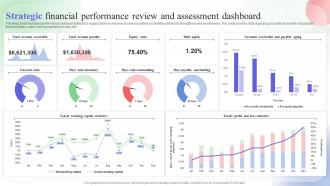
Following slide illustrates performance dashboard utilized by organizations to improve business position by identifying financial strengthens and weaknesses. This slide provides data regarding accounts receivable and payable, financial ratios, yearly working capital summary, etc. Introducing our Strategic Financial Performance Review And Assessment Dashboard set of slides. The topics discussed in these slides are Equity Ratio, Debt Equity, Current Ratio. This is an immediately available PowerPoint presentation that can be conveniently customized. Download it and convince your audience.

FAQs for Strategic Financial Performance Review

Focus on the stuff that actually matters for decisions - revenue trends, cash flow, profit margins, and burn rate. Accounts receivable aging is huge too because nobody wants cash flow surprises hitting them out of nowhere. Pipeline value and monthly recurring revenue growth give you that forward-looking view you need. Budget vs. actuals is always clutch. Honestly, keep it simple though - like 8-10 metrics tops or you'll get lost in the weeds. Start with these basics and just add whatever your team keeps bugging you about in meetings.

Honestly, financial dashboards are a game changer. You get real-time data on cash coming in and going out, plus you can see receivables, payables, and bank balances all in one spot. Way better than constantly opening different spreadsheets (which I used to do and it drove me nuts). The visual charts help you catch seasonal trends or weird spending spikes. Set up alerts for when cash gets low - saves you from those "oh crap" moments. Being able to project your cash position for the next few months? That's where it really pays off.

Honestly, keep it simple with financial dashboards. Line charts are perfect for tracking performance over time. Bar charts? Great for comparing stuff like revenue across departments. Don't sleep on tables either - sometimes people just want the actual numbers right there. Heat maps work really well for risk stuff or showing correlations. Gauge charts are solid for KPIs when you have target ranges. But seriously, avoid those weird 3D charts - they just make everything harder to read. Focus on your most important metrics first, then see what your team actually uses before going crazy with features.

Look, financial dashboards are a game changer for small businesses - you can actually see what's happening with your money instead of drowning in random spreadsheets. Cash flow problems? You'll catch them early. Which products are profitable? Finally know for sure. No more guessing or spending your weekends trying to piece together where you stand financially (seriously, that time-suck alone made it worth it for me). The trick is keeping it simple at first. Pick maybe 3-4 numbers you actually care about and start there. You can always add more fancy stuff later once you're not overwhelmed by it.

You NEED real-time data, trust me on this one. Otherwise you're making decisions with old info - like using yesterday's weather forecast to decide what to wear today. Your dashboard becomes useless if it's just showing historical stuff. Live cash flows and current revenue numbers let you catch problems before they explode and jump on opportunities fast. I learned this the hard way actually. Markets move too quick for static data nowadays. Get your dashboard updating daily minimum, but honestly hourly is way better for the important metrics. Don't settle for stale numbers.

Honestly, dashboards are a game-changer for budgeting. You'll see your spending and cash flow in real-time instead of playing guessing games with old spreadsheets. Those visual charts make it dead simple to compare what you planned vs. what actually happened. I love how you can catch problems early - like if your marketing budget starts spiraling before it tanks everything else. Most tools let you run "what if" scenarios too, which is pretty neat for planning. Oh, and definitely set up alerts for the stuff that matters most. Start by linking your main accounts and you're golden.

Don't cram everything onto one screen - that's the fastest way to overwhelm people. Figure out who's actually using this thing first, then build for them. Skip the vanity metrics that look fancy but don't help anyone make real decisions. Cash flow beats pretty revenue charts every time, honestly. Put your most important stuff where people will actually see it, not buried somewhere they have to scroll to find. Stick with obvious colors - red for bad, green for good. And definitely test it with real users before going live. They'll catch weird stuff you never thought of.

Honestly, start with data governance - figure out who owns what data and set up regular checks. I've watched so many dashboards completely fall apart because nobody was actually keeping the numbers clean. Pull from your main system, not some random Excel file Dave updates whenever he remembers. Automated alerts help when things look sketchy. Build reconciliation between your dashboard and actual financial systems. Oh, and train people to question weird-looking data instead of just going with it. Trust me on that last part - blind faith in numbers will bite you.

Honestly, Power BI is probably your best bet - especially if you're already using Microsoft stuff at work. The free version is solid for testing things out. Tableau looks amazing (seriously, their charts are beautiful) but it'll cost you more. Google Data Studio works fine for basic dashboards, though it feels kinda limited after a while. I mean, you could always go old school with Excel but that gets messy real quick with complex data. Try Power BI first and see if it plays nice with your data sources. That's what I'd do anyway.

Just ask each department what they actually look at every week - like 5-7 key things max. Sales obviously wants their pipeline numbers, conversion rates, commission stuff. HR's all about payroll and headcount budgets. Marketing teams will want their campaign ROI and cost-per-acquisition metrics (plus they'll probably pick the prettiest visualizations, let's be honest). Operations cares about expenses and budget variances mostly. Most dashboard platforms have role-based permissions anyway, so you can set up different views for each team. Start with those weekly metrics they mentioned, then expand from there. Way easier than guessing what everyone needs.

Start with a solid update rhythm - daily for the must-watch stuff, weekly for trends, monthly for big picture KPIs. Automate your data sources if you can because trust me, manual spreadsheet updates are pure hell and you'll mess something up eventually. Clean house regularly by ditching old metrics that don't matter anymore and adding new ones when priorities change. Set up threshold alerts so you're not glued to the screen all day. Oh, and actually sit down with your team periodically to make sure people are using it - otherwise you're just building fancy wallpaper nobody cares about.

Dashboards are a game-changer for seeing what's actually happening with your money in real-time. Executives get the bird's eye view with KPIs for big picture planning. Department heads can dive into their specific metrics to fix budgets and operations. Honestly, anything beats staring at endless spreadsheets - the visual stuff just clicks better. Your front-line managers? They're using it for daily cash flow decisions. The trick is setting up different views for different roles since a CEO doesn't need the same details as a department manager. Just make sure everyone sees what matters for their specific decisions.

So most dashboards just pull data straight from your accounting software using APIs or database connections. Pretty simple setup usually. You'll need admin access to both systems - might want to grab someone from IT if you're not super technical. QuickBooks and Xero play nice with most tools, but honestly, legacy systems can be a total pain. Once it's connected though, everything updates automatically or on whatever schedule you set. I'd start by seeing if your accounting software already has built-in connectors for the big dashboard players like Tableau or Power BI.

Honestly, the real-time access thing is huge - you can pull up your numbers whether you're at your desk or literally anywhere else. No more waiting around for manual updates either, everything just refreshes automatically. Security and backups happen behind the scenes so that's one less headache. Your whole team can jump in and see the same current data at once, which is pretty clutch for meetings. Oh, and definitely set up view-only access for people who just need to peek at stuff but shouldn't be changing anything. Trust me on that one.

Definitely measure stuff before and after you build it - otherwise you won't know if it actually helped. Time savings are huge here. I've seen teams go from spending days on reports to just hours, like 60-70% faster. Track how quickly you can spot budget problems or cash flow issues too. Month-end closes should get way smoother. Honestly, the error reduction alone makes it worth it since bad financial data can mess up big decisions. Compare what you spend on the dashboard against all that saved time over a year. Oh, and start timing your current manual work now so you have something to compare against later.

Ratings and Reviews

100% of 100
Review Form
Write a review
Most Relevant Reviews
  1. 100%

    by Charlie Reed

    Commendable slides with attractive designs. Extremely pleased with the fact that they are easy to modify. Great work!
  2. 100%

    by Claud Hughes

    They guys always go the extra mile to meet the expectations of their customers. Almost a year has been associated with them. 

2 Item(s)

per page: