


Weekly Production Progress Report With Scrap And Efficiency Rate




Try Before you Buy Download Free Sample Product
 Impress Your
 Audience
 100%
100% Editable
 Save Hours
 of Time


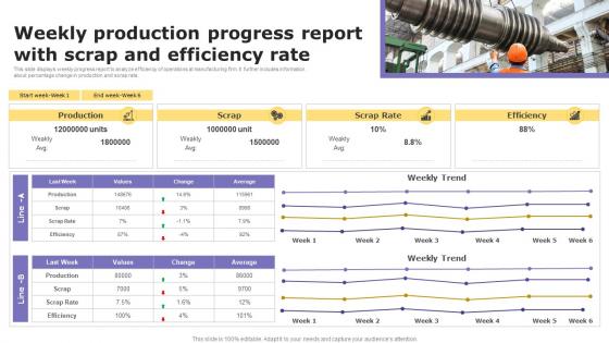
This slide displays weekly progress report to analyze efficiency of operations at manufacturing firm. It further includes information about percentage change in production and scrap rate.
People who downloaded this PowerPoint presentation also viewed the following :
Weekly Production Progress Report With Scrap And Efficiency Rate with all 7 slides:
Use our Weekly Production Progress Report With Scrap And Efficiency Rate to effectively help you save your valuable time. They are readymade to fit into any presentation structure.






FAQs for Weekly Production Progress Report With Scrap
Start with OEE, throughput, and cycle times - those are your bread and butter. Downtime tracking is huge too, both planned and unplanned. Quality stuff like first-pass yield and defect rates matter because honestly, who cares if you're cranking out garbage fast? Also grab your resource utilization numbers and cost per unit. Oh, and labor efficiency if you can swing it. Don't overthink it at first though - nail these basics before you go crazy adding a million other metrics that'll just overwhelm everyone.
Track your throughput rates, downtime percentages, and how well you're using resources. Compare these to your targets or what others in the industry are hitting - that's how you find the problem spots. Break it down by shift or product line too. Honestly, looking at trends over time is way more valuable than just checking numbers once. Set up alerts when efficiency dips below certain levels so you can jump on issues early. Oh, and don't just look at snapshots - the patterns tell the real story about what's actually broken.
Honestly, data analysis is like having superpowers for your production line. Track your key metrics consistently and you'll start seeing bottlenecks you never noticed before. Performance trends become super obvious. Which machines are slowing everything down? Now you know. Walking the floor only tells you so much - the real patterns hide in the numbers. Instead of guessing what's broken, you can actually target the problem areas. I mean, who doesn't want x-ray vision for their operations? Just look for patterns over time and you'll be shocked what pops up.
Honestly, those production reports are a goldmine for finding bottlenecks. Track your cycle times and throughput at each station - like if Station A cranks out 100 units per hour but Station B only does 60, boom, there's your problem. Watch for spots where work piles up or processing drags. I'd run these reports weekly and compare different shifts. The patterns tell the whole story. Higher inventory sitting around? Longer wait times? That's where things are getting jammed up. It's pretty straightforward once you start looking at the actual numbers instead of just guessing.
Oh man, the biggest thing is mixing time periods - like weekly vs monthly data. Makes your charts look absolutely terrible. Also don't cherry-pick just the good numbers (guilty of this myself lol). Make sure you actually define what "efficiency" means for your specific setup first. Half the reports I see are way too detailed for whoever's reading them. Focus on stuff that'll actually change decisions. And honestly? Those baseline calculations are where most people mess up, so double-check those before hitting send. Oh, and account for any downtime that wasn't actually production issues.
Weekly reports work best for most places - gives you solid data without going crazy. Daily is just too much noise (learned that the hard way lol). Monthly? You'll miss stuff that needed fixing weeks ago. High-volume operations might want bi-weekly during crunch time, but honestly weekly's your starting point. The real test is whether your team actually looks at them and does something about it. No point in perfect reports if they just sit in someone's inbox, you know? Start there and see what happens.
Honestly, Excel or Google Sheets are still your go-to for most production reports - they just work. Power BI or Tableau are worth it if you're drowning in data or need those fancy real-time dashboards. There's also manufacturing-specific stuff like Wonderware MES systems, though I've seen people get great results with simple OEE calculators too. Really depends on how complex your data is and who's reading these reports. Sometimes I think we overthink this - if a basic spreadsheet does what you need, why make it harder? Just match the tool to what you're actually trying to accomplish.
Dude, charts and graphs are a game changer for production data. You'll spot problems way faster than scrolling through endless spreadsheets. Heat maps instantly show which lines are tanking. Trend lines tell you if things are actually getting better over time. I swear, reviewing reports used to be torture until we got decent visuals - now the data actually makes sense. Dashboards give you that real-time view too, which is clutch. Start simple though. Pick your top 5 KPIs and throw them into basic charts. You'll catch issues so much quicker.
Honestly, benchmarking is a game-changer - suddenly you know if your efficiency rates actually suck or if you're doing great. No more wondering where you stand. You'll catch improvement opportunities that were hiding in plain sight, plus it makes asking for budget way easier when you've got solid competitor data. I remember being shocked the first time we did this properly at my old job. Pick 2-3 key metrics that matter most to your operation. Find some decent industry reports to stack up against. The data helps you figure out what needs fixing first instead of just guessing.
Yeah, supply chain issues totally screw with your efficiency reports. Your numbers will look awful - output drops, cycle times get longer, costs go up - even though your actual processes are fine. It's super frustrating because leadership sees the bad metrics and thinks you're failing. What I'd do is create a separate section in your reports specifically calling out external disruptions. Or at least add notes explaining the weird spikes. Honestly, covering your ass is half the job sometimes. You don't want to get blamed for stuff that's completely out of your hands, you know?
Okay so first thing - tackle that equipment downtime. Get preventive maintenance scheduled and cross-train your people so you're not screwed when Bob calls in sick again. Next, look at your workflow setup. Maybe rearrange those workstations or tweak the scheduling to cut down idle time? Your data probably shows quality problems causing rework too, so dig into what's actually causing those issues. Oh and set up regular check-ins on whatever KPIs had the biggest gaps. Honestly though, just pick your top 2-3 problems first. Don't try fixing everything at once or you'll go crazy.
Just add a section for worker feedback - those guys see stuff the numbers miss. Quick surveys work great, or grab people for 5-minute chats during shifts. They'll tell you exactly why Line 3 keeps jamming or whatever's actually slowing things down. Honestly, floor staff usually know the real problems before management does. Mix their quotes right in with your data - way more convincing than just showing charts. Leadership gets the full picture instead of wondering why productivity's tanking but everything looks fine on paper.
Ugh, low production efficiency is like getting punched from every direction. First, your costs balloon because you're burning through resources just to make the same stuff. Customers get pissed when deliveries are late or quality sucks - and trust me, winning them back costs way more than keeping them happy in the first place. Then you can't compete on price since efficient competitors are eating your lunch with lower unit costs. Your team starts hating their jobs too because nobody wants to work in broken processes all day. Honestly? Find your worst bottlenecks and fix those first.
So honestly, start with the basics - cycle time, inventory turnover, defect rates. OEE is huge too. Lead times are where you'll find the most obvious waste (I swear, companies overlook this constantly). Track your value stream mapping results and any kaizen improvements you've made. The key is showing both current numbers AND month-over-month changes. Otherwise you can't tell if your lean stuff is actually working. Don't just dump data - organize it so people can see the bottlenecks you've eliminated. Makes a huge difference when leadership reviews it.
Honestly, the biggest game-changer is getting sensors and IoT stuff to track everything automatically - no more manual number-crunching. Real-time dashboards are a lifesaver since you're not stuck waiting for those useless weekly reports. The AI pattern detection is pretty wild too, like it'll predict equipment failures before they happen. I'd probably start small though - pick one process you really want visibility into, get that automated first. Oh, and the machine downtime tracking alone will save you tons of headaches. Once you see how much better decisions get with live data, you'll want to expand it everywhere.
-
Good research work and creative work done on every template.
-
I faced no difficulty while searching for the slide I wanted. Honestly, the website’s interface is easy to use and can be navigated easily!