

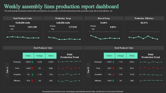
Weekly Assembly Lines Production Report Dashboard Snapshot




Try Before you Buy Download Free Sample Product
 Impress Your
 Audience
 100%
100% Editable
 Save Hours
 of Time


This slide illustrates production numbers of the assembly lines of a corporation. It includes total produced units, production scrap, rate of scrap, efficiency, etc.
People who downloaded this PowerPoint presentation also viewed the following :
Weekly Assembly Lines Production Report Dashboard Snapshot with all 7 slides:
Use our Weekly Assembly Lines Production Report Dashboard to effectively help you save your valuable time. They are readymade to fit into any presentation structure.





FAQs for Weekly Assembly Lines Production
Focus on production numbers first - how many units you actually made versus what you planned. Quality stuff like defect rates matters too. Equipment downtime kills everything, so track that. Labor efficiency is huge. Oh, and definitely include safety incidents because honestly that trumps everything else if someone gets hurt. Bottlenecks are worth noting since they mess up your whole week. Make it visual - charts, colors, whatever helps patterns pop out quickly. The whole point is someone should be able to scan it in 30 seconds and know what's screwed up for next week.
Look, a production dashboard basically stops your team from constantly asking "wait, where are we on that project?" Everyone sees the same data - progress, what's stuck, what needs attention first. No more endless Slack threads or email chains trying to figure out status updates. During standups, people actually have something concrete to talk about instead of just winging it. When everyone can see how their work connects to the bigger goals, they're way more likely to speak up early when something's going sideways. Honestly, it's one of those things that seems obvious once you have it. Just pick 3-5 key metrics that actually matter to your team and start there.
Honestly, line charts are your best bet for tracking trends over time, and bar charts work perfectly when you're comparing different production lines or shifts. Heat maps are clutch if you've got multiple facilities - problem spots just jump right out at you. Those KPI cards at the top? Total game changer. Managers love scanning total units, efficiency rates, downtime hours in like two seconds. Skip pie charts completely though - they're basically worthless for production stuff. Oh, and keep your colors consistent across everything. You'll definitely want the ability to drill down into hourly data when something looks weird in the weekly view.
So basically, real-time data means you see what's happening NOW instead of getting yesterday's info. Machine breaks at 2pm? You'll know instantly, not when someone updates some random spreadsheet tomorrow morning. Your weekly reports become way more accurate too since you're catching every little issue as it happens - honestly, it's kind of a game changer once you get used to it. I'd start with whatever production lines are most critical first. Then just expand from there when you're ready.
Honestly, I'd go with **Tableau** or **Power BI** first - both are solid for pulling data from different places and look pretty professional. **Google Data Studio** is decent too if you want free, though it's not as powerful. You could even stick with Excel if your data's straightforward and you're good with pivot tables. I mean, I've seen some surprisingly slick Excel dashboards. The real trick is picking whatever your team will actually keep updated. Nobody wants a dashboard that sits there collecting digital dust. Start with what feels comfortable, then move up if you need more bells and whistles later.
Yeah, dashboards are pretty customizable - you can tweak almost anything to fit your industry. Manufacturing folks usually want throughput and downtime metrics front and center, while service companies care more about completion times and customer satisfaction. Honestly, the trick is figuring out what your team actually looks at every day, not just what makes the bosses happy (though that counts too, obviously). You can mess with time intervals, set up alerts for critical stuff, and rearrange the whole layout. I'd start by writing down the 5 metrics your people check constantly - put those right up top where they're easy to spot.
You need that historical data - it's literally what makes your dashboard actually useful. Like, 847 units sounds impressive but is it though? Without knowing your usual numbers for this time of year, you're just guessing. Trends show you seasonal stuff and help separate real problems from normal ups and downs. I'd grab at least 12 weeks of past data to build solid baselines. That way you're setting targets based on what actually happened before, not just hoping for the best. Makes way more sense than flying blind.
Pick 3-5 KPIs that actually matter for your production stuff - output, quality, downtime, efficiency rates. Week-over-week trends are clutch for spotting patterns fast. Visual charts honestly save so much time vs staring at spreadsheet numbers. Auto-pull the data if you can, otherwise you'll forget to update it (trust me on this one). Traffic light colors work great - green/yellow/red gives you instant status without thinking. Keep it simple enough that people will actually check it during meetings instead of ignoring another complicated dashboard.
Honestly, the hardest part is everyone wanting different stuff on the dashboard - stakeholders never agree on what's actually important. Data freshness will drive you crazy too since production data is always messy and late. Real estate becomes impossible when you're cramming everything into one view. Multiple data sources? Performance goes to hell real quick. Plus getting clean, consistent feeds is a total pain. I learned this the hard way - just start with maybe 3 key metrics max, then build from there based on what people actually use. Don't try to make it perfect right away.
Just do quick surveys or casual check-ins with your users. Watch them during meetings too - you'll see what they actually click on vs. what gets ignored. Those metrics they keep asking about but can't find? That's your redesign roadmap right there. People are surprisingly honest about dashboards since they're stuck using them every day (unlike other products where they might be polite). Monthly feedback sessions work well. Here's the thing though - you've got to actually make the changes they suggest and tell them about it. Otherwise they'll stop caring about giving you feedback.
Start with clean design and intuitive nav - that's your foundation. Keep colors consistent, use white space generously, and put your key metrics right at the top where they can't be missed. There's this "5-second rule" I swear by - anyone glancing at it should get the main info that fast. Add tooltips for technical stuff (trust me on this), check contrast ratios so it's accessible, and definitely test on different screen sizes. Oh, and get real user feedback constantly. They'll catch things you're totally blind to. Short bursts of testing beat one big review every few months.
Honestly depends on how fast your stuff can blow up. Daily works great for anything running 24/7 - you'll catch problems before they get ugly. Slower processes? Maybe every 2-3 days is fine. I've watched teams burn out from too many updates though. Like, constant pings just become background noise and people tune out completely. You don't want that. Start daily for the first month, see how often you're actually getting useful changes that need action. Then dial it back if needed. Better to stay sane than drown in alerts, you know?
Honestly, production dashboards are game-changers for making decent decisions instead of just winging it. You'll catch trends in output and efficiency before they become real problems. Think of it like getting regular blood work done - boring but catches stuff early. Historical data shows you patterns so you're not just guessing about staffing or equipment purchases. Oh, and bottlenecks become super obvious when you see the numbers laid out. I'd definitely use it for setting quarterly targets and actually tracking if you're hitting them.
Honestly, I'd keep it super simple at first - maybe just 2-3 alerts for your biggest concerns. Set thresholds like when production drops below 85% or quality tanks. Most dashboard tools can ping you through email or Slack when stuff goes sideways. Trust me, alert fatigue is no joke. Had a coworker whose phone went off constantly and he just started ignoring everything, even the important stuff. You can set up escalation too so if nobody responds, it automatically bothers your supervisor instead. Start small, then add more alerts once you figure out what actually matters.
Dashboards are getting way more real-time now, with AI doing the heavy lifting on insights instead of just showing you what already happened. Mobile-first is basically required at this point. The cool part is how they're adding predictive stuff right into the interface - no more digging around for forecasts. Self-service customization is everywhere so people can build their own views without bugging IT constantly. Oh, and interactive storytelling where the data walks you through findings automatically. For your production dashboard, I'd throw in some predictive maintenance alerts soon and make sure it works on phones. Those features are becoming pretty standard.
-
Really like the color and design of the presentation.
-
I looked at their huge selection of themes and designs. They appeared to be ideal for my profession. I'm sure I'll grab a few of them.