


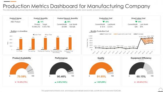
Production Metrics Dashboard For Manufacturing Company




Try Before you Buy Download Free Sample Product
 Impress Your
 Audience
 100%
100% Editable
 Save Hours
 of Time


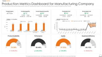
This slide represents dashboard depicting production metrics for manufacturing company. It covers product quantity, rework quantity, production cost, labor cost etc.
People who downloaded this PowerPoint presentation also viewed the following :
Production Metrics Dashboard For Manufacturing Company with all 7 slides:





FAQs for Production Metrics Dashboard
So definitely track throughput first - how many units you're cranking out per hour or day. Quality rates are huge too, like defect percentages and first-pass yield. Equipment effectiveness (OEE) and cycle times matter a lot. Honestly, downtime tracking is where you'll find most of your wins hiding. Don't forget inventory levels and resource utilization. Safety incidents too if that's relevant for you. Your dashboard should be a quick health check, then you can dig deeper when stuff looks weird. Start with maybe 6-8 metrics tops - more just gets messy.
Honestly, real-time dashboards are game-changers because you catch problems as they're happening instead of discovering them hours later in some boring report. Machine performance, quality issues, bottlenecks - you'll see it all updating live. The trick is setting up smart alerts so you're not glued to your screen 24/7 (learned that one the hard way). Configure thresholds for your critical stuff and boom - you'll get pinged the second production drops or equipment starts being weird. There's actually something weirdly addictive about watching those charts refresh!
Dude, automation completely changed how we track production stuff. No more stupid typos from manual entry, and you can see what's happening right now instead of waiting for someone to update a spreadsheet. The data just flows straight from machines to your dashboard automatically. Honestly, it catches problems so much faster than the old way. I'd probably start with whatever metrics matter most to you - once you see how clean the data gets, you'll want to automate everything else too. Way less headache overall.
Dude, production dashboards are seriously worth it. Your whole team can see real-time performance stuff in one spot instead of digging through random tools. Standups become way smoother - no more awkward "uh, let me check that" moments. You'll catch problems faster and actually make decisions based on data instead of just winging it. Plus you can celebrate wins together when things are going well. Oh, and definitely set up alerts for the important metrics so the right people get pinged automatically when something breaks.
Put your most important stuff right at the top - seriously, don't make people scroll around looking for key numbers. Colors need to actually mean something (red = bad, green = good), not just random decoration. Group similar metrics together and give people context like "hey, we're 15% above target" so the numbers actually make sense. Refresh rates should match what you're measuring - real-time updates for monthly data is just silly. Oh, and definitely test this with real users first. I've seen way too many dashboards that looked perfect to the designer but confused everyone else. Short sentences work. So do longer ones that actually flow naturally when you're explaining the bigger picture.
Okay so first thing - double-check you're actually pulling from the right databases. Your ETL might be dropping records or creating duplicates without you knowing. Set up some automated checks that'll catch weird stuff like random spikes or missing timestamps. We had a dashboard once that showed 200% efficiency for a whole week... nightmare. Document whatever transformations you're doing to the raw data, and honestly? Use version control for your dashboard code. Get someone else to regularly spot-check your numbers against the source systems too. I know it's extra work but you can't just trust the data blindly.
Honestly, start with OEE if you're feeling overwhelmed - it rolls availability, performance, and quality into one clean number. After that, cycle time and throughput are no-brainers. Defect rates too, obviously. Labor productivity matters way more than people think, and changeover times will kill you if you're not watching them. Oh, and energy per unit is getting big now with all the green stuff companies are pushing. Schedule adherence and inventory turns round out my list. Set up alerts when things drop below target - you don't want to be catching problems manually.
Yeah, it totally depends on what you're making. Automotive companies are obsessed with defect rates and cycle times - makes sense since recalls are a nightmare. Food and beverage? They're all about throughput and waste percentages, plus crazy compliance stuff for safety. Electronics is wild though - their precision standards are insane, like microscopic tolerances that would make your head spin. I'd say just focus your dashboard on whatever failure would hurt you most. If quality issues tank your reputation, track those defect metrics religiously. Regulatory headaches? Prioritize compliance KPIs. Match your pain points basically.
So for dashboards, I'd probably go with Grafana first - it's free and works great for real-time stuff. Gets you up and running super fast too. Tableau and Power BI are solid if your team needs fancy analytics but isn't too technical. Oh, and there's Datadog or New Relic if you're specifically tracking app performance. Honestly though, Grafana's community is massive so you'll find templates for basically everything. Start there and see how it feels - worst case you pivot later but at least you didn't spend money figuring out what you actually need.
Start with forecasting widgets that tap into your historical production data - they're great for spotting future bottlenecks and maintenance needs. Tableau and Power BI both have ML built right in now, which honestly makes this stuff so much simpler than it was even a few years ago. Equipment failure probability is a solid first prediction to tackle, or maybe throughput forecasts based on current patterns. Just make sure your data's clean before feeding it to the models. Oh, and definitely set up automated alerts for when predictions flag potential problems. Test one model first, see how accurate it gets, then build from there.
Yeah, so disengaged workers basically don't give a shit about getting the numbers right. They'll rush data entry or skip steps entirely. Your metrics become unreliable garbage. Engaged people actually care - they'll use the dashboard to improve performance and take ownership of reporting. It's pretty obvious when you think about it. Productivity drops show up in your numbers too. I'd check if engagement scores dip whenever data quality suddenly tanks. You might find some interesting connections there that help explain what's happening.
Start by asking your team what decisions they're making every day - that's where the real value is. Focus on the stuff that actually matters: OEE, machine downtime, defect rates, throughput. Most tools let you drag widgets around pretty easily. Role-based access is huge though - operators need live machine status while supervisors want shift summaries. I'd honestly test it with just a few people first because I've seen way too many dashboards that look impressive but nobody uses them. Floor managers and executives care about totally different things, so don't try to cram everything into one view. Get their feedback and tweak from there.
Honestly, data quality will be your biggest headache. Everything's scattered across different systems, and teams calculate the same metrics in totally different ways - it's a mess. Then you'll waste hours arguing about whether to prioritize error rates or recovery time first. Making it actually useful instead of just looking good is tricky too. Don't overwhelm people with data they'll ignore. I'd say pick 3-5 metrics that matter most to everyone and nail those first. You can always add more once people trust what you've built. Start small, prove it works, then expand from there.
Start with the hard numbers - error rates, response times, that stuff. Those metrics will actually tell you what's broken. But here's the thing, data without context is pretty useless. You'll want user feedback and support tickets to explain why something's failing. I do like a 70/30 split personally - mostly quantitative for catching problems early, then qualitative to figure out what's worth fixing first. Set up dashboards so the numbers alert you fast. Then dig into the human side to understand what really matters.
So historical data is like your cheat sheet for forecasting - shows you all the patterns and seasonal stuff that'll help predict what's coming. You can catch those recurring bottlenecks and figure out your actual capacity limits. Plus you'll see how outside factors messed with your numbers before. It's kinda like checking last year's holiday madness to prep for this year's disaster. The dashboard uses that context to make better forecasts and flag when things go sideways. Just make sure your data's clean and goes back at least a year - garbage in, garbage out, you know?
-
Designs have enough space to add content.
-
Nice and innovative design.