


Garment Manufacturing Quality KPI Dashboard




Try Before you Buy Download Free Sample Product
 Impress Your
 Audience
 100%
100% Editable
 Save Hours
 of Time


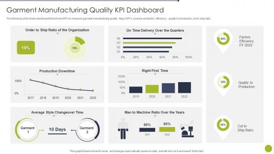
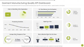
The following slide shows dashboard that shows KPIs to measure garment manufacturing quality. Major KPIs covered are factory efficiency, quality to production, cut to ship ratio.
People who downloaded this PowerPoint presentation also viewed the following :
Garment Manufacturing Quality KPI Dashboard with all 7 slides:
Use our Garment Manufacturing Quality KPI Dashboard to effectively help you save your valuable time. They are readymade to fit into any presentation structure.





FAQs for Garment Manufacturing
Honestly, I'd focus on defect rates first - split them into major vs minor so you can prioritize. First-pass yield is clutch too. Customer return rates will show you what's actually making it out the door broken. Quality audit scores are obvious but necessary. Inspection efficiency is weirdly overlooked by most people, definitely track that. If you're dealing with suppliers, their performance ratings matter big time. Same with fabric and trim quality metrics for incoming stuff. Cost of quality is probably the most eye-opening one though - shows exactly how much you're bleeding on rework and returns. Start with automated dashboards for defect rates and first-pass yield since those update in real-time.
So basically a KPI dashboard lets you see quality issues happening right now instead of finding out weeks later when customers complain. Way better than waiting around. You'll catch defect rates and supplier problems as they're actually happening, which honestly saves so much headache. Like if one production line keeps screwing up or a fabric batch is causing issues - boom, you know immediately. Then you can fix stuff based on real data instead of just putting out fires all day (which gets exhausting fast). I'd start with tracking maybe 3-4 key metrics first though.
Track your defect rates first - break them down by stitching, fabric, sizing issues. Then add first-pass yield and return percentages. Supplier quality scores are huge too, plus inspection pass rates. Honestly, rework costs hit different when you see the actual dollar amounts eating into profit. Lead times for fixing quality problems matter, and customer satisfaction scores if you've got them. Real-time dashboard updates are key so problems don't spiral. We learned that the hard way at my last job. Start with these basics - you can always layer on more detailed stuff once everyone's comfortable with the main metrics.
So defective rate - just divide your bad units by total units, times 100 for percentage. Put that sucker front and center on your dashboard since it's basically your most important number. I'd track it daily and weekly with a trend line so you can catch issues fast. Color coding works great too - green/yellow/red based on your thresholds. This metric seriously can tank your whole production if it gets out of hand. Oh and definitely break it down by defect type and which line it's happening on. Otherwise you're just staring at a number with no clue how to fix it.
Customer satisfaction scores are like your gut check for all those quality metrics you're tracking. Perfect defect rates? Great. But if customers hate how your product fits or falls apart after a week, those internal numbers are pretty meaningless. Numbers tell one story - the customer experience tells another, and that's what really matters at the end of the day. You'll want to watch for satisfaction dips and match them up with your production data. It's actually a solid way to catch quality problems before they snowball into something worse.
Dude, real-time data integration is actually clutch for this stuff. No more waiting around for batch uploads from yesterday - you're seeing live feeds straight from inspection stations and production lines. Quality issues pop up on your dashboard the second they happen, not hours later when it's already too late. Short bursts work better than long explanations here, trust me. You can spot defects before they turn into those nightmare recalls nobody wants to deal with. Set up alerts so your team gets notified immediately when metrics go sideways. Honestly beats playing catch-up with old data.
Tableau and Power BI are your best bets for this. Power BI's probably the winner since it plays nice with Excel - and let's be real, everyone's already using Excel for quality data anyway. Google Data Studio could work if budget's tight, but it's pretty basic compared to the other two. Pick whatever connects easily to your current quality systems. Your team will thank you for not making them learn something totally foreign. Oh, and definitely start small with a pilot dashboard first - learned that one the hard way on a previous project.
Your historical data is basically a crystal ball if you use it right. Track stuff like which suppliers have higher defect rates or how rush orders mess with quality - I swear this catches problems weeks early. Set up alerts for when conditions match past trouble spots, like when certain fabric types start acting up. Seasonal patterns are huge too, though everyone seems to miss those. The whole point is getting ahead of issues instead of just reacting after they've already screwed you over. Makes your dashboard actually useful for once.
You'll want to hit these benchmarks: defect rates under 2-3%, first-pass yield above 95%, customer returns below 1%. Keep rework costs under 5% of production too. The numbers shift depending on your market though - luxury brands need way tighter tolerances than fast fashion, obviously. What really matters is comparing yourself to your top 3 competitors, not just industry averages. I'd start by auditing where you're at now. Then set quarterly targets to improve 10-15% until you hit those benchmark levels. Your dashboard should track all this stuff side by side.
Start with customer-facing stuff first - defect rates, returns, quality scores. That's what actually matters. Then add your operational metrics like inspection rates and rework costs. Group similar things together so people aren't hunting around the screen. Executives want the big picture trends, but your production folks need the nitty-gritty breakdown by defect type. I'd honestly keep it super simple at first - you can always add more later once you see what people actually use. Too many dashboards turn into a hot mess because someone got carried away with fancy widgets nobody looks at.
Go with green and red color coding - makes pass/fail rates super obvious at a glance. Charts beat the hell out of number tables (seriously, who wants to stare at spreadsheets?). Your team will thank you for adding filters by production line, dates, whatever defect type they're hunting down. Put your biggest metrics right at the top where people actually see them. Visual stuff like icons helps the non-techy folks get what's happening with quality trends. Honestly, if someone can't figure out the main points in 10 seconds, you've overcomplicated it.
Check your quality KPIs weekly at minimum. During crazy busy periods or when things go sideways, you'll want daily monitoring. Monthly deep dives are where the magic happens though - that's how you catch trends and seasonal stuff. I swear, so many teams build these gorgeous dashboards then completely ignore them for months. Don't be those people! If your metrics are all over the place, definitely go daily until things stabilize. The whole thing needs to become routine, not something you remember at 3am randomly.
So you'll want to get them comfortable with the basics first - filtering data, reading charts, understanding defect rates and quality scores. The tricky part? Most people freeze up around data initially. Focus on what specific KPIs actually matter for their jobs, since floor workers need different insights than managers. Then show them what to do when something looks off - like when trends spike or dip unexpectedly. Oh, and definitely do practice sessions with real scenarios from your plant. That way they can see how dashboard alerts translate to fixing actual quality issues. Makes it way less abstract.
Honestly, just pick your baseline metrics first - defect rates, first-pass yield, customer complaints, whatever matters most to your process. Then track those same ones after you make changes. The dashboard lets you filter by dates so you can actually see if stuff's improving or not. I'd stick to maybe 3-4 metrics max because tracking everything gets messy fast. Oh, and set up those automated alerts - you'll know right away when something's working or when you need to switch gears. Way better than waiting weeks to realize an initiative flopped.
Honestly, the biggest pain is getting all your data to play nice together. Quality stuff lives everywhere - inspection reports, defect logs, supplier scorecards - and making it work in one dashboard? Nightmare fuel. Then you've got the people problem. Production teams and quality folks will eye-roll at another "tool" they have to learn. Can't really blame them though. Training's huge because if they don't get the metrics, your dashboard becomes very expensive decoration. My advice? Pick one metric that actually matters and nail that first.
-
Thank you for offering such fantastic custom design services. The team is really helpful and innovative. In a very short time, I received my personalized template.
-
The website is jam-packed with fantastic and creative templates for a variety of business concepts. They are easy to use and customize.