


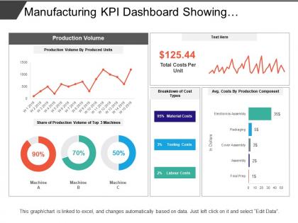
Manufacturing kpi dashboard showing production volume and cost breakdown




Try Before you Buy Download Free Sample Product
 Impress Your
 Audience
 100%
100% Editable
 Save Hours
 of Time


Focus on your facilities with our Manufacturing Kpi Dashboard Showing Production Volume And Cost Breakdown. Give full exposure to all the benefits.
People who downloaded this PowerPoint presentation also viewed the following :
Manufacturing kpi dashboard showing production volume and cost breakdown with all 6 slides:
Go for a frolic with our Manufacturing Kpi Dashboard Showing Production Volume And Cost Breakdown, You will enjoy every bit.
FAQs for Manufacturing kpi dashboard showing production volume
So basically you want to track the big four: quality, efficiency, cost, and safety. OEE is honestly your best friend here - it shows how your production line's actually performing, not just what you think it's doing. Track defect rates, on-time delivery, downtime, cost per unit. Safety incidents too, obviously. Oh and inventory turnover - forgot that one initially. But here's the thing: pick maybe 6-8 metrics tops that actually help you make decisions. Don't just throw pretty numbers on screens. Start with whatever's driving you crazy right now and build around fixing that first.
So basically, these dashboards give you live data from your whole production line - cycle times, throughput, equipment efficiency, all that stuff. When something's running slow or backing up, it'll show up right away with color coding or alerts. Way better than wandering around the factory floor trying to guess what's wrong, honestly. You can spot the exact bottleneck in seconds instead of wasting time. Each station shows its performance, so if one area keeps lagging behind the others, that's your problem right there. Makes troubleshooting so much faster.
Dude, you definitely need real-time data if you want your dashboard to actually help instead of just showing what already happened. Think about it - checking yesterday's numbers when something's breaking right now is pretty useless. With live feeds updating every 15-30 minutes (or faster if you can swing it), you'll catch bottlenecks and equipment issues while you can still fix them. That's honestly the difference between preventing a problem and dealing with a mess later. Otherwise you're just staring at history while your production line goes sideways.
First figure out what actually matters - downtime, quality, throughput, whatever. Then just drag those key metrics to the top of your dashboard where you'll see them right away. Seriously, don't try cramming everything onto one screen like most people do. Stick to maybe 5-7 metrics per area max. The drill-down feature is honestly the best part though - when something looks weird, you can dig into the details fast. Oh and set up alerts so you're not staring at the thing all day. Secondary stuff can live on other tabs where it won't distract you.
Honestly, Power BI and Tableau are your best bets if you've got the budget - they play nice with manufacturing systems and handle real-time stuff well. Excel can work for basic dashboards, but it gets messy fast with big datasets. My old coworker swears by Grafana for IoT sensor data, which might be overkill but it's solid. Some MES platforms throw in dashboard features too. Really though, pick whatever your team won't abandon after two weeks. There's nothing worse than building something fancy that nobody maintains.
So predictive analytics is like upgrading from looking backwards to actually seeing what's coming. Instead of just tracking what already went wrong, you can catch equipment about to fail, spot when you'll max out capacity, stuff like that. Makes you proactive rather than always putting out fires. Honestly, the ROI on preventing one major breakdown usually pays for the whole system. I'd say pick your most critical process first - don't try to do everything at once or you'll just overwhelm yourself. Once that's working, then expand from there.
Honestly, keep it stupid simple for manufacturing dashboards. Green/yellow/red color coding is your best friend - operators can spot problems instantly without thinking. Skip the fancy charts that look Instagram-worthy but confuse everyone on the floor. Basic bar charts and line graphs work way better. Put your top 5 KPIs front and center where people don't have to scroll around hunting for them. Group similar stuff together too - like all your quality metrics in one spot. Oh, and remember floor managers need totally different info than the C-suite folks. Start small with those critical KPIs, then add more once you've got the foundation working.
Honestly? Most manufacturing stuff needs updates every 15-30 minutes minimum. Production metrics like throughput and quality issues - you want those refreshing constantly so you can actually catch problems before they blow up. Daily updates for financial stuff like cost per unit work fine since those don't swing around much. I've worked with way too many teams using dashboards that only update once daily and it's basically useless. Start with hourly as your baseline, then crank up the frequency for whatever your operators are checking most. Oh, and ask them what they actually need - sometimes what seems critical to management isn't what the floor really uses.
Honestly, the trickiest part is dealing with data silos - like when your systems don't talk to each other at all. Plus every department has their pet metrics they swear by. Production loves efficiency stats, quality control lives for defect rates... it's chaos. My advice? Pick maybe 3-5 KPIs that everyone can agree actually matter and start there. Don't try to boil the ocean right away. Getting stakeholders involved early is huge - otherwise you'll build this gorgeous dashboard that just sits there collecting digital dust. Oh, and definitely check if your data sources can integrate before you get too far down the rabbit hole!
So basically, these dashboards show you what's actually happening vs what should be happening in real time. Way better than digging through endless spreadsheets every time you need to check something - trust me on that one. You'll spot trends fast and see which areas are total disasters that need fixing ASAP. Set up alerts when your numbers go wonky so you catch problems early. The best part? You can finally prioritize improvement projects based on real data instead of just guessing. Makes the whole continuous improvement thing way less painful.
So you wanna track equipment effectiveness? Start with OEE - it's this metric that rolls availability, performance, and quality together. Pretty neat once you wrap your head around it. MTBF and MTTR are solid basics too (time between failures and repair time). The planned vs unplanned downtime thing is huge - nobody talks about it enough but it'll save your butt. Oh, and don't forget maintenance costs per unit. Honestly though? Just focus on OEE and MTTR first. Those two will show you what's actually broken without drowning you in data.
Dude, get a KPI dashboard set up ASAP. Your managers need to see what's actually happening on the floor instead of just guessing. I'm telling you, the patterns you'll spot in downtime and quality issues will blow your mind - we had no clue how much we were missing before. Focus on exceptions and trends, not just boring raw numbers. That way when something goes wrong, your team can jump on it fast. Oh and make sure everything's in one place - nobody has time to hunt through five different systems when production's going sideways.
Honestly, benchmarking is what makes your KPIs actually useful. Without it, you're just staring at random numbers wondering if they're good or bad. Like, is 85% efficiency amazing or trash? You won't know unless you compare it to industry standards or your past performance. I can't tell you how many times I've seen dashboards with zero context - just numbers floating in space. Pretty useless tbh. Find industry averages for your main metrics first, then work those into your dashboard so you can actually tell if you're winning or need to panic.
Start with the basics - productivity rates, quality scores, safety incidents per person or team. Most dashboard tools can pull from HR systems and production logs, but honestly? Getting everything connected is usually a nightmare. Focus on what actually moves the needle: units per hour, defect rates by operator, attendance. Oh, and training completion - that one's huge. The trick is making your team see it as support, not Big Brother watching them. I'd probably start small with just a few key metrics. You can always add more once you figure out what's actually driving results in your place.
Dude, those KPI dashboards are game-changers for compliance stuff. Instead of digging through endless spreadsheets when inspectors roll up, everything's already tracked - safety incidents, emissions, quality issues, the whole nine yards. Real-time monitoring means you actually get warnings before hitting those scary regulatory limits. No more scrambling around like headless chickens. When audit season hits (ugh), you just click a few buttons and boom - reports are done. We used to spend literal weeks pulling data from different systems. Set up some automated schedules and honestly? You'll sleep way better knowing you're covered.
-
Colors used are bright and distinctive.
-
Very well designed and informative templates.