


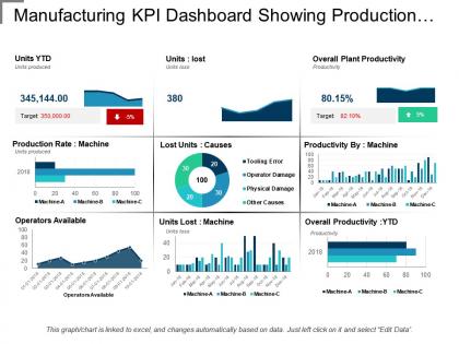
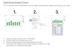
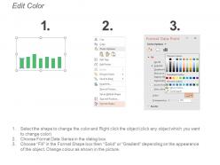
Manufacturing kpi dashboard showing production rate and lost units





Try Before you Buy Download Free Sample Product
 Impress Your
 Audience
 100%
100% Editable
 Save Hours
 of Time


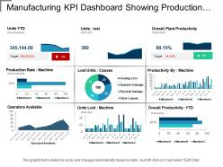
Track the productivity levels of a manufacturing process with our manufacturing KPI dashboard showing production rate and lost units. This presentation slide of manufacturing KPI dashboard has been designed by our team of professional team members and provides manufacturers valuable business insights to meet their organizational goals. Our manufacturing control panel PPT slide helpful you to define metrics to measure analyze and optimize production processes regarding their quantity, quality and various cost aspects. This excel linked presentation slide of production metrics can be used to visualize on graphs and charts to provide real-time monitoring for senior executives and give a warning message when volumes exceeds set thresholds. With the help of this production KPI template which shows production rate and lost units allows you to evaluate the quantities that your business can produce over time such as month, a semester or a year and help you compare those results to previous periods to stop anomalies, or to show the progress. Guard against bad habits with our Manufacturing Kpi Dashboard Showing Production Rate And Lost Units. Ensure you don't become complacent.
People who downloaded this PowerPoint presentation also viewed the following :
Manufacturing kpi dashboard showing production rate and lost units with all 6 slides:
Decipher the data with our Manufacturing Kpi Dashboard Showing Production Rate And Lost Units. Your thoughts will get a clear line to follow.
FAQs for Manufacturing kpi dashboard showing production rate
Honestly, start with OEE - that's your main one. Then track production volume, defect rates, and downtime. Cycle time and first-pass yield are super helpful too. Don't sleep on inventory turnover either, it shows if you're actually running efficiently. Cost per unit is obvious but critical since it hits your profits directly. Oh, and on-time delivery rates - customers care about that more than anything sometimes. These basics will cover like 90% of what you need to know. You can always get fancy with specialized metrics later, but nail these first.
Dude, visualization is a game changer for manufacturing dashboards. Instead of staring at endless spreadsheet rows, you get instant clarity. Heat maps show struggling production lines right away. Trend charts reveal patterns you'd totally miss otherwise. Color-coded stuff flags problems immediately - way better than hunting through data tables. I swear, half the time people overlook critical issues because they're drowning in numbers. Start simple with charts for your key KPIs. Your team will spot and fix problems so much faster. It's honestly night and day once you make the switch.
You need real-time data to actually monitor your manufacturing KPIs properly. Otherwise you're just looking at yesterday's problems while new ones pile up today. Manufacturing moves too fast for delayed reports - downtime happens, quality tanks, bottlenecks appear out of nowhere. When these hit, waiting hours to find out is brutal. I learned this the hard way at my last job. Set up alerts on your most critical metrics so you'll get pinged immediately when things go sideways. Your team can actually fix stuff before it becomes a disaster.
First figure out what actually matters to your operation - cutting downtime, better quality, whatever. Those metrics should be front and center on your dashboard. Most platforms let you drag widgets around and set up different views for different people (floor managers don't need the same stuff executives see). Here's the thing though - resist the urge to cram everything in there. I've seen way too many dashboards that are basically useless because they show every possible metric. Stick to maybe 5-7 KPIs that actually connect to your goals. Set up alerts for when things go sideways so you're not babysitting the screen all day.
Power BI or Tableau are your best bets for manufacturing dashboards. If you're already using Microsoft stuff, Power BI's a no-brainer - cheap and works great with everything else. Tableau costs more but it's pretty slick. Don't get caught up in all the bells and whistles though. Most teams buy these tools and use like 20% of the features. For hardcore manufacturing stuff, check out Wonderware or GE's Proficy - they speak PLC fluently, which is nice. My advice? Figure out what data you're working with first, then pick whatever talks to your systems easiest.
So predictive analytics is basically being able to catch problems before they blow up on you. Game changer, honestly. Your machines about to fail? You'll know weeks ahead instead of scrambling when it dies mid-production. Same thing with demand spikes and quality issues - you can prep instead of panic. The trick is setting up smart alerts though, because otherwise you're just drowning in even more numbers. I learned this the hard way at my last job. Focus on predictions that actually let you DO something about it.
Honestly, the worst thing you can do is cram like 20 metrics on one screen - nobody knows where to look. Pick 5-7 max that actually matter to what your team can control. I've seen so many dashboards that just show random data because "hey, we have it!" but it doesn't help anyone make decisions. Definitely loop in the people who'll use it daily - they know what questions come up constantly. Make sure your data updates often enough to be useful (learned that one the hard way). Start with your biggest production headaches first.
Honestly, monthly reviews work best for most places. But here's the thing - you want your actual data updating way more often, like daily or weekly. Real-time stuff matters for production rates and quality issues. The KPIs themselves though? Don't mess with those constantly. I've watched teams drive themselves crazy changing metrics every other week - total waste of time. Fresh data, stable metrics. Only switch up your KPIs when priorities actually shift or you realize a metric isn't telling you anything useful anymore.
So basically, discrete manufacturing tracks individual units - stuff like units per hour, cycle time, and first-pass yield. You're literally counting products rolling off the line. Continuous processes are totally different though - they're all about maintaining steady flow rates, temperature control, and batch consistency. It's kinda like comparing a car assembly line to a chemical plant, you know? Completely different beasts. Your dashboard needs to match whatever you're actually making. If you're pumping out individual products, go with unit-based metrics. Continuous streams? Focus on flow and stability instead. Makes way more sense that way.
Check your absenteeism and turnover rates first - those are dead giveaways for engagement issues. Safety incidents tell a similar story. Training completion rates work well too, plus how often you're promoting from within. If you're doing employee surveys (which honestly, not everyone has time for), throw those scores in there. The cool thing is you can usually spot patterns - when people start checking out, your quality and efficiency numbers tank pretty quickly after. I'd start with maybe 3 metrics max though, otherwise you'll drown in data.
Honestly, start with data quality or you'll hate yourself later. IoT sensors throw out so much garbage data it's ridiculous. Pick maybe 3-4 key metrics first - uptime, temp, whatever matters most. Don't go crazy trying to track everything right away. Your pipeline needs to actually handle all that streaming data without choking your dashboard. Oh, and figure out how long you're keeping this stuff because IoT data piles up fast. I'd test it on just one production line first. Way easier to fix problems when you're not dealing with your entire operation.
Benchmarking totally changes the game - suddenly you're not just staring at "85% OEE" wondering if that's even decent. You get real context against industry standards and top performers. Honestly, it's way better than flying blind with just your internal numbers. Think of it like getting actual letter grades instead of random test scores. You'll see exactly where competitors are beating you and where you're actually winning (which is nice for a change). Makes it so much easier to get budget approval too when you can show leadership concrete gaps. I'd grab 3-5 key benchmarks for your most important metrics and just add them as reference lines on your dashboard.
Think of it as your lean manufacturing mission control. Real-time tracking of waste metrics - overproduction, defects, inventory - helps you catch problems early. The visuals make bottlenecks obvious to your whole team. Cycle times become way easier to monitor too. Here's what I love most: you'll actually know if your kaizen efforts are paying off instead of guessing for weeks. Oh, and don't go crazy with metrics at first. Pick 3-4 that target your biggest waste problems. You can always add more later once people get comfortable with it.
Culture is everything with KPI dashboards, trust me. Teams that blame people for bad numbers? They'll avoid transparency like the plague. You need that psychological safety thing first - where dashboards help people improve instead of getting them in trouble. Hierarchy screws things up too. Frontline workers think it's just Big Brother watching them work. Here's what actually works though: let your operators pick the metrics that matter to them. Show how the data makes their job easier, not just another way to catch their screw-ups. Buy-in happens when people feel ownership.
On-time delivery percentage is huge - start there. Then track your inventory turnover ratio and lead times. Supplier performance scores matter too, plus order fulfillment accuracy because honestly, shipping wrong stuff is the worst. Days of inventory outstanding and cash-to-cash cycle time will show you how your working capital's doing. Don't forget supplier quality ratings and transportation costs as a percentage of spend. Oh, and maybe I'm overthinking this, but these basics should cover most of what you need. You can always add more specific metrics later when you figure out what's actually breaking.
-
Great designs, Easily Editable.
-
The Designed Graphic are very professional and classic.