

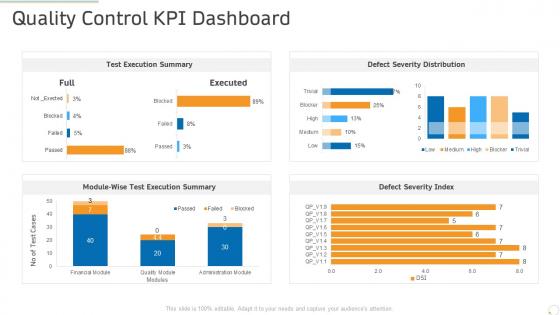
Quality control kpi dashboard production management ppt powerpoint templates




Try Before you Buy Download Free Sample Product
 Impress Your
 Audience
 100%
100% Editable
 Save Hours
 of Time


Our Quality Control KPI Dashboard Production Management Ppt Powerpoint Templates are topically designed to provide an attractive backdrop to any subject. Use them to look like a presentation pro.
People who downloaded this PowerPoint presentation also viewed the following :
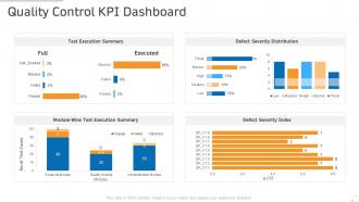
Quality control kpi dashboard production management ppt powerpoint templates with all 2 slides:
Use our Quality Control KPI Dashboard Production Management Ppt Powerpoint Templates to effectively help you save your valuable time. They are readymade to fit into any presentation structure.
FAQs for Quality control kpi dashboard production management
Start with defect rates and first-pass yield - those are your bread and butter. Customer complaints matter too, obviously. I'd track cost of quality stuff like rework and scrap costs because that hits your budget hard. Don't forget supplier ratings since bad suppliers = your headache. Customer satisfaction is honestly the only thing that really counts at the end of the day. For timing, measure how long quality checks take and how fast you fix problems. Oh, and make sure you can break everything down by product line - super helpful when something goes sideways.
Honestly, KPI dashboards are clutch for catching defect patterns early. You get real-time data on defect rates broken down by shift, machine, product line - whatever you need. The visual alerts will save your butt by flagging when quality starts dipping. Historical data shows you recurring problems and helps track down root causes. I'd set up automated alerts when defect rates hit certain levels, though don't go crazy with thresholds or you'll get alert fatigue. Make sure your team actually looks at it during shift changes - sounds obvious but you'd be surprised how often people skip that step.
Honestly, Power BI or Tableau are your best bets for QC dashboards - they actually play nice with manufacturing data. Excel can work if things aren't too complicated, but it gets messy real quick with live feeds. Minitab's pretty sweet if you need heavy stats built right in. Though honestly, I'd probably go with QlikView too since it handles complex data relationships well. The real trick is making sure whatever you pick talks to your current systems without being a total pain to update. I'd start with Power BI's free trial first.
Honestly, daily updates are the absolute minimum you should do. Real-time is obviously better if you can swing it. Most places I've seen refresh their dashboards every couple hours during shifts - that seems to work pretty well. Quality problems can blow up fast, so you don't want to be stuck with yesterday's data when something's going sideways. For critical stuff or high-volume production, definitely push for hourly or live feeds. The trick is not drowning your team in constant updates while still catching issues early. I'd start daily and ramp up based on how quickly things typically go wrong in your process.
Honestly, dashboards are a game changer - you'll catch quality problems right away instead of spending forever digging through Excel hell. Real-time KPI tracking means weird trends pop out immediately. The best part? Your whole team sees identical data, so no more arguing about which report version we're using (been there, hate that). Visual charts make patterns super obvious compared to staring at endless rows of numbers. Oh, and definitely set up threshold alerts. Trust me, catching issues early beats explaining expensive disasters to your boss later.
Look at your defect rates from the past 6-12 months first - that's where you'll find the recurring problem spots. Historical data shows you when quality issues typically spike and which processes keep screwing up. You can catch seasonal patterns too, which honestly surprises a lot of people. Once you see these trends, set up alerts before problems hit and adjust your quality thresholds based on real performance instead of guessing. It's basically like having a cheat sheet for preventing the same mistakes. Use that data to figure out where to focus your team's attention.
Your quality team's feedback is gold - they're using those KPIs every single day and know what's actually useful versus what's just noise. I can't tell you how many times I've seen gorgeous dashboards that nobody on the floor actually cares about. The frontline staff will tell you straight up if something's impossible to track or if you're measuring the wrong stuff entirely. Makes way more sense than guessing from your office, right? Their input helps you build KPIs that actually improve quality instead of just looking impressive in meetings. Set up regular check-ins with them to keep things realistic and actionable.
Honestly, these dashboards are a game changer for staying on top of compliance stuff. You get real-time visibility into whether you're hitting your ISO standards, FDA reqs, whatever your industry throws at you. Set up automated alerts so you catch problems before auditors show up at your door - trust me on this one. The visual layout makes spotting trends way easier than staring at spreadsheets all day. Having everything centralized means no more scrambling during inspections. Start with threshold alerts for your most critical metrics first. That's where you'll actually see the benefit right away.
Don't set crazy unrealistic benchmarks or your team will just tune out completely. Like, if you're hitting 2% defect rates and suddenly demand 0.01%, everyone knows that's BS and they'll ignore your whole dashboard. Look at your historical data first, see what industry standards are, then pick something that's tough but actually doable. You want people stretching, not rolling their eyes. Start where you're at now and tighten things up gradually as you get better. Otherwise you'll end up with another ignored dashboard that just sits there looking pretty while nothing actually improves.
Start with the basics - automated feeds from your production sensors and inspection systems straight into something like Tableau or Power BI. Honestly, don't overthink the "real-time" part at first. Hourly updates are way easier to debug when things go sideways (and they will). Pick your most critical QC metrics first, then worry about the fancy stuff later. The APIs on most modern tools handle this pretty smoothly now. Oh, and clean data beats fast data every time - I learned that one the hard way on my last project.
Ugh, data format headaches are the worst part honestly. Manufacturing systems spit out info completely different from lab equipment - different date formats, units, how they even define "defect rates." Then you've got timing issues where some stuff updates hourly, others daily or just manual uploads. Access is another nightmare since IT controls some feeds but quality owns others. I'd map out your current sources and formats first though - saves so much pain later. Oh and don't get me started on when systems randomly change their export format without warning.
So basically predictive analytics flips your QC dashboard from just reacting to problems to actually catching them early. Instead of "oops, defects hit 5% yesterday," you'll get warnings like "hey, you're heading toward 8% defects by Thursday." Game changer, honestly. The system looks at your historical data, process stuff, environmental factors - all that - then predicts when your quality metrics might go sideways. Gives your team actual time to tweak processes or schedule maintenance before things get messy. Oh, and set up those automated alerts when predictions hit your thresholds. Way better than scrambling after everything's already broken.
Put your biggest numbers right at the top - defect rates, pass/fail stuff, trend lines. People need to see problems instantly. Red/yellow/green is your friend here, and honestly don't get fancy with colors beyond that. Make sure all your charts use the same time periods (this trips people up more than you'd think). Add benchmarks so folks know what "good" actually looks like. Build in drill-down capability so you can dig into specific issues. The whole thing should be readable in 30 seconds max. Oh, and test it with real users first - they'll roast anything that doesn't make sense.
Make it actually useful for each group - that's what gets them hooked. Production managers want defect trends, executives need high-level scorecards, quality engineers dig into root causes. Our first dashboard collected dust for months because we didn't do this! Set up alerts for thresholds they actually care about, not random notifications. Get them involved in picking the metrics that matter for their decisions. Oh, and monthly reviews work great - show them how the data solved real problems. That's honestly what keeps people coming back for more.
Start with CSAT and return rates - they're super straightforward to set up and connect directly to your QC work. NPS is solid too, plus complaint resolution time. I'd grab quality-related return rates and defect complaints per batch for the real data on whether your efforts actually matter. First-call resolution is honestly one of the best indicators since it shows you're catching stuff early. Warranty claims and review sentiment are great if you can pull that data without too much hassle. Those return rates don't lie though - they'll tell you everything about how customers feel about your quality.
-
Top Quality presentations that are easily editable.
-
Commendable slides with attractive designs. Extremely pleased with the fact that they are easy to modify. Great work!