Quality Management System Dashboards ISO 9001 Quality Management Ppt Themes

Rating:
100%
Quality Management System Dashboards ISO 9001 Quality Management Ppt Themes
Slide 1 of 7

or

Favourites Favourites

Try Before you Buy Download Free Sample Product

Audience Impress Your
Audience
Editable 100%
Editable
Time Save Hours
of Time
The Biggest Sale is ending soon in
0
0
:
0
0
:
0
0
Rating:
100%
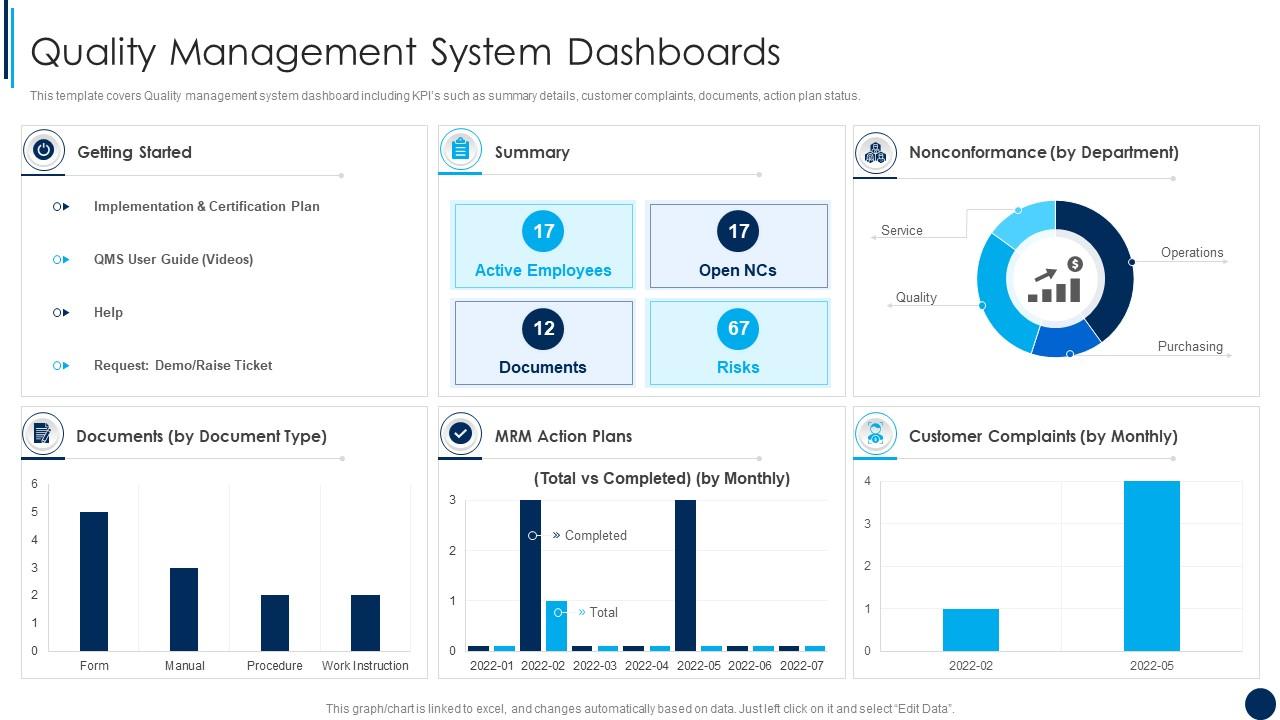
This template covers Quality management system dashboard including KPIs such as summary details, customer complaints, documents, action plan status. Deliver an outstanding presentation on the topic using this Quality Management System Dashboards ISO 9001 Quality Management Ppt Themes. Dispense information and present a thorough explanation of Quality Management System Dashboards using the slides given. This template can be altered and personalized to fit your needs. It is also available for immediate download. So grab it now.

FAQs for Quality Management System Dashboards ISO 9001 Quality

Track your defect rates first - that's the obvious one. Customer complaints and audit findings are gold too. I'd add non-conformance trends because those patterns reveal so much. Process capability metrics? Super boring but they catch problems early, which saves your butt later. Supplier quality scores matter if you work with vendors. Training completion rates help too, though honestly I sometimes forget about those. Keep everything visual and actionable - if a metric doesn't help you make decisions, scrap it. Start with maybe 5-7 core ones.

Dude, QMS dashboards are seriously worth it. You get all your quality stuff - defect rates, complaints, audit results - right there instead of hunting through endless spreadsheets. Real-time data means you'll catch problems early rather than scrambling after things blow up. The whole reactive vs proactive thing actually works for once. You can compare how different teams are doing and drill into specifics fast. Honestly beats waiting around for those monthly reports that nobody reads anyway. Pick your top 5-7 metrics first and start there.

Honestly, Tableau and Power BI are your best bets if you've got the budget - they play nice with most QMS systems. Qlik Sense is solid too, especially for real-time stuff. Google Data Studio surprised me though, works pretty well for basic quality metrics (just don't expect miracles with complex analysis). MasterControl and Greenlight Guru come with dashboards built-in, which is kinda nice. But here's the thing - pick whatever connects easiest to your current QMS. I've seen people get all excited about fancy features then spend months fighting data imports. Not worth the headache.

Automated validation rules are your best friend here. Pull data straight from your operational systems - CAPA database, audit tools, document control - instead of doing manual uploads. Trust me, we had stale metrics sitting there for weeks once because someone forgot to update a spreadsheet. Total nightmare. Set up timestamp checks and error flags so you'll know immediately when something breaks. Daily reviews help too, even if it's just a quick sanity check. The goal is killing manual entry wherever you can and building in those automatic quality checks. Oh, and alerts for weird data spikes save your butt.

User access is your main security defense for QMS dashboards - controls who sees what data and what they can do with it. Set up role-based access where quality managers get full visibility, operators only see their metrics, and auditors have read-only compliance access. Think of it like organizing a shared drive but way more critical since you're dealing with sensitive quality stuff. Honestly, least privilege is key here - give people exactly what they need for their job, nothing extra. Oh, and don't forget to review permissions when roles change (learned that one the hard way).

Look, most people's eyes glaze over when you show them spreadsheets full of quality data. But throw the same info into a clean chart or dashboard? Suddenly everyone gets it. Red/yellow/green indicators are honestly kind of basic, but executives eat that stuff up because they can see problems instantly. Your meetings will actually be productive when everyone's staring at the same visual instead of trying to interpret rows of numbers. The trick is figuring out what each group actually cares about first - then build your visuals around those specific pain points.

Honestly, the worst thing you can do is try cramming every possible metric into one dashboard. It becomes this overwhelming disaster nobody wants to touch. Pick maybe 5-7 things that actually matter for decisions. Also - and I can't stress this enough - talk to your users while you're building it, not after. I've watched teams spend months on something perfect in their minds, then users hate it. Make sure it works on phones too since everyone's always checking these things on mobile. Oh, and data that updates once a week is basically useless for most stuff.

Honestly, QMS dashboards are a game-changer for compliance stuff. Real-time tracking of all your regulatory requirements in one spot - no more hunting through files. You'll get alerts before deadlines hit and can spot processes going sideways early. My old team used to track everything in Excel (nightmare). Now you can pull audit reports instantly and actually look like you have your act together. The automated warnings when metrics get wonky? Total lifesaver. Just make sure you customize it for whatever regulatory framework you're dealing with.

Honestly, start with data formats first - it's such a pain if you skip this step. Figure out what metrics each department actually tracks, then find the overlapping KPIs that matter company-wide. APIs and automated feeds will save you tons of headaches over manual uploads (learned this the hard way). Set up one central spot that pulls from all your systems - ERP, CRM, production stuff, whatever you've got. Build dashboard views for each department but make sure they connect to your bigger quality goals. Oh, and definitely pilot with just 2-3 departments first. Work out the bugs before going wide.

Customer feedback metrics are like your sanity check - they tell you if all that internal quality stuff actually matters to customers. Track complaint patterns, satisfaction scores, resolution times. Honestly, you could nail every internal benchmark but still have pissed off customers, which means you're missing something big. These numbers help connect your quality work to what customers actually experience. Oh, and definitely set up alerts for complaint spikes - catching problems early saves you tons of headaches later. Way better than finding out through angry emails or bad reviews.

Honestly, it depends on your company size and what industry you're in. Start with your biggest quality headaches first - maybe customer complaints or audit results if you're smaller. Manufacturing? Track defect rates and supplier stuff. Service companies usually care more about customer satisfaction and how long processes take. Healthcare has crazy different compliance needs than tech obviously. I'd pick like 5-7 metrics that actually move the needle for your business. Don't try to shove everything on one screen - it gets messy fast. Build from your core problems outward.

Honestly, visual storytelling is everything here. Trend lines and sparklines beat static snapshots every day - people need to see the story over time. I always throw in color coding because red/yellow/green just hits different, you know? Control charts are clutch since they actually tell you if something's worth freaking out about or just normal noise. Keep your time periods consistent though, and definitely add targets so people aren't guessing what success looks like. Bottom line: if they have to squint to get it, you've already lost them.

Yeah, mobile access for QMS dashboards is pretty much mandatory at this point. Quality managers are constantly moving around - production floor, different sites, working from home. They can't wait until they're back at their desk to check data or log issues. Short sentences work. Everyone's glued to their phones anyway, so if your dashboard doesn't work well on mobile, you're basically creating unnecessary delays. Test it on an actual phone though, not just that little mobile preview thing in Chrome - trust me on that one. Quick loading times matter too since people get impatient fast.

Honestly, check your dashboard stuff at least quarterly - monthly's better though. First thing - do your KPIs even match what the business cares about anymore? Things change so fast it's kinda ridiculous. Look at whether people actually use the data to make decisions or if it's just... there. Ask users what helps and what's basically clutter. I'd definitely test changes with a few people before going wide. Trust me on that one. Drop the old metrics that don't matter anymore. Add new ones that fit your current goals. The whole process is way less painful when you're not overhauling everything at once.

Honestly, QMS dashboards are game-changers for catching problems before they blow up. Instead of waiting weeks for reports, you'll see issues happening right now. Trends become obvious. Bottlenecks can't hide anymore - which is honestly kind of satisfying when you've been suspecting something's off. Set up alerts when metrics go wonky so you're not constantly staring at screens. Your team stays on their toes because nobody wants their numbers looking terrible on the main dashboard. Oh, and don't go crazy with metrics at first. Pick maybe 3-5 that actually matter to customers and build from there.

Ratings and Reviews

100% of 100
Review Form
Write a review
Most Relevant Reviews
  1. 100%

    by Charles Nguyen

    Thanks for all your great templates they have saved me lots of time and accelerate my presentations. Great product, keep them up!
  2. 100%

    by Callum Gonzalez

    Delighted to see unique and eye-catching PowerPoint designs that are so easy to customize.

2 Item(s)

per page: