


Quality control dashboard manufacturing company performance analysis ppt ideas graphics




Try Before you Buy Download Free Sample Product
 Impress Your
 Audience
 100%
100% Editable
 Save Hours
 of Time


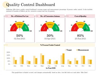
Following slide shows quality control dashboard covering target and measurement percentage of process under control. It also includes statistics of number of defects per lot, corrective actions and cost of quantity.
People who downloaded this PowerPoint presentation also viewed the following :
Quality control dashboard manufacturing company performance analysis ppt ideas graphics with all 2 slides:
Use our Quality Control Dashboard Manufacturing Company Performance Analysis Ppt Ideas Graphics to effectively help you save your valuable time. They are readymade to fit into any presentation structure.
FAQs for Quality control dashboard manufacturing company performance analysis
Honestly, stick with the basics first - defect rate, first-pass yield, customer complaints, and rework costs. These actually show you what's going wrong (or right) day-to-day. Supplier quality scores are clutch too, plus cycle time for fixes and cost of quality as percentage of revenue. Though that last one really depends on what your boss obsesses over, you know? Keep it simple - like 5-7 max. More than that and you'll drown in data nobody looks at. Just make sure they update automatically so you're not stuck doing manual reports every week.
Honestly, visual dashboards are game-changers for QC. Instead of staring at endless spreadsheet rows, you get charts and heat maps that actually tell a story. Spot problems right away with color-coded alerts - way better than manually digging through data like some kind of detective. Your team can instantly see what's working and what isn't without being data nerds. I'd start simple: bar charts for defect rates, maybe some trend lines. The difference is crazy - you'll catch issues before they blow up into major headaches.
Honestly, real-time data is a game changer for quality control. When something goes wrong, you find out instantly instead of three days later when it's already a mess. Your alerts ping you the second metrics go sideways, so you can actually fix stuff before it blows up. I learned this the hard way at my last job - we were always playing catch-up because our data was delayed. Now I'm obsessed with setting up proper dashboard alerts. Trust me, it's way better to prevent problems than scramble around putting out fires every week.
Dude, get a quality control dashboard set up. It shows you production metrics in real time so you catch defect patterns way before they blow up your budget. I swear, once you start using one you'll get weirdly obsessed with watching those green/red status lights - it's like a game almost. Different shifts and machines will show trends you'd never notice just looking at reports. The whole point is catching problems early instead of shipping garbage to customers. Oh, and definitely set automated alerts when defect rates go crazy so you're not glued to your computer all day.
Don't try cramming every metric onto one screen - that's the biggest mistake I see. Pick like 5-7 KPIs that actually matter for decisions, not just cool-looking data. Real-time updates are overrated too, honestly. Most quality stuff doesn't need constant monitoring and it just becomes noise. Your alerts should mean something when they go off, not scream about every tiny deviation. Oh, and here's what works: ask your team what they're deciding on daily first. Then build the dashboard around those actual needs instead of guessing what looks impressive.
User feedback is honestly gold for quality control dashboards. People will tell you which metrics they actually use - put those front and center. They'll also call out when alerts are way too chatty or when something important is missing completely. Monthly check-ins work great, just don't be one of those teams that asks for input then ignores it (so annoying). I've watched dashboards go from total afterthoughts to something people genuinely rely on. The trick? Actually listen when users complain about workflow stuff. Those pain points they mention aren't just whining - they're roadmaps for improvement.
So first thing - get your data formats standardized before you even think about the dashboard. I know, super boring stuff, but trust me on this one. You'll need automated pipelines that can handle whatever gets thrown at them - APIs, CSV files, database connections, all that. Map everything to consistent field names and units. Also validate data quality right when it comes in because bad data will absolutely wreck your metrics later. Oh, and set up lineage tracking so when something breaks (and it will), you can actually figure out where the problem started.
Oh man, these dashboards are total game-changers! Real-time tracking of all your quality metrics without digging through endless spreadsheets. Set alerts for when stuff goes out of range, and honestly? It's such a lifesaver when auditors randomly show up. Everything's centralized - ISO compliance, FDA requirements, whatever you need. Reports generate instantly instead of that whole week-long data nightmare we used to deal with. The automated notifications catch problems before they blow up. I still remember manually tracking everything and it was absolutely brutal.
Okay so tracking corrective actions - you want to watch defect recurrence rates first. Are the same problems coming back after you "fixed" them? Time-to-resolution is big too, plus customer complaints (hopefully dropping after your fixes). I always check cost of quality metrics and process capability stuff, though honestly the capability indices can be a pain to set up right. The game-changer is automated alerts when things start going sideways. Way better than scrambling to fix everything after it's already broken. Oh, and compare your before/after periods - that's where you'll actually see if anything worked.
So basically each industry just tailors their dashboards to whatever keeps them out of trouble. Manufacturing tracks defect rates and production stuff. Healthcare's all about patient safety and staying compliant. Food industry dashboards are honestly wild - they're obsessed with contamination risks and FDA standards, plus endless temperature logs. Financial services? They're watching transaction accuracy and fraud detection like hawks. Start with your top 3-5 critical metrics that actually matter for your business and regulatory stuff. Don't overthink it - just focus on what'll hurt your bottom line if it goes wrong.
Predictive analytics with AI is honestly where everything's headed - your dashboard can spot quality problems before they even happen instead of just telling you what broke. The machine learning stuff is getting weirdly accurate at finding patterns in all that manufacturing data. Computer vision is another big one - cameras automatically catch defects and push that info straight to your dashboard. Some platforms even do AR overlays for inspections now, which is pretty cool. Oh, and definitely ask your current vendor what's coming next. These features are becoming standard so fast you don't want to get left behind.
Look at those historical trends on your dashboard - they're like having a heads up for what's coming. You'll start noticing patterns everywhere: quality drops during night shifts, seasonal weirdness, or how things always go sideways right after maintenance. Honestly, once you see it you can't unsee it. Instead of scrambling to fix stuff that already broke, you can actually get ahead of it. Maybe adjust your staffing or tweak processes before problems hit. I'd say pick your worst 3 patterns first and build some prevention around those.
Start with red/yellow/green status lights - your team will instantly know what's broken. Put the most critical stuff right up front, not hidden somewhere. Real-time feeds are a must because stale data is useless (trust me on this one). Set up alerts they can actually customize, and let people dig deeper without endless clicking. Honestly, the drill-down thing is huge - nobody wants to hunt through five screens to find one problem. If it takes more than 30 seconds to understand, you've overcomplicated it.
Honestly, these dashboards are game-changers for catching problems early. Pick like 3-5 metrics that actually matter to your operations - don't go crazy with too many. Set up alerts when things drift outside normal ranges so you're not scrambling later. The best part? Those monthly meetings become way less awkward when everyone's staring at the same real-time numbers instead of debating old spreadsheets. You'll spot defect trends super quickly and actually see if your fixes are working. I'd focus on tracking which processes cause the most headaches first.
Dude, mobile access for QC dashboards is absolutely critical. Quality problems don't care if you're stuck in meetings or out in the field - they happen when they happen. Being able to pull up metrics and handle alerts from your phone means you're catching stuff way quicker. One team I know about literally halved their response times just by going mobile-friendly. Your field people can finally stay in the loop too instead of being completely blind to what's happening. Just make sure the thing actually works on small screens and isn't a nightmare to tap around on. Honestly changed everything for real-time monitoring.
-
Informative design.