


Maintenance Dashboard With Production Volume




Try Before you Buy Download Free Sample Product
 Impress Your
 Audience
 100%
100% Editable
 Save Hours
 of Time


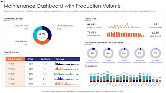
This slide presents maintenance dashboard which covers quick stats, top products, returned items, downtime causes with quantity ordered, revenues, sold items, active machines, broken machine, missing parts, price, etc.
People who downloaded this PowerPoint presentation also viewed the following :
Maintenance Dashboard With Production Volume with all 7 slides:
Use our Maintenance Dashboard With Production Volume to effectively help you save your valuable time. They are readymade to fit into any presentation structure.






FAQs for Maintenance Dashboard
Start with uptime percentage, MTBF, and MTTR - those are your bread and butter. Work order backlogs too, because nothing's worse than surprises. I always track planned vs unplanned maintenance ratios since that tells you if you're being proactive or just putting out fires. Total costs matter obviously, but honestly? Break it down by equipment type if your boss is into that level of detail. Some aren't. The whole point is catching problems early before they get expensive. My old manager used to say "predictable problems aren't really problems" - kinda cheesy but true. Add more metrics later once you've got these down.
Here's my take - get everyone looking at the same screen, you know? No more calling around asking "hey, is that pump still down?" because it's all right there. Your techs can see what's broken, managers know what's priority, and honestly the whole "I thought Bob was fixing that" thing just disappears. Real-time updates mean less confusion overall. Short bursts work better than long explanations sometimes. Set up alerts for the scary stuff and you'll notice how much easier it gets to keep everyone on the same page. Way better than email chains that go nowhere.
Honestly, you can't run a decent maintenance dashboard without good visuals. Raw data is useless - charts and graphs let you actually see what's happening. Trends jump out at you instead of being buried in some nightmare spreadsheet. Bar charts work great for comparing stuff, line graphs show trends over time, heat maps are perfect for equipment performance. The trick is keeping everything clean so people get it immediately. I've seen too many dashboards that look like someone threw data at a wall. When done right though? You'll catch problems early and your team will actually understand what needs fixing.
So predictive analytics looks at your old maintenance records and finds patterns to predict when stuff's gonna break. Pretty cool, right? You'll get alerts like "pump
-
SlideTeam is a great place for PPT templates. They have many templates on a single topic. It has made my life a lot easier.
-
Commendable slides with attractive designs. Extremely pleased with the fact that they are easy to modify. Great work!