


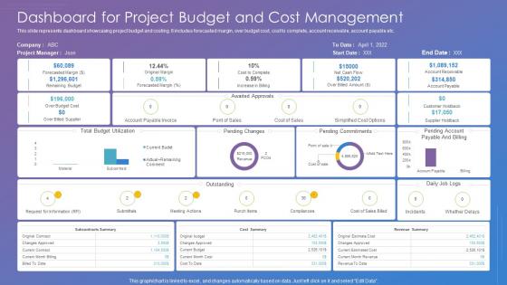
Dashboard For Project Budget And Cost Management




Try Before you Buy Download Free Sample Product
 Impress Your
 Audience
 100%
100% Editable
 Save Hours
 of Time


This slide represents dashboard showcasing project budget and costing. It includes forecasted margin, over budget cost, cost to complete, account receivable, account payable etc.
People who downloaded this PowerPoint presentation also viewed the following :
Dashboard For Project Budget And Cost Management with all 6 slides:
Use our Dashboard For Project Budget And Cost Management to effectively help you save your valuable time. They are readymade to fit into any presentation structure.





FAQs for Dashboard For Project Budget
Pick metrics that actually matter to your business goals first - revenue, conversion rates, customer acquisition costs, whatever moves the needle for you. Add some context around those with trends and comparisons to your targets. Maybe throw in leading indicators if they help predict what's coming. I swear, half the dashboards I see are just metric overload with flashing numbers everywhere. Keep it simple. Focus on 5-7 things that'd actually make you change course if they shifted. Test it with your team before you commit - they'll tell you real quick if it's useful or just pretty to look at.
Honestly, just start by asking each team what they actually need to see. Executives want the big picture stuff - KPIs and trends they can digest quickly. Operations teams are different though, they need the nitty-gritty details and real-time numbers they can act on immediately. Sales obviously cares about pipeline metrics, support wants ticket volumes, etc. Most tools let you set up different user roles anyway. The trick is working backwards from what decisions people are trying to make. Way too many dashboards just throw every metric at everyone and it's useless.
Honestly, just pick 3-4 colors tops and make sure there's good contrast so people can actually read stuff. I've wasted so much time squinting at dashboards where the text blends into the background - it's awful. Use one main color for your important metrics, then stick with grays for everything else. Clean sans-serif fonts work best. Two font weights max, but make your sizing really obvious so users know what's important. Your dashboard isn't supposed to win design awards anyway. People need to scan info quickly, so don't get too creative with it.
Look, real-time data integration is what makes dashboards actually worth using instead of just looking nice. Your data updates automatically so you catch trends and problems as they're happening - not hours later when it's too late. Think of it like watching a live sports game versus just checking the final score. Completely different energy, right? Faster decisions happen because you're working with fresh info, not yesterday's news. Oh and your team will actually trust the thing when they know it shows what's really going on right now.
Tableau, Power BI, and Looker are the main ones everyone uses. Power BI's probably your best bet - works great with Microsoft stuff and doesn't cost a fortune. If you're into coding, D3.js is pretty powerful for web dashboards. Grafana's solid for monitoring data too. Excel works for basic charts but... yeah, it's Excel lol. Oh, and honestly? Just pick whatever connects easily to your current data setup. That'll save you way more headaches than trying to force some fancy tool that doesn't play nice with your systems.
So basically dashboards are live and you can actually interact with them - click around, filter stuff, drill down. Reports? They're just static snapshots, like PDFs frozen in time. Dashboards update automatically with real-time data, which is honestly kind of addictive once you start using them. They're super visual too - charts and graphs everywhere that make trends obvious right away. Reports tend to be more text-heavy with tables and stuff. Oh, and if you need to catch problems as they're happening or track ongoing performance, you'll definitely want the dashboard route.
Don't cram everything onto one screen - it's way too overwhelming. Horizontal scrolling is the worst, seriously. Focus on maybe 3-5 metrics that actually matter for decisions, not just pretty numbers that look good in meetings. Your most important stuff should be visible right away without scrolling. I learned this the hard way, but test it with real users first because what seems obvious to you might confuse everyone else. Keep colors consistent too. Start small and add more later if you need it.
Honestly, just start collecting feedback however you can - surveys, user interviews, or my personal favorite: literally watching people use your dashboard. That shoulder-surfing thing is weirdly revealing. Pay attention to what confuses them, where they're clicking stuff that doesn't work, features they keep requesting. Once you've got patterns, prioritize by how many people mentioned it and whether it actually breaks their workflow. Then here's the part most people skip - go back to those same users after you make changes. Half the time you'll find you fixed one thing but accidentally broke something else.
Your dashboard needs to tell a story, not just dump data everywhere. Start with the big picture KPIs at the top. Then break down what's causing those numbers underneath. Think of it like "here's the problem, here's why it's happening, now do this about it." I've seen way too many dashboards that look like someone just threw charts at a wall. People shouldn't have to play detective with your data. End with actionable stuff - what should they actually do next? That's how you get people to care about your dashboard instead of ignoring it.
Dude, dashboards are game changers. Instead of hunting through endless spreadsheets, you get all your important stuff in one spot. Real-time charts make it super obvious when something's off - like sales tanking in the midwest or customer complaints spiking. I swear, once you start using them you'll wonder how you ever managed without one. You can literally watch trends develop instead of just guessing what's happening. Oh, and definitely set up alerts for your biggest metrics. Trust me, you don't want to be manually checking everything every day like some kind of data monk.
Honestly, dashboards are a game changer compared to drowning in spreadsheets. Your brain just grabs onto visuals way faster than scanning endless rows of numbers. Charts instantly show you trends and weird outliers that you'd totally miss otherwise. Real-time updates mean you're not constantly pulling reports either - which is huge. The cool thing is setting up different views for different people. Your boss wants the big picture KPIs, but your team needs all the nitty-gritty details. Just start with whatever metrics you actually care about most and expand from there.
Clean data sources are your starting point, obviously. Set up automated quality checks so you catch weird stuff early instead of scrambling later. Document everything - seriously, where data comes from, governance rules, all of it. You'll hate yourself if you don't when someone inevitably questions your numbers. Version control is non-negotiable for dashboard logic. Test in staging first (learned this the hard way). Monthly audits to double-check calculations against source systems. Oh, and build error alerts so you find out when things break, not your users telling you something looks off.
So there are basically three types you'll run into. Operational dashboards are for tracking daily stuff - think website traffic, sales numbers, that kind of thing. Strategic ones show the big picture metrics that executives care about, like quarterly goals. Then analytical dashboards are where you really dive deep into trends and try to figure out what's actually happening with your data. Honestly, the analytical ones can be a rabbit hole if you're not careful. Just pick whichever matches what your team needs to decide on day-to-day versus long-term planning.
Start with responsive design and bigger buttons - trust me, nobody wants to squint at tiny icons on their phone. Focus on your top 3-5 metrics first since mobile screens are basically postage stamps. Flexible grids help everything adjust automatically, and collapsible sections are your friend here. Swipe gestures work great for switching between views. Oh, and definitely test on real phones, not just Chrome dev tools - there's always some weird quirk that only shows up on actual devices. Mobile dashboards are honestly a pain but prioritizing what users need most makes it way less overwhelming.
Honestly, the biggest thing right now is AI stuff automatically flagging weird data points - saves so much time. Real-time collaboration is huge too since teams are scattered everywhere. Everyone's designing mobile-first because let's be real, we're all doom-scrolling dashboards on our phones anyway. Dark mode finally caught on (about time). But here's what actually matters: contextual dashboards that change based on who's looking and what they need. No more showing the same boring view to everyone. Interactive storytelling with data is taking off big time. Focus on making yours conversational instead of just dumping spreadsheet numbers at people.
-
Innovative and attractive designs.
-
Editable templates with innovative design and color combination.