


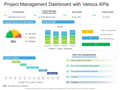
Project management dashboard snapshot with various kpis




Try Before you Buy Download Free Sample Product
 Impress Your
 Audience
 100%
100% Editable
 Save Hours
 of Time


Our Project Management Dashboard Snapshot With Various KPIs are topically designed to provide an attractive backdrop to any subject. Use them to look like a presentation pro.
People who downloaded this PowerPoint presentation also viewed the following :
Project management dashboard snapshot with various kpis with all 2 slides:
Use our Project Management Dashboard Snapshot With Various KPIs to effectively help you save your valuable time. They are readymade to fit into any presentation structure.
FAQs for Project management dashboard snapshot
Honestly, start with the basics - timeline with milestones, budget tracking (planned vs actual), and task ownership so nobody's confused about who's doing what. Risk indicators are clutch for catching problems before they blow up. I'd also throw in workload visualization because there's always that one person drowning while someone else is basically doing nothing lol. Resource allocation helps with that mess too. Keep it clean though - dashboards get ugly fast when you cram too much in. Just focus on what people actually bug you about in meetings and build from there.
Honestly, dashboards are a game changer because everyone sees the same stuff at once. No more "hey what's happening with that thing" messages every five minutes. Progress, deadlines, blockers - it's all right there instead of buried in some email thread from last week. Plus you'll actually have fewer pointless meetings, which is reason enough to set one up. The trick is getting people to actually look at it though - maybe send notifications or whatever works for your team's vibe.
Honestly, stick to the metrics that actually matter for making decisions. Timeline milestones, budget burn rate, and how you're using resources - those are your main ones. Risk indicators are clutch too since they'll warn you before everything goes to hell. I'd throw in task completion rates and maybe quality stuff if you're tracking deliverables. But seriously, don't go over like 5-7 metrics total. I've watched people's eyes glaze over when dashboards have too much noise. Most of those fancy metrics are just for show anyway. Start with the basics, then see what questions keep coming up in your team meetings - that'll tell you what else to add.
Honestly, visuals are a game-changer for dashboards. Your brain processes charts and color-coded stuff way faster than boring spreadsheet rows. Like, who wants to stare at numbers when you could have progress bars that actually make sense? Icons help too - they guide your eye straight to the important bits. But here's the thing: don't go overboard with colors and widgets everywhere. That just turns into visual chaos. I'd start with your biggest priorities and make those stand out first. Way better than hunting through text when you're juggling a million things.
Dude, you NEED real-time data for your dashboard. Otherwise you're basically flying blind - like checking yesterday's weather to decide if you need an umbrella today. Spot problems while they're still small instead of scrambling when everything's on fire. Budget going crazy? You'll know immediately. Team missing deadlines? Catch it early. I learned this the hard way on a project last year (total mess). Set up those automated feeds so the data refreshes itself. Trust me, stale information is worse than no information sometimes.
Yeah, most dashboards are pretty flexible - you can customize widgets, metrics, all that stuff based on what you actually need. Software teams usually want sprint burndowns and bug tracking front and center. Construction projects? More like Gantt charts and resource views. You can drag and drop components around, set up your own KPIs, even mess with colors (which honestly makes a bigger difference than you'd think for getting people to use it). My advice? Find a template that's close to your industry first, then tweak it. Way easier than starting from nothing.
So for project dashboards, I'd check out Asana, Monday.com, or Trello first - they're pretty intuitive and have decent built-in features. Microsoft Project is overkill unless you really need those heavy-duty Gantt charts. Notion and Airtable are surprisingly flexible if you don't mind setting things up yourself. Oh, and honestly? Sometimes plain old Excel or Google Sheets with pivot tables does the trick for smaller stuff. My cousin's been using Sheets for her marketing projects and swears by it. I'd grab free trials of like 2-3 options and see what feels right for your team's vibe.
Honestly, manual data entry is where everything goes to hell - automate those feeds if you can. Get someone on your team to actually own the data quality, otherwise it'll just turn into a mess nobody wants to deal with. Regular validation checks are huge too. Build some kind of standard process for updates so people aren't just winging it. Oh and audit what you've got going on right now - like this week if possible. Way easier to catch bad data before it screws up your whole dashboard than trying to fix it later when everyone's already making decisions off wrong numbers.
Honestly, the hardest part is getting people to actually use the thing. Your team will probably stick with whatever they're using now unless you make it super easy for them. Data quality is another nightmare - garbage in, garbage out, you know? Plus you'll want to track literally everything at first (I definitely did this), but too many metrics just confuses everyone. The technical stuff can be a pain too, especially if you're trying to connect it to systems that are already in place. Start with maybe 3-4 metrics that your team genuinely cares about. Get them excited about it early on and make data entry as simple as possible.
Honestly, dashboards are game-changers for catching problems before they blow up your whole timeline. You'll see which tasks are dragging way past their deadlines and who's drowning in work. Dependencies become super obvious too - no more playing detective about why everything's stalled. I swear, there's always that one approval step that takes forever (looking at you, legal reviews). The visual layout makes these patterns jump out at you instead of staying buried until your next status meeting. Basically, you can fix bottlenecks while they're still small instead of scrambling when everything's already behind.
So here's what I've learned about dashboards - don't try to squeeze every single metric in there, even though it's tempting. Focus on what your team actually needs to see. Update it consistently too (trust me on this one, got called out for stale data in front of a client once - embarrassing). Clean visuals are everything. You want people to scan it quickly without squinting. Every few months, check if those KPIs still make sense since priorities always change. Consistent colors help, and put your most important stuff at the top. Honestly, just ask your team what they'd realistically check daily and start there.
Honestly, just ask people what they think - quarterly check-ins work great and stakeholders actually love giving opinions about tools they use every day. Set up surveys and track which features people ignore vs. constantly click on. User interviews are gold too. Watch your support tickets for patterns (that's where the real pain points show up). Don't try to fix everything at once though. Pick one piece of feedback per sprint and actually implement it so people know you're listening. Small changes beat massive overhauls every time. Oh, and usage analytics will tell you way more than people's opinions sometimes - actions don't lie.
So strategic dashboards are all about the big picture stuff - budget health, portfolio performance, whether you're hitting business objectives. Your execs live for this data. Operational ones get into the nitty-gritty: who's overloaded, which tasks are done, where things are getting stuck. Honestly, you'll probably need both eventually, but I'd start with operational since that's what you'll be checking constantly. The strategic view is more like monthly check-ins with leadership. Makes sense to build what you actually use first, then worry about the executive summary later.
Honestly, dashboards are a game-changer for stakeholder reports. They transform all that messy project data into clean visuals that execs actually want to see. No more digging through spreadsheets right before meetings – you'll have real-time budget and timeline charts ready to go. The visual format lets everyone spot trends instantly. I mean, who doesn't prefer colorful graphs over boring status updates? You can customize different views too. Your CEO gets the big picture while team leads see detailed breakdowns. Set up automated schedules and these things practically run themselves. Trust me on this one.
Honestly, AI stuff is the biggest shift right now - you're getting predictive analytics that'll catch project issues before they blow up, plus automation for all the boring update tasks. Everyone's building in real-time collab features so your team doesn't have to bounce between apps anymore. Mobile design is pretty much expected at this point since people want to check projects from anywhere. The customization options are getting insane too - drag-and-drop widgets based on what you actually do. Oh, and definitely check what your current platform's planning feature-wise. You don't want to get stuck with something that becomes outdated in like six months.
-
Really like the color and design of the presentation.
-
Unique and attractive product design.
-
Really like the color and design of the presentation.
-
Attractive design and informative presentation.