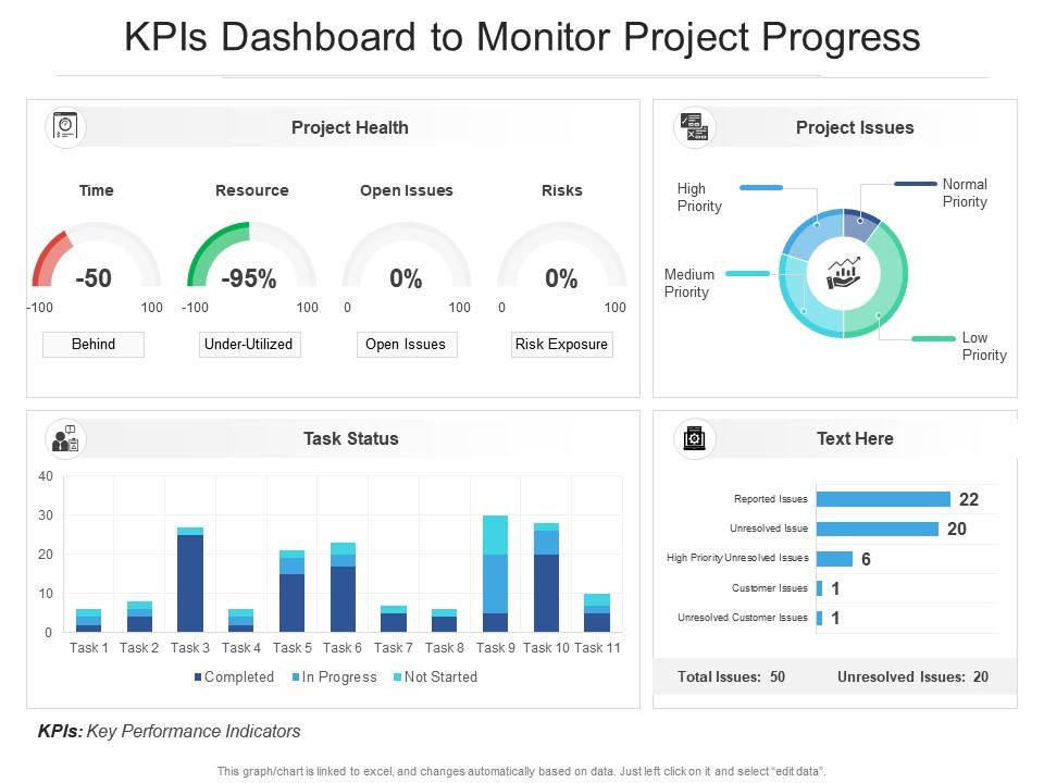
Kpis dashboard snapshot to monitor project progress
Try Before you Buy Download Free Sample Product
Audience
Editable
of Time
Our KPIs Dashboard Snapshot To Monitor Project Progress are topically designed to provide an attractive backdrop to any subject. Use them to look like a presentation pro.
People who downloaded this PowerPoint presentation also viewed the following :
Kpis dashboard snapshot to monitor project progress with all 2 slides:
Use our KPIs Dashboard Snapshot To Monitor Project Progress to effectively help you save your valuable time. They are readymade to fit into any presentation structure.
FAQs for Kpis dashboard snapshot to
**INPUT**: What are the key metrics to include in an effective KPIs dashboard? **OUTPUT**: Effective KPIs dashboards include revenue growth, customer acquisition costs, operational efficiency ratios, employee productivity measures, and customer satisfaction scores. These metrics enable organizations to streamline decision-making by providing real-time visibility into performance trends, identifying bottlenecks quickly, and aligning teams with strategic objectives, ultimately delivering enhanced accountability and competitive advantage across departments.
Visual design enhances KPI dashboard clarity through strategic color coding, intuitive layouts, consistent typography, clear data hierarchies, and streamlined visual elements. These design principles minimize cognitive load while maximizing information comprehension, with many organizations finding that well-designed dashboards reduce decision-making time, improve stakeholder engagement, and ultimately deliver faster insights and enhanced operational efficiency.
Healthcare, financial services, retail, manufacturing, and logistics industries benefit most from KPI dashboards due to their data-intensive operations and regulatory requirements. These sectors leverage dashboards to monitor patient outcomes, track financial performance, analyze sales metrics, optimize production efficiency, and ensure supply chain transparency, ultimately delivering faster decision-making and enhanced operational control.
KPI dashboards should be updated based on business needs and data volatility, with real-time updates for critical metrics like sales or operations, daily updates for performance tracking, and weekly or monthly updates for strategic indicators. Financial services and retail often require hourly updates for customer interactions and inventory, while manufacturing and healthcare benefit from shift-based or daily refreshes, ultimately enabling timely interventions and competitive advantage.
Leading KPI dashboard tools include Tableau, Power BI, Google Data Studio, Qlik Sense, and Looker, each offering distinct visualization capabilities and integration options. These platforms streamline data consolidation, automate reporting processes, and enable real-time monitoring across departments, with many organizations finding that cloud-based solutions like Power BI deliver enhanced collaboration and scalability.
KPIs can be tailored by aligning metrics with strategic goals, departmental functions, industry benchmarks, and organizational priorities. Through careful selection of relevant indicators, businesses enhance performance tracking across sales, operations, and customer satisfaction, while ensuring measurable outcomes that drive decision-making, ultimately delivering targeted insights and competitive advantage.
Leading KPIs predict future performance through metrics like employee training hours, customer acquisition rates, and sales pipeline activity, while lagging KPIs measure past results including revenue, customer satisfaction scores, and market share. Effective dashboards strategically combine both types, with leading indicators enabling proactive decision-making and lagging indicators validating outcomes, ultimately delivering comprehensive performance visibility.
Stakeholder feedback enhances KPI dashboard effectiveness by identifying relevant metrics, improving data visualization clarity, and ensuring alignment with business objectives. Through regular input sessions, organizations can refine dashboard layouts, prioritize critical performance indicators, and eliminate unnecessary complexity, ultimately delivering more actionable insights and enabling stakeholders to make faster, data-driven decisions.
Data visualization transforms complex KPI data into intuitive charts, graphs, heatmaps, and dashboards that enable instant pattern recognition and trend analysis. Through interactive visual elements, organizations streamline decision-making processes, enhance stakeholder communication, and accelerate performance monitoring, with many finding that visual dashboards reduce analysis time while improving strategic alignment and accountability across teams.
Data accuracy for KPI dashboards is ensured through automated data validation, regular source system audits, establishing clear data governance protocols, implementing real-time monitoring alerts, and maintaining standardized calculation methodologies. Organizations across sectors like retail and manufacturing find that combining these systematic approaches with scheduled data quality checks ultimately delivers reliable insights, enhanced decision-making confidence, and improved operational efficiency.
Effective KPI prioritization strategies include business impact assessment, stakeholder alignment workshops, frequency-based categorization, performance correlation analysis, and strategic goal mapping. Organizations typically implement tiered dashboard layouts, with executive teams focusing on revenue and customer metrics while operational managers emphasize efficiency indicators, ultimately delivering targeted insights that drive faster decision-making and improved performance outcomes.
A KPI dashboard helps identify business trends by visualizing historical data patterns, tracking performance metrics across multiple time periods, and highlighting seasonal fluctuations or growth trajectories. Through interactive charts and trend analysis features, organizations can spot emerging opportunities, declining performance areas, and cyclical patterns, enabling proactive strategic adjustments and data-driven forecasting for competitive advantage.
Common pitfalls include displaying too many metrics, using poor visual hierarchy, lacking clear context or benchmarks, choosing irrelevant KPIs, and creating overly complex designs. These design flaws can overwhelm users and reduce decision-making effectiveness, with many organizations finding that streamlined dashboards focusing on 5-7 key metrics ultimately deliver clearer insights and faster strategic responses.
Real-time data integration significantly enhances KPI dashboard usability by providing instant visibility into performance metrics, eliminating manual data entry, and enabling immediate decision-making capabilities. This approach streamlines operational efficiency across organizations, with financial services and manufacturing companies finding that automated data flows reduce reporting delays, improve accuracy, and ultimately deliver competitive advantages through faster strategic responses.
**INPUT**: What are some examples of successful KPI dashboards from leading companies? **OUTPUT**: Successful KPI dashboards include Amazon's operational efficiency metrics, Netflix's viewer engagement analytics, Salesforce's sales performance tracking, and Tesla's production line monitoring systems. These companies leverage real-time data visualization, predictive analytics, and automated reporting to streamline decision-making, enhance operational transparency, and accelerate strategic responses, ultimately delivering competitive advantages through data-driven insights. [Word count: 56 words]
-
Great designs, Easily Editable.
-
Excellent work done on template design and graphics.
-
It saves your time and decrease your efforts in half.
-
Excellent products for quick understanding.