


Project plan dashboard with overall progress




Try Before you Buy Download Free Sample Product
 Impress Your
 Audience
 100%
100% Editable
 Save Hours
 of Time


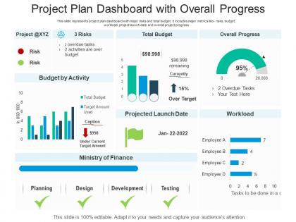
This slide represents project plan dashboard with major risks and total budget. It includes major metrics like- risks, budget, workload, project launch date and overall project progress
People who downloaded this PowerPoint presentation also viewed the following :
Project plan dashboard with overall progress with all 2 slides:
Use our Project Plan Dashboard With Overall Progress to effectively help you save your valuable time. They are readymade to fit into any presentation structure.

FAQs for Project plan dashboard
Definitely start with timeline/milestones, task status, and budget tracking - can't skip those. Team workload is huge too since you'll catch bottlenecks early. Risk indicators and progress percentage round it out nicely. Here's the thing though - I've watched so many people make dashboards that look like airplane cockpits and nobody uses them. Stick to maybe 6-8 metrics that actually matter. Your stakeholders should be able to look at it for like 10 seconds and know if everything's fine or if it's time to panic.
Honestly, visual charts are a game changer for project stuff. Your brain just processes pictures way faster than staring at endless spreadsheet rows. Gantt charts and progress bars make it super obvious where you're hitting roadblocks or resource issues. I'm obsessed with color-coded timelines - they just make sense instantly. Stakeholders actually get what's happening without you having to explain every detail. Bar graphs work great for milestones. Pie charts are perfect for budget breakdowns, though I know some people hate them. You'll cut your status meeting time in half, guaranteed.
Track the basics first: timeline progress, budget vs spend, resource usage, and task completion rates. Risk indicators are clutch too if you can swing it. Honestly, I've seen teams go overboard with dashboards - tracking every little thing until nobody knows what matters anymore. Start simple. Maybe throw in a red/yellow/green health score so you can see project status at a glance. If you're doing agile, team velocity helps a lot. The key is only adding metrics that actually help you make better decisions faster, not just because they look impressive on a report.
Honestly, dashboards are clutch because everyone sees the same info in real-time. No more endless email chains or playing phone tag for updates. You can spot bottlenecks and deadlines instantly. Those awful "what's the status on..." meetings? Gone. Stakeholders stop bugging you constantly since they can check progress themselves. The trick is showing metrics that actually matter - not just pretty numbers that look good but tell you nothing useful. I've seen too many dashboards that are basically digital decoration. Make sure yours helps people make real decisions, and you'll wonder how you ever managed projects without one.
So you've got Microsoft Project, Asana, Monday.com - those are the big ones everyone talks about. Trello's solid for basic stuff. Smartsheet feels like Excel but way less annoying to work with. Honestly? I've watched people create amazing dashboards in regular Excel, though it becomes a total nightmare once projects get complicated. Oh, and if you want fancy analytics, Tableau or Power BI can grab data from whatever PM tool you're using. Really depends on team size and how complex things get. Just grab free trials of like 2-3 options and see what doesn't make you want to throw your laptop.
Honestly, less is more with dashboards. Focus on what your team checks daily instead of cramming every metric you can think of onto one screen. Clear labels and consistent colors are your friends - nobody wants to hunt around for basic info. I swear, some dashboards look like slot machines with all the blinking widgets! Watch how people actually use it and ask for feedback. Short sentences work. If multiple people can't find the same thing, that's your cue to move it somewhere obvious. The goal? Your team should want to check it without you nagging them about it.
Dude, you absolutely need real-time data for your dashboard or it's just a fancy screenshot. Like, what's the point of seeing last week's numbers when your project's burning down today? Live updates from all your tools let you catch problems - budget issues, delays, whatever - right when they pop up. Way better than those awkward Monday meetings where everyone's like "oh yeah, we've been behind schedule for days." Just make sure your integrations actually work (mine crashed last month and I didn't notice for three days). Test the feeds regularly so everything syncs right.
Look for dashboards that let you switch views based on your methodology. Agile teams need sprint boards and burndown charts upfront. Waterfall? You'll want Gantt charts and milestone tracking instead. Most decent tools these days are pretty customizable - you can hide stuff you don't need and set up different templates. Role-based views are clutch since your stakeholders don't care about the same metrics as your dev team. Honestly, I'd start by figuring out which KPIs actually matter for your specific approach first, then find a tool that displays those well.
Honestly, figure out what's actually broken first and what numbers your boss cares about. Don't go crazy adding every metric just because the tool lets you - I've watched so many beautiful dashboards collect dust because they're useless. Pick maybe 5-7 KPIs that actually drive decisions. Your executives want the big picture stuff while team leads need to see task-level details, so customize views accordingly. Consistent colors help (seems obvious but you'd be surprised). Oh, and test it with real users first! They'll catch things you missed and save you from endless revisions later. Keep data fresh enough to matter.
Honestly, mobile compatibility is a game changer. You can check project updates on your commute, update stuff during client meetings, or review timelines while waiting in line for coffee (which, let's face it, is half our day). Super helpful for field teams who aren't glued to desks. Your charts and data need to actually work on small screens though - not just be tiny versions of the desktop view. Try opening your current dashboard on your phone right now. I bet it's more frustrating than you remember! Remote workers especially love having real-time access to everything.
Honestly, dashboards are game-changers for catching problems before they blow up. Instead of hunting through a million spreadsheets (ugh), everything's right there - budget issues, timeline delays, resource crunches. The visual alerts are clutch too. You'll actually notice when something's going sideways instead of finding out three weeks later when it's too late. Plus you can set up notifications for the stuff that really matters to you. I've seen too many projects crash because people didn't spot the red flags early enough. Way easier to track what's working and what isn't.
Figure out what your team actually checks daily vs weekly first. Most critical stuff goes at the top - that's where people look anyway. Group similar things together so nobody's digging around for basic info. I swear, half the dashboards I've seen look like someone just dumped every possible graph on there! Clean design wins every time. Use consistent colors, leave white space, make sure it works on phones if that's what people use. Oh and definitely test it with real users first - they'll spot the annoying stuff you totally missed.
Honestly, integrations are where dashboards get really powerful. Your dashboard becomes this central spot where everything flows together instead of being stuck in silos. Pull in Jira for bugs, GitHub commits, Slack updates, time tracking from Toggl - whatever you use daily. No more tab-hopping between apps just to see where projects stand. Your team gets updates automatically, stakeholders can actually see what's happening, and you'll stop living in spreadsheets (thank god). I'd start with maybe 2-3 tools you use most and build from there. Don't go crazy all at once or it gets messy.
Honestly, most teams I know update theirs weekly or every two weeks - depends how fast things move. Pick specific people to handle different pieces like budget, timeline, whatever. Trust me on this one: dashboards die when nobody owns them! Block out time on everyone's calendar for updates. Don't make it this big thing you do when someone complains the data's old. Pull numbers from your PM tools, financial stuff, team reports. Short sentences work. Automate what you can so people aren't manually entering everything - that gets old fast.
Honestly, start with surveys and user interviews - that's where you'll get the real dirt on what's broken. Check your analytics too to see which features people completely ignore. I've watched so many beautiful dashboards flop because users couldn't find basic info without hunting around for ages. Listen for the complaints that keep coming up: slow loading, can't find what they need, confusing layout. Don't try fixing everything at once though. Pick the biggest pain point that's bugging the most people and tackle that first. Way less overwhelming.
-
Top Quality presentations that are easily editable.
-
Wonderful templates design to use in business meetings.