


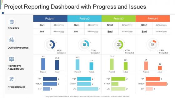
Project reporting dashboard with progress and issues




Try Before you Buy Download Free Sample Product
 Impress Your
 Audience
 100%
100% Editable
 Save Hours
 of Time


Our Project Reporting Dashboard With Progress And Issues are topically designed to provide an attractive backdrop to any subject. Use them to look like a presentation pro.
People who downloaded this PowerPoint presentation also viewed the following :
Project reporting dashboard with progress and issues with all 7 slides:
Use our Project Reporting Dashboard With Progress And Issues to effectively help you save your valuable time. They are readymade to fit into any presentation structure.





FAQs for Project reporting dashboard with
Honestly, you need five main things on that dashboard. Timeline with milestones is obvious. Budget tracking - what you've spent versus what's left. Task status where it's crystal clear who owns what (this saves so many headaches later). Key metrics that actually matter to your project. The risks section is clutch though - I can't stress this enough. Stakeholders eat that stuff up because it shows you're thinking ahead. Whole idea is giving everyone a quick visual without drowning in status update emails. Just don't overcomplicate it or people will ignore it completely.
Honestly, visualization is a game-changer for dashboards. Your brain processes visuals so much faster than scanning through endless spreadsheets. Heat maps are perfect when you want to see performance hotspots across regions or whatever. Progress bars? They're weirdly satisfying and show goal progress instantly. Don't fall into the pie chart trap though - match your visual to what the data's actually trying to say. I always figure out the story first, then pick charts that make sense. Color coding helps too, but don't go crazy with it or you'll blind people.
Tableau and Power BI are great but honestly pretty expensive if you're just getting started. Monday.com or Notion work well for basic project tracking without the crazy learning curve. Google Data Studio is actually solid if you're already using Google stuff - and it's free which is nice. I've literally seen people build amazing dashboards in plain old Google Sheets with some smart formatting tricks. My advice? Try whatever you already have access to first. You might be surprised what you can pull off before dropping money on the fancy tools.
Stick to 3-5 KPIs max - budget variance, timeline stuff, quality metrics. That's really all you need. I've seen people go nuts with dashboards that look insane, so keep it simple. Red/yellow/green indicators are your friend, plus some basic trend lines for anything time-based. Your stakeholders should glance at it and instantly know what's up. Here's my test: grab someone who knows nothing about your project. If they can't figure out the status in 10 seconds, you've overcomplicated it. Trust me on this one.
Honestly, the worst thing you can do is cram everything onto one screen thinking more data = better insights. Pick 5-7 metrics that actually matter for decisions, not just stuff that looks cool in meetings. I've seen so many dashboards that are basically data graveyards - impressive numbers everywhere but nobody knows what to do with them. Focus on your daily users, not the exec who glances at it monthly. Quick test: if you can't explain why each metric helps someone make a real decision, ditch it. Less noise, more signal.
So instead of waiting around for those weekly status meetings, real-time integration just pulls everything live from your tools - Jira, Slack, whatever you're using. Bottlenecks show up immediately, not three days later when you're scrambling to fix them. Your dashboard updates automatically, which honestly saves so much time. No more outdated spreadsheets (thank god). You'll catch budget issues or timeline problems the second they happen. Makes decision-making way faster since you're working with current info. I'd start with your most important data sources first - don't try to connect everything at once.
UX is everything for dashboards, honestly. People will just stop using it if they can't find stuff quickly - I've watched entire teams abandon perfectly good dashboards because the interface sucked. Your data needs to match how your team actually thinks about work, not some generic template. Good navigation matters. Visual hierarchy matters more than you'd think. The sweet spot is when people get answers without even thinking about the tool itself. Like, they shouldn't have to decode weird charts or dig through confusing menus. Make it stupid simple and you'll actually see adoption.
Honestly, dashboards are a game-changer for keeping everyone on the same page. Your team can see exactly what's happening without having to bug each other constantly. They're great for catching problems early – way better than finding out about delays when it's too late to fix them. You'll spot bottlenecks fast, and nobody has to deal with those annoying "hey what's the update on..." messages anymore. Just make sure someone actually maintains the thing though. I've seen too many teams create these elaborate dashboards then let them go stale after two weeks. Set up auto-updates if you can and pick one person to babysit it.
Stick to four main things: how much of your schedule you've actually finished vs what you planned, your budget burn rate, resource utilization, and how many risks/issues are piling up. I swear half the dashboards I see are just full of pointless numbers that look impressive but tell you nothing. Budget burn shows if you're hemorrhaging cash. Schedule completion keeps you honest about timelines. Resource util catches bottlenecks before they wreck everything. Risk tracking stops you from getting blindsided - learned that one the hard way! Start there and only add more metrics if they actually help you decide something.
Just ask each group what their top 3-5 priorities are first - saves you so much time later. Executives want the big picture stuff like budget and major risks. Team leads need the nitty-gritty: tasks, who's doing what, timelines. Clients? They honestly just care about milestones and when they'll get their deliverables. Most tools have role-based views you can set up pretty easily. Oh, and don't overthink it - you can always tweak things once people start using them and complain about what's missing.
Set up automated rules to catch errors before they hit your dashboard - trust me on this one. We once showed 200% over budget because someone entered costs in the wrong currency (still cringe thinking about it). Do regular audits weekly or monthly depending on how fast your project moves. Document where every data point comes from first though - you'll be shocked how many potential issues this reveals. Pull directly from your main systems instead of manual uploads when you can. Oh, and create clear standards for data entry so your team isn't just winging it.
Set up alerts for the stuff that actually matters - budget burn rate, timeline slips, how your team's bandwidth looks. When your budget's burning 20% faster than expected, you'll catch it right away instead of that awful "oh shit" moment during next month's review. Track the early warning signs, not just the damage that's already done. I do weekly dashboard check-ins with my team (sounds boring but it's honestly saved my ass so many times). We talk through what the trends mean before small problems turn into those fire drill situations. The key is discussing it, not just looking at pretty charts and moving on.
Project dashboards change completely depending on your industry. IT teams track sprint progress and bug counts. Healthcare focuses on patient outcomes and compliance stuff. Construction? Safety incidents and whether projects are hitting deadlines - which honestly seems way more stressful than my job. The trick is figuring out what your stakeholders actually care about. Don't overthink it. Just write down the 5-7 things people ask you about most. Then build around those metrics. You'll save yourself tons of headaches by starting simple and customizing the visuals to match what matters in your specific field.
Dude, mobile dashboards are honestly a lifesaver. I can check how projects are moving along while I'm stuck in traffic or waiting for my lunch order. Push notifications hit me the second something's going wrong, so I can fix it before it becomes a disaster. Your team stays way more engaged too since they know you're reachable. The approval stuff is clutch - I don't have to make people wait until I'm back at my computer to sign off on things. Start with notifications for your biggest milestones first, that's what made the biggest difference for me.
Update it weekly at minimum, but honestly daily works better during busy periods. Don't dump every metric you can think of on there - focus on what your stakeholders actually ask about. I made that mistake once and my CEO kept wanting info that wasn't even on the dashboard, super awkward. Automate your data feeds so you're not stuck updating charts manually all the time. Monthly reviews are clutch for figuring out if you need to swap out KPIs. What matters during planning usually becomes irrelevant once you're executing, so don't be afraid to retire old metrics that aren't telling the story anymore.
-
Use of different colors is good. It's simple and attractive.
-
Awesomely designed templates, Easy to understand.
-
Qualitative and comprehensive slides.