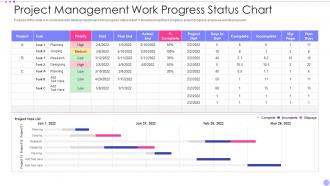
Project Management Work Progress Status Chart
Try Before you Buy Download Free Sample Product
Audience
Editable
of Time
Our Project Management Work Progress Status Chart are topically designed to provide an attractive backdrop to any subject. Use them to look like a presentation pro.
People who downloaded this PowerPoint presentation also viewed the following :
Project Management Work Progress Status Chart with all 7 slides:
Use our Project Management Work Progress Status Chart to effectively help you save your valuable time. They are readymade to fit into any presentation structure.
FAQs for Project Management Work
You'll want timeline/milestones, task dependencies, resource allocation, and who owns what. Show the connections between tasks - that's where most people screw up honestly. Pretty charts are worthless if you can't see how one delay impacts everything else. Build in buffer time because stuff always runs long. Add progress tracking and figure out your critical path. Oh, and don't overcomplicate it from the start. Simple works better until your team actually needs more detail. Dependencies are seriously the make-or-break piece though.
Dude, Gantt charts are literally lifesavers for project timelines. You get these horizontal bars showing each task against actual dates, which beats scrolling through boring lists any day. Dependencies become obvious too - like when you can't start something until another piece is done. Honestly, I wish I'd started using them sooner because they catch problems before they explode in your face. Plus stakeholders love the visual aspect since they don't have to decode your messy notes. Even a basic one you throw together beats text every time. Seriously worth trying on your next project.
Look, project management charts are honestly game-changers for keeping your team aligned. No more "wait, who's doing what again?" moments. Gantt charts, Kanban boards - whatever works for your style - they show timelines, dependencies, all that stuff visually. Your remote teammates can actually see what's happening instead of playing email tag constantly. The trick is updating them regularly (I know, obvious but people forget). Reference them in meetings too or they just become pretty decorations. Trust me, once your team gets used to checking the chart first, those endless status meetings become way less painful.
Honestly, I'd start by figuring out what phases matter most for your specific project type. Software stuff? Focus on sprints and bug tracking. Construction? You'll want permit deadlines and inspection milestones front and center. Grab a basic template first - way easier than starting from zero (learned that the hard way). Then just tweak the timeline, task categories, and milestones to fit what you're actually doing. Map out those critical dependencies too. The chart should highlight whatever's gonna make or break your project's success.
Update them weekly minimum, but daily's better if things are moving fast. Get real progress data from your team - and yeah, good luck with that because half the time they'll give you vague "it's going fine" responses. Track actual progress vs what you planned, not just wishful thinking. Standardized colors and symbols help everyone stay on the same page when reading the charts. Oh, and don't just update and walk away - actually review them with stakeholders regularly or you'll miss problems until it's too late. Set a calendar reminder because honestly, you'll forget otherwise.
Honestly, just think about what you're actually trying to show people first. Gantt charts are perfect for project timelines with dependencies. Workflow stages? Kanban boards work great. I'm obsessed with burndown charts for tracking sprint progress - they literally kept me sane last month. But here's the thing: if you're presenting to executives, don't overwhelm them with crazy details. A simple milestone chart hits different when they just want the big picture. Who's gonna see this chart and what do they need to decide? Start there, then pick whatever's simplest but still gets your point across.
Microsoft Project and Asana are probably your best bets - both handle Gantt charts really well. Smartsheet's pretty solid too, like Excel but actually designed for projects. You could technically use Google Sheets but honestly that gets annoying with bigger projects. Monday.com and ClickUp work fine if your team's already on those platforms. My cousin swears by ClickUp but I think their interface is kinda cluttered. Anyway, definitely try the free trials first - maybe pick 2 or 3 and see which one doesn't make you want to throw your laptop out the window.
Dude, project management charts are total game-changers for those stakeholder meetings. Visual stuff just works better than dumping spreadsheet hell on people. Gantt charts show progress instantly, network diagrams catch bottlenecks, cost curves track your budget burn. Way more engaging than rows of numbers, trust me. Different audiences need different views too - executives want the big picture timeline while your team leads need all the nitty-gritty task details. Oh, and stakeholders actually ask better questions when they can see what's happening. Just pick whatever chart tackles their main worry first, then expand from there. Makes everything so much smoother.
Honestly, the worst mistake is trying to track every single little thing - you'll just confuse everyone including yourself. Keep it simple at first with the stuff that actually moves the needle. Regular updates are huge too because stale charts make you look sloppy. I've watched people absolutely butcher perfectly good project plans by going nuts with rainbow colors and fancy fonts. Looks pretty but nobody can read it lol. Dependencies are tricky - don't make everything connect to everything or it becomes this tangled mess. Start with your main milestones and build up from there.
Charts are like having a crystal ball for project disasters. You'll spot bottlenecks and delayed tasks way before they blow up your timeline. I probably spend too much time staring at Gantt charts, but honestly? Worth it. Caught tons of issues during my Monday morning chart check-ins. They're also great for testing out different scenarios - like what happens if Sarah's part runs two weeks late. Just don't be that person who builds beautiful charts then never looks at them again. Update them regularly or you're basically flying blind.
So Gantt charts map out everything upfront - super rigid but stakeholders eat that stuff up. Agile charts like burndowns and Kanban boards? Way more flexible. You work in short sprints and can actually pivot when things go sideways (which they always do, let's be real). I honestly can't stand how locked-in traditional charts make you feel. Agile shows real-time progress and adapts with you. If your project scope keeps changing, go agile. Your sanity will thank you later.
Turn those boring spreadsheets into visuals that actually make sense! Color-code overdue stuff, throw in some progress bars, and definitely use Gantt charts - they're lifesavers in meetings, trust me. Heat maps are solid for seeing who's swamped vs. who has bandwidth. Dashboards give you the whole picture without digging through fifty tabs (been there). Pick visuals that match what your team constantly asks about. Short bars for quick updates. Longer timelines when people need the full story. Honestly, half the battle is just figuring out what questions come up most and building around those.
Honestly, those completed project charts are like a goldmine for figuring out what actually went wrong (and right). Check your planned vs actual milestones - I guarantee you'll cringe at how optimistic you were with deadlines. We all do it. Look at which team members consistently hit their marks and who always needs extra time. Dependencies that caused surprise delays? Write those down immediately - they'll save your butt on the next similar project. Also track where resources got stretched thin or wasted. Keep the charts as templates, trust me on this one.
Dude, project management charts are total lifesavers for resource stuff. You can see who's drowning and who's basically twiddling their thumbs. Gantt charts work great - I'm obsessed with mine, probably to an unhealthy degree lol. They show your whole timeline so you catch conflicts early. Like when you realize Jake's got four deadlines hitting Tuesday or the dev team will be free for a week. Just don't be like me and forget to update them constantly, or you're managing off old data which is... not ideal.
Stick to the main ones: timeline stuff (milestones, deadlines), budget tracking, resource allocation, and how fast tasks are getting done. Team velocity matters too if you're doing sprints. I'd watch for blockers and dependencies - those things will mess you up fast. Don't go overboard with charts though, seriously. I've worked with people who track literally everything and it becomes useless noise. You want enough info to spot problems early but not so much that you can't see what's actually important. Start simple with these basics, then maybe add more later if they're actually helping you make decisions.
-
I’m not a design person, so I couldn’t make a presentation to save my life. Thankfully, they have all kinds of templates that I regularly use for my work.
-
Loved the fact that SlideTeam provides clean, high-definition, and professional PowerPoint products.Â